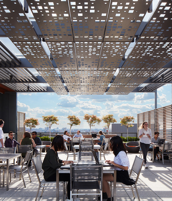
项目坐落于奥斯汀市中心以北的北拉马尔大道(North Lamar Boulevard)上,是Clayton Korte事务所与建筑景观事务所Word + Carr Design Group的共用办公地点。项目由上世纪中期的建筑改造而成,起名为“Design Office”。改造后的办公室体现了Clayton Korte事务所的跨界合作精神,促进了设计师之间的交流与协作。开放式的办公室环境不管是从空间层面还是象征性层面都模糊了两家创意事务所之间的界限,强调出两家事务所共同的价值观。除了满足办公空间需求外,Design Office内还设置了艺术展览空间,并作为设计论坛场地,所有专业的设计师和建筑师每月会在这里参加分享会。
Located on North Lamar Boulevard just north of downtown Austin, Clayton Korte’s office embodies the firm’s commitment to interdisciplinary collaboration and to fostering discourse in the design community. Officially named Design Office, the mid-century office space is home to two design practices, Clayton Korte and Word + Carr Design Group, a landscape architecture firm. The open office environment symbolically and physically blurs the line between the creative studios, reinforcing their shared values. In addition to satisfying office space needs, Design Office also provides exhibition space for art, and serves as a design forum, where designers of all disciplines and architects host monthly gatherings.
▼项目概览,overall of the project © Casey Dunn
项目的前身是一栋1963年建成的钢框架砖混结构建筑,最初作为投机行业办公楼使用。尽管原建筑室内空间阴暗沉闷,后期需要进行大量的改造工作,但这些尚未开发的原始空间却拥有着巨大的潜力,因此,建筑师Clayton Korte抓住机会买下了它。办公楼共有两个楼层,占地10000平方英尺(约929平方米),坐落于一个山地斜坡上,紧邻奥斯汀市主干道之一。倾斜的山地几乎将建筑的整个底层覆于土壤之中,因此,改造的首要任务是加固建筑的结构,避免不稳定土壤对建筑的影响。为了防止建筑最终滑向北拉马尔大道对面的Pease公园浅滩,Clayton Korte事务所委托施工人员为建筑加固了65个基桩。此外,由玻璃与钢板饰面构成的加建体块元素取代了原有的入口雨棚,这种设置不仅提供了高效的避雨空间,同时增加了室内空间的利用率。外立面上的砖材表面经过了稀石灰粉刷处理,这种处理方法操作简单,经久耐用,是当地传统的建筑工艺之一。除了办公楼前方街道上的30个停车位外,屋顶的停车场还额外提供了15个停车位。
The 1963, steel-framed, brick-infill building was originally built as a speculative office building. Despite housing a set of dreary, dark offices and needing a lot of work, Clayton Korte jumped at the chance to acquire it, recognizing the untapped potential of the raw spaces. The 10,000-square-foot, two-story structure is set into the hillside abutting one of Austin’s principle thoroughfares. The property slopes the equivalent of one floor from front to back. Unstable soils meant the first order of business was stabilizing the structure. Sixty-five structural piers were drilled to prevent the building from eventually sliding toward Shoal Creek in Pease Park, which sits directly across N. Lamar Boulevard. A new, glass-and-steel facade replaces the inefficient cladding of the pop-out element above the entry on the front of the building. The exterior brick is lime-washed, a simple durable finish traditionally used in the area. Rooftop parking for fifteen cars supplements the thirty street level spaces.
▼玻璃与钢板饰面构成的加建体块元素取代了原有的入口雨棚,A new, glass-and-steel facade replaces the inefficient cladding of the pop-out element above the entry © Chloe Hope Gilstrap
建筑加固后,办公楼室内的墙体被移除,仅留下基础结构,Clayton Korte事务所致力于以极简的设计手法处理改造后的开放式空间。外墙上原有的小型窗户被扩大了一倍,极大地改善了室内的自然采光,同时将附近公园的绿化景观引入室内。外墙的内侧被清洗一新,后用家装涂料粉刷,并在表面铺设了工业毛毡覆层,设计师们可以将手稿或图纸等钉在墙上。这种设置,将每一面墙都转化成一个引人注目的空间,鼓励并促进了设计师之间的合作与交流。
Following stabilization, the interior was gutted, leaving an empty shell into which a minimal set of spaces was introduced. The existing, small perimeter windows were enlarged—doubled in size—to bring more light into the building and to feature treetop views of the adjacent Pease Park. Perimeter interior walls were cleaned, clad in homesite, and topped with industrial felt, transforming virtually every wall into pin-up space to encourage collaborative design exchanges.
▼开放流动的办公空间,open flowing work space © Casey Dunn
▼每张书桌周边都拥有充足的个人空间,open, free-flowing floor plan with ample space between workstations © Casey Dunn
▼大面积的玻璃窗保证了室内的自然采光,Large glazing ensures natural light to the interior © Casey Dunn
▼设计师可以将图稿钉在墙面上,designers can pin-up drawings onto the wall © Casey Dunn
为数不多的私人办公室被规划在平面的角落中,主要工作区因此形成流动的开放式空间,同时这种设置确保了每张办公桌之间都留有足够的距离。尺度亲人的办公家具进一步增强了空间的开放感。
The few private offices that exist are pulled to the corners, ensuring an open, free-flowing floor plan with ample space between workstations. Low-scale office furniture reinforces the sense of openness.
▼私人办公室被规划在平面的角落,private offices are pulled to the corners © Casey Dunn
设计师将二层楼梯的入口扩大,并用一个极具雕塑感的木制楼梯代替了原有的楼梯。工业风格的钢制桁架,暴露的焊接点与温暖的橡木台阶踏板完美融合,形成和谐的极简风格。其中,台阶踏板所用的木材来自2011年旱灾后回收利用的橡木,橡木表面均经过了上油处理。开放式的楼梯位于办公室的中央,它将开敞明亮的两层工作室从视觉与空间上连接在一起。
The former utilitarian stair connecting the first and second floors was removed. The remaining opening was widened to accommodate a dramatic, wood-wrapped stairway featuring a steel stringer with exposed weld joints and post oak treads. The oil-finished post oak, harvested following a severe drought in 2011, also wraps the stairway. The central open stair anchors the large, light-filled studios on both floors.
▼位于工作室中央的开放式楼梯,The central open stair anchors the large, light-filled studios on both floors © Casey Dunn
▼二层楼梯入口,entrance of the stair on the second floor © Chloe Hope Gilstrap
▼二层楼梯的入口被扩大,并采用玻璃隔墙与其他空间分隔,The remaining opening was widened and separated from the rest of the space by a glass partition © Chloe Hope Gilstrap
▼楼梯墙面细部,detail of the wall of the staircase © Chloe Hope Gilstrap
天花板和地板保持了原始的状态,白色的天花板保温层与抛光混凝土地板裸露出来。德克萨斯明媚的阳光透过大型玻璃窗照进室内,通过调节半透明的窗帘可以使光线变得更加和煦。内墙上钢制的踢脚板延续了极简主义的美感,同时兼顾了实用性与耐久性。项目中所有的钢制门窗均是为Design Office量身订制的。厨房与服务区则为两家事务所的共享空间。
Ceilings and floors remain raw, exposed white ceiling insulation and polished concrete, respectively. Simple, semi-sheer curtains were installed to modulate the bright Texas sun through the now larger windows. Plate steel baseboards continue the minimalist aesthetic while providing durability. Custom steel windows and interior doors were fabricated in-house. Kitchen and support areas are shared by all tenants.
▼夜景,night view © Casey Dunn
▼一层平面图,first floor plan © Clayton Korte
▼二层平面图,second floor plan © Clayton Korte
Architecture: Clayton Korte Interior Designer: Clayton Korte General Contractor: Burnish & Plumb Landscape Architect: Word + Carr Design Group Structural Engineer: Scott Williamson, P.E. Metal Fabrication: Drophouse Design Photography: Casey Dunn, Chloe Hope Gilstrap
{{item.text_origin}}

