Step inside some of the houses we sell in our Open House series, in which we ask owners to reflect on why their house has been a special place to live. Here, we’re meeting architects Steve Chance and Wendy de Silva of Chance de Silva at their first-ever new-build project, Venus, made in collaboration with journalist and ‘art provocateur’ Graham Cooper in the late 1990s. The design drew on the Japanese machiya typology, specifically the city houses of Kyoto, and three artists were invited to make site-specific work for the space in an attempt to unite art and architecture. Read on to hear why the project is still dear to them today, and check out the sales listing here.
Steve: “Wed lived on this street for years, first in a squat and then, once people there started dispersing and getting married, in a little cottage further down the road.
“We’d eyed up this site and bought it in the mid-1990s as a dilapidated shed that had fallen into disuse. There was so much airspace above, so we knew something could be done.”
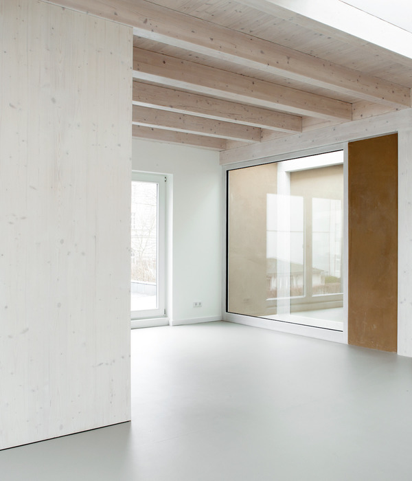
Wendy: “We set out to create a modern space with good light and views, and to use natural materials like oak, copper, brick and slate.
“We looked at typical machiya houses of Kyoto to create protection and privacy from the pavement, which in traditional Japanese houses is done with a mix of fences, screens, shoji doors and blinds. Ours is a modern interpretation, incorporating flexible space after the manner of Tado Ando and Toyo Ito.
“Other elements that were inspired by Japan include the copper cladding on the top part of the house, which we took from the capping of a balustrade fence post at the Kiyomizu-dera temple in Kyoto when we visited.
“And the curving of the ceiling planes on the upper floor were influenced by Philippe Starck’s Nani Nani building in Tokyo. But whatever conceptual design ideas and influences from the long gestation period of a design process, the important thing is that everything comes together into a coherent totality, so that it all looks seamless.”
Steve: “The house works on multiple levels. The old front door and the bricks for the ground floor were salvaged from the demolished building, giving a robust quality to the entrance. As you enter you step down from the hall into the inner hall at the bottom of the stairs, passing a bathroom without realising it and a storage cupboard, all detailed in Douglas fir with a distinct Japanese influence.
“And there are two further steps down into the rear living space, where you can see right through into the small rear courtyard where the slate paving continues out into the garden.
“As you go up through the house, the spaces gets lighter and airier. At the front, the kitchen is like the bridge of a ship and you can survey the street scene as the facade leans out slightly and has glazed corner windows.
“The kitchen gets the morning sun, while all three levels get the afternoon light. Clerestory windows bring light down the stairs into the centre of the house. On the top floor, a small dormer window slot acts as a sundial casting light onto the brick sidewall.”
Wendy: “Our third partner on the project was Graham Cooper, an artist and journalist. We commissioned Matt Hale, who made two integrated art pieces, one of glass tubes filled with domestic fluids such as shampoo and detergent; Frank Watson, who made three photographic lightboxes and Graham, who made
, a time-lapse film of the building under construction.”
Steve: “The whole idea of working with artists arose from a conversation in the pub between Matt Hale and myself about the shared concerns of us as architects and those of artists we knew, who were making installations or work that adapted found buildings.
“We vowed that we would find an opportunity to work together, and Venus was that opportunity. We have subsequently worked with a number of different kinds of artists such as filmmakers, choreographers, glass artists and musicians in our projects.”
Wendy: “When we borrowed the money to build the house, the bank’s condition was that we would have to sell it to pay them back.
“But we opened the space up as a gallery when it was finished and at the private view there were so many people saying to us
. And they were right! So, we moved in for several years.”
Steve: “What we valued most about living here was just that it’s a lovely house. That’s a rather bland statement, but the combination of toughness and warmth, the amount of light and spaciousness in a relatively modest sized house is special.
“In the bigger picture, it’s the first newbuild one-off house that Chance de Silva did. It was also a little joint-venture development, again the first one we did. And we lived in the house for several years so, having designed every detail, we got used to living with it and some of the ideas that were prototyped in this house have been replicated in other projects.”
Wendy: “I think we’ve always been driven to recreate the qualities of warmth and toughness and light, and the flexible uses of space, on all the subsequent projects.”
Steve: “Home for us is a place that fits you like an old overcoat or a jumper that you’ve worn for many years. A house should have some familiar aspects, particularly materially, but the joy of a contemporary house is the many qualities traditional buildings don’t have: interweaving and flexible space with light, and technology for additional comfort, however simple.”
Wendy: “The house will always stay with us because so much thought went into every detail of the building and because we’ll always be referring to it for inspiration for our current and ongoing work. We moved several years ago, to another site that we found, developed and built a house on, about five minute’s walk away. We are not planning to move from that house and Venus has had a great life for many tenants have enjoyed living there. So, whoever buys it is going to be a lucky owner, we think.”
{{item.text_origin}}

