Architects:Lacime Architects
Area :2728 m²
Year :2018
Photographs :XingzhiArchitecture
Lead Architects :Zhiguo Ren
Landscape Design :Beijing chuangyi shance landscape design co. LTD
Interior Design :YU STUDIO
Client: : Chongqing Vanke
Design Team : Xueqing Fu, Lu Zhang, Yong Yang
City : Chongqing
Country : China
Located close to Chongqing Central Park. Architectural design reinterprets traditional space essence in modern language. Generally, it follows the traditional space layout featuring axial symmetry, front hall and backyard, and multiple courtyards. Walls, columns, and eaves are used to create courtyards and enframed scenery in different sizes and levels of openness.
The front hall is a two-story exhibition space that comes with three exhibition halls connecting each other and a cozy reception room. The main building faces public space of the city: large metal mesh and glass are used to give an air of artistic mystery; the private space of the garth is furnished with an 8.6-m-tall glass to show complete openness.
There is a veranda with overhanging eaves in the backyard to make a spiritual home with “the four glasses of water returning to the hall”. Semi-outdoor corridor in unregular size offers possibilities of transportation, socializing and relaxation, etc. In the center of the earth stands a huge bonsai of three pine trees. Large overhanging eaves enframe the sky for people roaming along the veranda and depict a tranquil picture of pine trees and rocks for those meditating indoors.
The veranda becomes a boundless and natural extension from indoors to outdoors, from building to the landscape through the extended glass, large-sized grey space, and bonsai-featured garth. The designer divides large overhanging eaves into the flat roof and pitched roof so as to deliver comfortable space experience. Internally, the suspended ceiling of flat roof is butted together with indoor space to weaken the bonds between indoor and outdoor spaces; externally, the suspended ceiling eave of a pitched roof is made slightly low to enframe garth landscape from indoors.
Lines make the building look tall; metal texture and transparent glass weave a delicate appearance; lines and surfaces work together to deliver a simple yet forceful volume. The flexibility of modern building is presented in a soft-hard and virtual-real manner.
Metal lines of the outer contour are all custom products: columns, eaves, waistlines, bottom edges, and door pockets. Custom-made metal sections bring out a forceful yet simple design. Detailed design in joints shows designers’ close attention paid to user experience as we; as builders’ sophisticated craftsmanship.
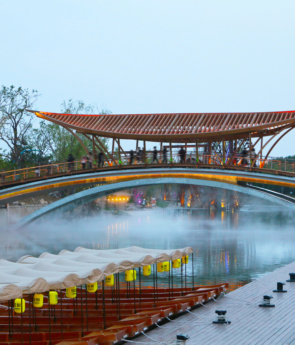
The main building is surrounded by waters on three sides. Lines in the inverted triangle are designed where the external wall bottom and water surface meet to support the main building and create an “overhanging” visual effect. Columns of outer frame are erected into water; the part above water is externally decorated with an aluminum sheet while that beneath the water with stainless steel sheet. As ripples vary, the stainless steel sheet reflects light onto the building.
The façade of the main building comes with 4500 Y-shaped three-dimensional elements to form a huge metal net. Y-shaped elements are totally man-made, and the 1.2mm*2.4m plate is pre-fabricated in the factory, cut and installed on the site. The lighting system is installed above and below the metal net, so soft light comes out of triangular holes at night to make the net look totally different in the daytime.
As an important part of façade design, the suspended ceiling works to set a limit on space through space division. Many super-sized plates are used for the suspended ceiling of garth veranda, and each plate is 3 meters long and 2.3 meters wide (max.). 30mm-thick stainless steel bars are put between aluminum plates. As super-sized plates and complex details present challenges for flatness during the construction, thickened plates, increased keel density and on-site repeated adjustments are done to achieve desired flatness at length.
On one hand, existing techniques add details to the simple design. On the other hand, rational deconstruction and restructuring make complex design clearly presented. The large overhanging eave of the garth surrounded on three sides is separated from the main building. As the eave is complex in structure and layer, double-pitch roof, the suspended ceiling of a flat roof, the suspended ceiling of a pitched roof, have lines and other elements are disintegrated and integrated into façade design to dovetail with the design logic of “forms reflect the structure”.
The centerpiece of the project is the artistic space consisting of building, landscape, and indoor elements. In this centerpiece, “building is the paper while landscaping the pencil”. That is, spaces differ as viewing locations and sunlight vary, which brings an extraordinary visual experience. So it is the most charming artwork of Emerald Park.
▼项目更多图片
{{item.text_origin}}

