OPA DESIGN BRIEF | PREPARED BY VERED KADOURI AND CRAFT & BLOOM
Helmed by Chef Shirel Berger, Opa opened its doors in September 2018 with the goal of creating a culinary ex- perience inspired entirely by the exquisite beauty and range of the plant kingdom. To ensure that this vision per- meated through every design element, Opa tapped architect and interior designer, Vered Kadouri, and Telavivian design house, Craft & Bloom; both of whom are known for their love of modern design and their thoughtful useof local, natural materials.
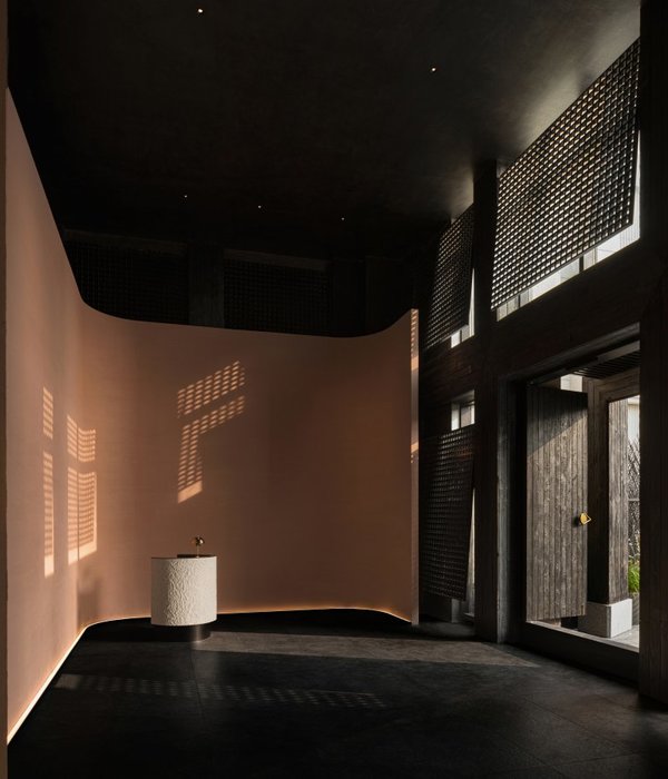
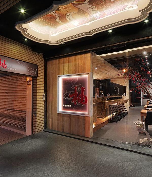
The 35-seat restaurant is located in Tel Aviv’s bustling but decidedly ramshackle Levinsky Market. This setting, while charming in its authenticity, posed an immediate and obvious design challenge: how does one create a re- fined dining experience on a derelict street that is otherwise marked by wholesale storefronts and bodega-style corner stores? In order to create the desired look, Kadouri and Craft & Bloom closed off the entire street-facing facade by removing all the existing metal grates and transparent windows and installed a combination of glass and drywall painted in a natural finish. The outcome: an entrance resembling that of an art gallery rather than a restaurant. This decision provided an intimate, womb-like effect that dulled out street noise and separated guests from the unruly outside world. Opa became a peaceful cocoon amidst the chaos.
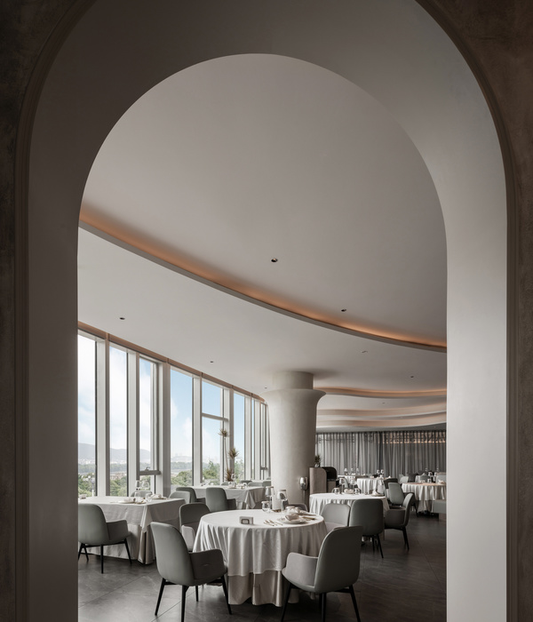
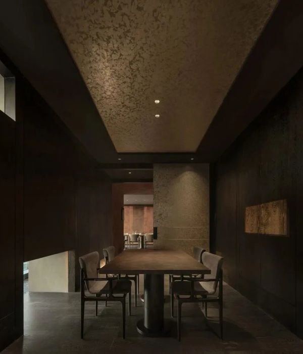
At the start, beyond the unsightly facade, was a dark and cramped storage unit. Kadouri and Craft & Bloom de- cided to install a sizable skylight above the patio at the back of the restaurant to flood the space with natural light and provide a livable habitat for plant life. This indoor patio added a casual element to the fine dining experience - making the restaurant more approachable for younger diners. The walls were uniformly finished with a natural plaster sans color; a celebration of the beauty of the material itself. The subtle but naturally-occurring texture of the walls and flooring contributed to a warm and informal atmosphere that still honored the design trio’s affinity for minimalism. The restaurant’s neutral color pallet includes subdued hues of peach and nudes, warm grays, and light woods.
Watching Berger, (27) in the kitchen is equivalent to watching an artist with her paintbrush. Her stunning, minimal- ist plates and splendid, local ingredients demanded an exposed kitchen where guests could bear witness to her nightly performances, executed with stirring emotion and intense focus. The glass-enclosed kitchen is positioned rather assertively near the entrance of the restaurant, making it clear to arriving guests that the food is at the forefront. Berger’s workstation, which juts out beyond the glass, is level to the guests’ countertop seating, putting her on the same plane as her patrons. This was done purposefully to honor Shirel’s central vision and philosophy behind the restaurant: that Opa be a place where food is consumed as much with the eyes as it is with the stom- ach, and quality ingredients are prepared with respect, care, and transparency.
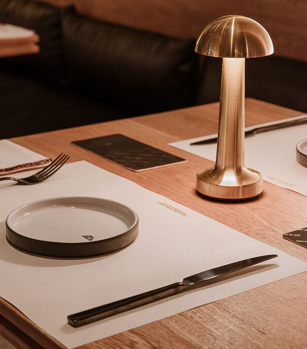
The space’s design was greatly inspired by Berger’s cuisine and process: minimal, clean, locally-sourced, and with an air of understated elegance. Like Shirel, Kadouri and Craft & Bloom believe in focusing on impeccable mate- rials and exploring the ways in which they work organically together. Over-styling, much like over-spicing, is only necessary when the bare ingredients are in need of clever disguise. In the case of Opa, every element shines in its simplicity.
{{item.text_origin}}


