▼项目概览,overall of the project © 李恒
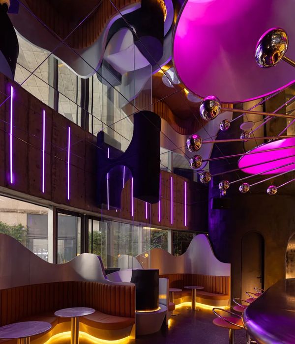
在最新的城市夜生活指数排行中,成都再次躺赢。在“反内卷”之余,丰富多彩的生活衍生出商业模式的革新变化,而 CARE PARTNER 也在这座遍布生活细节的城市中,用简约的空间和多变的氛围呈现,持续寻找当下都市青年“孤独”问题的解答。
In the latest city nightlife index, Chengdu once again won. In addition to the “reverse inner volume”, the rich and colorful life has derived the innovation and change of the business model, and CARE PARTNER is also present in this city full of life details, with simple space and changeable atmosphere, constantly looking for the answer to the “loneliness” problem of the current urban youth.
▼简约的空间和多变的氛围,simple space and changeable atmosphere © 李恒
作为 CARE PARTNER 品牌与设计师肖懿展的第二次合作,成都 CP 延续了杭州首店的微生态观念,在对流浪宠物关照的基础上,拥有自己独特的风格表达:引入全天候生活场景的串联,借助多媒体灯光的延续,在现场体验的丰富感受之上,用咖酒模式的新思路形成本土表达的力量,为社交场景带来丰富有趣的体验。
As the second cooperation between CARE PARTNER brand and designer Xiao Yizhan, Chengdu CP continues the micro-ecological concept of the first store in Hangzhou, and has its own unique style expression on the basis of caring for stray pets: By introducing the series of all-weather life scenes and the continuation of multimedia lighting, based on the rich experience of the scene, the new idea of coffee and wine mode forms the power of local expression, bringing rich and interesting experience for the social scene.
▼楼梯,staircase © 李恒
是 CP 更是 CP!
CP is more than CP!
CARE PARTNER 的命名,源于主理人对于流浪宠物的收容关爱。所以设计团队在立项之初,就考虑用开放的形式拥抱社区。CP 既代表了品牌核心的人文关怀,更指向了每个都市人逃离孤独的渴望。团队希望借此唤醒社群中人与人的交流,让每颗心都能在身边找到抚慰。
The name “CARE PARTNER” comes from the owner’s care for stray pets. So from the beginning of the project, the design team considered embracing the community with an open form. CP not only represents the humanistic care at the core of the brand, but also points to the desire of every urbanite to escape loneliness. The team hopes to awaken the communication between people in the community, so that every heart can find comfort around.
▼FOR PETS 宠物休息站,Pet rest station © 李恒
在沿街设置几张外摆的桌椅,在咖啡馆中已屡见不鲜。而 CARE PARTNER 却将过渡灰空间变成了社群休闲的自发聚集地。以“绿色站台”为概念,将室外区域打造成半开放的公共空间。在设计上,使用圆形的镂空天顶向酒店落客区的概念致敬,为丰富的灌木植被开辟自由生长的空间,也令到达都充满仪式感。而下方的不锈钢支架还增加了贴心的横杆设置,方便作为宠物牵绳的固定点着力。
Set up a few tables and chairs along the street, in the cafe is common. CARE PARTNER turns the transitional gray space into a spontaneous gathering place for community leisure. With the concept of “green platform”, the outdoor area is transformed into a semi-open public space. The circular hollowed out ceiling is used in the design to pay tribute to the concept of the hotel drop-off area, opening up space for the rich shrub vegetation to grow freely, and making the arrival full of ritual feeling. And the lower stainless steel bracket also increases the intimate bar setting, convenient as a pet leash fixed point focus.
▼以“绿色站台”为概念的半开放公共空间,”green platform” semi-open public space © 李恒
▼圆形的镂空天顶向酒店落客区的概念致敬,the circular hollowed out ceiling © 李恒
通过“宠物休息站”的品牌理念输出,向社区传递了友好的邀请信号:任何人都可以带着自己的宠物来到这里交流。设计团队希望通过舒适清新的公共空间,在商业以外融入更多人文关怀,拉近心灵之间的距离。
Through the brand idea output of “Pet rest station”, it sends a friendly invitation signal to the community: anyone can bring their pet to communicate here. Through comfortable and fresh public space, the design team hopes to integrate more humanistic care outside of business and narrow the distance between hearts.
▼由“宠物休息站”看咖啡/酒吧室内入口,viewing the entrance from the “Pet rest station” © 李恒
日咖夜酒的生活变调 Day coffee night wine life change tone
咖啡与酒文化的本质,是追寻“放松”“自由”的生活方式与状态,而成都的悠闲正和这种特质不谋而合。结合 CARE PARTNER“日咖夜酒”的体验方式,设计将两种消费场景融合到同一空间,在全时段的商业模式中,创造丰富多变的体验。
The essence of coffee and wine culture is the pursuit of “relaxed” and “free” lifestyle and state, and Chengdu’s leisure coincides with this characteristic. Combined with the experience mode of CARE PARTNER “Day coffee night wine”, the design integrates the two consumption scenes into the same space, creating a rich and changeable experience in the business model of the whole period.
▼入口,entrance © 李恒
▼入口座位区日景,day view of the seating area at the entrance © 李恒
灰色的水磨石从户外蔓延至室内,在瓷砖、水泥和绿植的共同作用下,不同的触感和肌理相互融合,室内外的空间边界也逐渐模糊,延续了温润动人的空间质感。吧台上方的菜单以“方”与“圆”对两种休闲方式进行区分,而较高的菜单设置,方便身处二楼的消费者也能轻松点选饮品。
Grey terrazzo spreads from outdoor to indoor. Under the joint action of ceramic tile, cement and green plants, different touch and texture blend with each other, and the boundary between indoor and outdoor space is gradually blurred, continuing the warm and touching space texture. The menu above the bar is “square” and “round” to distinguish the two kinds of leisure, and the higher menu Settings, so that consumers on the second floor can easily choose drinks.
▼吧台,bar counter © 李恒
▼吧台上方的菜单以“方”与“圆”对两种休闲方式进行区分,the menu above the bar is “square” and “round” to distinguish the two kinds of leisure © 李恒
▼菜单细部,details of the menu © 李恒
▼灰色的水磨石与绿植从户外蔓延至室内,grey terrazzo and plants spread from outdoor to indoor © 李恒
深入生活的本质,我们慢慢发现,自己与细微感动的连接越来越少。或许每个人都在寻找一种纯粹的体验,所以 CARE PARTNER 的室内并没有加入过多的装饰元素,设计通过简洁的白色钢构呈现,并将灯带做了隐形化处理,来解决空间结构和美观度问题,为光与色的表演留出了充足的空间。
Going deep into the nature of life, we slowly find ourselves less and less connected with subtle touches. Perhaps everyone is looking for a pure experience, so the interior of CARE PARTNER does not add too many decorative elements. The design is presented by simple white steel structure, and the lamp belt is made invisible to solve the problems of space structure and aesthetics, leaving enough space for the performance of light and color.
▼简洁的白色钢构,simple white steel structure © 李恒
▼近景,details © 李恒
▼由中庭看二层座位区,viewing the upper floor from the atrium © 李恒
基于酒精和咖啡两种不同生活状态的融合,设计团队打破了咖啡厅的既定印象,在氛围营造中大胆尝试酒吧的灯光感受,将空间的软性塑造交给不断变幻的色彩,用早 C 晚 A 的链接方式,表达年轻一代对于线下交流的真实渴望。一杯温情的暖饮,一杯摇晃的微醺,塑造着品牌与消费者之间的情感纽带与感官链接。
Based on the integration of alcohol and coffee, the design team broke the established impression of the cafe, boldly tried the lighting experience of the bar in the atmosphere creation, and gave the soft shaping of the space to the ever-changing colors. With the link way of early C and late A, the real desire of the young generation for offline communication was expressed. A cup of warm drink and a cup of shaking tipsy shape the emotional bond and sensory link between the brand and consumers.
▼二层空间,upper floor © 李恒
▼由二层看菜单,viewing the menu from the upper floor © 李恒
▼不断变幻的色彩,the ever-changing colors © 李恒
CARE PARTNER 始于咖啡,却不止步于咖啡。空间中的桌椅与家具均采用小尺度的轻量形体,以模块化组合的形式呈现。在轻松舒适之余,更能适应多变的功能与使用场景。除了开放的社交场域,空间中还专门设置了较为私密的独立小包厢。通过隐形的上推式玻璃窗和隐形门,消减独立区域在开放空间中的存在感,并将变幻的灯光避开独立区域,为会议、沙龙等活动提供了亲近多元的社交场景。
CARE PARTNER starts with coffee, but doesn’t stop with coffee. The tables, chairs and furniture in the space adopt small scale and lightweight shapes, presented in the form of modular combination. In addition to ease and comfort, more adaptable to changing functions and use scenarios.
▼细部,details © 李恒
猫与人的生态兼容 Cats are ecologically compatible with humans
如果说 CARE PARTNER 的形色是表象,那么植根品牌基因的人文主义,则代表了设计与品牌生长的深度互融。与首店不同,设计团队这次选择将宠物收养区设置在吧台的正对面。在人们点单等待的片刻,也可以感受与这些都市精灵们亲近。这种善意不仅体现在物质条件的关照,也对照了品牌深切的人文初衷。考虑到宠物们的心理健康,使用玻璃房划分独立的空间区域,让人们在感受可爱生灵、融化钝感内心的同时,保持充分的距离,以减少宠物们的应激反映。同时形成品牌的独特记忆点,在商业之上赋予品牌更加亲和友善的视觉形象。
If the lighting and colorur of CARE PARTNER is the surface of branding, then the humanism rooted in the brand gene represents the deep integration of design and brand growth. Unlike the first store, the team chose to place the pet adoption area directly opposite the bar. While people are waiting for their order, they can also feel close to these urban elves. This kindness is not only reflected in the material conditions of the care, but also against the brand’s deep humanistic intention. Considering the mental health of pets, the glass room is used to divide the independent space area, so that people can feel the lovely creatures and melt the dull heart at the same time, keep a sufficient distance, so as to reduce the stress of pets. At the same time, the unique memory point of the brand is formed, which gives the brand a more friendly and friendly visual image on the business.
▼宠物玻璃房,Pet glass house © 李恒
人们需要与自然亲近,这对遗失的城市精灵们来说同样重要。室内绿色植物的引入,呼应了微缩自然的真实性,也传递了品牌对待生命的善意。CARE PARTNER 的出现,是 Z 时代群体对当代生活的一种回应。它不仅代表了一种消费方式的革新,更是新生力量对于都市节奏的真实反馈。
People need to connect with nature, which is also important for the lost city elves. The introduction of indoor green plants echoes the authenticity of miniature nature and conveys the goodwill of the brand towards life. The emergence of CARE PARTNER is a response of the group of Age Z to contemporary life. It not only represents a kind of consumption mode innovation, but also the real feedback of new forces to the urban rhythm.
▼由宠物区看座位区,viewing the seating from the glass house © 李恒
一展设计将品牌的人文关怀与潮流态度结合,通过可视化的灯光语言与多变情景设置,将咖啡、酒的跨文化融合与宠物关怀的人文命题解码,让品牌逐渐转变成一种消费习惯,催生出新的线下社交互动模式。在未来,传统业态内核的活力将被当代需求持续唤醒,以模式更迭与潮流语言的结合为手段,关照当代年轻消费群体的真实渴望,以更先锋的表达来激发更广阔的潜在需求。
Yizhan design combines the humanistic care of the brand with the attitude of the trend, and decodes the humanistic proposition of the cross-cultural integration of coffee and wine and the care of pets through visual lighting language and changing scene setting, so that the brand is gradually transformed into a consumption habit and a new offline social interaction mode is generated. In the future, the vitality of the core of the traditional business will be continuously awakened by the contemporary demand. By means of the combination of mode change and fashion language, the real desire of the contemporary young consumer groups will be taken care of, and the potential demand will be stimulated by more pioneering expression.
▼宠物玻璃房内部,interior of the Pet glass house © 李恒
项目名称:CARE PARTNER
项目地点:中国·成都
竣工时间:2022 年 6 月
项目类型:咖啡/酒吧
设计单位:杭州一展室内设计有限公司
主创设计:肖懿展
设计团队:王鹏飞 毛建雄 陈利亚 王忠天 张来建
软装设计: 杭州一展室内设计有限公司
灯光设计顾问:杭州乐翰照明设计工程有限公司
项目摄影:李恒
项目撰文:壹+品牌管理咨询
蓝岸装饰琳琳子 发表于 2023-4-27 16:42
{{item.text_origin}}

