废弃工厂的蜕变 | 艺术与建筑的完美融合
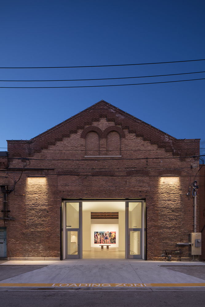
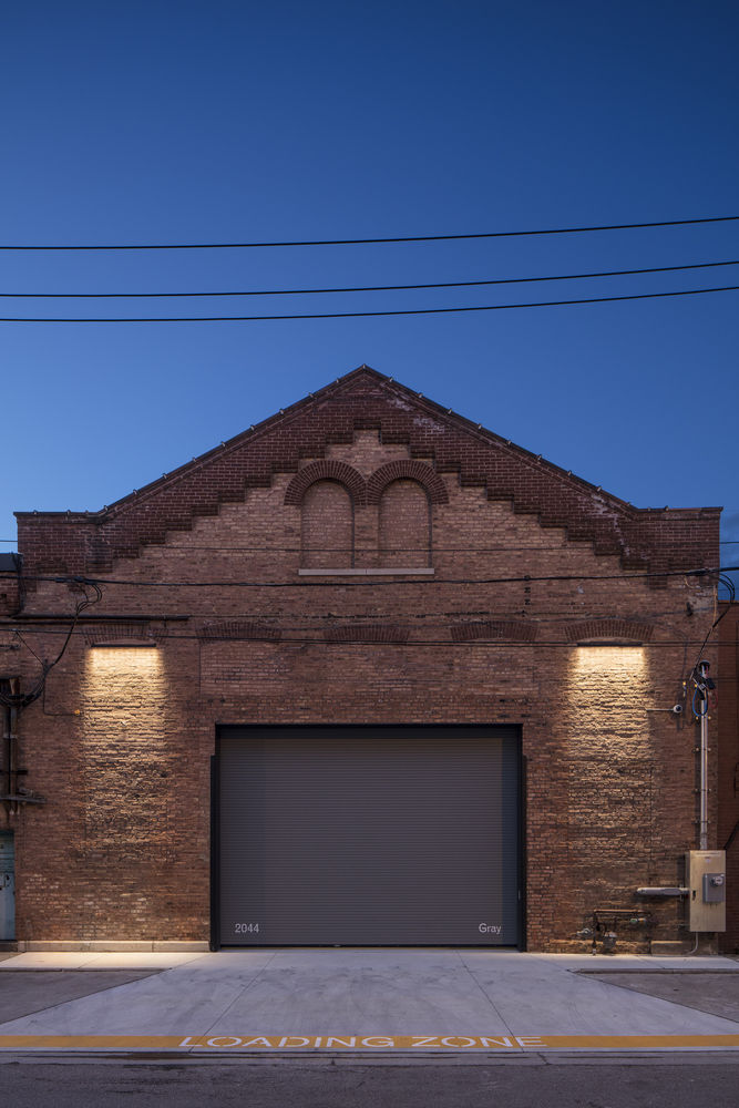
架构师提供的文本描述。一家老机器店被发现,就在那条破旧的小路上,靠在铁轨上。一位画廊老板让我们看看。搞砸了门面。累了,列着桁架,屋顶/排水头腐烂,板上有裂缝/凸起。但跨度,高度,显示器灯都是对的。找到后面的庭院就完成了交易。我们对自己说,“别搞砸了”
Text description provided by the architects. An old machine shop was found, off the beaten path, up against the tracks. A gallery owner asked us to look at it. Messed up façade. Tired, listing trusses, rotting roof/drain-heads, cracked/heaved slab over slab. But the span, the height, the monitor light was right. Finding the rear courtyard sealed the deal. We said to ourselves, “Don’t screw it up”
© Tom Rossiter
汤姆·罗西特(Tom Rossiter)
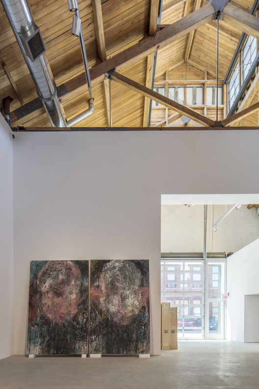
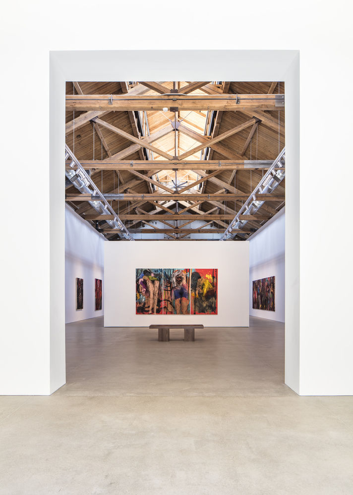
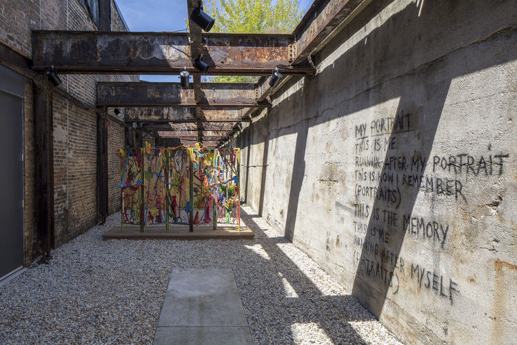
序列一个空间接收一个空间来呈现/吸收/反射一个空间来蜿蜒/修补/发现一个空间,在户外,让自己喘口气。
The Sequence One space to receive One space to present/absorb/reflect One space to meander/tinker/discover One space, outdoors, to catch ones’ breath
© Tom Rossiter
汤姆·罗西特(Tom Rossiter)
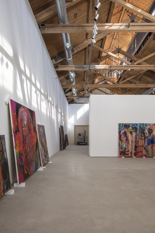
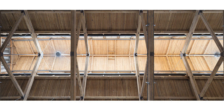
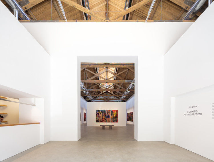
工作外壳:屋顶桁架被修复,加固和张紧;弹孔,结构甲板被取代,喷砂暴露道格拉斯杉木。为车辆和行人开放了一个中央门户。(设计问题:隐蔽的安全百叶窗、分段货车舱门、房源线上的无障碍入口,均为“一举一动”)。
The Work Shell: Roof trusses were restored, reinforced and tensioned; purlins, structural decking replaced, sandblasted to expose the Douglas Fir. A central portal was opened, for vehicles and pedestrians alike. (design problem: concealed security shutter, sectional truck bay door, accessible entry on property line, all in “one move”).
© Tom Rossiter
汤姆·罗西特(Tom Rossiter)
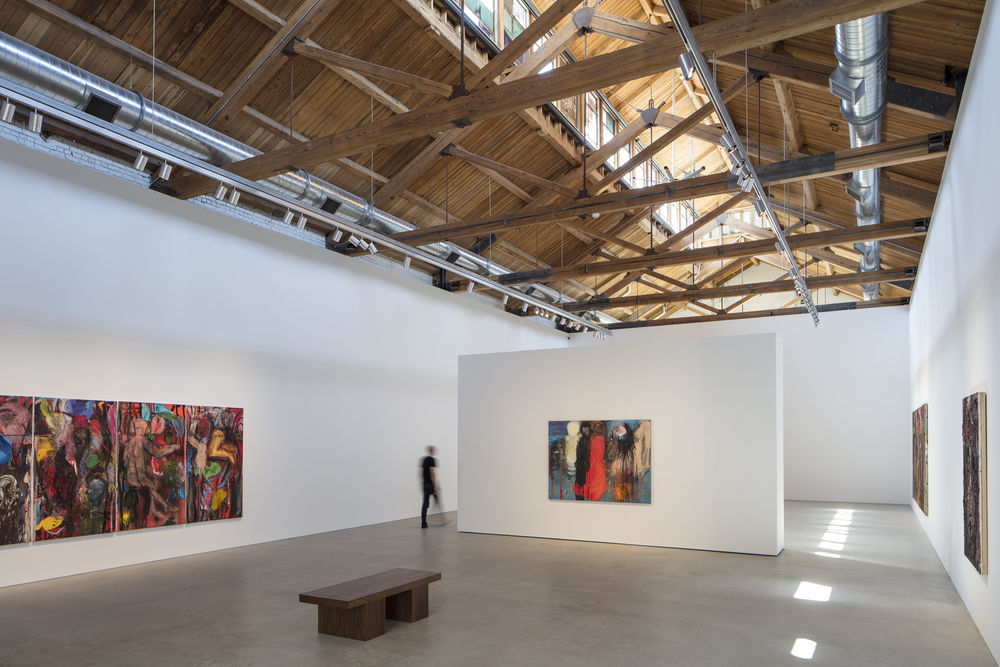
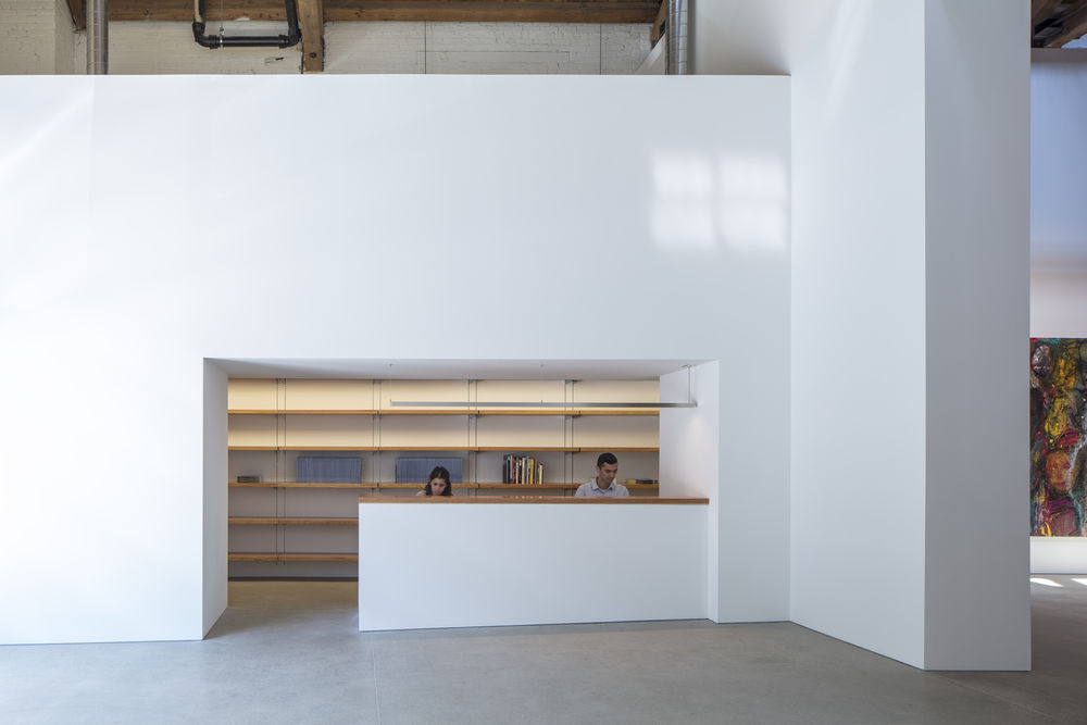
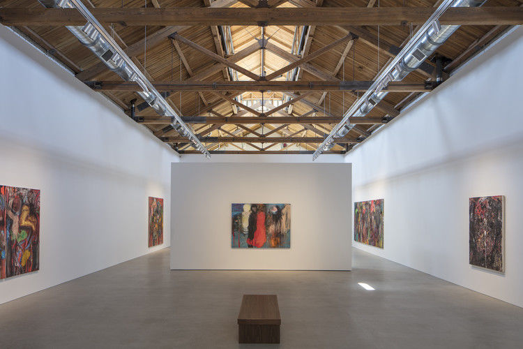
内部:一个新的混凝土地板,地面,小心上升,高原,上升。在此之上,一个视觉脱离,“浮动,内衬”的平白色油漆石膏。道格拉斯FIR前台和图书馆书架。高度、宽度、深度和线是隐式相互关联的。新金属是刷银;结构,腰带,机械,照明,风扇,装饰。主房间里住着两面大的滚动墙,每道墙都有一个门的宽度。(它们最初是混在一起的,但会随着时间的推移而迁移。)
Within: A new concrete floor, ground, carefully rises, plateaus, rises. Atop this, a visually disengaged, “floating, inner liner” of flat white painted gypsum. Douglas Fir reception top and library shelves. Heights and widths and depths and lines are implicitly interrelated. New metals are brushed silver; structure, sash, mechanical, lighting, fans, trim. Two large rolling walls live in the main room, each the width of one portal. (These are initially mudded together, but will migrate over time.)
© Tom Rossiter
汤姆·罗西特(Tom Rossiter)
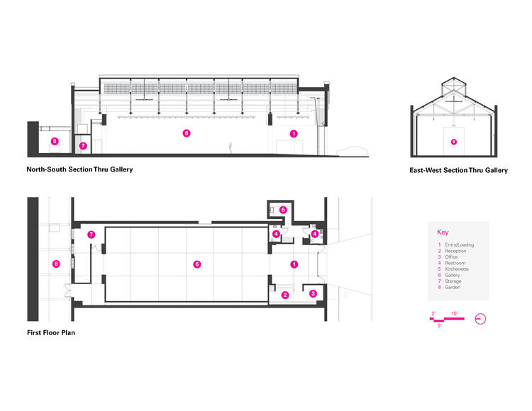
First floor plan - Sections
一楼图则-分段
© Tom Rossiter
汤姆·罗西特(Tom Rossiter)
就这样唐纳德·贾德(DonaldJudd)说:“艺术和建筑应该永远对称,除非有充分的理由。”比尔·特恩布尔(BillTurnbull)说,他希望“我的作品看起来像个农民”,就好像他不在那里一样。比看上去难多了。
That’s it. Donald Judd said “art and architecture should always be symmetrical except for good reason”. Bill Turnbull said he wanted “my work to appear that of a farmer”, as if he was not there. It’s harder than it looks.
© Tom Rossiter
汤姆·罗西特(Tom Rossiter)
