© Fernando Guerra | FG+SG
费尔南多·格拉
架构师提供的文本描述。Dpot是在圣保罗一片1500平方米的地块上建造的,那里以前有一个被一个大花园包围的房子。通过研究现行的土壤使用和占用规律,我们认识到在拆除现有建筑后,新建筑物的使用指数、强制性挫折等因素会有很大的不同(或不利)。因此,确保具有同样的建设性潜力将意味着更新和改造现有结构。
Text description provided by the architects. Dpot was built on a 1,500-m2 plot in São Paulo, where there had previously been a home surrounded by a large garden. Upon studying the Soil Usage and Occupation laws in force, we realized factors such as usage index, mandatory setbacks, etc., would be very different (and unfavorable) in the case of a new building, following demolition of the existing. Thus, ensuring the same constructive potential would mean renovating and converting the existing structure.
© Fernando Guerra | FG+SG
费尔南多·格拉
Ground Floor Plan
© Fernando Guerra | FG+SG
费尔南多·格拉
解决办法是重组原建筑的内部空间和立面,使其适合商业用途。这一转变虽然深刻,但保留了“过去”作为住宅的非正式和放松的心情,在那里,产品可能被展示和安排,就像,实际上,在一所房子里。天花板上下高度的交替和梅扎宁的存在为每个房间设置了不同的尺度,将体积的组合转变为一组不同比例的平行棱镜。
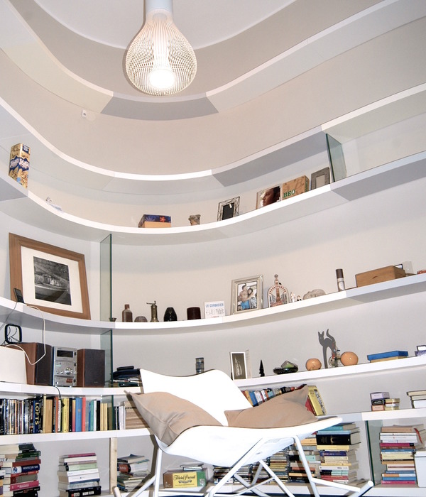
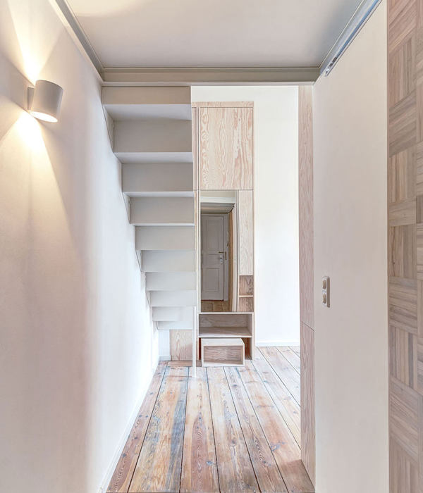
The solution was to reorganize internal spaces and façades from the original building, suiting them to the commercial use. The transformation, albeit deep, retained the informal and relaxed mood from the “past” as a residence, where products may be displayed and arranged as if, in fact, in a house. The alternation of higher and lower ceiling heights and the existence of mezzanines set a different scale to each room, turning the combination of volumes into a grouping of juxtaposed prisms of various proportions.
© Fernando Guerra | FG+SG
费尔南多·格拉
© Fernando Guerra | FG+SG
费尔南多·格拉
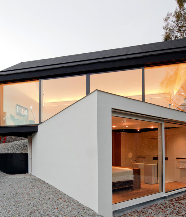
最后,还有另外两个重要的想法:花园总是可以从商店里看到,装饰好的房间总是可以从外面看到。解决办法是“撕开”所有卷的较低部分(服务区除外),并在整个周边安装一条不间断的玻璃条,以提供所需的透明度。我们选择在上段外面涂上水泥牌匾,在里面铺木板。内部和外部的整合是完整的,“空白”卷似乎漂浮在休息室,在一个茂盛的花园。
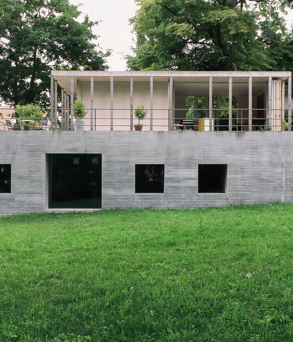
Finally, two other important ideas: that the garden was always visible from within the store, and that the decorated rooms were always visible from the outside. The solution was to “tear” the lower section of all volumes open (except those housing the service areas), and install an uninterrupted strip of glass around the whole perimeter, as to provide the desired transparency. We chose to clad the upper section with cement plaques on the outside and wooden planks on the inside. The integration between interior and exterior is complete, and the “blank” volumes seem to float over the lounges, amidst a lush garden.
© Fernando Guerra | FG+SG
费尔南多·格拉
Architects Isay Weinfeld
Location Alameda Gabriel Monteiro da Silva, 479 - Jardim America, São Paulo - SP, Brazil
Project Manager Elena Faria Scarabotolo
Team Cristiano Kato, Elisa Canjani, Katherina Ortner, Sara Leitão, Sebastian Murr, Sophia Lin
Area 770.0 m2
Project Year 2015
Photographs Fernando Guerra | FG+SG
Category Store
Manufacturers Loading...
{{item.text_origin}}

