© Camila Cossio
卡米拉·科西奥
架构师提供的文本描述。如果我们谈论墨西哥城最好的“考克利”(taquerías),那么El Califa已经是一个美食参考,不仅因为它的配料质量,还因为它的服务和氛围。2017年,该品牌开始扩张,并在该市最繁忙的街道之一Avenida de los Insurgentes开设了一家新餐厅。
Text description provided by the architects. El Califa is already a gastronomic reference if we talk about the best “taquerías” in Mexico City, not only for the quality of its ingredients but also for its service and atmosphere. In 2017, the brand started an expansion process and opened a new restaurant in one of the busiest streets in the city, Avenida de los Insurgentes.
© Camila Cossio
卡米拉·科西奥
在这个新的地方,埃尔卡里法确立了作为一个品牌的发展指南,揭示了一个新的室内设计和身份。
At this new location, El Califa establishes the guidelines for its evolution as a brand, revealing a new interior design and identity.
© Camila Cossio
卡米拉·科西奥
Bar Elevation
杆高
埃斯拉韦工作室发现了它的灵感来源在玉米饼和它的几何翻译到圆圈,以及它的重复,分区和变体。墨西哥玉米饼是墨西哥人生活中的一个重要部分,从西班牙前时代起,我们的祖先就把玉米饼当作一道菜、一种食物和一种勺子。今天,每个人都找到了巧妙的方法来使用它,在准备、折叠和拿着玉米饼的过程中创造了一种个人的触觉。
Esrawe Studio found its source of inspiration in the tortilla and its geometric translation to the circle, as well as in its repetition, partition and variants. The tortilla has been an important part of people’s lives in Mexico since pre-hispanic times, when our ancestors used corn tortillas as a dish, food and spoon. Today everyone finds ingenious ways to use it, creating a personal touch in the way of preparing, folding and holding a taco.
从各种不同的折叠玉米饼的方式,我们产生了一个新的概念,以重新解释墨西哥传统的“塔奎拉”的本质。
From all the different ways of folding a tortilla we generate a new concept to reinterpret the essence of traditional “taquerías” in Mexico.
© Camila Cossio
卡米拉·科西奥
品牌的身份,即品牌的语言,是直观而明显的。我们保持品牌的无忧无虑的精神,并通过新的图形赋予它权力,使El Califa能够传达一种通过时间自然形成的本质。作为墨西哥人,我们成长在“rótulos”这一墨西哥传统广告的图形和文化丰富性的包围下,唤起了城市美食的休闲、诚实和包容的精神。正是在“rótulos”中,我们找到了灵感,创造出新的比例和表现形式,形成了El Califa这个标志性的名字。这些生动的元素巧妙地开玩笑,并以一种抽象而又轻浮的方式从“塔克利亚斯”(taquerías)中找到的桌布上翻译而来。这些元素回应了城市和流行的环境,在这种背景下,埃尔·卡里法(El Califa)及其美食成为主角。
The identity The language of the brand is intuitive and obvious. We maintain the carefree spirit of the brand, and empower it through the new graphics so that El Califa can convey an essence that has been formed naturally through time. As Mexicans, we have grown up surrounded by the graphic and cultural richness of “rótulos”, a kind of traditional ads in Mexico, which evoke the casual, honest and inclusive spirit of urban food. It was in the “rótulos” that we found inspiration to create the new proportions and expression of the characters that form the iconic name of El Califa. The graphic elements, subtly playful and translated in an abstract yet flirtatious way from the tablecloths found in “taquerías”, respond to the urban and popular context within which El Califa and its cuisine are protagonists.
© Camila Cossio
卡米拉·科西奥
© Camila Cossio
卡米拉·科西奥
通过开放式厨房的空间,我们加强了玉米饼的准备,同时也使食客更接近传统的“玉米饼吧”。这一手势在共餐、“牛头”和玉米饼之间产生了联系,并使厨房变得高贵,使人们对菜肴的准备产生了某种敬佩之情。“taquerías”中的传统马赛克在空间上被重新解释,以产生一个当代的表达,成为El Califa的识别元素。这个马赛克巧妙地讲述了我们墨西哥料理中最基本的元素之一-玉米饼。
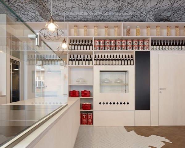
The Space By means of an open kitchen we enhance the preparation of the tacos, and at the same time we bring the diner closer to the traditional "taco bar". This gesture generates a link between the commensal, the “taquero” and the tacos, and dignifies the kitchen, causing a certain kind of admiration towards the preparation of dishes. The traditional mosaic in “taquerías” is reinterpreted in the space to generate a contemporary expression that becomes the identifying element of El Califa. This mosaic speaks ingeniously through a game of volumes of one of the most basic elements in our Mexican cuisine: the tortilla.
© Camila Cossio
卡米拉·科西奥
相对于简单的马赛克美学,地板是覆盖着城市感觉的土地装饰了一个XXL网格的黄金圆圈。最后,气氛被来自定制灯泡的温暖光线所淹没,这些灯泡唤起了“塔克利”的轻松氛围。
In contrast with the simple aesthetic of the mosaic, the floor is covered by the urban feeling of the terrazo embellished with an XXL grid of golden circles. Finally, the atmosphere is submerged by the warm light coming from custom bulbs that evoke the effortless atmosphere of “taquerías”.
Wall Elevation
墙高程
© Camila Cossio
卡米拉·科西奥
这家餐厅的家具和餐具是专门为该项目开发的。这使得我们能够遵循源于室内设计和品牌认同的正式路线,强化其话语。(鼓掌)
The furniture and tableware of the restaurant were developed especially for the project. This allowed us to follow the formal line that originated the interior design and brand identity, strengthening its discourse.
Courtesy of Esrawe Studio
埃斯莱工作室提供
在制作玉米饼时,坚持玉米饼褶皱的几何表示,并从墨西哥街头发现的锻模的表达开始,在外墙上添加了一层外皮,这是一种格子,起到了餐厅和城市之间的过渡作用。
Insisting on the geometric representation of the folds of the tortilla when making a taco and starting from the expression of the forges found in the streets of Mexico, an exterior skin was added to the façade, a latticework that functions as a transition between the restaurant and the city.
Architects Esrawe Studio
Location Mexico City, CDMX, Mexico
Design Team Héctor Esrawe, Javier García-Rivera, María Santibáñez, Aloisio Guerrero, Alessandro Sperdutti, Daniela Pulido, Federico Stefanovich
Area 240.0 m2
Project Year 2018
Photographs Camila Cossio
Category Restaurant
Manufacturers Loading...
{{item.text_origin}}

