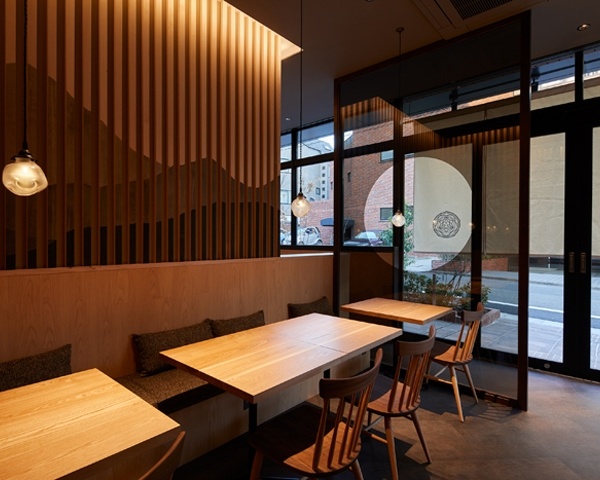
- 项目名称:Man Man鳗满
- 设计方:ARCHETYPE元太设计
- 建筑面积:165 sqm
- 摄影版权:形在建筑空间摄影
- 客户:Man Man鳗满
- 品牌:Van Der Rohe 凡德罗
桐梓林得益于90年代的城市建设和发展,形成了国际化和烟火气并存的独特气质,却又浓缩了成都独有的慵懒、安逸和包容。生活于此,“食”在桐梓林,鳞次栉比的餐饮环境,一家日本料理小店,又要如何立足在这样的背景之中。
▼沿街立面,facade
The existing of Tong Zi Lin district could be one of the evidences of urban high-speed development during 90s in city of chengdu, you will soon realized that its infrastructure network is truly inspired by the three basic principle of character of chengdu: comfort, coziness and city’s Inclusiveness. Therefore, “ Eating at Tong Zi Lin ” seems to be more fastidious. How can a restaurant which focuses on Japanese cuisine stand in this such a background is the main task for us to take up.
▼店铺外观,exterior view
日本料理的精神在于还原自然食材本味与匠人文化,而时代的高速发展,人心越发浮躁的当下,日料空间被嵌入了强烈的风格烙印,却大多数只筑其形,未注其魂。而在现代社会之中,丰富的物质文化让风格的界限越来越模糊,消费者需要品牌更具有独特的感染力,而品牌则需要可延续的生命力。于是我们开始重新审视对于空间未来环境的表达。料理是生活的艺术,而空间承载着生活。
Restoring the original taste of natural food is where the spirit of Japanese cuisine existed in. However, in this era of rapid de-velopment, the systematic design research was conducted about how to build up a Japanese style space, most of them are identical but lacking in its uniqueness. In modern society, hybrid culture has blurred the boundary of multiple branding style. A brand with its unique appeal while also having sustainable vitality seems to be more attractive to customers. For this reason, our strategy is to re-examine the ex-pression of the space more according to the ambience. Cuisine is the art of life. Space is a container for life of art.
▼店铺入口走廊,exterior corridor
▼外部细节,exterior details
对于鳗满而言,它不需要成为桐梓林浓墨重彩的一笔,却可以是这里最恰如其分的一个。学会融入环境,才能属于环境。对于品牌独特性与生命力的探索,也应当是如何将其融入到艺术和生活之中。项目所在的写字楼具有较强烈的建筑语言,若刻意打破建筑连贯性,显然会造成观感上的混乱。因此,我们需要平衡与建筑之间的和谐感。
▼轴测图,axon
We hold the opinion that MAN MAN doesn’t need to be overwhelming, but it can be the most appropriate one here in Tong Zi Lin. We fully believe that the exploration of brand uniqueness and vitality should be both preserved and adapted to new needs. The restaurant is sited on the ground floor of an office building. Knowing the impact that the project is having on those who lived in it, is the proper way we cross the line between the fields of urban planning and architecture that was completely un-covered.
▼入口空间,entrance
▼室内概览,interior overview
▼室外以景深及光影作为媒介,室内又延续不同空间的尺度联系,the light creating the interesting relationship between the interior space and exterior space
弧形成为一种建筑元素来界定空间与环境,形成的墙面为建筑带来更多凝聚力和连续性。曲线的韵律又天然透露着瞬间打动人的力度。而墙体的镂空,重塑了原有的节奏,将人的视线引入其中。室外以景深及光影作为媒介,室内又延续不同空间的尺度联系,构建出建筑内外的有趣关系。方寸之间,别有洞天。
The core design element that we decided to define space is the curve linear form so that it brings the cohesion and continuity to the building while gives the space some of its own personality. The rhythm of the curve flows through the different func-tional spaces, thus forming a corridor that leads customers into the space. People in Chengdu are obsessed and inspired by light, and more to the point, the absent of it. So the light influences the whole design that exterior is all about the shades of grey and shards of light, but the brighter artificial light lift the spirit in dinning space where the focus is on how the light hits the different surfaces, creating the interesting relationship between the interior space and exterior space.
▼弧形成为一种建筑元素来界定空间与环境,the core design element is the curve linear form
▼曲线的韵律又天然透露着瞬间打动人的力度,the rhythm of the curve flows through the different func-tional spaces
▼细部,details
▼模型,model
▼平面图,plan
项目名称:Man Man鳗满
设计方:ARCHETYPE元太设计
项目设计 & 完成年份 2019年6月 & 2019年10月
主创及设计团队:ARCHETYPE元太设计
主创: Louis 廖晋南
设计团队: Fei 薛菲,Simon 张浩霖,Tokay 余岛,Zoey 郑颖
项目地址:成都市上善国际北楼1-27号
建筑面积:165m² Area: 165 sqm
摄影版权:形在建筑空间摄影
客户:Man Man鳗满
品牌:Van Der Rohe 凡德罗
Project name:Man Man鳗满
Design:ARCHETYPE元太设计
Project Complete: Oct.2019
Leader designer & Team:ARCHETYPE元太设计
Design in charge: Louis 廖晋南
Space Design: Fei 薛菲, Simon 张浩霖, Tokay 余岛, Zoey 郑颖
Project location:Chengdu, China
Area:165 sqm
Photo credits:形在建筑空间摄影 Here Space Photography
Clients:Man Man鳗满
Brands / Products used in the project:Van Der Rohe
元太设计
{{item.text_origin}}

