2012年,联合车站成为华盛顿特区的新城际巴士中心车站。该公交运输服务中心于车站停车场中,并需要将相关服务设施和在旁边的Beaux Arts中的便利设施迁移到其中。Studio Twenty Seven Architecture对此进行了设计,旨在实现车站内可提供旅客需要的便利设施,而不需要离开车站这一目的。该设计以禅宗花园为灵感,三个亭子组成了这个新的公交运输服务中心。
In 2012, Union Station became the new central location for intercity bus travel in Washington DC. The new bus transit center is located in the parking garage, removed from the facilities and amenities of the majestic Beaux Arts masterpiece next door. Studio Twenty Seven Architecture was asked to design a solution that would provide amenities to the bus traveler without requiring them to leave the bus deck. Using the metaphor of a Zen garden, the new bus transit center comprises three pavilions.
▼建造在联合车站中的以禅宗花园为灵感的功能亭,a pavilion inspired by the zen garden in union station
第一个亭子的灵感来源于田野里的“岩石”。两个卵形结构拼合在一起,创造出椭球形的壳状几何形态。整个构筑物选用低成本的玻璃纤维制作,并由北卡罗来纳州的造船者装配制造。亭子用来提供票务和购物服务,这两个服务设施恰好融入这个非正交的外形。第二个亭子的灵感来源于岩石花园的“波基”,或是一种冥想门廊,可以欣赏周围的景观。这个亭子作为一个等候空间使用,由木材建成其结构,并用玻璃围护整个空间,这一设计让亭子不论在冷天还是热天都可使用,其中还设计了一个竹林环绕的露天平台,适宜于温和的天气使用。最后一个亭子设计为卫生间。由于下面的列车运行,这一对亭子间不得不规划隔开一段距离,以满足实际的管道需求。由于这个原因以及亭子的功能,设计师认为需要在外形上体现它的用处。由此,选择运用回收集装箱作为这个卫生间的外壳。特别的细节设计还在于:第一个亭子的嵌板纹饰是用莫尔斯电码写的Death Cab for Cuties的Soul Meets Body的歌词。这些歌词被嵌入密度纤维板中,然后用彩色真空密封玻璃纤维制作。
▼灵感来源于田野里的“岩石”的购物票务亭,the first pavilion contains ticketing and shopping kiosks serves as “rocks”
▼购物票务亭的夜晚效果,the first pavilion in the night
▼服务设施恰好融入这个非正交的外形,ticketing and shopping kiosks, two programs that easily fit into non-orthogonal forms
The first pavilion serves as “rocks” in the field. This is formed from two ovoid shapes, merged together, created from booleaned ellipsoid monocoque geometry. This method provided for cost effective cast fiberglass fabrication and assembly by a North Carolina based ship builder. This pavilion contains ticketing and shopping kiosks, two programs that easily fit into non-orthogonal forms. The second pavilion is the rock garden’s “pochi,” or meditation porch, overlooking the neighboring arrangement. This pavilion serves as a waiting space, with a wood and glass enclosure for hot and cold days and a bamboo-encircled open air deck is for mild days. The last pavilion contains restrooms. Due to the trains running below, this pavilion had to be set off at a distance to accommodate the practical plumbing need. Because of this, and the pavilion’s purely utilitarian function, it was decided that this should speak of what it truly is. A series of recycled shipping containers serve as the armature for this discreet comfort station.Pavilion one inset panels are Morse code for popular Death Cab for Cuties lyrics from “Soul Meets Body”.These lyrics were translated and rounded into MDF panels and then fabricated from color coated vacuum sealed fiberglass.
▼椭球形的壳状几何形态,the ellipsoidal shell geometry matching the station
▼嵌板纹饰是用莫尔斯电码写的Death Cab for Cuties的Soul Meets Body的歌词,Pavilion one inset panels are Morse code for popular Death Cab for Cuties lyrics from “Soul Meets Body”
自1908年以来,联合车站一直是哥伦比亚特区的标志性建筑和铁路中心枢纽。两年前, Union Station Redevelopment Corporation邀请美国5家城际巴士公司联合将车站打造成华盛顿的综合性车站。在联合车站综合体中加入公交运营,这样可以让乘客更加方便地乘坐地铁、地铁巴士、火车和观光班车。
Since 1908, Union Station has been an architectural icon and the central hub for railroad transport in the District of Columbia. Two years ago, the Union Station Redevelopment Corporation invited the nation’s five inter-city bus carriers to make Union Station their single point of embarkment in Washington. Locating the bus carriers within the Union Station garage complex would allow passengers easy connection to Metrorail, Metro Bus, Trains and sightseeing shuttles.
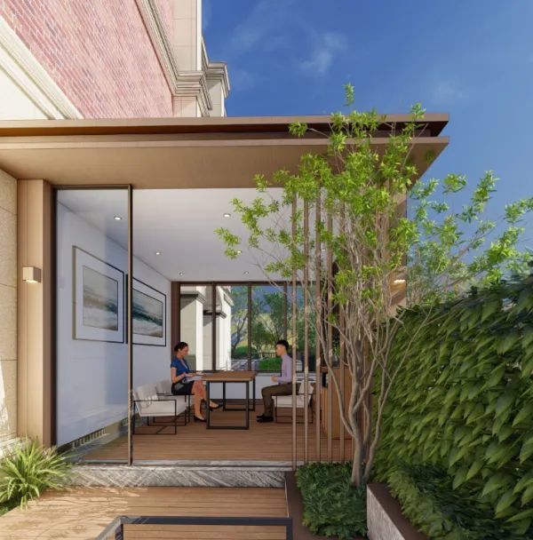
▼由木材和玻璃建造的等候亭,a waiting pavilion made of wood and glass
▼室外带座位的木平台,wooden platform with seat outside
这个项目旨在这个新的综合体里为乘客提供等候设施、便利设施和寻路服务。同时,该建造工作将在这个每天24小时运转的车站内进行,所以时间的安排和施工准备空间都非常有限。由于这些限制和100多万美元的总体预算,设计师决定使用预制的构造方式来对其进行建造。
The goal of this project was to provide shelter, amenities and way-finding for bus passengers at this new centralized location. Because the work would take place within the confines of an existing parking garage that operated twenty four hours a day, the scheduling opportunities and construction staging space were both very limited. With these constraints and an overall budget of just more than a million dollars, the program seemed to dictate the use of pre-fabricated pavilions as a design solution.
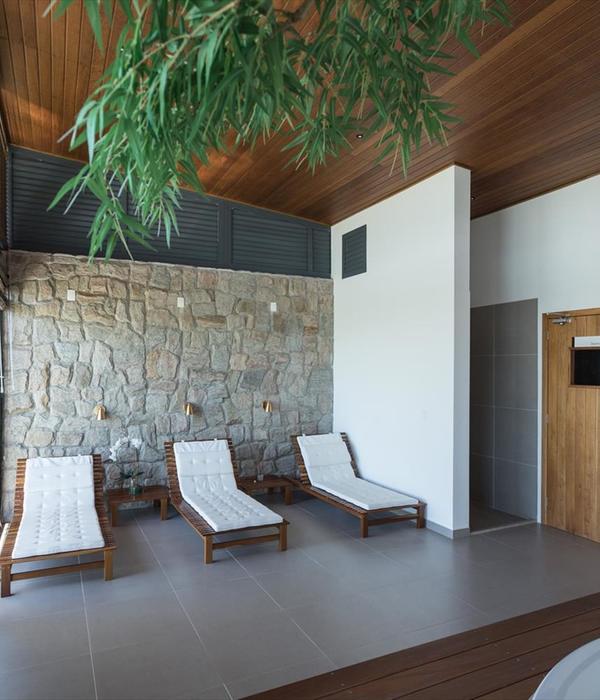
▼一个竹林环绕的露天平台,适宜于温和的天气使用,a bamboo-encircled open air deck is for mild days
由于项目被建造在不引人注目的地点,所以每个设计细节都需要呈现小型的、标志性的、引人注目的特点。对设计团队来说,该设计作为公共汽车站的过渡景观,整个设计需要使用图形的表达形式,让其成为一个可访问的,有触感的,吸引人的互动和商业对象。所以设计团队借用了日本岩石花园的主题,将其打造成一个空间和时间的符号。整个装置最终形成为旅行者提供食物、住所和商业,其位于站台与联合车站内部的连接上,这里正是乘客出行的公共通道。整个装置包括四个亭子,一个是信息亭,一个是购物亭,一个是等候亭,还有一个是洗手间。
The decidedly unspectacular site suggested that each program piece be small and iconic, dramatic and inviting. To the design team, the transitional landscape of the bus deck called for figural forms, pavilions that are iconographic objects within a field, accessible, and tactile, inviting interaction and commerce. The design team employed a metaphor derived from a Japanese rock garden that would be a spatial and temporal signifier.The final installation provides food, shelter and commerce to travelers. Located on the pedestrian arrival deck that connects directly to the interior of Union Station, the pavilions are arranged in response to the common travel paths displayed by the passengers and visitors. There are four pavilions – one for information, one for shopping, one for shelter and a fourth for restroom facilities.
▼使用预制的构造方式来对其进行建造,the use of pre-fabricated pavilions as a design solution.
1+2号亭作为信息+购物空间,采用倾斜的椭球形单壳体形式,为了节省建筑预算,建筑师采用可回收的玻璃纤维作为面板,结合具有粘合作用的玻璃纤维肋结构构成。它们将乘客从自动扶梯上吸引到商店内,并引导他们到等候区。 3号亭作为候车空间,由一个带座位的木平台和室内结构组成。在这里乘客可直接看到公共汽车的到达和停车区域。 4号亭作为卫生间,利用回收的集装箱构造完成。
Pavilions 1+2 – The Information + Vending space is a booleaned ellipsoid monocoque form, rationalized for construction budgeting purposes as developable fiberglass reinforced panels, with bonded fiberglass rib structure. They are designed and positioned to draw passengers from the escalators to the shop and guide them to the waiting area. Pavilion 3 – The waiting pavilion consists of a wood terrace for seating and a conditioned room for shelter. This space maintains direct visual access to the bus arrival & parking areas. Pavilion 4 – The restroom pavilion is a repurposed shipping container.
▼功能亭设计效果图,design sketches of pavilions
▼车站结构,the station structure
▼1号亭构造细节,details of no. 1 pavilion
Project Number:US-1201 Completion Date:August 2013 Location: Washington, DC Photos First Tier:Wait_interior, Bathroom, Dusk Pavilion, Pavilions, Travelers, Wait_Dusk, Wait_Exterior Photos Second Tier:Aerial, Bathroom Glass, Full Site, Garden Bench, Garden, Long View, Pavilion Rear, Planter Bench, Ramp Photo copyright holder: Studio Twenty Seven Architecture Photographer: Hoachlander Davis Photography, Anice Hoachlander
{{item.text_origin}}


