Newton, Massachusetts Summer, 2020 3,300 SF
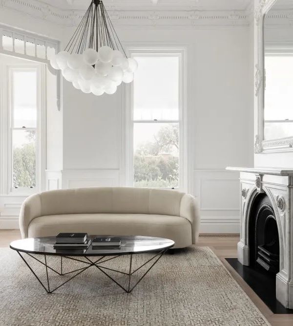
In a historic neighborhood in Newton, Massachusetts, this 110-year-old home sits on a beautiful, oversized lot. Although it originally had a colonial structure, it had been modified and updated over the years to include multiple styles and a variety of disconnected spaces and details. The challenge was to collaborate with the client and strategically focus on the areas that would have the greatest impact and provide the most architectural cohesion for this young and active family.
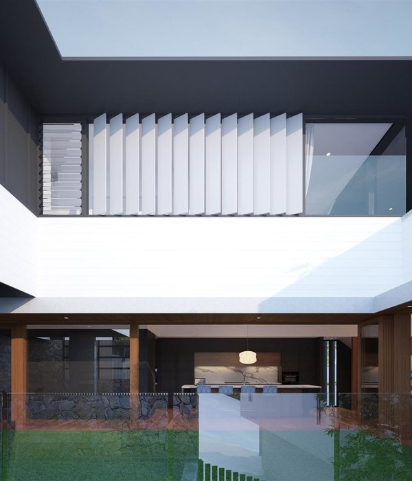
The design processcentered on unlocking the original integrity and beauty of this historic home. On the exterior, this involved a series of small, thoughtful decisions that brought the whole to life. By recessing the storage enclosure at the entry porch and setting a rhythm of accordant columns, we framed a new horizontal, transitional space, which grounded itself in a welcoming gesture to the street. After close study of the interior requirements, the rear development was a quiet fulfillment of volumetric opportunity. The goal was to accommodate a dramatically transformed kitchen into complex series of existing roof slopes that resulted in a natural scouting viewpoint over the exceptional expanse of urban vegetation. Shifting the home’s color to a light palette scheme erased its heaviness, and provided a canvas for a diverse and flourishing array of plantings that carry a sense of interior intimacy throughout the family’s property.
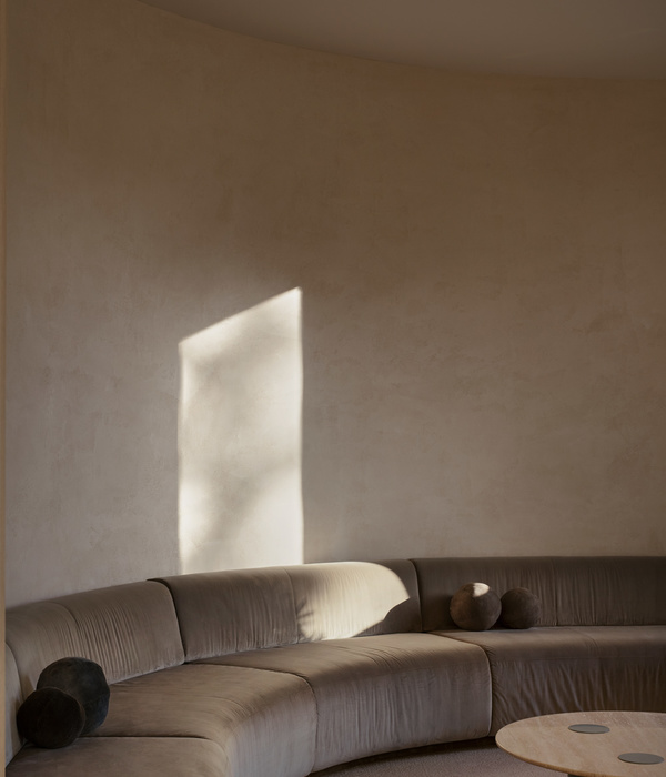
Inside, on the main level, the details, colors, and furniture were unified to make the spaces feel connected and consequential. A dark and disconnected original kitchen was transformed into a bright, functional hub of activity in a now sunlit filled space. Intricate original trim details juxtapose with clean, modern cabinetry in soft blues and crisp, linear white oak. A thoughtful breakfast nook and a spacious island provide areas for an active family to gather throughout the day. Unused corners are now functional spaces for office work, entertaining, and plentiful storage. A simple corridor becomes a drop zone for coats, shoes, supplies, and a small powder room, all hidden behind a series of seamless doors made to look like an extension of the surrounding walls. Targeted updating on the rest of the main level included floor finishes, additional insulation, architectural details, furniture design and lighting.
On the second level, specific programmatic updates improved the sense of openness in a home comprised of small rooms and corridors. At the top of the stairs, the space opens up to a new room for sitting or doing homework, filled with south light. An upstairs bedroom and shared kids’ bathroom was also updated.
Architect of Record: Mathison | Mathison Architects Builder: Marvel Construction Landscape Architect: Cunningham Landscape Design Photographer: Greg Premru Photography
{{item.text_origin}}

