© Jorg Ceglar
架构师提供的文本描述。让幼儿园成为一个建筑师的游戏与空间的融合与儿童游戏的地方。我们正在介绍在里卜尼察新建的幼儿园,这是斯洛文尼亚最大的幼儿园。新幼儿园由 Bojan MrežAr、Renato Rajnara 和 PeterRijavec 设计,拥有 24 间游戏室,面积 4,500 平方米。400 名儿童在游戏中玩耍和学习。
Text description provided by the architects. Let the kindergarten become a place where an architect’s play with space blends with a child’s play. We are presenting the newly built kindergarten in Ribnica which is the biggest kindergarten in Slovenia. The new kindergarten designed by Bojan Mrežar, Renato Rajnar and Peter Rijavec has twenty-four playrooms and measures 4,500 m2. 400 children is playing and learning in it.
© Jorg Ceglar
c.Jorg Cegla
作者们在思考幼儿园在现代世界中的地位时,坚信一个安全、温暖的地方是孩子成功成长的先决条件,这个地方应该使孩子能够以和平和轻松的方式了解世界和社会,因此幼儿园的房间被设计成包括中间的操场。模仿孩子的双手拥抱,形成一个安全、温暖的地方和环境。
The conviction of the authors, when contemplating a kindergarten’s position in the modern world, is that a safe, warm place is a precondition for successful development of a child. This place should enable the child to get acquainted with the world and society in peaceful and relaxed manner. Therefore, rooms of the kindergarten were designed to embrace the playground in the middle, imitating hands embracing the child and forming a safe, warm place and environment.
© Jorg Ceglar
c.Jorg Cegla
房间是为年幼的孩子准备的,几乎完全拥抱孩子,而拥抱房间,看管较晚的孩子,就不那么封闭了,这意味着当时机成熟时,孩子会离开去一个广阔的世界。因此,作者真诚地希望,给幼儿园孩子们的安全感和温暖感,将陪伴他们一生。
Rooms, intended for children of early ages, almost fully embrace the child, while a hug of the rooms, guarding children of later ages, is less closed and points to the child’s leaving for a big, wide world when the time comes. Therefore, authors earnestly hope that the feeling of safety and warmth, given to the children in the kindergarten, will accompany them throughout life.
© Jorg Ceglar
c.Jorg Cegla
Cross Section
新的幼儿园建筑群大致分为两座楼,即行政商业大楼和儿童专用建筑。这些建筑具有西北-- 东南方向,遵循周围建筑物和道路的方向,两座建筑一起将地块分成两部分。建筑物的北面是供出入和停车之用,而南面则是专为儿童设计的,因此,这两座建筑物保护了地块的安静、柔嫩和南部,使其远离喧闹、粗糙的北部地区。
New kindergarten complex is roughly divided into two buildings, namely an administrative-commercial building and the one for children. The buildings have northwest-southeast orientation, following orientations of surrounding buildings and roads. Both buildings together split the plot into two separate parts. The part north of the structure is meant for the access and Parking, whereas the southern part is exclusively designed for children. The two structures therefore guard the quiet, tender, southern part of the plot from the noisy, rough northern part.
© Jorg Ceglar
c.Jorg Cegla
行政商业大楼的设计是一蹴而就的。它的布局是现代的。建筑物的平面图是矩形的,地窖、地下和一楼的地板布置。另一方面,儿童建筑被完全不同的对待。建筑物的平面图大致由两个“U”字母或两个口袋或海湾组成,每一个都有一个不同的方向。该建筑的线条是强烈的曲折,并适应儿童的大小以及情节的特点。根据暴露在阳光下、视野、噪音等因素,对每个房间的特定房间的方向进行了优化。
The administrative-commercial building is designed in a single move. Its layout is modern. The floor plan of the building is rectangular, with the floor arrangement of the cellar, ground floor and first floor.
On the other hand, children’s building is treated totally differently. The floor plan of the building roughly forms a shape of two ‘U’ letters or two pockets or bays, each having a different orientation. The building’s line is strongly zigzagged and adapted to the child’s size as well as the plot’s features.
Orientation of certain rooms is optimised for each room separately, depending on exposure to the sun, views, noise, etc.
Ground Floor Plan
此外,在考虑到周围现有建筑物和自然特征的情况下,在将建筑物放置在空间方面也给予了极大的注意。这一灵感来自 Ribnica 中心现有的建筑网络,在那里,各自为政的房屋一个接一个地沿着这条路走。个别房屋之间有很小的空隙,屋顶高度也略有不同。它们总共形成了一个不规则形状的长长的网络。每一所适合其主人需要的个别房屋,都与邻近的房屋不同,但却融入并属于一个更大的实体。
Further, great care has been taken at placing the buildings in space, taking into account existing buildings in the surroundings as well as natural characteristics. The inspiration was found in the existing network of buildings in the centre of Ribnica, where individual houses, one by one, follow the road. There are small gaps between individual houses as well as slightly different roof heights. Altogether they form a long network of irregular shapes. Every individual house, adapted to its owners needs, differs from the neighbouring one and yet blends in and belongs to a bigger entity.
© Jorg Ceglar
c.Jorg Cegla
同样,在幼儿园草稿中,个别房间 (游戏室) 在公共操场周围相互跟随。对于一个具体的地点来说,每一个都是不同的,但又是最理想的,作为整体的一部分。在屋面设计中也采用了同样的原则,即大实体内的个性和差异性。作者试图将 Ribnica 居民几个世纪以来所知道的原理和形状与现代的当代建筑原则结合起来。
Similarly, in kindergarten draft individual rooms (playrooms) follow one another around the common playground. Each is different yet optimal for a concrete location, functioning as a part of the whole. The same principle has been used for designing the roof, namely individuality and difference within the big entity. Authors tried to combine the principle and shapes known to inhabitants of Ribnica for centuries with modern, contemporary principles of architecture.
© Jorg Ceglar
c.Jorg Cegla
行政商业建筑的设计布局
Design layout of the administrative-commercial building
建筑被设计成一个简单的立方体,与明显不同的儿童建筑形成了鲜明的对比。正确的几何体功能,作为一个硬的,严肃的基础/起点,围绕着儿童的建筑翅膀开玩笑地扭曲。
Building is designed as a simple cube acting as a contrast to noticeably varied children’s building. Correct geometric body functions as a hard, serious basis/starting point around which wings of children’s building playfully twist.
© Jorg Ceglar
c.Jorg Cegla
儿童建筑的设计布局
Design layout of children’s building
儿童建筑被设计成与行政商业建筑形成对比。
孩子们的房间设计得非常有趣、破碎和专注。
因此,他们在不同的角度下互相跟随,形成两个大海湾或口袋,围绕在中间,形成一个优质的游乐场环境。
Children’s building has been designed to contrast with the administrative-commercial building. Rooms for children are designed in a much playful, crumbling, and attentive manner. Therefore, they follow each other, under different angles, and forming together two big bays or pockets that surround and form a quality playground environment in the middle.
© Jorg Ceglar
c.Jorg Cegla
建筑元素-- 平面图上的建筑元素,以及立面和屋顶上的元素-- 以不同的角度,以不同的方式相遇,共同创造出一场建筑游戏。因此,建筑为我们提供了尽可能多的材料来满足我们的想象力。
走廊是沿着破碎的游戏室翅膀设计的,提供光线 (北极光),面向大自然。同时,他们的可变宽度可以作为一个游戏室。此外,室内天花板沿屋顶线,从而创造出不同高度的房间。
Architectural elements – on the floor plan as well as on the façade and roof – meet each other under different angles, in different ways and jointly creating an architectural play. Thus, architecture provides us with as much material as possible for feeding our imagination.
The corridors have been designed along broken playroom wings providing light (northern light) and facing the nature. At the same time, their variable width can serve as a playroom. Moreover, the indoor ceiling follows the line of the roof, thus creating rooms with different heights.
© Jorg Ceglar
c.Jorg Cegla
内部和外部都设计了各种形状,颜色,材料,纹理,灯光等。它创造了一个非常丰富的环境,为儿童提供多样化的经验。
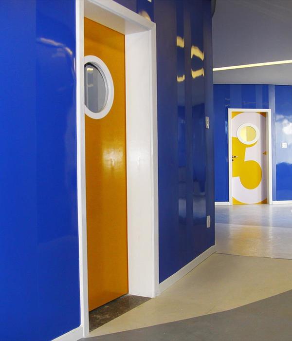
Ceiling lowers in cloakrooms and toilets, whereas rises in playrooms to open the space. In the highest part of the playroom, we have placed a folding platform giving additional appeal to the room. At breaking points of the wings the corridor widens considerably, making space for central area. A part of central rooms’ floor descends terrace-like and creates a theatre environment. The long side of the façade opens central area into the park. Both the interior and exterior is designed with variety of shapes, colours, materials, textures, lights, etc. It creates a very rich environment to provide the child with diversity of experience.
© Jorg Ceglar
c.Jorg Cegla
Architects ARHI-TURA d.o.o
Location Majnikova ulica 3, 1310 Ribnica, Slovenia
Category KindergartenArea 4500.0 sqmProject Year 2014
Photographs Jorg Ceglar
{{item.text_origin}}

