CallisonRTKL completed Porter at Port Imperial with a design that deliberately pays homage to the restaurant’s New Jersey home, while the dining experience reflects an authentic New York City restaurant.
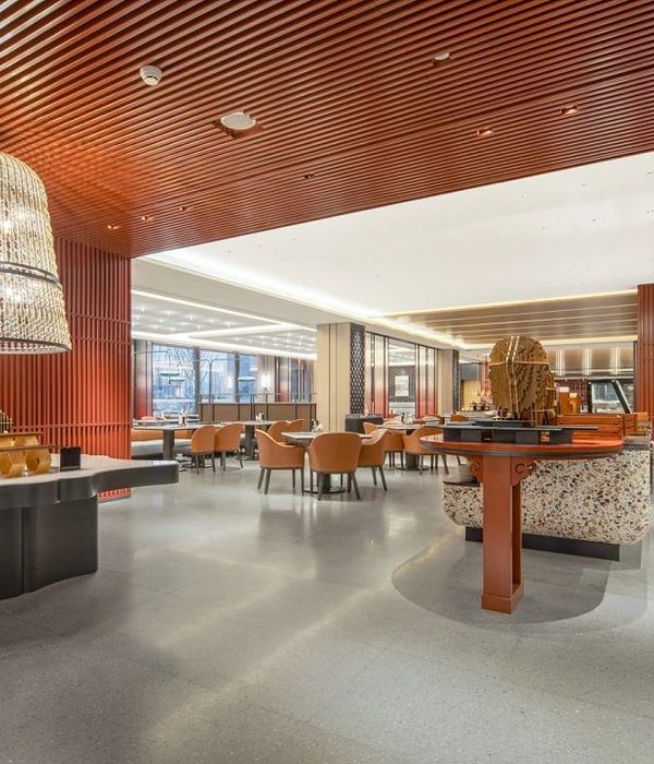
An elevated gastropub in the RiverHouse11 luxury apartment complex, Porter at Port Imperial is a New York City-level design experience that simultaneously honors its New Jersey roots. Conveniently located just steps away from the NY Waterway Port Imperial Ferry terminal, the Hudson-Bergen light rail, and the Hudson River, Porter at Port Imperial’s elevated yet accessible dining experience is an immediate draw for both residents and visitors—one that is on par with the best that New York City has to offer. Designed by global architecture and design firm CallisonRTKL, the restaurant’s interior design pulls inspiration from the neighborhood’s history as an industrial shipping port—epitomized by the handcrafted logo inspired by a ship’s porthole—blending natural, unfinished materials and nautical-inspired lighting elements with more elevated, contemporary design. The ultimate result is a space that feels both modern and timeless. Warm wood textures, biophilic elements, and strategic pops of color reflect the neighborhood’s energy, growth, and diversity. Ultimately, the restaurant reflects the neighborhood’s approachable and forward-thinking nature while serving the community’s every need from morning to night in a single, thoughtfully designed space. Neighborhood residents can grab coffee and pastries from Porter Provisions in the morning and then end their day with a meal at the central restaurant or cocktail at the bar.
The open kitchen concept allows Executive Chef Christopher Lim, Executive Pastry Chef Tara Glick, and their teams to showcase their art while patrons enjoy a craft cocktail at the bar or one of the community tables. Modern colors, layered textures, and elegant seating further emphasize this sophisticated feel. The 3,800 square-foot Porter at Port Imperial provides three distinct services, each an exciting experience for patrons, no matter what time of day they choose to visit. These include a large bar with community seating, an open kitchen designed to celebrate the theater of cooking, and a bakery/provisions store to engage the local community with custom offerings available to dine-in or take on the go. To define each of these unique zones, the design team used an ombre color scheme. The bar is the darkest and most moody space, and the open kitchen has a medium-range color story. This bridges the gap to the bakery, the lightest and brightest space in the restaurant. Similar finishes are used throughout, in various shades throughout, providing cohesion while still keeping each zone’s visual identity distinct, helping customers navigate the different services on offer.
Design: CallisonRTKL Photography: courtesy of CallisonRTKL
8 Images | expand images for additional detail
{{item.text_origin}}


