- 项目名称:M-HOOD潮牌买手店
- 项目地址:广州,大阪仓
- 空间设计:厚上设计
- 完成时间:2020年10月
- 室内面积:400平方米
- 分类:商业建筑 时装店 咖啡厅
- 材料:不锈钢 亚克力 玻璃 灯膜
- 主案设计:周雨飞,梁锡坚
- 设计团队:蔡焕金,陈莞平
- 摄影版权:厚上设计
- 设计师:周雨飞,梁锡坚
- 摄影:厚上设计
广州是国家历史文化名城,也是中国的南大门。从十八甫繁盛街圩到“十三行”发达贸易巅峰,奠定了广州”千年商都”的名号。从清代到现代,几乎全国各地的服装批发都和广州有着密切的联系。现代化电商促进了服装行业日新月异发展的,也对实体店的体验和品味提出了更高的要求,作为新一代广州时尚潮人对服装的环境和空间有着新的理解和诠释。
Guangzhou is a national famous historical and cultural city and the South Gate of China. From the Qing Dynasty to modern times, almost all parts of the country’s clothing wholesale and Guangzhou are linked. Modern e-commerce promotes the rapid development of the clothing industry, and also puts forward higher requirements for the experience and quality of physical stores. As a new generation of fashion trendsetters, how do they have a new understanding and interpretation of the clothing environment and space.
▼项目外观,overall of the appearance
▼外观细部,details of the appearance
▼门廊细部,details of the porch
本店是一个专业的服装买手店,业主对服装有着深厚的情感,所以对店铺的选择非常苛刻。本案坐落于广州工业建筑最为集中的区域,也是广州唯一仅存的日式古堡建筑,“日式小洋楼”,建筑充满着历史的痕迹和苍伤。由于是历史建筑,所以不能破坏原有的墙体和门窗,这给我们带来了挑战。所以本案就利用了视觉的反差,塑造一个从材质到氛围有着传统与现代的新旧对比。
This is a professional clothing buyer’s shop. The owner has been operating independently for more than 10 years, so the choice of the shop is very strict. This case is located in the most concentrated area of industrial buildings in Guangzhou, and it is also the only remaining Japanese style castle building, At present, it is also the largest and most characteristic professional clothing buyer’s shop in Guangzhou. Because it is a historical building, we can not destroy the original walls and doors and windows, which brings us challenges. So this case uses the contrast of vision to create a contrast between the old and the new with tradition and modernity from material to atmosphere.
▼分析图,axonometric drawing
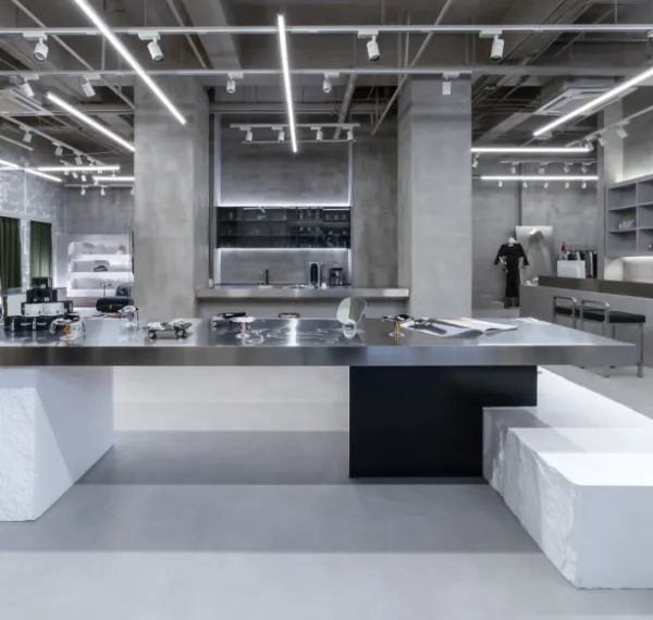
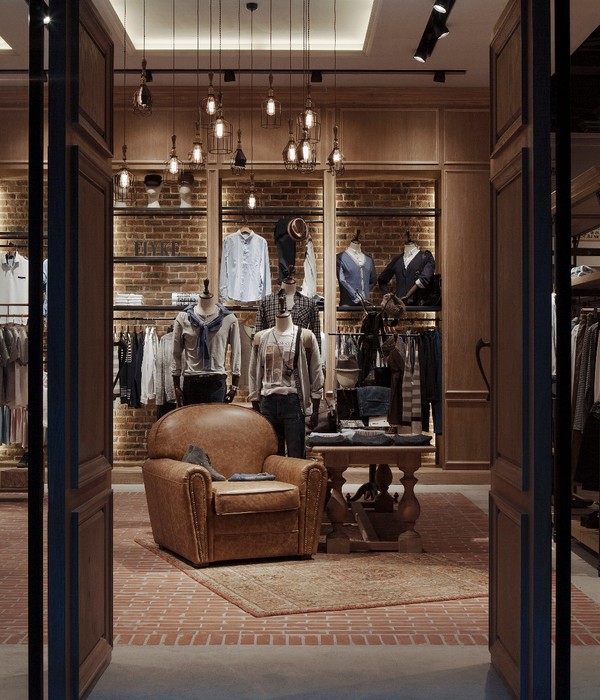
首层主要展示国潮和休闲服装,空间以现代设计手法为主,前台区域以极简不锈钢体块的造型呈现,转折造型的不锈钢能扩大背景墙的宽度,将空间趣味性凸显出来。原本建筑墙体和凹位部分利用起来做成灯箱,营造多层次的灯光氛围,大面挂衣服的墙面,上下故意的漏出原墙体的红砖,让现代和复古的材料形成鲜明的对比,让空间充满细节。
The first floor mainly displays national fashion and leisure clothing, the space is mainly based on modern design techniques, and the front area is presented with large stainless steel shapes. The turning stainless steel shape can expand the width of the background wall, and refine the interest of the space. The concave part of the wall is used to make a light box to create a multi-level lighting atmosphere, The wall in the middle deliberately exposes the red bricks in the upper and lower parts, which makes the modern and retro materials form a sharp contrast and makes the space full of details.
▼一楼陈列空间,the display area
▼入口展台,Entrance booth
▼一楼陈列空间细部,detailed view of the ground floor display area
▼收银台,Cashier
首层的右边是一个咖啡吧区,有下沉过道区和吧台区。该区域是为了让服装和咖啡店达到互相赋能的作用。改变客户对服装店传统的认知,也给顾客的朋友一个等待休息的空间。
On the right side of the first floor is a coffee bar area with a sunken aisle area and a bar area. The purpose of this area is to enable the clothing space and the coffee shop to interact with each other. Change the customer’s perception of the traditional clothing store, but also give customers a waiting and rest space.
▼咖啡厅,cafe
▼咖啡厅细部,details of the cafe
▼下沉庭院,sunken garden
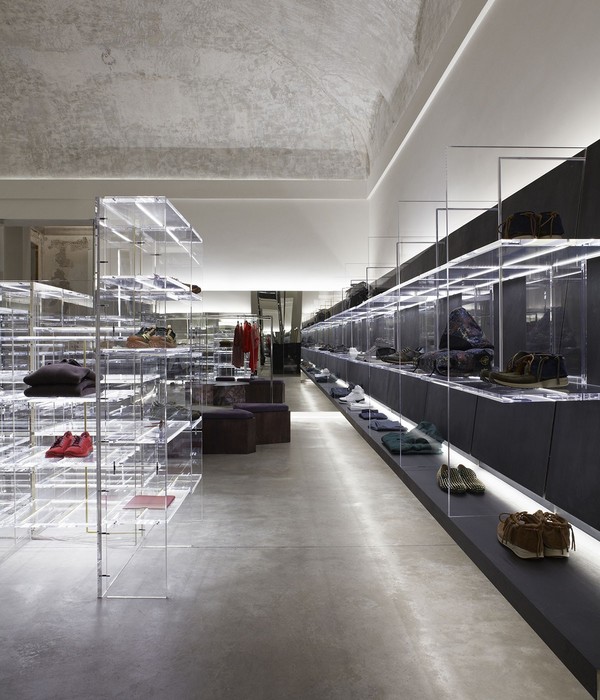
二层主要是设计师品牌的服装,很多服装界的设计师的作品将在这里展示。为了更好的利用墙面的肌理烘托服装的质感,所以我们采用了一些玻璃材质,将服装包裹起来,更能提升服装的品质感。利用建筑原有的壁炉,做一些饰品展示,展品层次就能丰富起来。
The second floor is mainly the clothing of designer brands. Many works of fashion designers will be displayed here, In order to better contrast the texture of clothing, we use some glass to frame the clothing, so as to improve the quality of clothing. Using the original fireplace of the building as an ornament display can enrich the level of ornaments.
▼二层展示区,Exhibition area
▼二层展示区通往摄影区,leading to the photography area
▼试衣间,Fitting Room
通往二楼是一个复古楼梯,我们保留的复古木质楼梯韵味,就在楼梯间的顶部做了一大面镜子,将楼梯的复杂结构折射到顶部,形成一个矛盾的趣味空间。
Leading to the second floor is a retro staircase. We keep the original charm of the staircase, and make a large mirror on the top of the staircase to reflect the complex structure of the staircase to the top, forming a contradictory and interesting space.
▼楼梯,stairs
▼空间细部,detailed view
建筑外观的重要窗户位置, 利用灯光勾勒出神秘的色彩氛围,让古堡在夜色中格外的浪漫。
Use lighting to outline the building, let the night in the castle render mysterious color atmosphere.
▼夜景,night view
▼底层轴测图,axonometric drawing of the ground floor
项目名称:M-HOOD潮牌买手店
项目地址:广州,大阪仓
空间设计:厚上设计
完成时间:2020年10月
室内面积:400平方米
分类:商业建筑 时装店 咖啡厅
材料:不锈钢 亚克力 玻璃 灯膜
主案设计:周雨飞、梁锡坚
设计团队:蔡焕金、陈莞平
摄影版权:厚上设计
Project name: M-HOOD Buyer’s shop
Project location: Dabancang, Guangzhou
Space design team: HOLD DESIGN
Email:
Construction time: October 2020
Gross Built Area (square meters): 280 square meters
Classification: commercial building fashion shop cafe
Material: stainless steel acrylic glass lamp film
Design in charge: peter、ekko
Design team:kim、pinn
Photography team:HOLD DESIGN
{{item.text_origin}}

