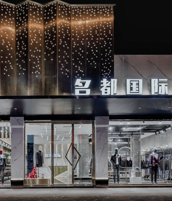
伴随着10.1国庆,中国领先体育用品品牌安踏上海首家第十代形象店铺正式启幕。全新安踏旗舰店坐落于上海繁华零售区——南京东路步行街的翻新路段。
安踏上海南京东路旗舰店以奥运为主题,秉承着安踏“永不止步”的品牌理念,将健身房和脉动光的元素融入到店铺设计中,为消费者营造出一个进步、积极、动感的购物空间。一眼望去,店面呈现出高科技风范的现代美学理念,同时亦沿袭了十九世纪外滩建筑的别致风格。
这家旗舰店是安踏推出的第十代门店形象,由安踏设计团队与全球知名设计公司Gensler通力合作设计完成。
Just in time for the National Day holidays, Anta unveiled the first flagship store in Shanghai, along the newly refurbished section of East Nanjing Road, one of the most prominent retail pedestrian streets in Shanghai.
Featuring an Olympic theme, the new flagship store adheres to Anta ” Keep Moving” brand concept. The gym inspired and pulsation lighting element creates a very progressive and dynamic retail space. First impression of the shop front communicates a modern high-tech aesthetics while respecting the historical 19
th
century bund architecture.
Anta’s flagship store is the tenth-generation store design and is a collaborative effort between Anta design team & Gensler, the largest design firm in the world.
▼店铺室内概览,Flagship shore interior view
从主入口步入门店,消费者将进入焕然一新的安踏世界。作为北京2022年冬奥会和冬残奥会官方体育服装合作伙伴,安踏与北京冬奥会联合标识高悬于旗舰店上方。
此外,照明设计也在优化商品展示效果方面发挥了重要作用。直接照明着重凸显产品,环境照明以及不同的色调和渐变设计则营造出动感的视觉效果,吸引消费者深入探索。秉承安踏“永不止步”的品牌宣言,门店设计格外注重畅动体验,为消费者营造集动感与力量于一体的购物空间,彰显力争胜利的品牌理念。
From the main entrance, the customer is greeted with an entrance portal that invites you into the new Anta universe. As the Official Sports Apparel Partner of The Olympic and Paralympic Winter Games Beijing 2022, the official composite logo was promptly displayed above the flagship store.
The store concept is designed to support the ‘new health – conscious consumer movement. By combining Gym style with progressive lighting scenes, to create an active sports store environment that can change pace to reflect the latest product displays & campaigns.With Anta’s brand statement “Keep Moving”, attention is brought to the design of the store that allows movement and creates a sense of dynamism and movement.
▼门店立面,store front
门店橱窗以活力四射的冬季运动为主题,与北京冬奥会的宣传活动巧妙呼应。橱窗中以发光的线条勾勒出充满动感的冬季滑雪道场景,让人联想起安踏的品牌标识。滑雪道上的三个人体模型分别呈现滑雪以及长短道速滑的场景,鲜活的运动气息扑面而来。
橱窗设计格外注重层次感与通透性,力求吸引途径此处的消费者将目光从橱窗转入门店,并投向店内的不同区域。
In line with the Beijing Winter Olympic campaign, the shop window features a dynamic winter sports theme. The window featured a scene of a dynamic winter ski slope, which the illuminated lines referenced the Anta logo. The scene communicates a sense of movement in the three mannequins performing skiing, speed skating, long and short track skating,
On the shop window, there is an emphasis on layers and transparency so that the passing customers will have their sight lines move from window and into the store and within different sections.
▼橱窗中以发光的线条勾勒出充满动感的冬季滑雪道场景
The window featured a scene of a dynamic winter ski slope with illuminated lines
为强调“永不止步”的品牌宣言,营造动感活力的购物空间,数字化和照明设计成为整个门店设计的关键所在。Philip Handford表示:“在店内走动时,能不断地感受到高科技风范,这一点在橱窗的动感设计和天花板上也有所体现。”
天花板上以“数字”图案呈现的灯具,是安踏视觉设计的全新元素。其灵感源自体育锦标赛和奥运会上使用的数字秒表。闪烁的灯光旨在体现出时间的紧迫感和动感效果。
To re-iterate the “Keep Moving” brand statement, and to create a sense of movement and dynamism, digital and light design is a key consideration to the store design. Philip Handford said, “The progressive lighting design plays a major role in how the customer explores the store, animated lighting scenes change rhythm and focus, to inspire the customer to explore the different store zones.
On the ceiling is a “numeric digits” light fixture which is a new visual vocabulary for Anta. It is inspired by the digital stopwatch seen at sports tournaments and the Olympics games. The pulsating lights aims to communicate a sense of time and movement.
▼数字化和照明设计成为整个门店设计的关键所在
digital and light design is a key consideration to the store design
安踏第十代门店设计旨在满足安踏核心顾客的需求,并借此吸引国内外的全新受众群体。随着越来越多的年轻人熟知和采用更加积极健康的生活方式,健身房和运动场所已成为他们工作之余的重要组成部分。为了再现这种生活方式,“健身房”和“体育俱乐部”风格成为品牌设计的核心支柱。门店设计中融入了健身房和体育俱乐部中常见的视觉元素,为消费者打造身临其境般的精彩体验。
The tenth-generation store design aims to inspire Anta’s core customers, as well as, capturing new audiences in China and overseas. As more and more young people become acquainted with a healthier and active lifestyle, the gym and sports environment become a central part of their life outside of work. To recapture this lifestyle, the “Gym-Tech” is the core concept design is the core brand design pillars. This creates a very immersive experience for customers with visual identity that you could find in the gym and sports clubs.
▼门店设计中融入了健身房和体育俱乐部中常见的视觉元素
visual identity that you could find in the gym and sports clubs were integrated to the design
▼陈列架和展示台设计亦从健身房元素中汲取灵感,on the VM racks and display platforms are gym inspired designs
陈列架和展示台设计亦从鞍马、哑铃、跑道、球场线和跳箱等健身房元素中汲取灵感。与众不同的视觉效果,令消费者仿佛置身于健身房和体育场馆之中。健身房地胶一般的材质和纹理,使这种视觉效果在门店的视觉陈列中得到延续。此外,门店中随处可见的动态字体也是此次重新设计全新采用的设计元素。
“从消费者视角来看,门店设计分为前、中、后三个层次,使他们的目光始终流连于不同的商品之间。”Philip Handford说道。
▼楼梯和陈列空间,staircase & display
On the VM racks and display platforms are gym inspired designs such as the pommel horse, weight bars, field tracks, court lines and plyometric boxes. With this visual impact, the Chinese consumers get a sense of familiarity as in the gym and sports stadium. This is extended to the VM displays with rubber gym floor materials and textures. What is also new is the very dynamic typeface seen around the store.
“From the customer’s viewpoint, the store design has layers in the fore, mid and background, so the the eye move from merchandise to merchandise”, said Philip Handford.
KT球鞋是安踏的经典系列,由篮坛巨匠克莱・汤普森(Klay Thompson)代言。Gensler与安踏携手打造惊艳的灯光装置,600多只球鞋均被点亮,展示了安踏历代的KT球鞋。球鞋点亮后组成的图案经过精心编排,不断变换以凸出特定的KT款型,展示活力动感的形态。通过这种简约的美学设计,安踏球鞋的时尚传承转化为真正的艺术作品,与当下更为年轻、时尚的市场产生共鸣。
The KT shoe is Anta’s most iconic product line, representing basketball phenomenon Klay Thompson. Gensler worked with Anta to create an awesome light installation consisting of over 600 illuminated cast resin shoes representing the different generations of KT shoes in Anta’s history. These shoes glow in carefully coordinated patterns, alternating with highlights of specific KT models and vibrant, energetic displays of movement. The simplified aesthetic transforms ANTA shoe heritage into a true piece of art that resonates with a younger, more fashionable market.
▼灯光装置,展示了安踏历代的KT球鞋,light installation, representing the different generations of KT shoes in Anta’s history
展示运动鞋的夹楼层是旗舰店设计的核心亮点:运动鞋可谓安踏的标志性品类,向三层购物空间延伸,并融入楼梯空间,为店内走动的消费者打造别具一格的体验。夹楼层和楼梯周围各种元素构成新奇角度,增加了空间的纵深感,不断揭示门店的崭新视角,吸引消费者前去探索。
门店的配色方案和设计概念亦延伸至二楼的女士系列。随着越来越多的女性出入健身房,追求更加积极的生活方式,这种健身房风格的环境可为女性消费者营造沉浸式的购物体验。门店三楼则提供了具有鲜明生活方式气息的购物环境。同样,瑜伽系列展示区亦重现了以瑜伽健身房为灵感的沉浸式体验。
The concept of the sneaker mezzanine is the core of the design of the flagship: stretching Anta’s signature product category across three floors, generating flow, an exciting invitation to explore the store, and integrating it with the stairs to create a singular experience of movement. The off-kilter angle of all the elements around the sneaker mezzanine and stairs create a huge depth of space, constantly revealing new aspects of the store to discover and explore.
The color palette and design vocabulary extending to the women’s collection on the second floor. As more and more women pursue an active lifestyle in the gyms, the gym environment provides a very immersive experience for the customer. On the third floor is a very lifestyle-oriented environment. Again, for the yoga collections, a yoga gym-inspired immersive experience is recreated.
▼展示运动鞋的夹楼层是旗舰店设计的核心亮点,the concept of the sneaker mezzanine is the core of the design of the flagship
全国各地的安踏门店都将进行一定程度的本地化改造,更有彩蛋设计元素等待消费者前去发现。
There is a degree of localization planned for Anta stores around the nation, and the Easter egg design elements are for the customers to discover.
{{item.text_origin}}


