In Brazil, it’s known as Cobogó. In India, they call it Jaalis. The French term is Brise-soleil. Here we know it as Breeze Block. Call them what you will, these little units of awesome are making a massive comeback.
Back in the 50s and 60s, breeze blocks were hot to trot. They were used extensively by architects in both residential and commercial projects, and their intricate patterns became ubiquitous in Australia, and also anywhere else you might experience a hot climate – Palm Springs, Brazil, Spain, etc. But like any material that gets overused, they soon became uncool. Shame, really, because lil’ ol’ breeze block is downright legit – it gives so much, and ask very little in return. Well, actually – it does ask for a bit of a clue from architects around its usage. Scale being the key point here, as little dicky screens, fences, and dare I say, feature walls we’ve all seen in our suburbia are precisely what’s killed our love of the breezeblock.
But luckily for us all, this underrated building material is making a huge come back. Perhaps this has a lot to do with the resurgence of our collective interest for all things mid-century modern. But I would hope our love of breeze block is based on its merit, rather than an architectural trend. As I said, this is one building material that has the potential to excite the most hard-core of minimalist architects as well as the lovers of intricate ornaments, and anyone in between – breeze block can effectively please us all. I don’t think too many other materials out there can make the same claim.
Breeze block allows us to construct screens that are at once durable, functional and beautiful. They offer sun shading, weather protection, security and ventilation. All this comes with an added bonus of ornament and geometric patterns that can melt the most minimalist of hearts. By day, breezeblocks create romantic dappled light and cast extraordinary overlapping shadows, adding a poetic element to the architecture. By night, the light passes through its small openings, creating an urban lantern of sorts, which gives joy back to our streetscapes.
And all this still leaves you in doubt, fear not. Yellowtrace to the rescue! Today we bring you many, many, MANY extremely delicious projects around the world that have used breeze blocks and their many brilliant interpretations to an extraordinary effect. From retail stores, restaurants, apartment buildings, houses, schools, museums, showrooms, crematoriums… I mean, shall I stop? You get it, right? I’m saying these bad boys have been used in almost every type of project. Prepared to have your socks knocked off.
You’re welcome.
PS. alt-J were on it way back in 2012 when they released their smash-hit Breezeblocks. Unfortunately, in the video, a woman gets bludgeoned with a breeze block, but let’s not hold that against this little ol’ material now, shall we?
Aesop Vila Madalena, São Paulo, Brazil by Campana Brothers // In late 2016, Australian skincare brand Aesop unveiled their second São Paulo signature store created in collaboration with local designers Fernando and Humberto Campana. Situated in the neighbourhood of Vila Madalena, the store design marries traditional characteristics of Paulista architecture with gestures inherent to Aesop philosophy.
Without a doubt, the hero if this beautiful interior is the Brazilian Cobogó brick, which creates a textural and a natural, earthy palette for the walls, ceiling, flooring, countertops and product displays. If this store doesn’t emphasise the beauty and versatility of traditional terracotta brick modules, then I’m not sure what does.
The Lantern by in Ha Noi, Vietnam by Vo Trong Nghia Architects // Located within Hanoi’s Dong Da district, this newly built gallery and lighting showroom for Panasonic was designed by Vo Trong Nghia Architects in collaboration with Takashi Niwa. The building presents as an arresting perforated terracotta façade, creating a simple yet significant impact on the surrounding landscape. During the day, the shadows of the nearby tree are cast upon the clean façade, bringing it to life. In the evening the building is illuminated from within, acting as a lantern in the city.
The terracotta blocks were traditionally used in Vietnam before air-conditioning. Designed for tropical climates, they allow for passive ventilation and shade from harsh sunlight. The blocks are both functional and inexpensive at approximately 70 cents, amounting to just over $4,000 AUD for the 5,625 blocks used. Furthermore, the bespoke fixing system allowed for a quick and simple assembly.
Ap Cobogó apartment in São Paulo, Brazil by Alan Chu // This apartment renovation in São Paulo was nicknamed ‘Ap’ due to use of the traditional 1930s Brazilian ceramic ventilation bricks, made popular by modernist architects like Lúcio Costa and Oscar Niemeyer. Initially, Cobogós were only made from cement, however, as their popularity grew, the blocks were updated with interpretations in new mediums including clay, glass and and ceramic.
This project takes advantage of ceramic breeze block, exploring its function, colour, graphics and light effects. Used predominantly on the apartment’s partition walls, Chu has also incorporated the block in the furniture specifically designed for this apartment. Genius.
Disfrutar Restaurant in Barcelona, Spain by El Equipo Creativo // Only in Spain are designers able to get away with using a melange of ceramic breeze blocks in a variety of patterns and colours, and totally get away with it.
From the kitchen, the bar and the patio, ceramics, in their different formats, lead visitors through various spaces that capture the essence of the local context. This versatile material creates a changing atmosphere, while communicating values the restaurant owners sought to communicate – sincerity, humility and respect for the history of the Mediterranean.
Apartment in Binh Thanh, Ho Chi Minh, Vietnam by Sanuki Daisuke Architects // Driven by the request from their client, Sanuki Daisuke Architects chose terracotta blocks for its relatively low cost – a hugely popular building material in Vietnam. Sanuki Daisuke combined its many different patterns to create a façade full of character, which makes use of natural ventilation, passive cooling by shading, while simultaneously enhancing occupant security.
Naranga Avenue House in Goald Coast, Australia by James Russell Architect // Located in Florida Gardens, a 60’s Gold Coast canal estate with leathery swinging grandmas and breezeblock houses is quite a context for this modest 4-bedroom family home that punches well above its weight, both in terms of scale and budget.
From the street and at a distance, the brick screen at Naranga Avenue House intentionally resemble breezeblock. Given the modernist history of the area, the clients were keen to make use of it in this project. However, the pesky budget issues with the material prevented their use from early in the design process. “We wanted to play with breezeblocks, a material that has its place here, but breezeblocks are expensive and need to be painted for protection from the corrosive coastal air,” said Russell.
Rather than giving up, the architect resourcefulness led him to specify extruded clay bricks on edge from Austral Bricks, exposing their holes. Extruded brick is inexpensive, has low embodied energy and doesn’t require applied finishes to protect it. The material from which it is made, clay, can be expressed and enjoyed.
“Fixed to expressed hardwood framing we make our screen. Sun becomes a dappled light, breeze moves through, rain becomes mist, daily rituals can happen in privacy, but with views or awareness of your surrounds”, explains Russell. Legend.
The New Crematorium at The Woodland Cemetery, Stockholm, Sweden by Johan Celsing Arkitektkontor // Completed in 2013, this crematorium forms part of the 1940s cometary complex, with the atmospheres of the interiors being the major concerns in the design of the new building.
Perforated bricks were chosen as a key material in many of the interiors both for their texture and scale, as well as acoustic performance. Their white glaze reflects and accentuates the light from the skylights in the roof above. Shown here is the public space, known as the Ceremony Room, where visitors and mourners gather to pay their final respects to those passed.
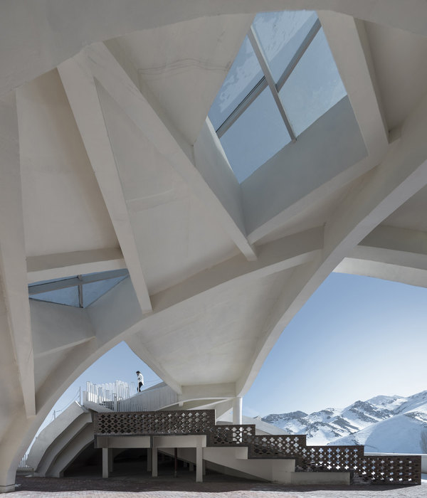
La Tallera Gallery & Museum in Morelos, Mexico by Frida Escobedo // Mexican architect Frida Escobedo transformed the former home and studio of painter David Alfaro Siqueiros into a public gallery and museum. The entire existing building complex is contained behind a triangulated concrete lattice. Built around the perimeter of the La Tallera de Siqueiros complex, the façade forms an enclosure around the buildings, grouping them together while allows light to filter through.
Khmeresque, University of the Nations in Battambang, Cambodia by Archium + Kim in-cheurl // “Building a temple for Won Buddhism, based on Mahayana Buddhism in Cambodia, the Hinayana Buddhist country, made us consider the relationship between religion and architecture as a whole,” explain the design team at Archium. “In addition to this, the meeting between the symbols of religious buildings and local traditions was something to be considered.”
Khmeresque is ultimately a religious space designed as a gathering place for local people. Divided loosely into an indoor and outdoor area, the focus of the architecture was to creating a beautiful expression familiar to Cambodian Won Buddhists. For this reason, only local and readily available materials, such as local bricks, were used to build the temple. This decision was not only reached for financial motives, but also to ensure the temple looked and felt familiar to the locals.
Photography by Benjamin Hosking. Video courtesy of Brickworks.
Inverdon House in Bowen, Australia by Chloe Naughton // Designed for a soon-to-be-retired couple, Inverdon House certainly challenges ‘the norm’ in the small regional North Queensland town where it is located. This is largely for its use of the hard-wearing, low-maintenance material of masonry which would otherwise typically be hidden in paint, plasterboard and render.
Vital for tropical living, the house blurs boundaries between interior and exterior. Only the two bedrooms are air-conditioned for especially humid nights. Awnings, shading, louvers and breezeblock screens ensure direct sun, high temperatures and air movement can be controlled in the best possible way.
Chloe Naughton is a young Australian architect who’s been making waves with this debut project since its completion in 2016, and for a good reason. Check out the video in which she chats with Tim Ross, explaining how she designed this beautiful, low maintenance home perfect for its tropical context.
Living Edge Brisbane Showroom by Richards and Spence // In May 2016, Living Edge launched its newest boutique furniture display/workspace at Robertson Road in Brisbane’s Fortitude Valley. This striking space saw the transformation of a fairly nondescript warehouse into a world-class showroom designed by Richards and Spence.
Consistent with the building’s original use as a warehouse, the architects looked for a building material that referenced the past, while remaining quintessentially modern. Prompted by the architects, Austral Masonry revisited their traditional offering with which it has had a long association – breeze block. The company embarked on a process of intense product development to fulfil the project’s supply requirements, purchasing new breezeblock moulds from the United States, enabling them to re-commence production at its premium masonry plant at Gympie.
I’m sure you’ll agree the results are spectacular and I’m not just saying that because I have a soft spot for this building (it’s where we launched our Milantrace 2017 talk series, after all! And here you can see the beautiful breezeblock screen by night, as shot during our Milantrace 2016 talk series).
Cobogo House in Sao Paulo, Brazil by Studio MK27 – Marcio Kogan // If money is no object and you’re looking to step up your breezeblock game, you design an impossibly intricate geometric screen made with infinite curved lines. As per Exhibit A. Or you enlist the Austrian-American sculptor, Erwin Hauer, to create one for you. Also as per Exhibit A.
This modular screen is a work of art, with curved lines designed to perfection as a nod to the architecture of Brasilia by Oscar Niemeyer. Furthermore, these sinuous concrete modules descend from traditional Cobogós (breeze blocks), created in Recife and diffused by Lucio Costa as a delicate reference to colonial architecture.
Throughout the days and months, the hollowed-out elements of the Cobogo House façade take on different forms with the direction of the sun. At night, this effect is once again transformed – in a continuous process of metamorphosis, the screen’s form changes due to reflected light. Sublime.
Los Limoneros in Marbella, Spain by Gus Wüstemann Architects // Swiss architect Gus Wüstemann designed this house in Spain to have a largely windowless exterior. To offset this grand gesture, an internal courtyard surrounded by perforated walls ensures that light permeates the building all year round.
“Being in Andalucia, in the south of Spain, the idea was to create a huge garden with big covered outside spaces, giving some shade when needed, where you could live outside day and night, all year long,” said the architect.
Privacy needed to be achieved from the neighbouring buildings, so the clients could live outside without being exposed. The design concept positions the entire site as a garden surrounded with a peripheral wall, creating the living room as a private garden. Above the living room is the patio house. In the winter time, one covered part of the private garden can be closed with sliding windows so that it can be heated, becoming a truly year-round outdoor space.
Mount Martha House in Port Philip Bay, VIC by Edition Office // The impressive body of work by Melbourne-based architecture practice Edition Office is entirely sympathetic, to themselves, to their clients, to their sites and landscapes. In line with their aim to celebrate grit and raw materiality, Mount Martha House is steeped in the Australian beach house vernacular and traditions of ‘making do’. With primitive early Australian beach shacks serving as reference point during the design process, Edition Office infused a strong sense of summer irreverence and easy-going holiday sentiment in the project.
Referencing Australian and American mid-century modernism, the house features exposed structural steel frameworks, use of ‘crude’ off the shelf materials and concrete breeze blocks. “The Mt Martha House is contained within two parallel flanking walls composed of concrete blocks laid upon their face. These flanking walls expose hollow cores which act as continuous breezeway screens, providing sanctuary to the home and courtyards within” says Kim Bridgland, director of Edition-Office.
Make Ventures HQ in Melbourne, Australia by Tecture // Property developer Make Ventures office is modest in size and its location at street level on a main Melbourne thoroughfare meant finding a balance between a light open interior and the space feeling overly visible.
“With Make being a young company, we felt it was important for the interior to have a fresh youthfulness,” explain the team at Tecture. Subtle references to the Make identity – a cross inside a quartered circle –informed key interior elements, such as the breezeblock screens, built from Austral Masonry GB 200mm Porcelain block in Smooth finish. “We love the subtlety of the reference to the Make logo within the breezeblock screens and the way the resultant patterning allows light and views through the space,” said the team.
B+B House in Brazil by Studio MK27 – Marcio Kogan + Renata Furlanetto + Galeria Arquitetos // The arrival at House B+B is an architectural trajectory that take place via a semi open ramp. This indoor/ outdoor space is shrouded in hollowed-out concrete blocks to the eastern side, creating a surprising light effects while doubling up as protection from bad weather conditions. I am particularly partial to the way this screen utilises circles and squares in a seemingly random manner, creating the most glorious visual effect. Extreme love.
Chi House in Phú Nhuận, Ho Chi Minh City, Vietnam by G+ Architects // Located on a compact urban block in Vietnam capital, this concrete and terracotta house is all about the double skin façade. Terracotta ventilation-brick create a multidimensional outer shell with its uniquely rhythmical facade that creates superb visual effects, both for the interior and the exterior. What’s not to love?
DPS Kindergarden School in Bangalore, India by Khosla Associates // Created in a 6-month time span and on a low budget (Rs.1200/sft – $250 AUD/ sqm!!), the cost efficiency and speed of construction of this project needed to be balanced with that the architects believed in – “creating a warm, playful and welcoming environment for these young children that would be filled with natural light and ventilation.”
Referencing vernacular architecture of the region, terracotta jaalis (shading and ventilation screens used traditionally in India) wrap around parts of the building. They are included on both sides of each classroom to facilitate adequate cross ventilation.
“Judging the sun directions, we played with a number of devices: horizontal and vertical pergolas and a combination of two different patterns of Jaali on the exterior that create interesting patterns on the building at different times of the day,” said the design ream.
In an age of air- conditioned schools becoming increasingly popular, Khosla Associates have attempted an energy efficient and cost effective approach that utilises minimal electrical load during the day due to effective harnessing of breezes and adequate natural light.
This Yellowtrace Promotion is proudly created in partnership with Brickworks. All related thoughts and ideas reflect our genuine opinion. Like everything we do at Yellowtrace, our sponsored content is carefully curated to maintain utmost relevance to our readers.
{{item.text_origin}}


