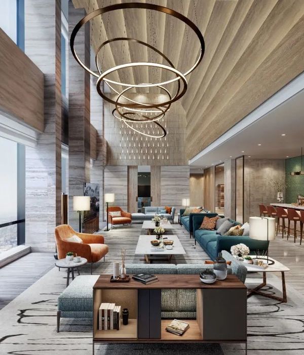
Antonio's room
Antonio's room
Antonio's room
Antonio's room
Antonio's room
Romer's room
Romer's room
Romer's room
Romer's room
Romer's room
Romer's room
Romer's room
Romer's room
Seven days a week, one room per day. Seven rooms designed by different artists, architects and designers from various backgrounds, nationalities and areas of influence to offer unique experiences. This is 7Shang guesthouse by WTLdesign.
Antonio’s room:
There are areas that designers forget to pay attention to, but are very important depending of the use of the space. Like the ceiling in a dentist room for example, or the floor in massage place, so Antonio had the desire to merge art and space in a single gesture, By doing that, his room offers the guests an interesting view when resting on the bed and looking at the ceiling, they can enjoy the forms and colors, inspired on the golden spiral which is from where the basic of the form begins.
There are no doors in Antonio’s room but an integrated space. The way the layout is approached allows all the areas within the room to be separated but connected at the same time.
Details matter, so you can see a wall that does not touch the floor or the ceiling, as an indicator of a unique space.
The materials are; local bamboo, concrete and Danish felt fabric.
Romer’s room
"Where does the garden leave off and the house begin?" Frank Lloyd Wright
This is what came to Romer’s mind when thinking about designing a room after his name "A garden inside of a room" the garden is not only a place of contemplation of plants but, as in a Venezuelan colonial patio, it is an essential part of the house. In this case it contains the shower and the bathtub. It is a place to relax and experience the outdoor indoors. It is an open bathroom completely integrated and spread within the room.
One of the elements that Romer wants to be highlight is the wood, its texture and patterns so I chose to present it in its various forms. At the entrance, there is white lacquered wood, showing the material completely covered with a pure color modified by humans but still keeping its softness to the touch. As we move into the main part of the room, there is a wall made of concrete panels imprinted with the natural grain of wooden planks, featuring the intricacies in the grain. On the floor we find natural wooden planks that extend to cover the adjacent wall at the head of the bed, showing the natural beauty of the wood. These three different forms of wood work together to demonstrate how special aspects of wood can be highlighted in conventional, traditional or more artificial ways.
Beijing is a city that deals with a lot of problems, specifically air pollution, which affects the whole population. The intention by using a blue ceiling is to have blue sky all year long. The color blue is applied only in the main area. The ceiling at the entrance is red in order to break this pure white space with a strong gesture.
Year 2017
Status Completed works
Type Hotel/Resorts / Wellness Facilities/Spas / Tourist Facilities / Interior Design
{{item.text_origin}}


