Architect:Ingenious Studio
Location:Bharuch, Gujarat, India; | ;View Map
Project Year:2023
Category:Shops;Showrooms
Reviving Elegance: Fashion store interior design blends white rustic revival with wooden textures, open layout, sleek fixtures, warm lighting, and minimalist branding for a modern yet cozy ambiance.
In the realm of interior design, every space tells a story. Within the realm of fashion retail, this narrative must not only captivate but also immerse their visitors in an ambiance that embodies the brand's essence. In this article, we delve into the transformative journey of renewing a fashion clothing store through the innovative concept of white rust renewal, blending antiquity with modern elegance to create an unparalleled shopping experience.
:
"White Rustic Revival" combines elements of color, style, and renewal
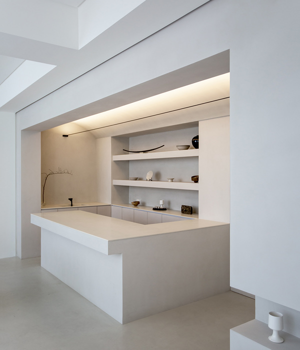
White: White symbolises purity, simplicity, and elegance. In interior design, white creates a sense of cleanliness, spaciousness, and sophistication. It serves as a neutral backdrop that allows other design elements to stand out.
Rustic: Rustic typically refers to a style that is characterized by simplicity, natural elements, and a sense of coziness. Rust color evokes feelings of warmth, comfort, and earthiness. This warmth creates a cozy and inviting atmosphere in the boutique. It evokes feelings of nostalgia and connection to nature.
Revival: Revival is a renewal of something. In this context, "White Rustic Revival" implies a modern reinterpretation or revitalization of rustic design principles, perhaps with contemporary twists. It breathes new life into traditional elements while embracing a fresh, modern aesthetic.
Overall, "White Rustic Revival" signifies a design approach that combined the timeless elegance of white with the warmth and charm of rustic elements, revitalizing traditional aesthetics for a modern audience.
Wooden Texture Incorporates natural warmth and earthiness, providing a tactile contrast to the crisp white surfaces. Wooden textures are predominantly utilized in display fixtures, and furniture pieces, adding depth and richness to the overall design.
Beyond its aesthetic appeal, white rust renewal played a pivotal role in shaping the ambiance of the store. Soft, muted tones of white and wooden formed a neutral backdrop, allowing the curated selection of clothing and accessories to take center stage.
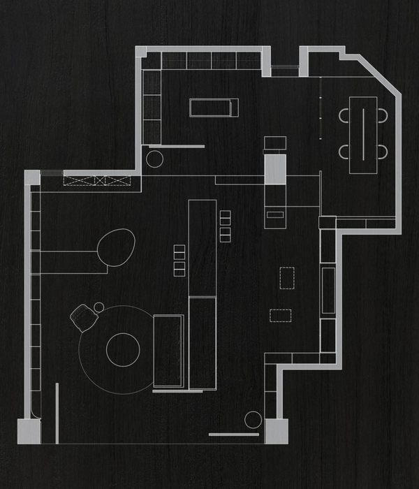
Created the open Layout to emphasise a sense of fluidity and unrestricted movement within the store, allowing customers to navigate seamlessly between different sections.
Segregated the space into distinct zones for different types of clothing, accessories, and promotional displays. Each zone is strategically positioned to optimize traffic flow and enhance the shopping experience.
Introduced focal points such as a centrally located display area or a statement lighting fixture to draw attention and create visual interest.
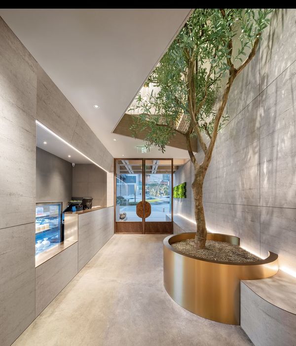
The reception area is positioned near the entrance, adjacent to the display area, to greet customers and provide assistance as needed.
The display area is strategically positioned near the entrance & reception area to immediately captivate customers' attention upon arrival.
The workshop area is located toward the back of the store, away from the main retail space, to minimize distractions and ensure privacy for staff members.
The changing area is positioned adjacent to the display area for easy access and convenience.
The office space is located behind the display area, separated from customer areas to maintain a professional atmosphere. Created office entry as hidden door in merge with passage paneling.
Utilized sleek and minimalist display fixtures in white finishes to showcase the merchandise effectively while maintaining a clean and uncluttered aesthetic.
Incorporated the cozy seating areas with comfortable upholstered furniture upholstered in earthy tones, providing customers with a relaxing environment to try on clothing or engage in browsing.
Implemented soft, diffused lighting throughout the store to create a warm and inviting atmosphere.
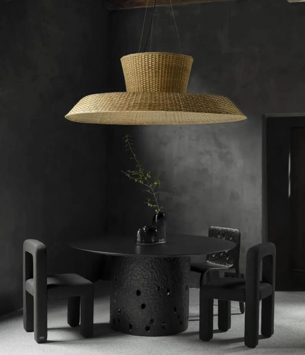
Installed spotlights ,pendant lights, chandelier and track lighting to accentuate focal points such as featured clothing racks, promotional displays, or artwork, adding drama and visual hierarchy to the space.
Minimalist Branding elements and signage are integrated seamlessly into the design, using a combination of white and rust-colored materials. This included a logo display behind the reception table & above the main door with gold color finishes that tie in with the overall aesthetic.
Architect: Ingenious Studio
Photography: Sagar Bhavsar
1. Philips: All interior lights
2. Century ply: Furniture details
3. Greenlam laminates: Furniture finish
4. Hettich: All hinges, drawer channels, other products
5. Asian Paints: All wall & ceiling color
▼项目更多图片
{{item.text_origin}}

