Jigsaw Editorial Studios | 颠覆传统,打造活力电影编辑空间
JIGSAW EDITORIAL
The film editing profession requires small, dark environments free from distraction and light reflection—in essence, hermetically sealed boxes. Yet at the same time, a film editing company, if it is to be competitive, must exist in a stimulating, socially interactive workspace, alive to workers and clients alike—a place where people will want to be.
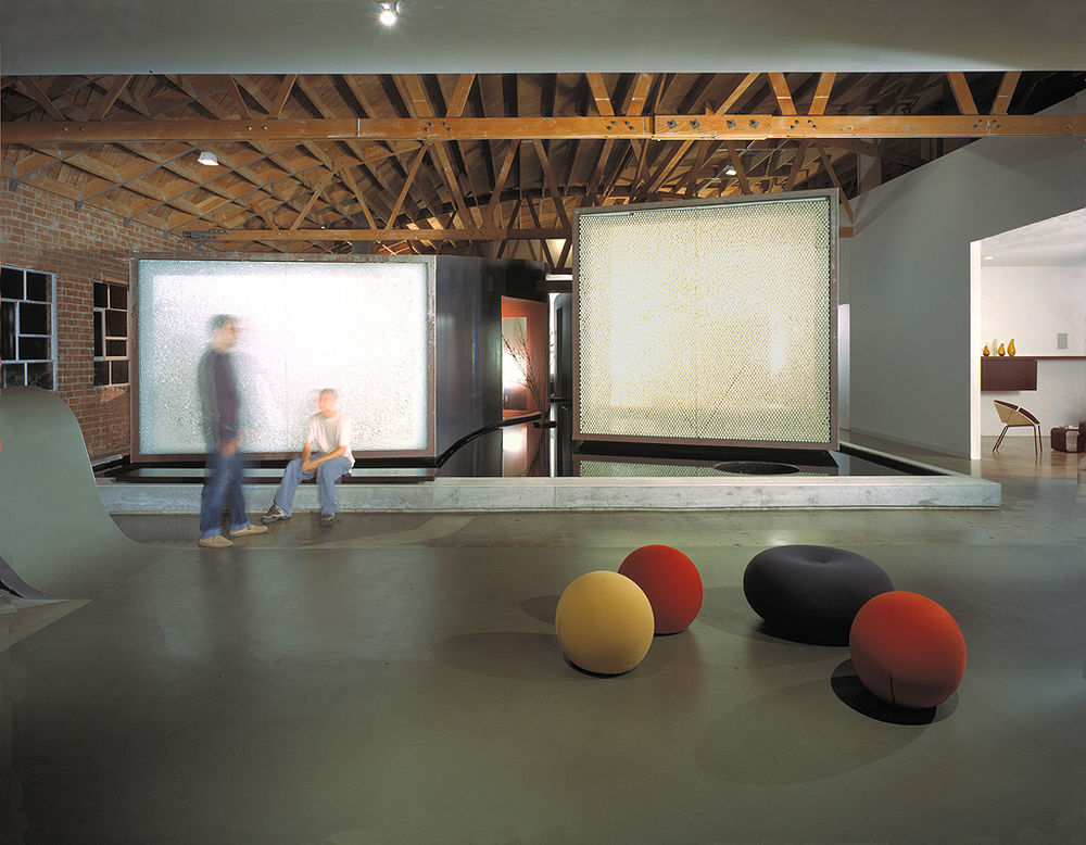
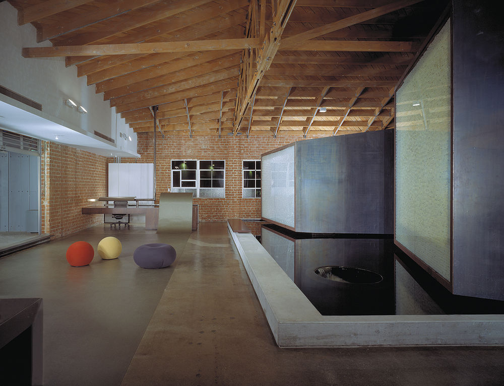
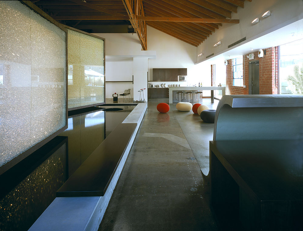
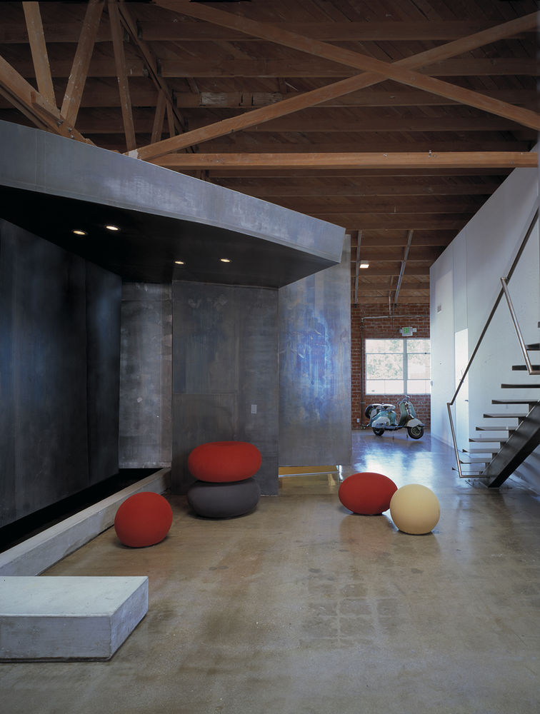
It was this challenge to transform the interior of a rough 1940’s 5,000 SF bow-truss warehouse into an entirely surprising and inventive space. The location of the warehouse—in a featureless, industrial area of West Los Angeles—created few basic restrictions, yet the question of how to incorporate box-like rooms inside a large area while simultaneously creating an alive, interior atmosphere became a major challenge.
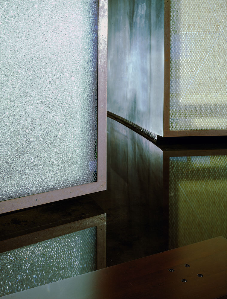
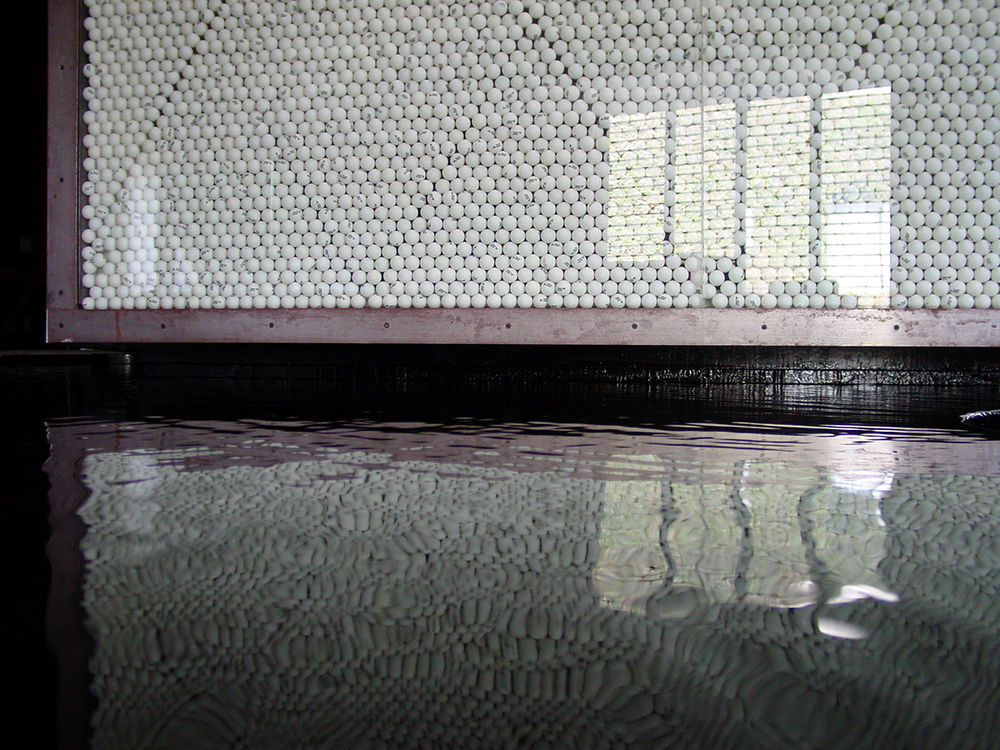
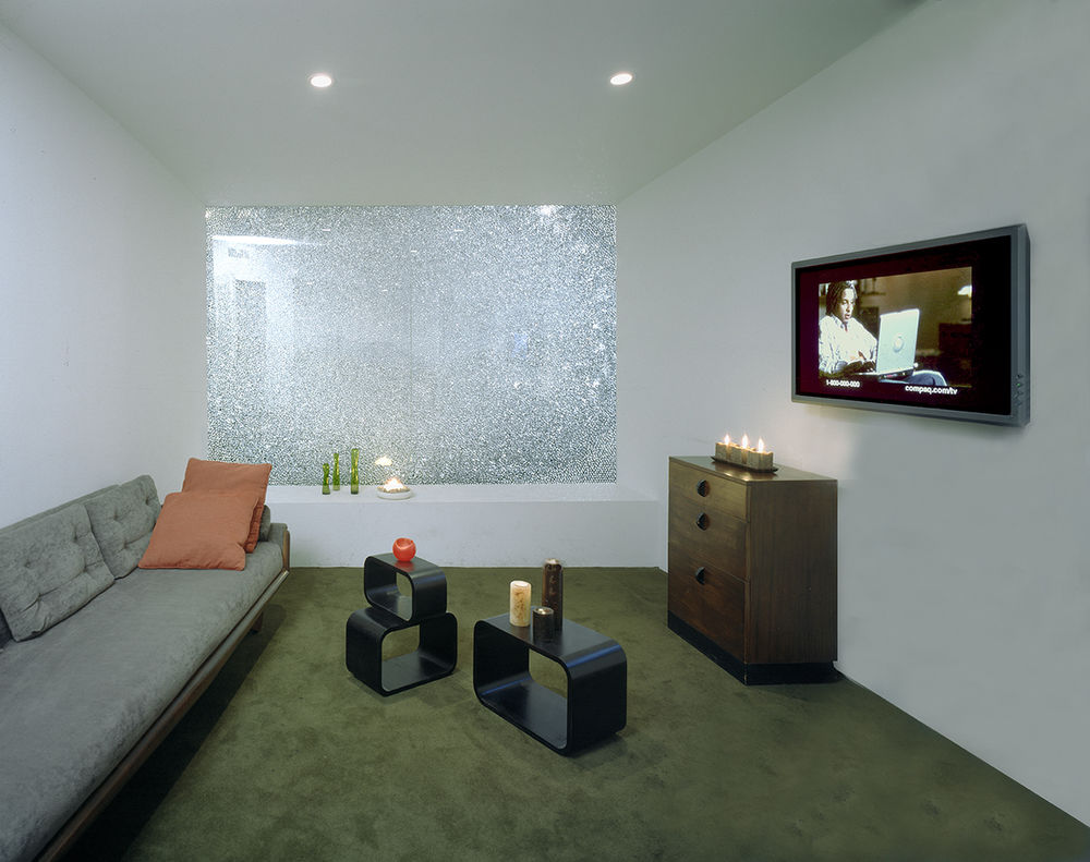
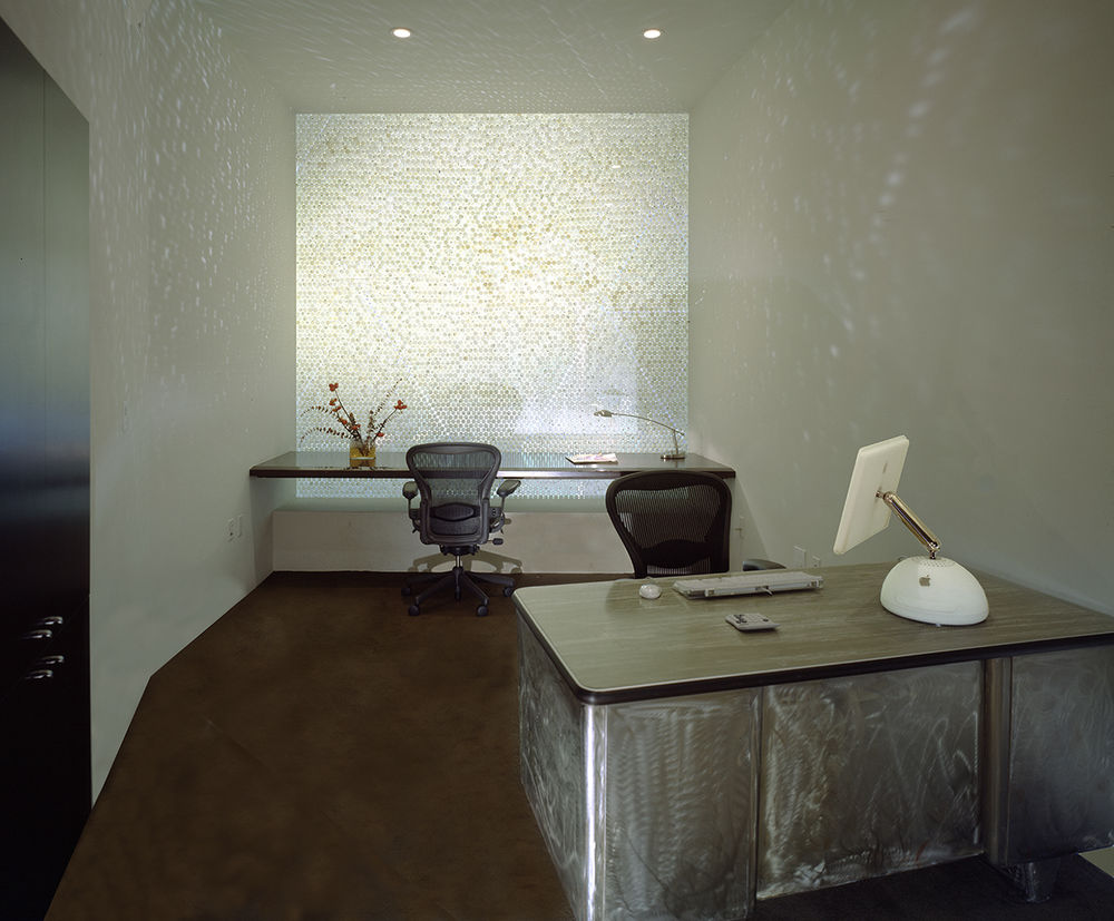
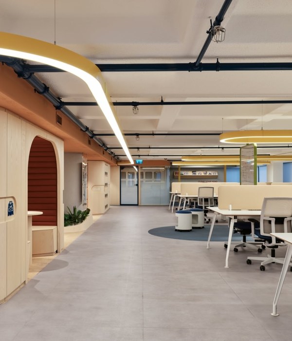
To answer this question, the architect’s first decision was to treat the building’s warehouse exterior as a kind of horizon or envelope within which to locate a large interior public area, which would enclose the warehouse’s smaller rooms. Incorporating the client’s program of offices, library, socializing zones, music rooms and editing rooms, the design uses independent forms as well as interior walls of unique materials, to create an entirely new and unexpected world of public and private space. The dull West Los Angeles neighborhood surrounding the warehouse is at once replaced inside, through a variety of volumes and forms, all kept below ceiling height. A constant flow of movement and circulation is created, heightening the interior’s excitement and tension. Opposite the café, the reception area grows out of the linoleum floor material, and is deliberately positioned away from the entrance door, so that the visitor must absorb the entire space.
