- 项目名称:CoCo都可十全街店
- 项目地址:苏州十全街
- 设计单位:欧阳跳建筑设计有限公司
- 主案设计师:欧阳跳
- 设计团队:姚运,周丹凤,马小贝
- 项目面积:170平米
- 设计起止日期:2021年1月
- 设计完工时间:2021年9月
- 主要材料:艺术漆,定制砖,艺术浇筑板,不锈钢,防火板
- 制造:上海邑通道具股份有限公司
- 灯光设计:无锡米未照明
- 材料品牌:佛山缪唯娅陶瓷有限公司
- 项目摄影:鲁哈哈
高楼林立的都市,从不缺乏钢架水泥、横平竖直的格子间。然而追本溯源,祖先筑巢而居的本能,是寻求遮风避雨的场所,因此,贴近自然的纯粹比人工打磨的精致更能触动心灵深处的柔软。
Cities with skyscrapers are no lack of steel frame, cement, horizontal and vertical grids. However, getting to the root of the matter, we know that the instinct of our ancestors to build nests is to seek shelter from wind and rain. Therefore, the natural purity can touch the softness of people’s heart more than the refinement of artificial polishing.
▼视频,the video
CoCo都可新店择址于苏州十全街,这里到处铭刻着古老历史的印记,至今保留着“水陆平行、河街相邻、两路一河”的传统格局和水乡情调,显现出极为丰富的文化底蕴。设计将场域形态融入未来的生命空间,与历史古街交相辉映,促进现代美学与整体秩序的共生共荣,同时,也在精神领域的碰撞中达成共振共鸣。
CoCo’s new store is located in Suzhou Shiquan Street, where ancient history is engraved everywhere. It still retains the traditional geographical pattern and the sentiment of water town, showing extremely rich cultural deposits. In this design, the designer integrates the field form into the future life space to reflect the historical ancient street on the one hand, and promote the symbiosis and co-prosperity of modern aesthetics and the overall order on the other. Meanwhile, the design also tries to achieve resonance in the collision of spiritual field.
▼店铺外观,exterior view
整个项目从回归原始和探索未来的生活方式思考,孵化出生命起源的卵形,通过曲线结构衔接了顶面、立面和地面,不仅从外观形态、更从内涵底蕴将艺术的渲染力源源不断地渗透到整个建筑,构筑治愈系和沉浸式的场景体验,剖析环境与未来建筑之间的关系哲学,也将品牌引向创意与可续的进化之道。
一层空间概览,overview of the first floor
▼窗边细部,the matrix of modeling lamp based on cell particles
作为改造项目,外观设计以历史为灵魂,尽可能地保留原有建筑的细节与神韵,并以现代艺术手法去维系、唤醒与复兴这座城市百年传承下来的文脉与礼乐,这不仅是对古老文明的探索,更是对未来生活的展望。
一层轴测图,axonometric of the first floor
空间内是一场恢弘而绮丽的叙事。推门而入,内部以不规则体块进行分割,线条的流动性和秩序感丰富了空间层次,在视觉上呈现出强烈的韵律美。出品区与座位区彼此呼应、互为补充。在表达两个功能区域和谐交融的同时,通过对材质、色彩和动线的选择与布局,为各自注入了然的独立属性。
The design of the space is like a grand and beautiful narrative. When you push the door and come in, you’ll find that the interior is divided by irregular blocks. The fluidity and sense of order of lines enrich the spatial hierarchy, presenting a strong beauty of rhythm visually.The food court area and seating area echo with each other. While maintaining a harmonious integration of the two functional areas, the choice and layout of materials, colors and moving lines add clear and independent attributes into each.
▼从入口望向楼梯和出品区,view of the food court and stairs
出品区的渐变墙体还原出山谷的质朴拙意,光与影的介入打破了单一色调带来的沉闷,在间接光源的晕染下,岩石表面立体触感的肌理,伴随着不锈钢台面折射出的粼粼波澜,粗犷中裹挟着微妙细腻感,赋予来客心灵回归自然的生命气息。
The wall in food court is simple and unadorned. The intervention of light and shadow broke the boring tone. Under the indirect light shading, the texture looks delicate and exquisite with the reflection of stainless steel, endowing visitors a feeling like recover their original simplicity.
▼出品区,food court
▼立体触感的肌理,the delicate texture
▼从出品区看用餐区,view of the seating area from the food court
座位区不设高隔,波浪墙身简洁的外形轮廓奠定了舒缓放松的氛围,柔和蜿蜒的曲线以开放且包容的姿态,为顾客提供安静却不逼仄的独处时光。
There is no high partition in the seating area. The simple outline of the wavy wall body creates a relaxing atmosphere. The gentle winding curve provides customers with a chance to enjoy quiet time.
▼座位区不设高隔,no high partition in the seating area
▼座位区细部,details of the seating area
以细胞粒子为蓝本的造型灯矩阵有序地分布在墙面,虚实之间呈现出一种极致简约的美感。与品牌色相仿的暖橙灯光,铺就温馨治愈的空间基底,打造连续、动态的空间体验。
The matrix of modeling lamp based on cell particles is orderly distributed on the wall, presenting an extremely simple aesthetic feeling between virtuality and reality.
Warm orange lights similar to the brand color pave a warm and healing space base to create a continuous and dynamic space experience for customers.
▼造型灯矩阵,the matrix of modeling lamp based on cell particles
顺着旋转楼梯拾级而上,建筑内不规则造型的洞穴、连接梁和弧形墙是设计师寻找语汇回应自然召唤的实践,形成了一步一景的场景画面感,也让空间平添了几分关于未来感的隐喻。
Climbing up the spiral staircase, we notice that the designer closes to nature by designing irregular shaped caves, connecting beams and curved walls, forming a changing scene with every step, and adding some metaphors about the future sense to the space.
▼旋转楼梯通向二层,spiral staircase leading to the second floor
▼旋转楼梯内部视角,view on the spiral staircase
▼仰视楼梯,looking up at the spiral staircase
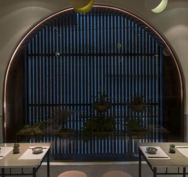
墙面上的内嵌窗口形成空间序幕引言,内部肌理漆的斑驳质感延续了一层空间的天然雕饰的原始之美,也构成了顾客置身其中的空间张力。
▼二层轴测图,axonometric of the second floor
The embedded window on the wall is like a prelude to the space. The mottled texture of the internal texture paint is full of the original beauty of the natural carving of a layer of space, and constitutes the spatial tension for customers.
二层空间概览,overview of the second floor
墙面上的内嵌窗口形成空间序幕引言
the embedded window on the walls as a prelude to the space
二层空间核心用餐区,main seating area on the second floor
▼视线穿过内嵌窗口,view through the embedded window
为什么越来越多的人在精神世界里活成了一座孤岛?发达的社交产品让我们快速高效地认知世界,但也将人与人的距离拉得更远。本案以“回归生命本源”为概念,藉由细胞、洞穴等意象,搭建了一个充满律动且柔美的空间,在游离于古老文明与现代美学的平衡中构造寻求内心自在的载体。
▼看向体验区, view of the experience area
靠窗座位,seating by the window
▼细部,details
世俗对成功的定义并不是每个人生存的准则,人应该做自己,追求内心真正的需求,不迎合、不盲从,活出自己的态度,这是设计一以贯之的初心,也是品牌的蓬勃发展的信心。
The secular definition of success doesn’t represent the criterion for everyone’s survival. Human beings should try to be themselves, pursue the real needs of their heart, do not cater to or blindly follow anything, but live out their own style. Yes, this also represents the consistent initial intention of design, and the confidence for the brand’s vigorous development.
▼夜景,night view
▼首层平面,the first floor plan
▼二层平面,the second floor plan
外观立面,elevation
▼剖面图,sections
项目名称:CoCo都可十全街店
项目地址:苏州十全街
设计单位:欧阳跳建筑设计有限公司
主案设计师:欧阳跳
设计团队:姚运、周丹凤、马小贝
项目面积:170平米
设计起止日期:2021年1月
设计完工时间:2021年9月
主要材料:艺术漆、定制砖、艺术浇筑板、不锈钢、防火板
制造:上海邑通道具股份有限公司
灯光设计:无锡米未照明
材料品牌:佛山缪唯娅陶瓷有限公司
项目摄影:鲁哈哈
Project Name: CoCo Shiquan Street Shop
Location: Suzhou, China
Design Company: OYTT Design
Chief Designer: Tiao Ouyang
Design Team: Yun Yao,Danfeng Zhou,Xiaobei Ma
Area: 170 square meters
Start Time : January,2021
Completion Time: September , 2021
Main Materials: art paint, custom brick, art pouring board, stainless steel, fireproof board
Manufacture:Shanghai Hooyi Displays&Fixtures Industries Co., Ltd
Light:Miwei Lighting
Material brand:MUY Ceramic
Photographer:Lu Haha
{{item.text_origin}}

