诺米典藏馆 | 现代艺术与商业空间的完美融合
“传统的典藏馆是专业机构或个⼈⽤于记录⽂件、藏品收藏,⼤多⽤于科研或⽂化传播。”当⼈们谈起典藏馆,最明显的视觉标志便是极具规模的整⻬货架。设计师提取相关视觉元素与建筑学理论结合,打造符合NOME⽓质的空间。将零售空间视为archive, 其藏品也从原来的记录和收藏功能转换为陈列储藏极具设计感的商品。
Traditionally, the archive is used by professional institutions or individuals to record documents and collections mostly for research or cultural dissemination. When people talk about the archive, the most obvious visual sign is the neatly organized shelves of great scale. The designers have taken the relevant visual elements and combined them with architectural theory to create a space that fits the NOME ethos. The retail space is seen as an archive, and the collection has been transformed from a documentary and collecting function to a display of design-inspired goods.
▼项目概览,overview ©Wen Studio
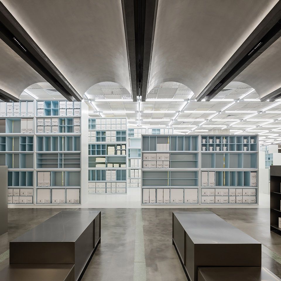
向域设计从建筑学中“形式、空间和秩序”三个⽅⾯进⾏研究及实践。形式和空间是建筑学中经常使⽤的⼿法,这些要素相互联系,形成⼀个综合的整体。当这些要素被⼈感知,彼此加强,并完全从属于整体的基本特征时,⼀个概念上的秩序便应运⽽⽣。这种秩序能持久地给⼈留下印象,⽽⾮转瞬即逝的感性观察所能⽐拟。
Atelier xy has involved and practiced the three aspects of architecture: form, space, and order. Form and space are important elements frequently used in architecture, and these elements are interlinked to form an integrated whole. When these elements are perceived, reinforced by each other, and fully subordinated to the essential features of the whole, a conceptual order emerges. This order leaves a lasting impression that is not comparable to fleeting perceptual observations.
▼从美妆区看向中央区,view of the central space ©Wen Studio
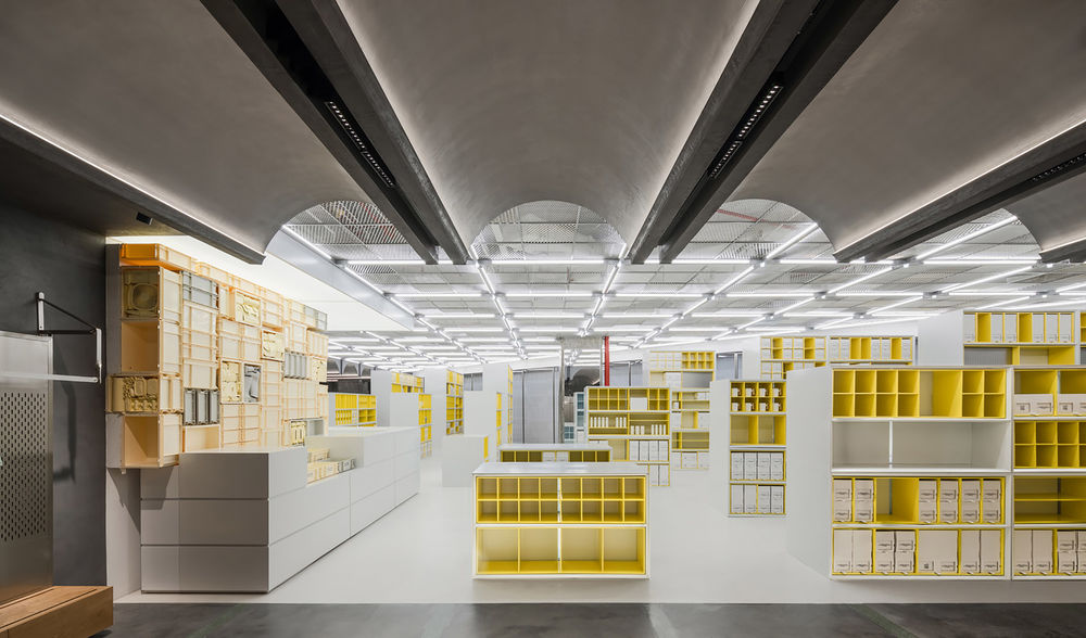
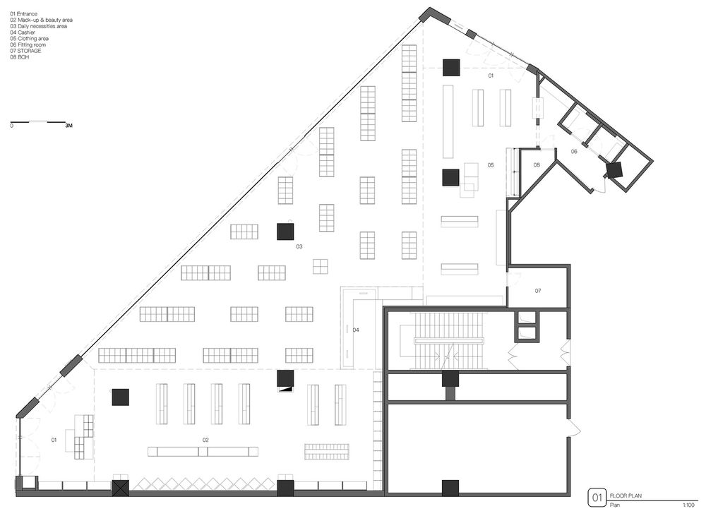
针对诺⽶典藏馆的现有空间,向域设计将店铺中陈列架的布置基于建筑现有轴线⽹格进⾏细分。在考虑两条主要购物流线的同时,以矩阵式排列展开。在保持统⼀秩序的同时,⼜因顾客的购物流线⽽富有变化。
For the existing space of the Nome archive, Atelier xy subdivided the layout of the displays in the shop based on the existing axial grid of the building. While taking into account the two main shopping flows, the arrangement is spread out in a matrix. While maintaining a unified order, the layout of the displays is varied according to the shopping flow of the customers.
▼中央区,the central space ©Wen Studio
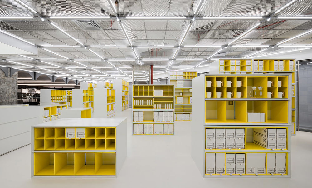
▼空间以矩阵式排列展开,the arrangement in a matrix ©Wen Studio
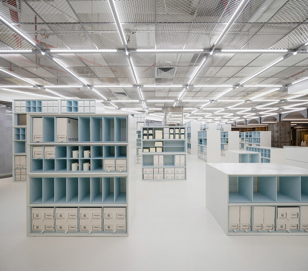
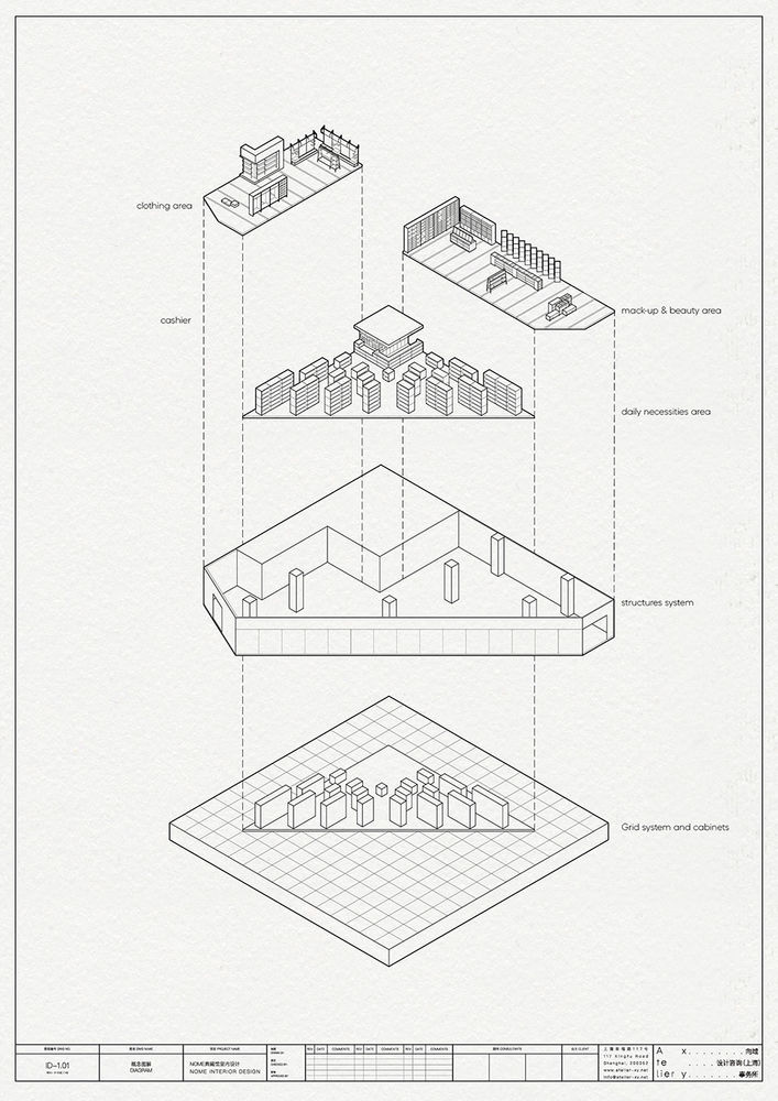
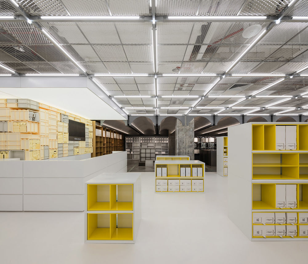
三⻆形的中央区是整个设计的核⼼,并将店铺划分成了:中央区、服装区和美妆区。⼤体量的货架根据轴线的划分从外向内、由⾼到低依次递减排列,不论从哪⼀个⻆度观看都呈现出阶梯状的秩序感。当顾客穿梭于货架之间,会因为货架的排列流线⾃然⽽然地⾛向收银台。
▼轴测图,axonometric diagram ©Atelier xy
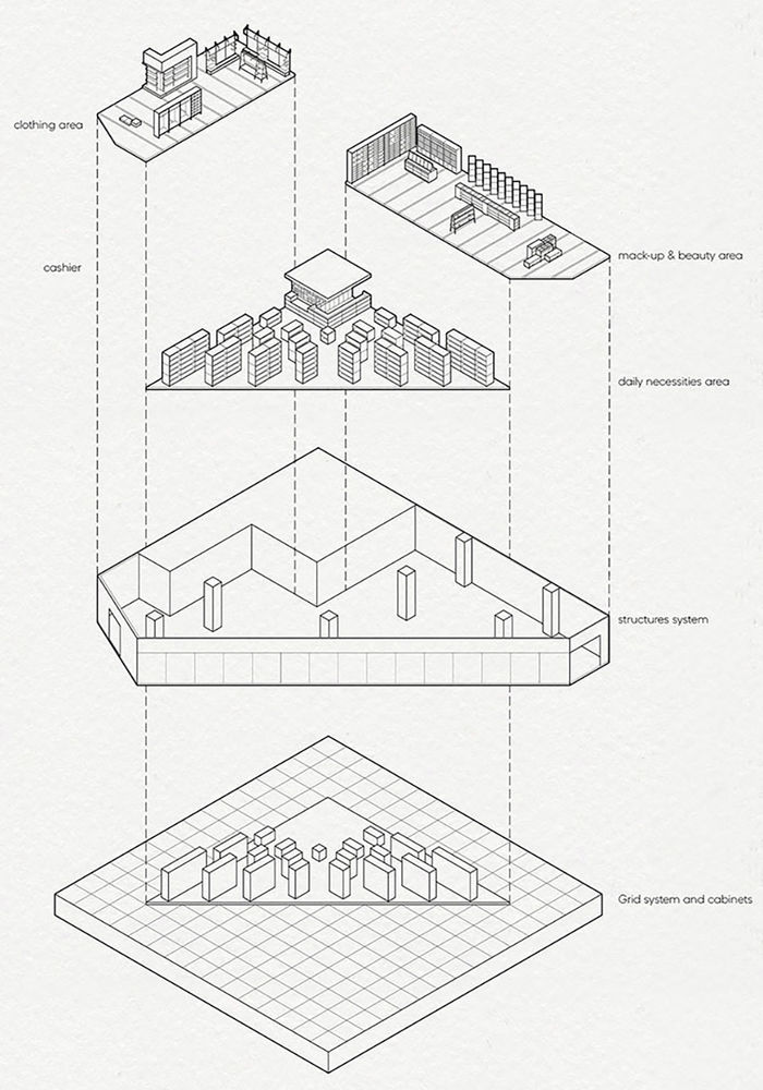
The triangular central area is the core of the design and divides the shop into the central area, the clothing area, and the beautiful area. The large volume of shelving is arranged in descending order from the outside to the inside, from high to low, according to the axes, giving a sense of order from any angle. As customers move between the shelves, they will naturally move towards the cashier counter due to the flow of the racks.
▼形式、空间、秩序下的货架,shelves forming space and order ©Wen Studio
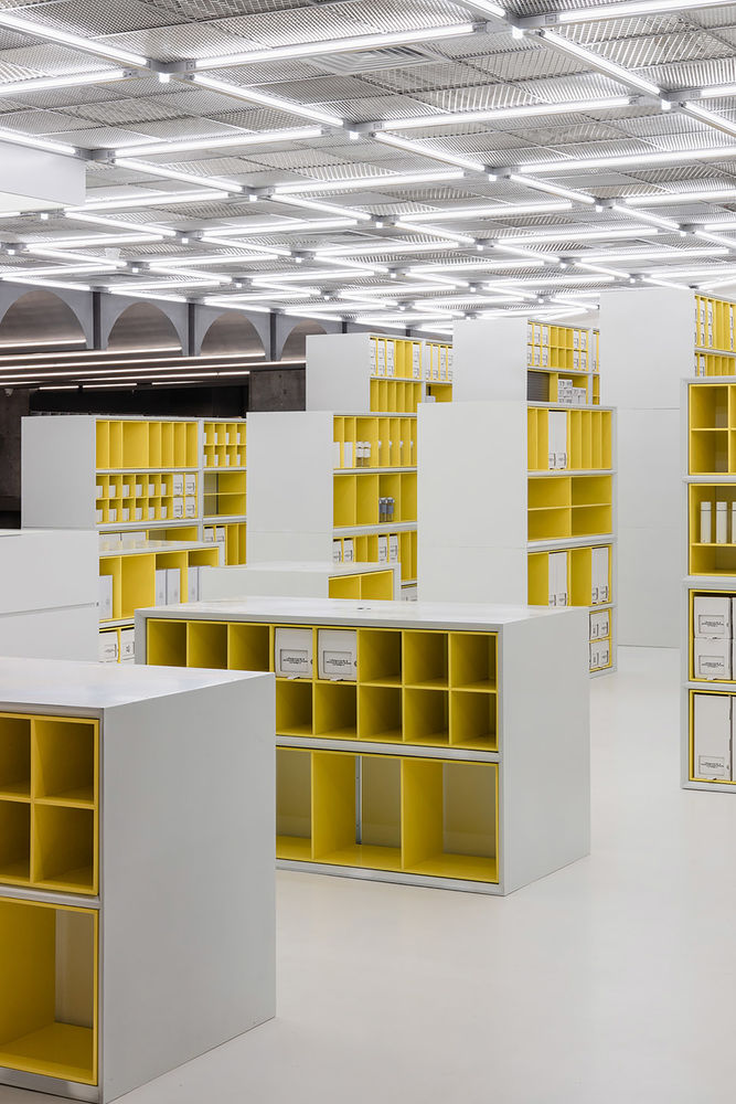
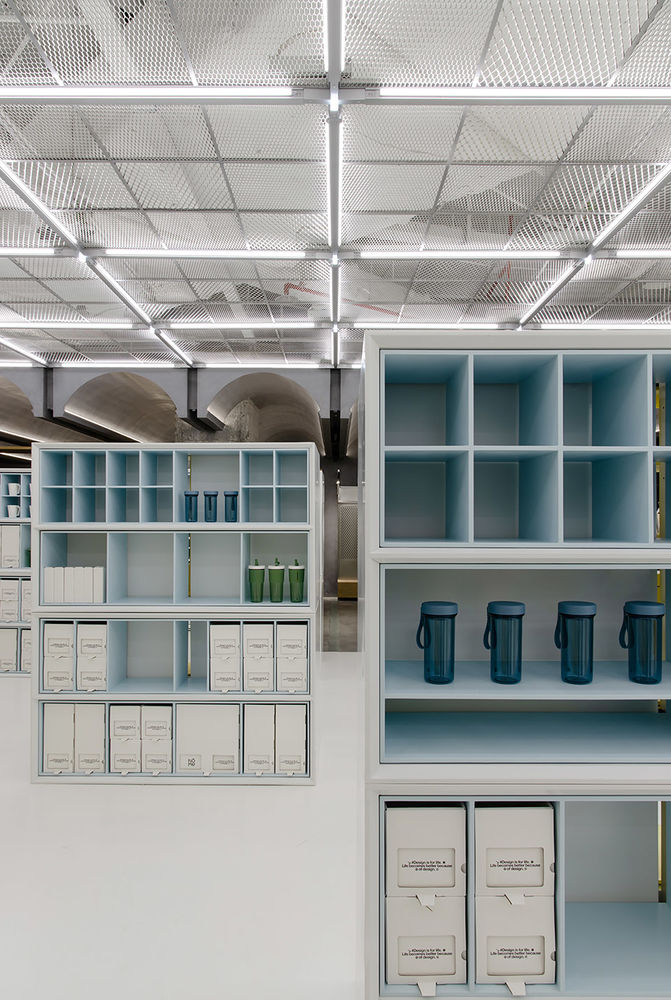
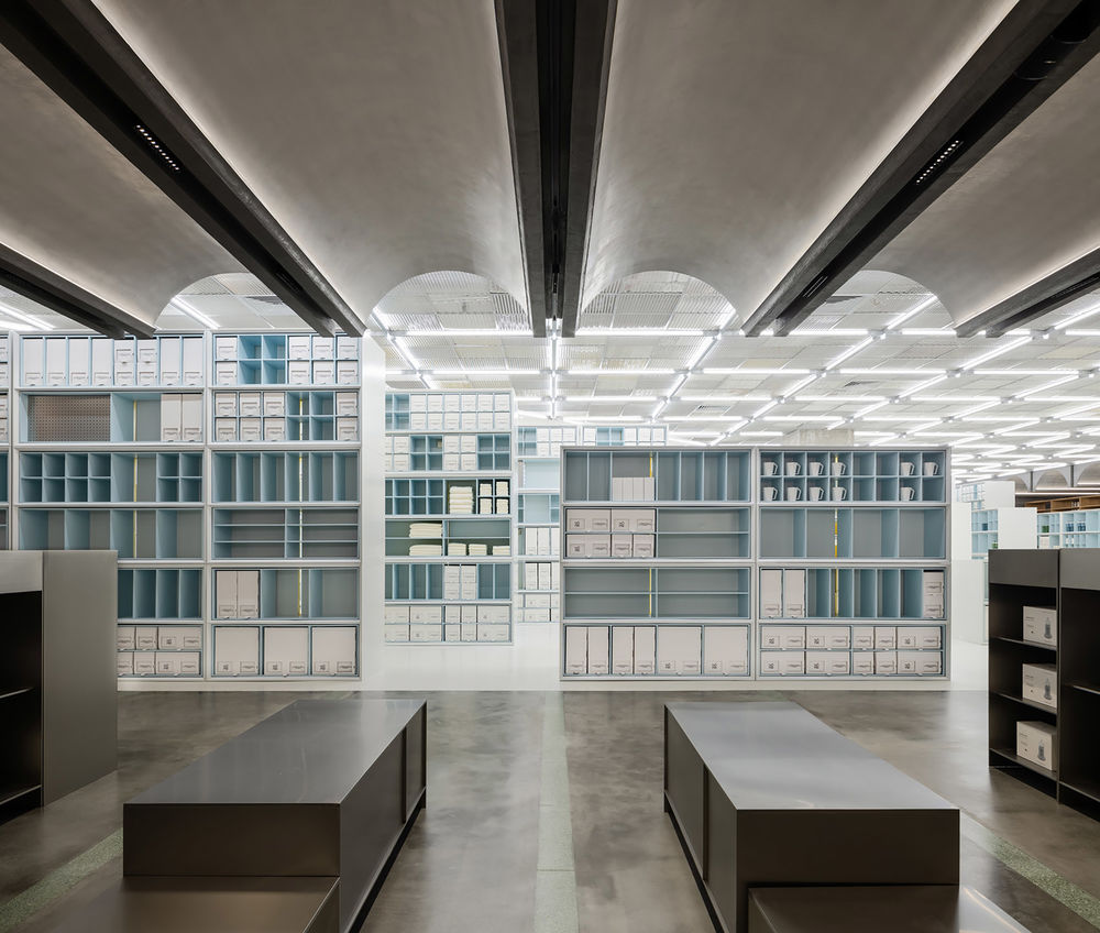
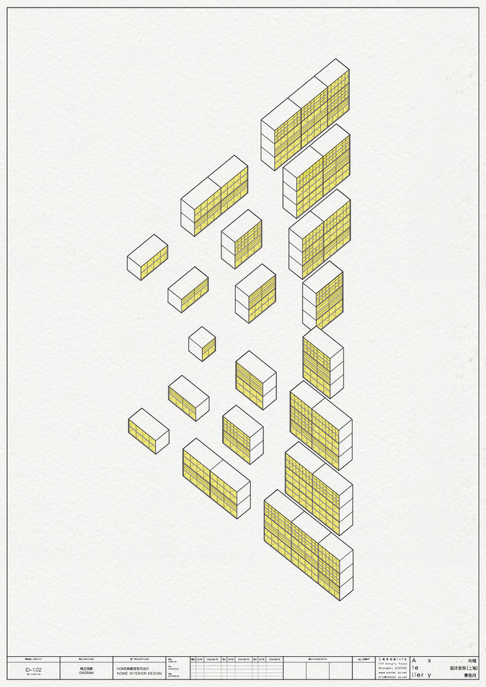
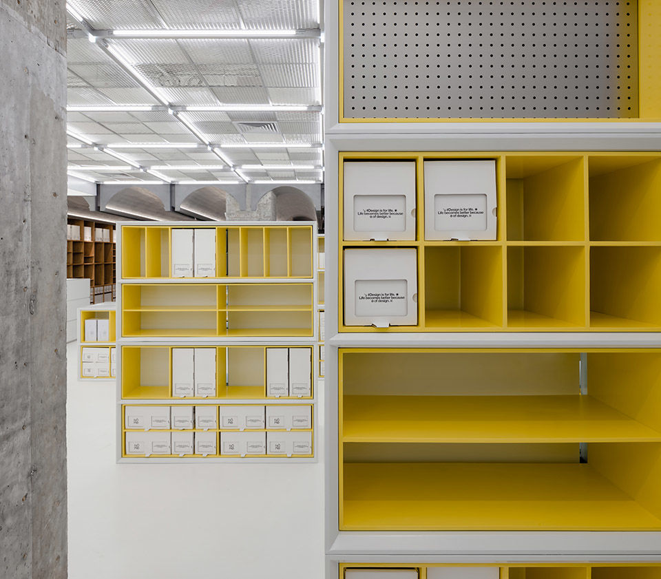
货柜⾼度呈阶梯状由⾼向低进⾏矩阵式排列,它们整⻬坐落在既定的轴线上,形成有趣的秩序。更有趣的是货柜的两⾯被分别设计成⻩⾊和蓝⾊。客⼈⾏⾛于店铺,因为观察⻆度的不同,店铺道具呈现出截然不同的颜⾊。空间的韵律由此产⽣。如何将种类繁多、数以万计的产品井然有序地进⾏陈列和仓储是在这个项⽬中设计师⾯临最⼤的难题。需要被重点陈列的产品被放置于货柜的视线⻩⾦区,⽽仓储的功能则被安放在客⼈不容易够得到的货柜最⾼处和最底部。
The shelves are arranged in a matrix of stepped heights from high to low, and they sit neatly on a set axis, creating an interesting order. What is even more interesting is that the two sides of the shelves are designed in yellow and blue respectively. As the customer walks through the shop, the props appear in different colours depending on the angle of observation. The rhythm of the space is thus created. The biggest challenge for the designers in this project was to organise and store the tens of thousands of products in an orderly manner. The products that needed to be highlighted were placed in the prime viewing areas of the shelves, while the storage features were placed at the top and bottom of the shelves where they were not easily accessible to customers.
▼⾏⾛于货架中的视角,view from inside the shelves ©Wen Studio
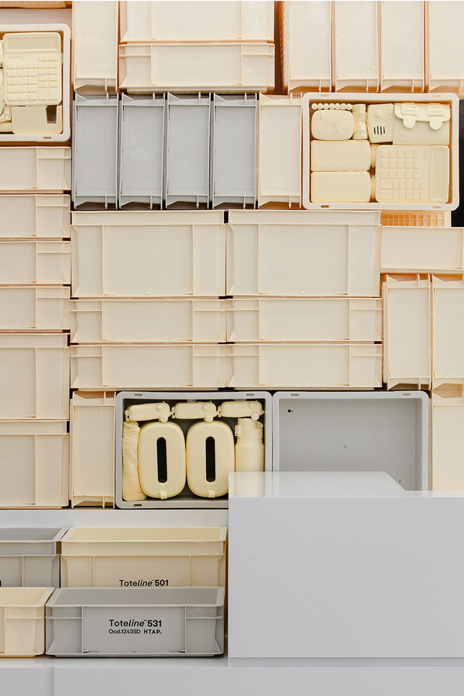
“极度舒适”是瑞典艺术家Michael Johansson实践的⼀个艺术装置系列。他痴迷于不同物体之间的规则性和巧合,⽽这些物体可能只是通过⼀种共同的颜⾊和形状联系在⼀起。设计师从Michael Johansson的作品中获得关于“强迫症”和“洁癖”的启发,为整合诺⽶典藏馆数以万计的产品类型找到突破⼝。
“Things fitting perfectly into other things” is a series of art installations practiced by Swedish artist Michael Johansson. He is obsessed with the regularity and coincidences between objects that may only be linked by a common colour and shape. The designer takes inspiration from Michael Johansson’s work on ‘obsessive-compulsive disorder’ and ‘cleanliness’ to find a breakthrough in integrating the tens of thousands of product types in the Nome archive.
▼追求“极度舒适”的基本准则,The basic rule of product display ©Wen Studio
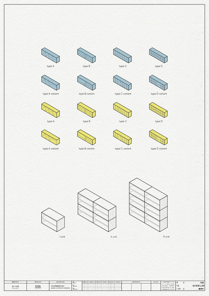
诺⽶典藏馆有15个⼤类,1750个产品类型,其仓储总量达3.2万之多。如何将种类繁多的产品进⾏陈列,在视觉上达到整⻬舒适的感觉、并且没有压迫感,是设计中最重要的课题之⼀。店铺中间的三⻆区域的品类为⽣活百货,⼤量使⽤⽩⾊货柜进⾏归纳和陈列。但由于货品⼤⼩的不同,需要不同尺⼨的辅助道具协助陈列。设计师在⽩⾊货柜的基础上,设计了“基本款辅助道具”和“变化款辅助道具”。将“变化款辅助道具”集中放置于货柜的⻩⾦视线范围内,其余空间⽤“基本款辅助道具”填满。最终实现了统⼀秩序的排列,又富于变化的道具组合。
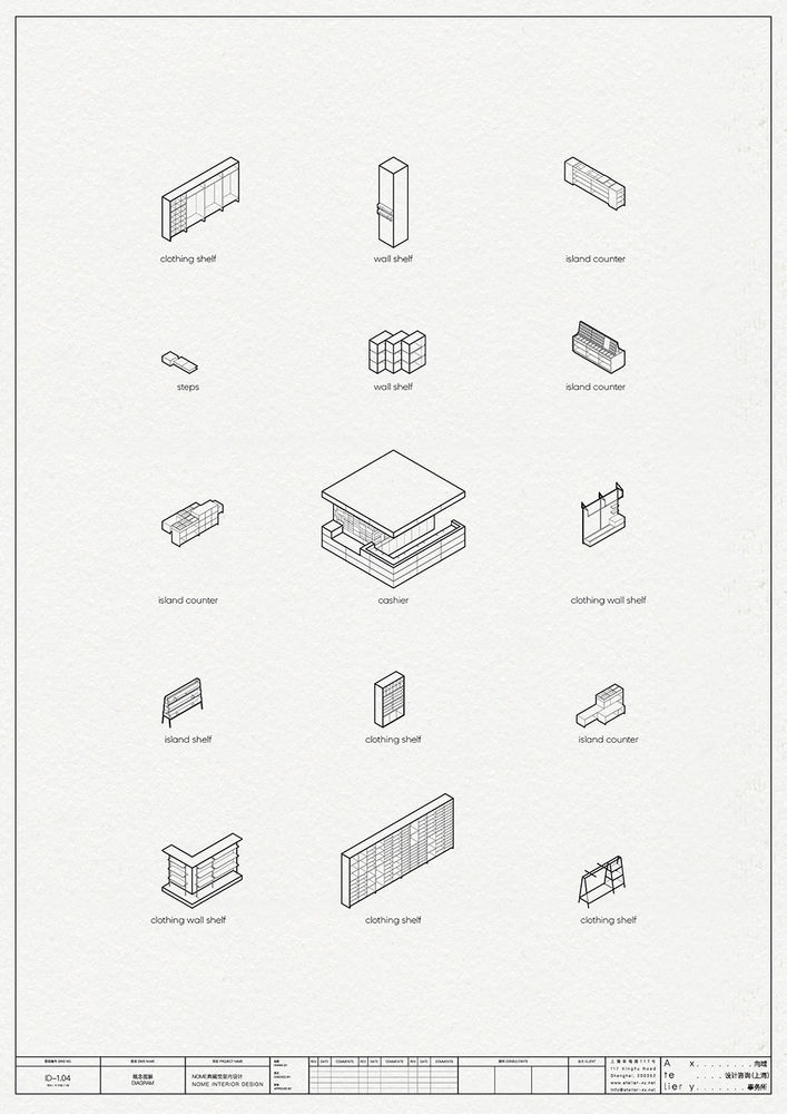
▼展柜图解,cabinet separators ©Atelier xy
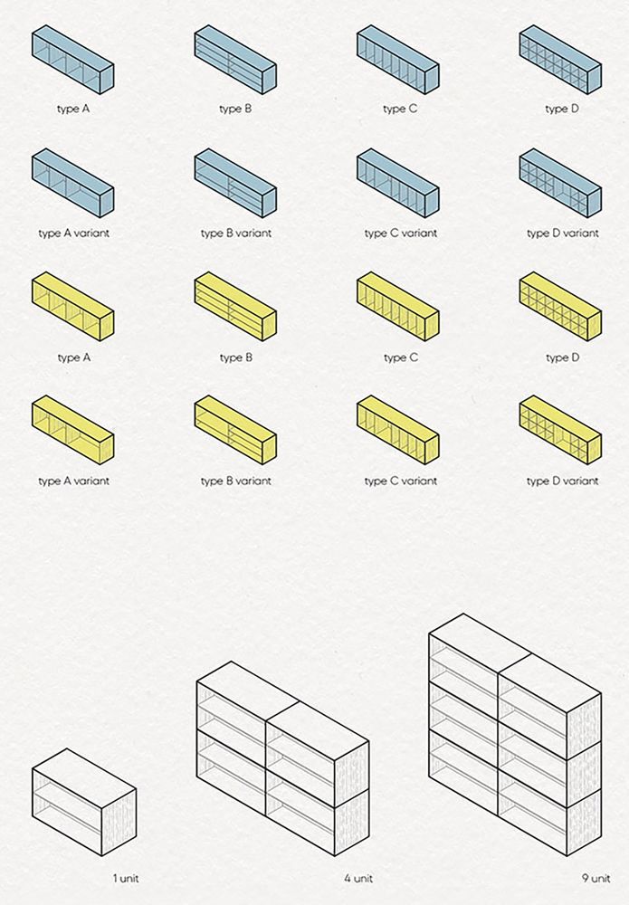
There are 15 categories and 1,750 product types in the Nome archive, with a total storage capacity of 32,000. One of the most important design issues was how to display the large variety of products in a way that was visually pleasing and not overwhelming. The triangular area in the middle of the shop is used to group and display a large number of white shelves for lifestyle products. However, due to the different sizes of the products, different sizes of auxiliary props are needed to assist the display. The designer has designed a ‘basic auxiliary’ and a ‘variation auxiliary’ on the basis of white cabinets. The ‘variation aids’ were placed within the prime viewing area of the cabinet, while the rest of the space was filled with the ‘basic aids’. The result is a uniform and orderly arrangement with a varied mix of shelves.
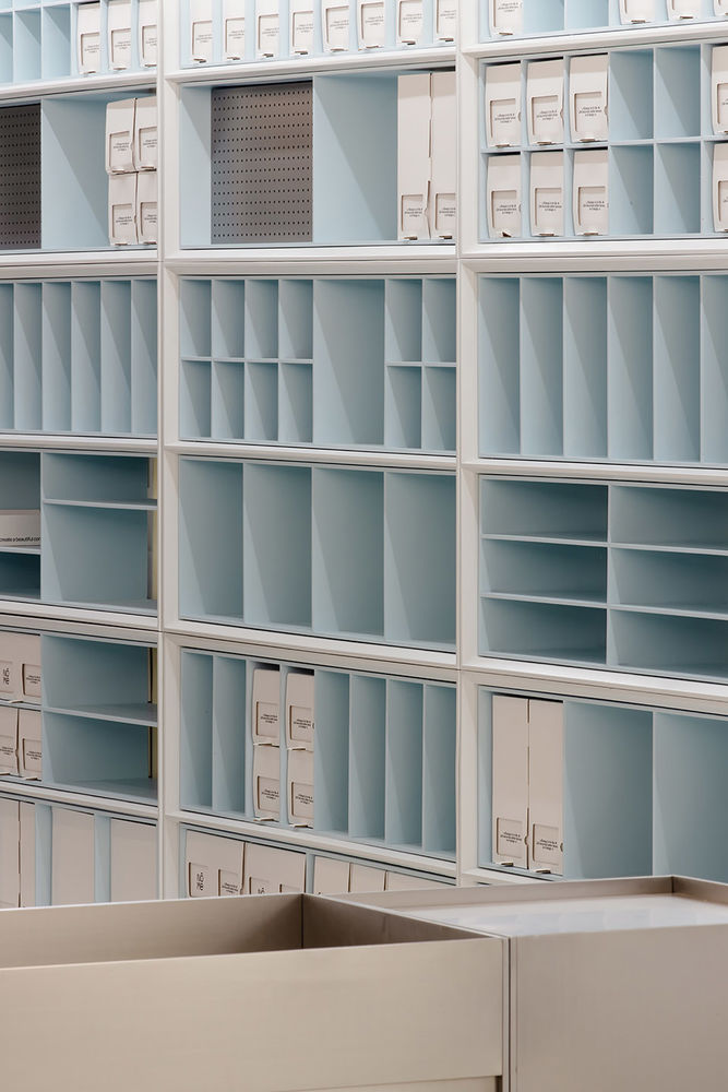
▼蓝色侧柜细部,details ©Wen Studio
美妆区的道具基调潮流摩登,从实际的产品陈列需求和顾客逛店的体验出发,将道具设计成⼏⼤类不同的展台、展架。既保持时尚摩登的整体形象⼜匹配相应的产品体验,丰富了整体店铺环境。
The shelves in the beauty area are trendy and modern, designed from the actual product display needs and customer experience, into several different types of stands and displays. The overall image of the retail is fashionable and modern while matching the product experience, enriching the overall retail environment.
▼美妆区,the beauty area ©Wen Studio
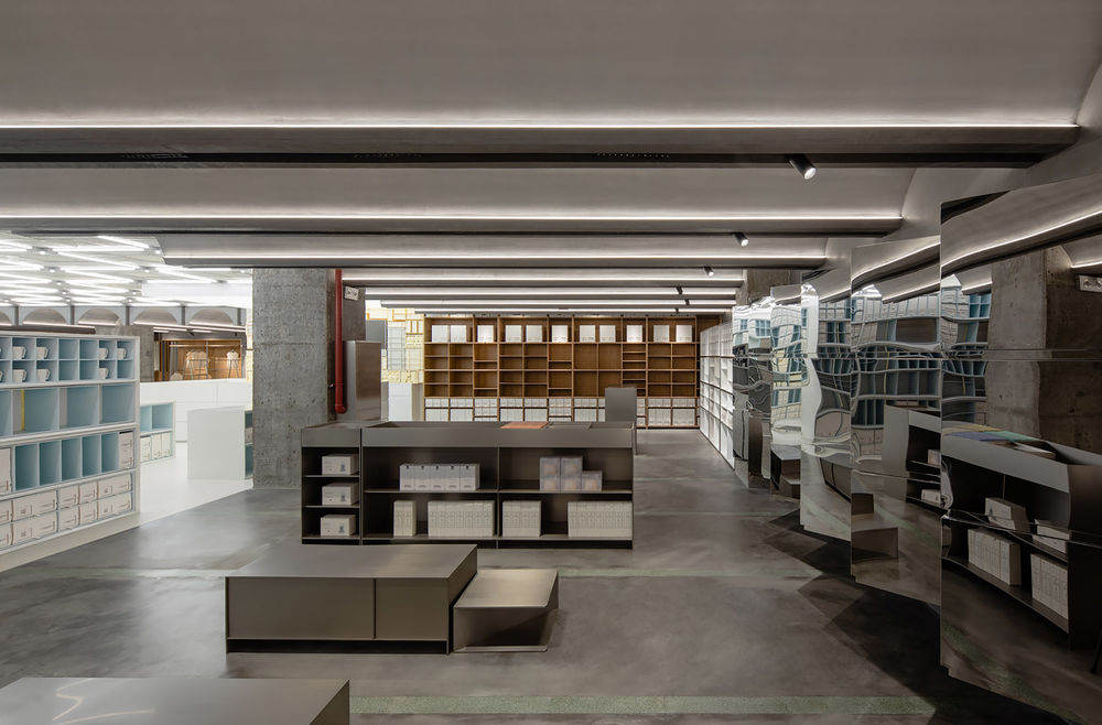
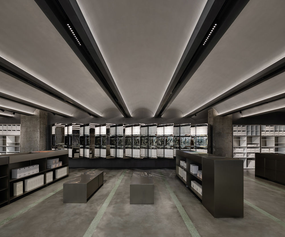
▼美妆区展架,shelves in the beauty area ©Wen Studio

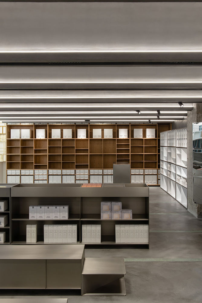
服装区的道具在潮流摩登的基调上,加⼊了温暖的⽊头元素,更亲肤也更贴近⽣活。靠墙的道具展示充分考虑了服装陈列的灵活性,所有⽊质辅助道具均⽅便拆卸,以配合不同服装⻓度的悬挂要求。通过数个⼩型不锈钢展台进⾏堆叠,组合出不同的展台,以配合当季服装陈列需求。
▼展架图解,display cabinets ©Atelier xy
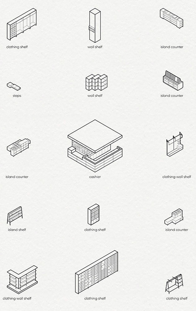
The shelves in the garment area are warm wood elements in a trendy and modern tone, more skin-friendly and closer to life. The shelves against the wall are designed to allow for flexibility in the display of clothing, with all wooden aids being easily dismantled to suit the different lengths of garments required for hanging. Several small stainless steel booths are stacked to create different booths to match the season’s clothing display requirements.
▼服装区入口,entrance of the garment area ©Wen Studio
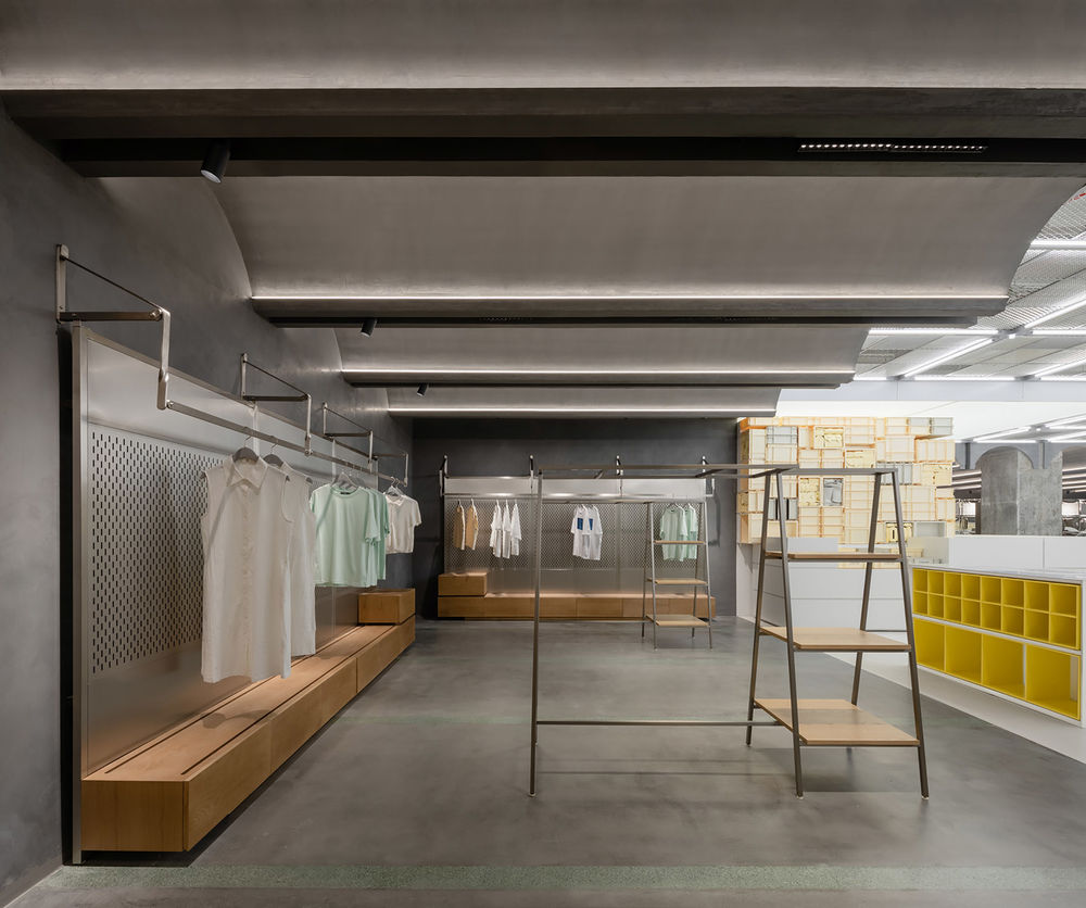
▼服装区,the garment area ©Wen Studio
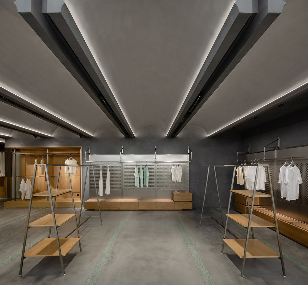
现代照明设计已经由传统的重点照明渐渐发展为空间均匀照明。这恰好符合有着丰富选品的诺⽶店铺照明的需求。店铺照明被细分为线型灯、点光源、线槽灯带和下明射灯,在保证整体照度及光影表现的同时,兼顾每个区域的产品表现。店铺灯具均使⽤显⾊性Ra>90的⾼显⾊光源,均匀的表现整个空间场景,准确还原所有的产品颜⾊与质感。店铺的整体照明氛围分为2个主要基调:中央区照明温暖⽽亲近,重点突出产品;服装区和美妆区时尚摩登,通过定制条形灯具来展现天花上漂亮的弧形线条。向域设计事务所从空间、道具、陈列及照明等多个⽅⾯⼊⼿,综合呈现了诺⽶典藏馆全新的品牌理念。
Modern lighting design has gradually evolved from traditional accent lighting to uniform lighting of spaces. This is exactly what is required for the lighting of the Nome archive, which has a wide selection of products. The shop lighting is subdivided into line lights, point sources, line channel strips, and downlighters to ensure overall illumination and light performance while taking into account the product performance of each area. The shop luminaires all use high colour rendering light sources with a colour rendering Ra>90 to evenly represent the entire space scene and accurately reproduce all product colours and textures. The overall lighting atmosphere of the shop is divided into 2 main tones: warm and intimate lighting in the central area, highlighting the products, and stylish and modern lighting in the clothing and beauty areas, with bespoke strip luminaires to showcase the beautiful curved lines of the ceiling. Space, props, displays, and lighting are the key elements of the new branding concept for the Nome archive.
▼收银区照明,lighting over the cash area ©Wen Studio
▼平面图,plan ©Atelier xy
▼剖面图,sections ©Atelier xy
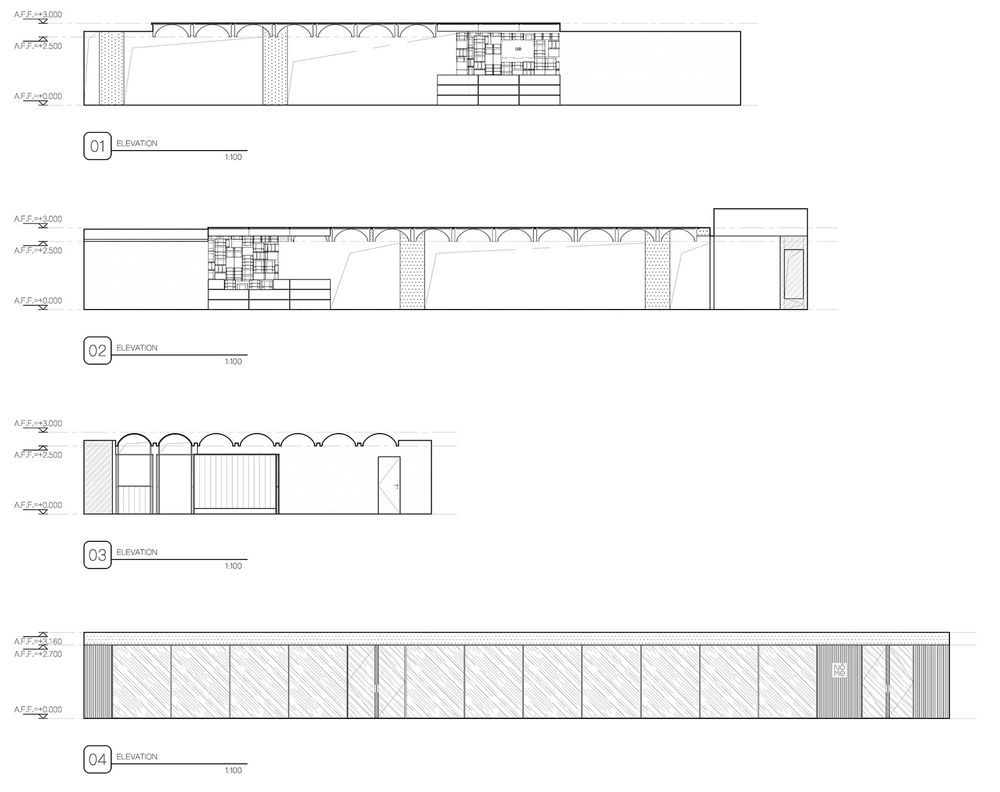
▼项目更多图片
