上海豫园商城片区城市再生 / c+d设计中心
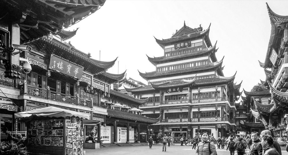
随着小世界改造工程的完工并重新投入使用,DC在上海豫园商城片区长达八年的改造更新工作暂时告一段落。豫园商城紧邻豫园花园和城隍庙,占地约5.3公顷,建筑面积约8.6万方。地处老城厢的豫园片区作为上海特有的人文标志和文化名片,是人们“上海印象”的重要基础。该地区从元、明、清到民国初年,在700多年间一直都是上海政治、经济、文化的中心,是“上海的根”。
With the completion of Xiaoshijie renovation project and its re-opening to the public, DC Alliance’s eight-year regeneration work in Shanghai Yuyuan Commercial Area has temporarily come to an end. Adjacent to Yuyuan Garden and Town God’s Temple, Yuyuan Commercial Area covers an area of about 5.3 hectares with the floor area of around 86,000 square meters. Located in Shanghai’s old town area, the Yuyuan district is a distinctive cultural landmark and essential element of Shanghai’s urban identity. Over a span of more than 700 years from the Yuan, Ming, Qing dynasties to the early Republic of China era, it served as the political, economic and cultural hub of Shanghai like “the Root” of this city.
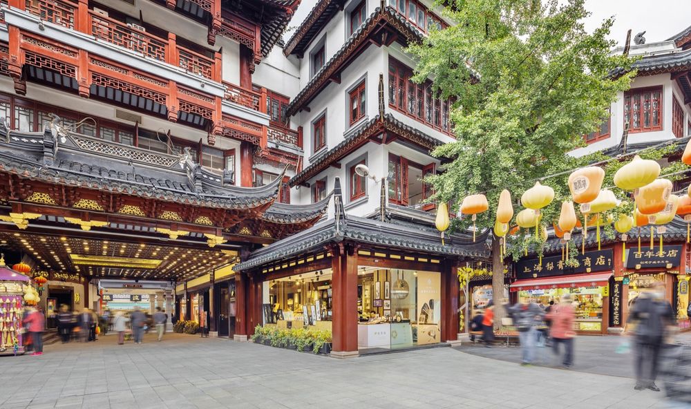
▼入口处,Entrance © 寻美影视Xunmei Media
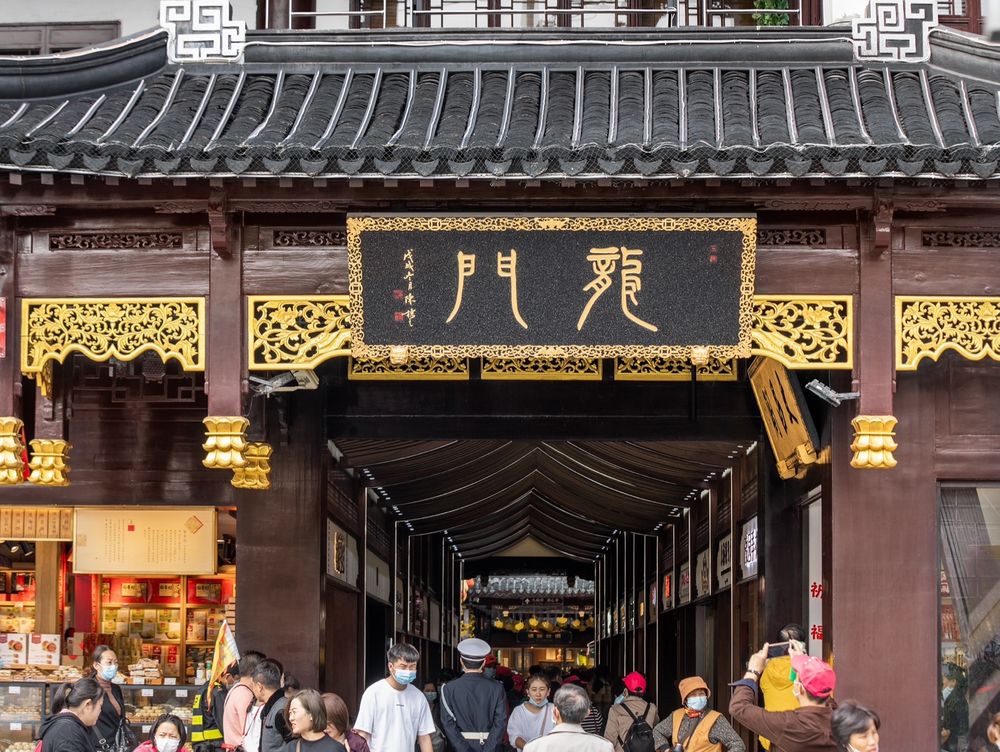
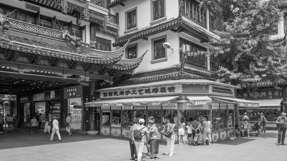
▼建筑一瞥,Architecture at a glance © DC国际
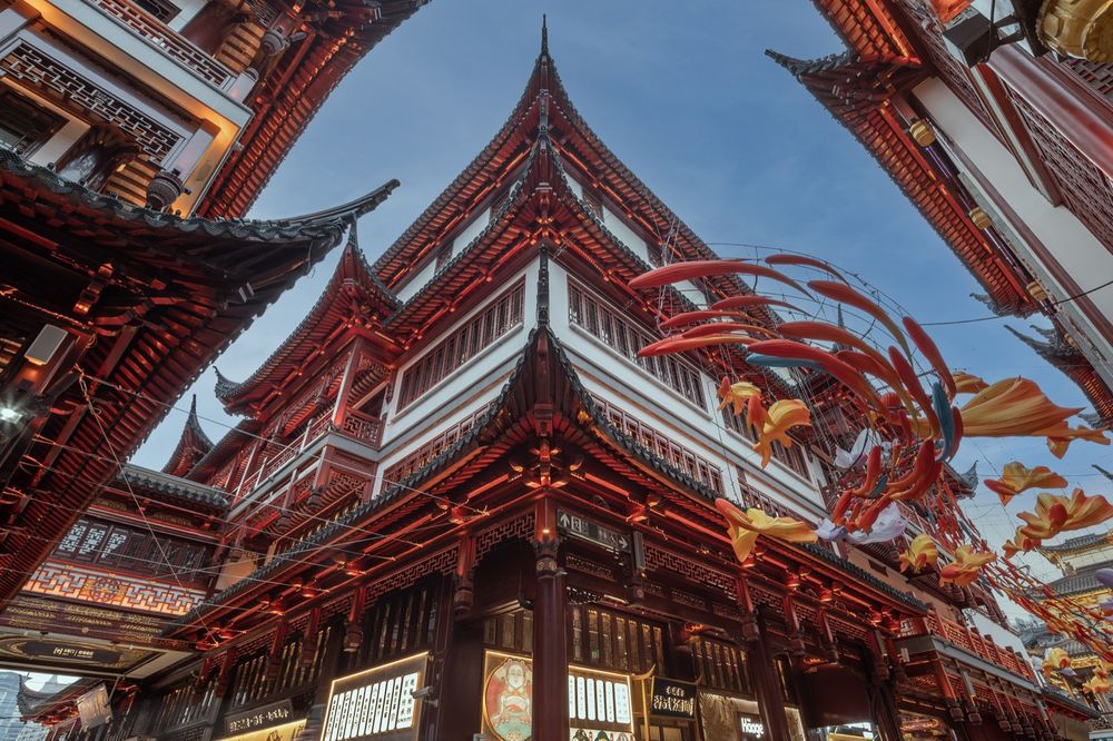
90 年代末独栋造楼形成的豫园商城的建筑格局,在近年来的城市发展和商业模式演进中,空间使用上的局限性日益突出;而过去二十余年的使用过程中,随功能需求改变而逐步发生的局部零敲碎打式的改建,也使豫园商城的整体形象不断受损,亟待改善。
The architectural layout of Yuyuan Commercial Area was originally formed in the late 1990s as a result of individual building development. However, recent urban development trends and evolving business models have highlighted the limitations of space use. Furthermore, incremental fragmented individual renovations over two decades in order to accommodate changing functional requirements have compromised its overall image, which calls for urgent improvement.
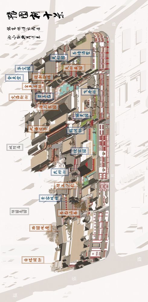
▼《豫园十景图》 ,Ten Scenes of Yu Garden © c+d 设计中心
▼豫园新动线,traffic flow analysis © c+d 设计中心
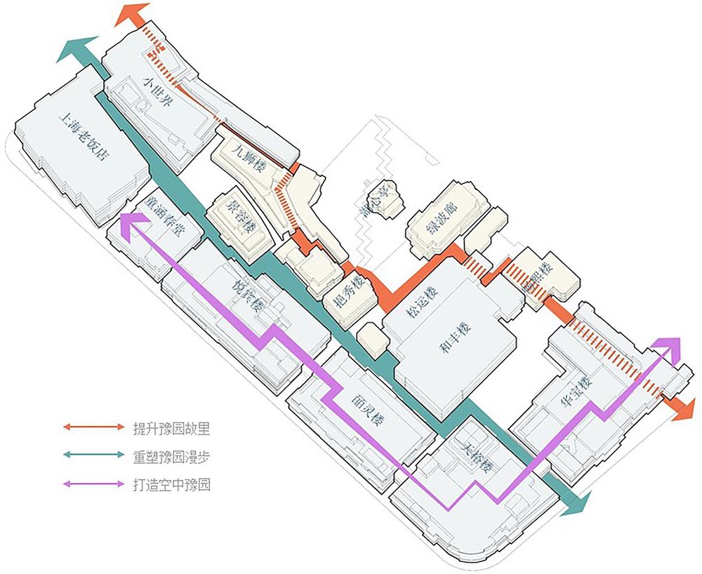
改造前的豫园商城,低区、高区人流分布极为不均。而根据清末至民国时期,湖心亭所在荷花池(即豫园商城与豫园花园相邻的过渡地带)周边商肆历史照片,其建筑高区(即2楼及以上),多有回廊空间,与室外公共空间形成了良好的互动关系。以此为空间原型,在本次提升改造设计范围内,退墙筑廊,开放原本封闭的建筑界面,将建筑内的部分空间共享给城市,以形成立体的城市公共空间,和地面层的街区空间相呼应,同时可以形成空中的商业动线系统,提升高区的商业活力。如此一来,该区域未被充分利用的历史文化、自然景观及商业资源,将得到充分的发掘和激活。以此原则为引导,以打造“豫园旧里”“豫园漫步”“空中豫园”三大主题场景为目标,启动了豫园商城这一轮的改造。
Before regeneration, Yuyuan Commercial Area showed an extremely uneven distribution of customer flows between the lower floors and the higher floors. According to the historical photos of the commercial shops around the Lotus Pond, where the Mid-lake Pavilion is located(the transition zone between Yuyuan Commercial Area and Yuyuan Garden), during the late Qing dynasty to the Republican period, there used to be winding corridors on the upper floors of the building(second floor and above), which established a positive interaction with outdoor public spaces. Taking this spatial prototype as a guide, within the area of regeneration this time, efforts have been made to move back walls and leave spaces for corridors, opening up previously enclosed building facades and sharing some internal space with urban surroundings to create three-dimensional urban public spaces. This initiative aims to form an aerial commercial circulation system to enhance commercial vitality in higher floors while also echoing to ground-level street spaces. By doing so, historical cultural elements, natural landscapes, and commercial resources which have been underutilized in this area will be fully explored and activated. Guided by this principle, Yuyuan Commercial Area launched this regeneration with an aim to accomplish three themed scenes which are “Old Times of Yuyuan”, “Strolling in Yuyuan”, and “Aerial Yuyuan”.
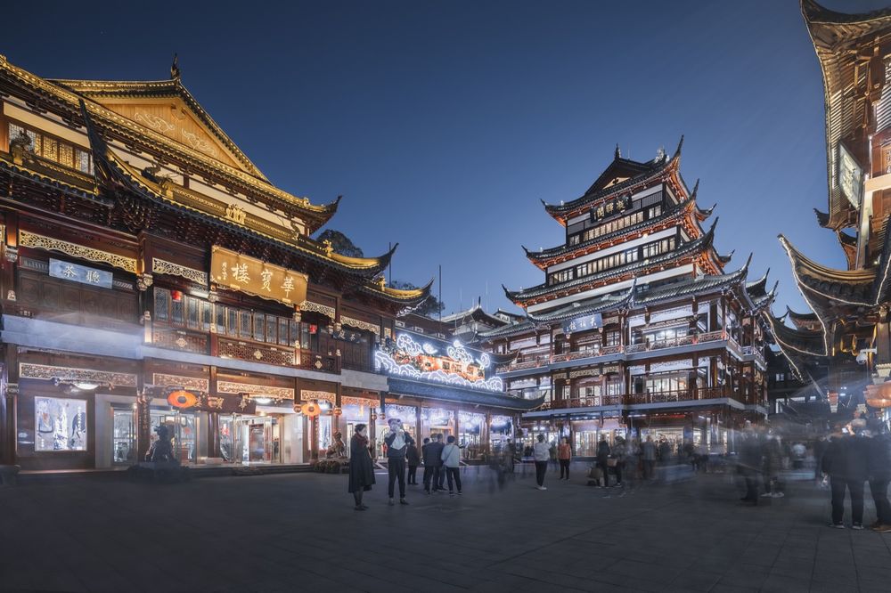
▼高视角,High viewing angle © 寻美影视Xunmei Media

在此整体改造规划设计策略之下,过去几年里陆续完成了对九狮楼、船舫楼、文昌街和老街、景容楼、天裕楼,以及小世界的改造。不同楼栋的现状条件、空间结构、使用定位等设计条件的差别很大。为不影响豫园商城整体运营,设计工作一方面基于总体原则,确保片区具有整体性和系统性,同时也根据不同对象的特点,分别制定有针对性的方案,并择点逐步启动改造工程。
Under guidance of these overall regeneration strategies, various buildings such as Jiushi Building, Chuanfang Building, Wenchang Street, Old Street, Jingrong Building, Tianyu Building, and XiaoshiJie have gradually completed individual renovations in recent years. The differences among these buildings’ existing conditions, spatial structures, and usage orientation are significant. To ensure minimal disruption on overall operations of Yuyuan Commercial Area, the design work has been based on general principles aimed to treat the entire area as a systematic whole while also customizing individual solutions according to specific characteristics of each object, as well as proposing a proper schedule for the whole regeneration project.
▼建筑立面一侧,Facade © DC国际
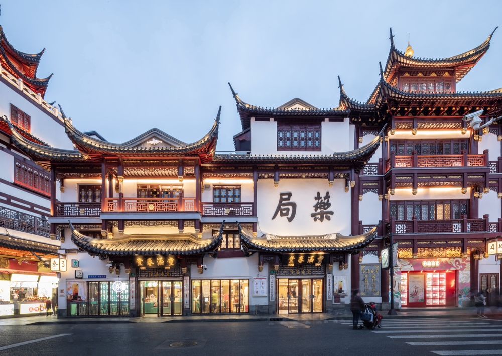
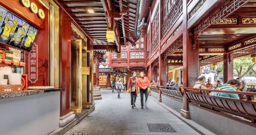
如船舫楼
Chuanfang Building
以保护为主,修复为辅,尊重历史风貌,突出百年老店的精致感,同时整合动线,提升公共空间人流疏导动线。
Emphasis was placed on preservation with restoration being secondary, with respect for historical style and features, highlighting the exquisiteness of century-old shop while integrating and optimizing circulations of public spaces.
▼内部概览,Interior view © 寻美影视Xunmei Media
如九狮楼
Jiushi Building
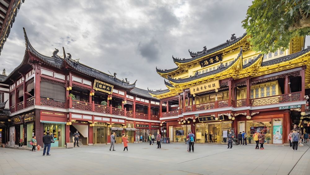
为提升楼栋的立面形象以契合整体规划改造的空间模式,将面对黄金广场的二层立面打开,形成整体二层回廊的空间节点。
▼景容楼、九狮楼面向黄金广场原貌,Original building appearance © DC国际
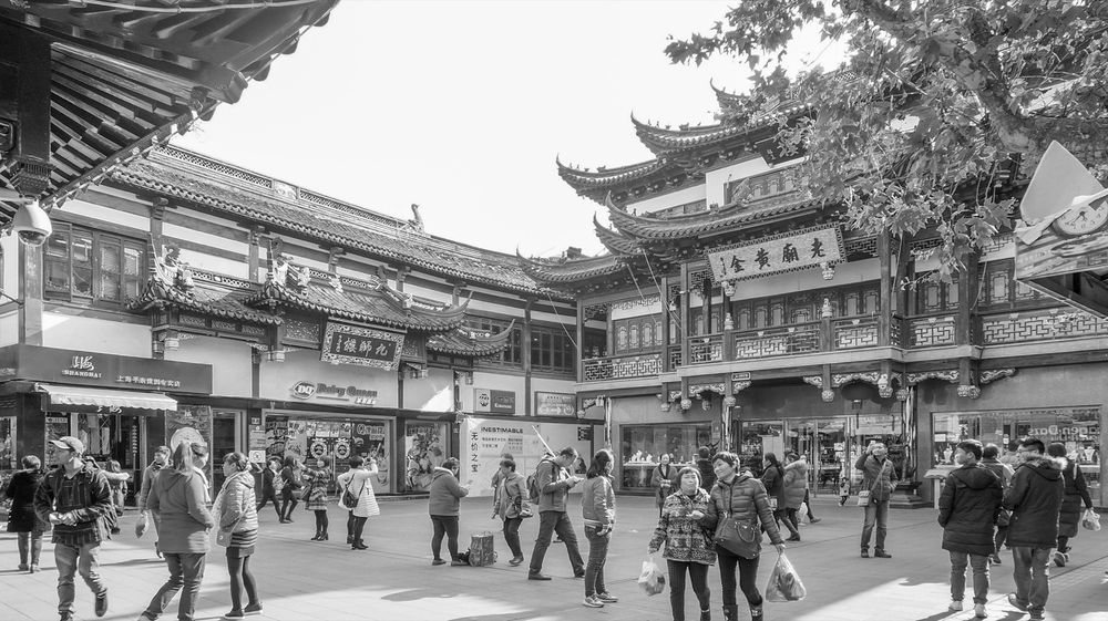
To improve its facade image to correspond to the overall regeneration spatial model, Jiushi Building opened up its second-floor façade which faces Golden Square, creating a space node of the entire second-story corridor system.
▼景容楼、九狮楼面向黄金广场侧,Jingrong Building and Jiushi Building face the Golden Square © 寻美影视Xunmei Media
如文昌街和老街
Wenchang Street and Old Street
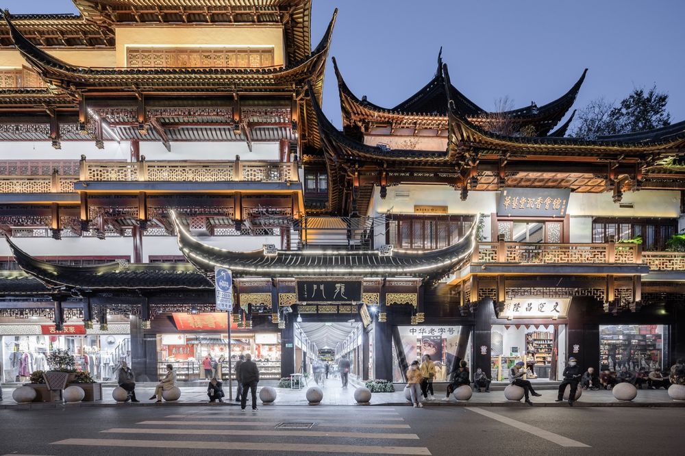
在保持原有街道肌理的原则下,调整街道界面,更新业态,强化每一段街道的差异化体验。
▼文昌街门头改造前原貌,Original building appearance © DC国际

With the principle of maintaining original street texture, the street interface has been adjusted and the commercial format has been updated to enhance differentiated experiences along each section.
▼文昌街门头改造后,Wenchang Street storefront after renovationt © 寻美影视Xunmei Media
如景容楼
Jingrong Building
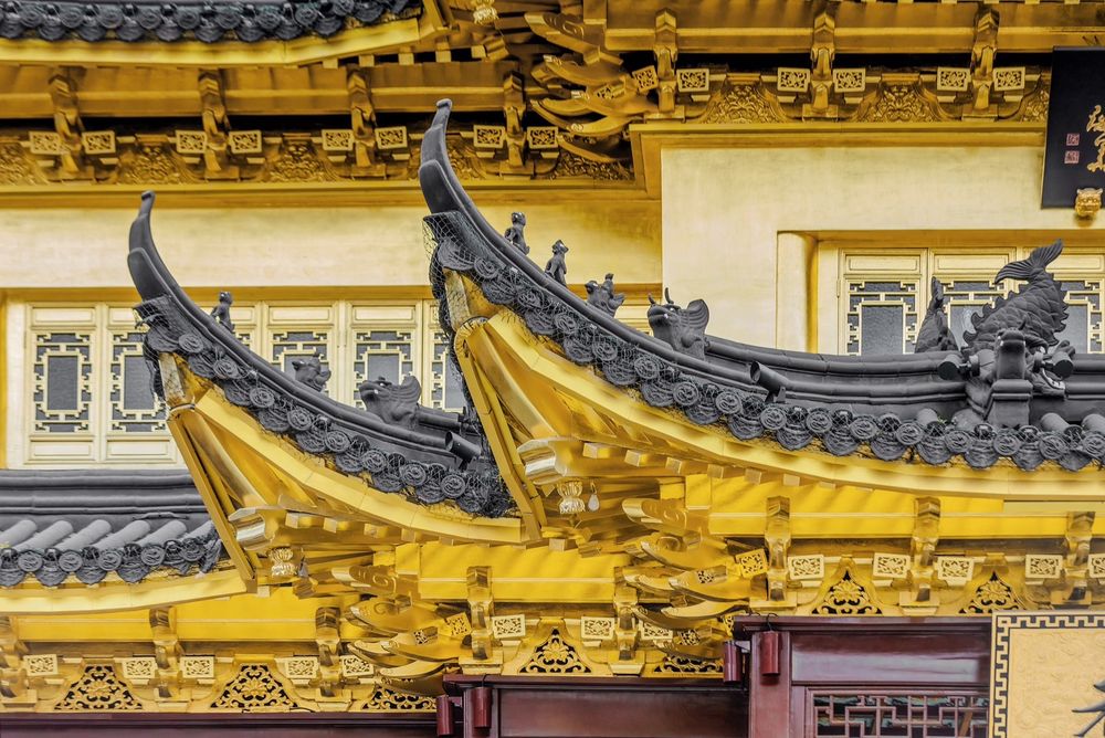
为了契合“老庙黄金”这一著名老字号品牌,强化金店的形象,除了将外廊打开,还将建筑外立面屋檐下部构件与二、三层外墙与窗扇部分贴以金箔,使其真正成为一幢“金楼”。
▼景容楼南侧原貌,Original building appearance © DC国际
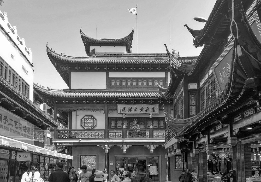
In order to match the well-known old brand “Laomiao Jewelry”, the store image has been improved by way of not only opening up its corridor but also gilding extensively throughout exterior components, making it a true “golden building”.
▼景容楼南侧立面改造后现状,The south facade of Jingrong Building after renovation © 寻美影视Xunmei Media
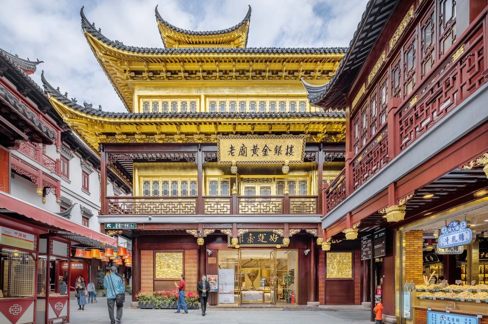
如天裕楼
Tianyu Building
为了强调 “豫园商城”主入口,凸显其在城市道路转角处的建筑形象,将西南角的门头向上抬升1.2m,形成大气的入口节点;面向中心广场的北侧主入口设置门楼,为观赏豫园提供绝佳的视点,同时在建筑的二、三层退墙筑廊,连接华宝楼,形成完整的室外游览路线,提升空间的活力和连续性。一层及二、三层退廊处的建筑立面置换为完整的落地门窗,并饰以金色金属装饰线条,在强化商业氛围的同时,形成传统与现代的对话。其他位置的立面则坚持“修旧如旧”的改造原则,尽可能地保留和再现天裕楼的历史风貌。
▼天裕楼外侧立面原貌,Original building appearance © DC国际
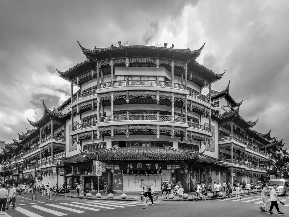
In order to emphasize the main entrance of Yuyuan Commercial Area and highlight its architectural image at the city road corner, the southwest storefront signboard has been raised by 1.2 meters, creating a grand entrance node. A gatehouse was erected at the north entrance facing the central square, providing an excellent observation point for enjoying the view of Yuyuan. Additionally, by moving back walls on the second and third floors, corridors are formed to connect Huabao Building, completing outdoor viewing circulation while enhancing spatial vitality and continuity. On façade of the ground floor and the receding walls of the second and third floors, floor-to-ceiling windows adorned with gold leaf have been used to enhance commercial ambience while fostering a dialogue between tradition and modernity. Other façade adhered to the renovation principle of “Restoring old as it was”, preserving and reproducing Tianyu Building’s historical style and features as much as possible.
▼天裕楼外侧立面改造后,The exterior facade of Tianyu Building after renovation © 寻美影视Xunmei Media
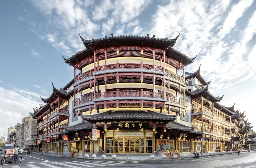
再如刚刚完成的小世界
Xiaoshijie, which has just been completed
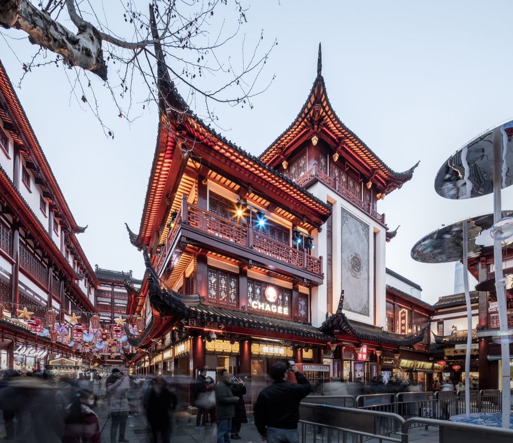
由于历经不同时段改造,原立面元素杂乱,拼凑现象严重。改造方案侧重主次层级的梳理,第一层级通过巨大青石浮雕墙重点强调南侧主入口空间,其他立面则延续与周边建筑风貌相协调的式样;第二层级统一门头及门窗形式,强化建筑的整体性;第三层级限定店招位置,但招牌大小及色彩允许商家有发挥的可能性。通过这种整体构建的逻辑,让建筑的文化性与商业性得到了传承与提升。
▼小世界内侧原貌,Original building appearance © DC国际
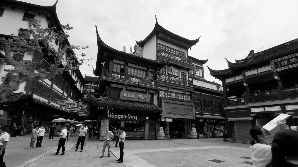
Due to renovations from various stages resulting in disordered original façade elements, the regeneration emphasis was laid on sorting out the primary and secondary priorities. First was to highlight south entrance space by means of a huge bluestone relief wall, while other façade continued styles coordinated with surrounding architectures. Secondly was to unify door and window forms, to enhance overall coherence. Thirdly was to standardize store sign placements, while leaving enough space for merchants to play freely in size and color. Through this holistic approach, the cultural and commercial aspects of the building have been preserved and enhanced.
▼小世界改造后,After the transformation of Xiaoshijie © 寻美影视Xunmei Media
虽然具体手法不尽相同,但均是在尊重上海豫园商城的文化形象的前提下, 参照豫园地区的历史空间形态,因地制宜,进而明确具体的设计改造策略。经过改造更新,片区内的空间体验、建筑风貌与质量均得到整体的改善与提升,也更加符合当下商业的实际需求,为未来的进一步发展奠定了新的基础。
Although specific methods vary, they are all proposed on the premise if respecting the cultural image of Yuyuan Commercial Area, and then clarified according to each individual conditions with reference to historical spatial forms of Yuyuan area. After this regeneration, overall improvements have been made in terms of spatial experience, architectural style and quality, meeting actual demand of contemporary commercials as well as laying a new foundation for further development.
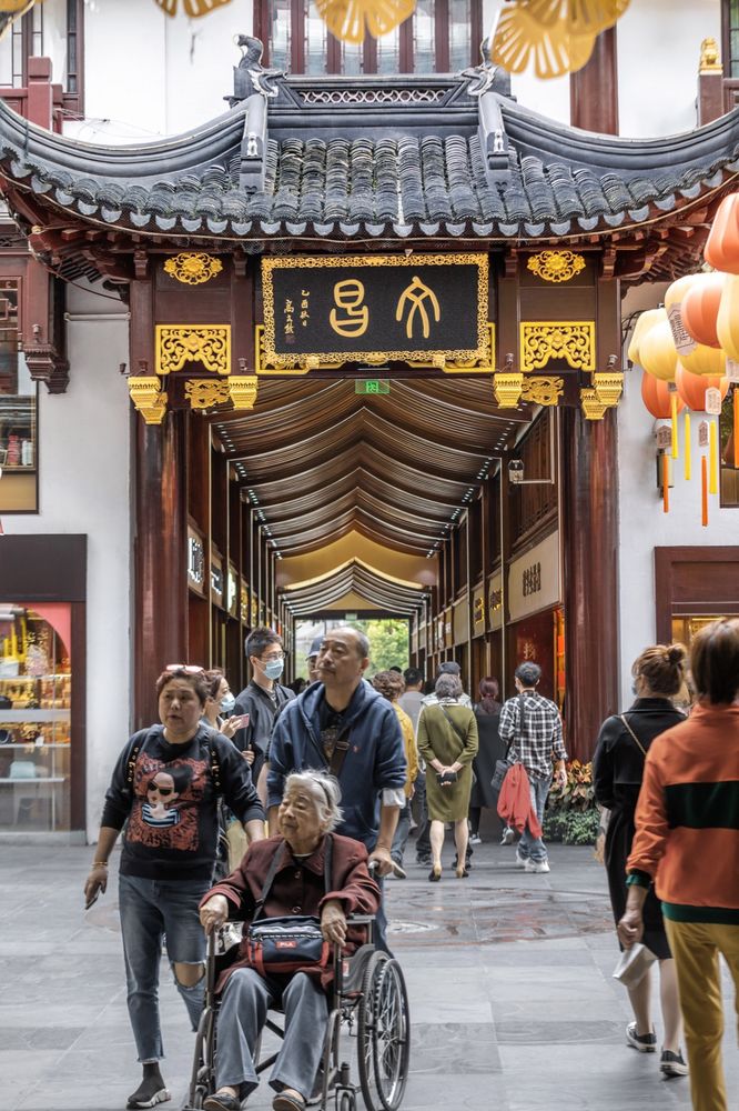
▼建筑细部,Detials © 寻美影视Xunmei Media
项目名称:上海豫园商城改造
设计方:c+d设计中心
项目设计 & 完成年份:2016.8-2023.12
主创及设计团队
“主持建筑师:董屹
设计团队:程久军,王斌,魏烯醇,高阳,张芹,曾鹏飞,李潇,王涵,钟点,李晨皓,张春伟,刘文雯,贺玮玮,毛蓓,拓展,陈佳妮,高盘,祁晓晗,路晨凯”
项目地址:上海市黄浦区豫园街道方浜中路265号
建筑面积:86000㎡
摄影版权(需要在投稿图片中注明每张版权):寻美影视、DC国际
合作方
“施工图:上海康业建筑装饰工程有限公司
结构:上海同大规划建筑设计有限公司
机电:上海康业建筑装饰工程有限公司
泛光照明:上海PINKO品冈照明设计有限公司、上海瑞逸环境设计有限公司
室内:明合文吉、Studio Glam、上海松果创意设计有限公司、黎欧思照明(上海)有限公司(室内灯光)
施工:上海住总集团建设发展有限公司”
客户:复星集团
Project name: Urban Regeneration of Shanghai Yuyuan Commercial Area
Design: c+d Design Center
Design year & Completion Year: 2016.8-2023.12
Leader designer & Team
“Lead Architect: Yi Dong
Design Team: Jiujun Cheng, Bin Wang, Xichun Wei, Yang Gao, Qin Zhang, Pengfei Zeng, Xiao Li, Han Wang, Dian Zhong, Chenhao Li, Chunwei Zhang, Wenwen Liu, Weiwei He, Bei Mao, Zhan Tuo, Jiani Chen, Pan Gao,Xiaohan Qi, Chenkai Lu”
Project location: No.265, Middle Fangbang Road, Yuyuan Subdistrict, Huangpu District, Shanghai
Gross Built Area (square meters): 86,000sqm
Photo credits (needs to credit each): Xunmei Media、DC Alliance
Partners “Construction Drawings: Shanghai Kang Ye Construction & Decoration Co.,LTD.
Structure:Shanghai TONGDA Planning Architectural Design Co.,Ltd
MEP: Shanghai Kang Ye Construction & Decoration Co.,LTD.
Lighting: PINKO Lighting Design, RDesign International Lighting
Interior: Studio MVW, Studio Glam, Kieferzapfen Design, LEOX Design Partnership
Construction: Shanghai Zhuzong Group Construction Development Co.Ltd”
Clients: Fosun
