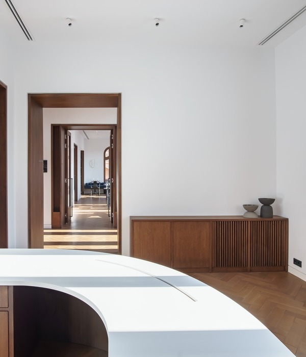
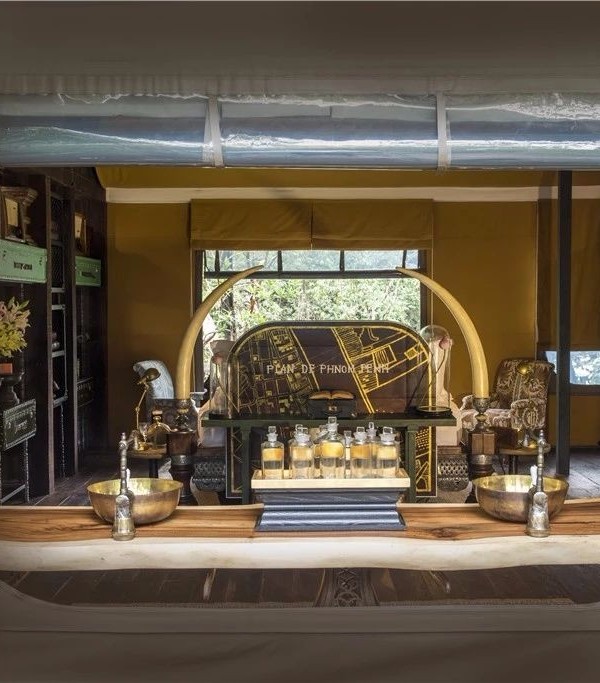
- 项目名称:MQ智能公司研发中心
- 设计公司:CUN寸DESIGN
- 设计师:崔树,王继周
- 设计团队:马川,孔伟青,赵亚
- 摄影师:王厅
- 项目类型:办公空间
- 主要材料:LED线性灯,镀膜玻璃,氧化铝板,乳胶漆
背景|Background
2016年开始CUN 寸 DESIGN试图用不同的设计思考来重新梳理当下各个领域的企业办公空间,由这个契机出发,我们很幸运在两年的时间内设计筹建了游戏领域、新媒体领域、传媒传播文化、互联网、电影视觉科技、地产办公示范区、高科技研发、文化创意等领域企业办公空间。于此同时通过对成绩的梳理,我们也提出了“企业运营空间”这一名词,并展开进一步的研究和探寻。当AI及智能机械的进步不断改变着我们的生活,我们也希望我们能通过设计来和这样的企业有一个全新的对话和沟通。恰巧,2018年初我们接触到了一家研发智能机械臂的公司,于是我们开始了一个新的挑战。
Since 2016, CUN DESIGN has been trying to explore corporate workspace design in a wide range of areas, and so far has completed plenty of offices for companies involved in different fields, including games, new media, culture communication, internet, film and visual technology, real estate development, high-tech R&D, as well as cultural and creative industry, etc. Based on practices in this regard, we put forward the concept of “Corporate Operation Space” and have been conducting further researches on it. As AI and intelligent machines constantly advancing and changing our life, we have been seeking for cooperation with companies engaged in this field. Fortunately, MACQUARIE, a firm dedicated to research and development of robotic arms reached out to us to reimagine its R&D Centre. For us, it’s a fantastic opportunity, though accompanied by challenges.
▼入口处,entrance area
困难|Challenges
首先我去到了这家公司的研发中心现场,位于朝阳门SOHO的一处400平米的办公环境。空间是由3个独立的单元合并而成,众所周知,由建筑师扎哈主笔的建筑外形炫酷且形式感十足,同时也是朝阳门一带的地标,但是对于室内设计来说由于追求建筑造型而带来的相对异形的室内空间,就成为我们做设计首要面临的问题。
At the beginning, we visited the original R&D Centre, a 400-square-meter workspace consisted of three independent spatial units. It is situated in GALAXY SOHO, a landmark designed by Zaha Hadid Architects. The overall architecture features special and striking shapes, which resulted in irregular plan of interior spaces, hence bringing difficulties to our work.
▼弧线形的结构,curved shape
第一:整个平面处于一个弧形区域基本上没有办法寻找一面相对平直的墙面,也很难切分比较完整的方形空间。
第二:整个平面位于一个扇形的区域内,所以安排相应平直有限的动线来分离空间就显得更加的不容易,但是这又是我们在处理任务时不能回避的问题。
第三:地处成熟的写字楼内,大厦的顶面空调设备,以及现有的建筑大梁,让空间内的天花层高及其复杂,最低的地方只有2100mm。所以怎么在小空间处理顶部的杂乱到有序,是我们面临的第三个问题。
综合以上难点,我们带着创始人期待的眼神,开始烧脑了。很不幸的是,这一次我在推倒自己重来的路上,久久不能找到一个好的方法。于是有一段时间我们自我否定了将近20稿内部方案,总觉得还是有点复杂了。
First of all, the plan has a curved shape, so it was hard to find a straight wall or divide the overall space into several square ones.
Besides, the fan-shaped plan also made it difficult to arrange straight circulations to partition the space. It was a great challenge which we had to solve.
What’s more, the ceiling air conditioning and beams caused a relatively low ceiling height, only 2.1 meters in some parts of the space. So dealing with the clutter of the ceiling in the relatively small space was also an arduous task.
After identifying these challenges, we worked to figure out solutions. However, things didn’t go very smoothly. We overturned nearly twenty design schemes and still couldn’t find an ideal one, because we thought they were a little bit complicated.
▼入口前台区域,reception desk at entrance area
▼从前台区看入口背景墙,view at reception area to the background wall
Inspiration灵感
在我寸步难行的时候另外一个工业设计打开了我的思考。我是一名骑手,最关心的就是MOTO车,在2016年宝马发布了一辆概念电动MOTO,这辆车有三个特点:
1.没有传统机器,所以改变了整车架构的重组形式;
2.选用当下最流行的材质,重新定义产品气质;
3.结合科技和互联,让机车的使用性质发生了新的变化。
我也超爱那条穿过整部车的橘色光,即打破了机车的传统结构,又重构了机车的结构。一条光,穿过空间和所有问题。于是我打算用打动我的设计去打动别人。
I like riding, and pay great attention to motorcycles. As we were stuck with the design solutions, an electric motorcycle concept unveiled by BMW in 2016 enlightened me. The motorcycle has the following three characteristics:
– Using no traditional machines, which changed the way of assembling and restructuring the whole motor;
– Utilizing the most prevailing materials to redefine the product;
– Combing technology with interconnection, which brought some changes to the functions.
I really love the orange element of it, like a light, stretching through the whole body of the motor, and breaking the conventional structure of motorcycles. A beam of light can pass through the space and solve all the problems. So I drew inspiration from it, hoping to create an impressive workspace.
▼进入内部的走廊,corridor to the interior
成型|
Realization
1.首先我们学习宝马的设计思路,让空间的诉求进行重新的结构组配,夸大不太好用的弧形空间,使用它本来就有的特点来营造会议和讨论区。
用相对平直的空间来切分一些必须的办公室。利用中间无边界区域的核心制作一个方形的开场办公区,保证办公家具的合理模数化排布和最好的办公面积。同时由于这个方形空间的出现,让四周重构了我们需要的环形通道,并且环形通道又单独行成4个不同的使用功能。这个方形办公区成为整个办公的核心区域,反而是由此开始像四周扩散完成了整个布置。
▼夸大弧形空间,exaggerated the curve shape
▼设计部,design apartment
▼空间呼应的灯具家具,light and furniture echo the space
1. Learning from BMW’s design idea, we firstly rearranged the layout of the space. We made use of the unique features of the curved spaces and endowed them with the functions for conference and discussion. And at the areas with more regular shapes, we split out several offices. At the middle of the overall space, we designed an open square working area, with the office furniture arranged in a modular way, which ensured a comfortable working space for the staff. Around this square working area, we restructured four necessary circular passageways. Each was given other different functions. It was from this core square area that the spatial layout of the office was completed.
▼利用相对垂直的空间作为办公室,regular shaped space used as offices
▼大办公区,large office area
▼独立办公室,individual office
2.剪裁掉的一些狭小空间,故意被我们安排成了前厅和走廊。重点是我们又重新梳理了进入逻辑,让每个人的进入过程都是从一个相对密闭而狭小的空间慢慢进去的,也让空间自带惊喜和获得感。即便如此,我们还是花了大量的时间去思考平面,让最好的采光完全落在了所有办公人员的位置。
2. For the narrow spaces left, we turned them into the foyer and corridors. And most importantly, we redesigned the circulation of entering the office. The space is enclosed and narrow at the entrance. But as going further in, it becomes more open, filled with surprises. We spent lots of time thinking about the plan, with a view to letting the daylight completely fall on each staff’s working position.
▼最好的采光落在所有办公位置,let the daylight fall on each staff’s working position
3.同时我们也感谢了灵感来源-那辆车。整个空间运用了机械设计的材质感,有灰色的金属感,半透明的玻璃感觉,灰色带来了不锈钢及塑料的现代感。
3. Besides, we also honored the source of the design inspiration – BMW’s electric motorcycle concept. The entire space features textures similar to that of mechanical design works, with translucent glass, gray metals, stainless steel and plastics, very modern.
▼半透明玻璃,translucent glass
▼灰色金属,grey metal
4.最后我用我最爱的那道橘色的光,做了一条完成导引和解决照明的光,这条光不拘谨也不做作,它没有故意去核算对称和位置,而是很随意的从入口处就进入,然后按照它自己喜欢的路径去穿透和路过了整个空间。我觉的它更像是这个空间里的一种精神 。
4. At last, I integrated the orange light that I love the most into the space. Its position was not identified through careful calculation. It starts from the entrance, leads to all areas and runs through the whole space freely, creating a free atmosphere in the office.
▼穿透整个空间的橘色光带,orange light pass through the whole space
很高兴能在另一个优秀的跨界设计作品中找到灵感,变成我们的思考方式。我想这也是一种缘分和一个新的工作方法。用一条光贯穿空间,完成所有,同时也感动了创始人,MQ的张总也很喜欢这条橘色的光,于是在最新的产品中,她们也加入了这条橘色的设计。这是最好的感谢,也是最好的传递。
We are gratified to draw inspirations from an excellent work from other design fields, and see it as a new approach for our interior design practices in the future. The founder of MACQUARIE was very impressed by the orange light passing through the office, so the company utilized orange elements in their latest product. For us, it’s the best reward.
▼项目分析图,project analysis
▼平面图,plan
Project information|项目信息
Project Name|项目名称: MQ智能公司研发中心
Project Location|项目区位:北京朝阳门SOHO-C座31007-31010
Project Area|项目面积:420㎡
Design Company|设计公司:CUN寸DESIGN
Designer|设计师:崔树、王继周
Design Team|设计团队:马川、孔伟青、赵亚
Photographer|摄影师:王厅
Design Type|项目类型:办公空间
主要材料:LED线性灯、镀膜玻璃、氧化铝板、乳胶漆
完工时间:2018.01
Project name: MACQUARIE R&D CENTRE
Area: 420 sqm
Location: Room 31007 – Room 31010, Building C, GALAXY SOHO, Beijing, China
Category: workspace
Interior design: CUN DESIGN
Designers: Cui Shu, Wang Jizhou
Design team: Ma Chuan, Kong Weiqing, Zhao Ya
Photographer: Wang Ting
Main materials: LED light bars, reflective glass, anodized aluminum plates, latex paint
Completion time: January 2018
{{item.text_origin}}

