Whitworth Locke is a 160 room hotel with a bar, cafe, lounge and co-working space at the ground floor that we designed in Manchester, England. This adaptive reuse project was an addition, complete gut renovation and comprehensive fit out of a collection of three linked buildings on an island site in Central Manchester with elevations on Princess Street, Whitworth Street, and the Rochedale Canal.
The hotel is comprised of three linked blocks, Heritage assets all, that were built in separate phases: Central House, Dominion House and Johnson House. This commission had special resonance for us as the beautiful former textile warehouses and showroom were highly reminiscent of some of the earliest work we did designing interventions to 19th century masonry buildings — functional and stylistic contemporaries to these Mancunian structures — in our native New York City. The proportions, materials, textures and quality of light we inherited felt a bit like home and demanded to be exalted.
Our alteration of the property was principally driven by the intent to preserve and celebrate the richness of the historic 19th Century building fabric whilst obliterating a poor previous alteration to the building from the 1980’s, all while creating a distinct new language commensurate to the new life and purpose we hoped to foster within. We paid special attention to the thresholds into the building and the dialogue between our interventions and the beauty of the Victorian blocks.
At the center of the three blocks we removed previous alterations and simplified the glazed barrel volume of the atrium to maximize transparency of the assembly and in turn reestablish the vestigial visibility of the elevations of Central and Dominion Houses on to what was formerly a little road called Galbraith Street. We finished the structure in color we found tonally close to Manchester skies, and as such regressive, deferential to the both the prominence of the historic facades and all we designed within. We put in a floor — contiguous both inside and out — of granite block pavers that draws in passerby and guests alike, the new life and conviviality clearly legible to the street. These choices set the stage for our larger approach of maximizing light, texture and crafting an interior throughout that extolled the virtue of the heritage assets via studied contrast.
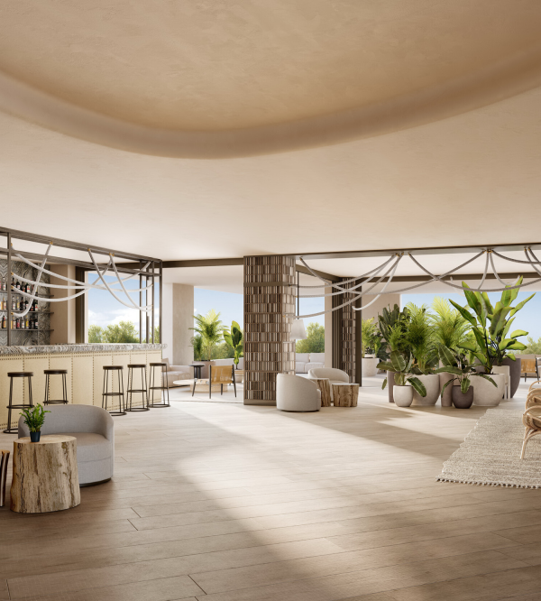
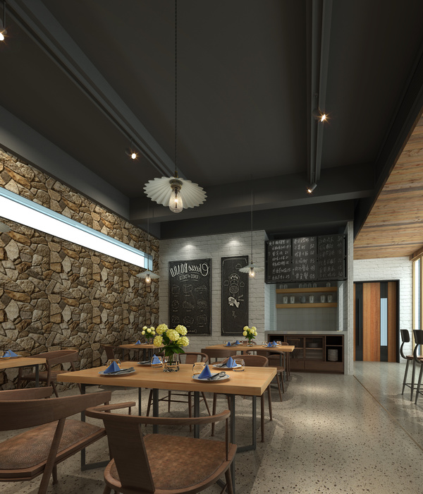
Our aim in fostering tension between our new interiors and the stolid bones of the Victorian fabric was for one to exalt the other. We seized upon a palette and language inspired by research into vintage visual communications promoting commercial industrial links that historically connected Manchester to far flung (and often warmer and brighter) corners of the globe. We loved the link between Merseyside and the equatorial, and as we designed most of the furniture and all of the joinery in the project, we took this as inspiration for both material and formal choices.
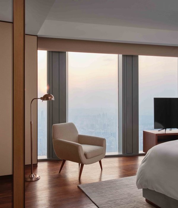
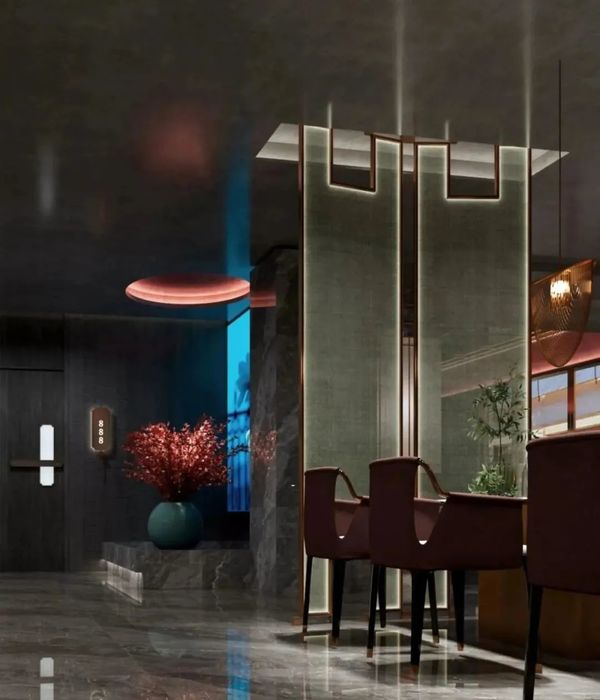
We designed the lighting and crafted the palette of warm materials and tones that at once envelop occupants and maximize the impact of the texture and rustication we both discovered and created throughout the property. We like to think we were just deferential enough to the heritage and beauty of the existing buildings, but there is an unabashedly new and bold language to the project. This conspicuous evolution reflects the way Manchester continues to grow and change. We hope our addition to this city can catalyze the dynamism we found up North that so inspired us.
{{item.text_origin}}

