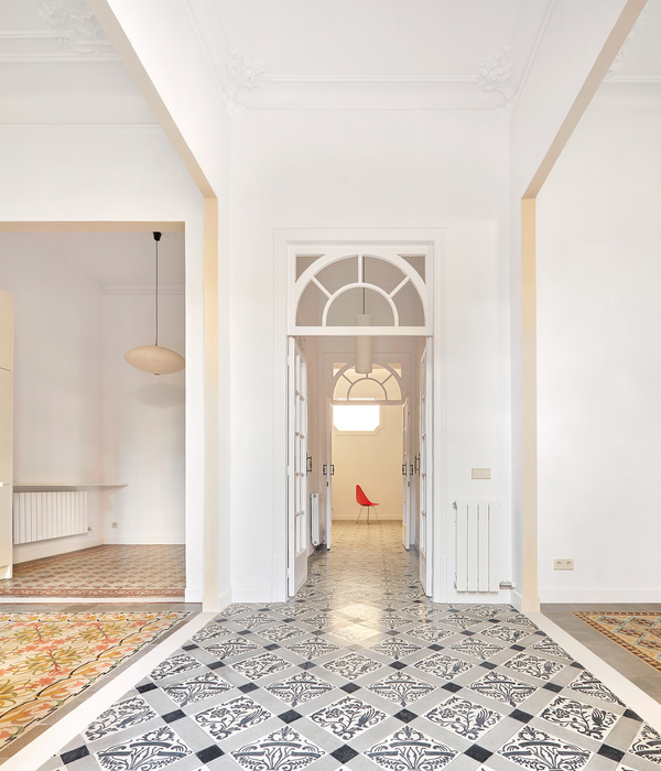
The main idea of the project can be called ” space inside”. It was interesting to find a non-standard format, you can even say "not earth” while remaining within the idea of”home comfort". These concepts, which are somewhat contradictory to each other, became the starting point for the development of the idea. We also wanted to emphasize the scale of the room, to make you feel its height.
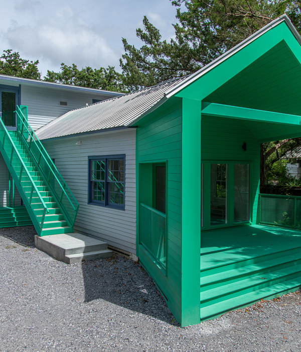
The color palette is maximally concise - there are three main shades-graphite, warm white and green. This allows you to emphasize the graphic solutions that are embedded in the interior concept. It is based on a complex, green shade. Through it, we wanted to emphasize the connection of abstract forms with the familiar world that surrounds us.
In this project, we are happy that we managed to implement one of our favorite techniques - connecting different planes - 2 D and 3 d. When the graphics, the drawing becomes a volume, and architectural solutions become part of the overall picture. I like that I managed to create an interior as a complete art object, as a single organism, where there is a sense of flow and interconnection. Well, the most important thing is that despite many problems in the construction process, the final result is as close as possible to the idea that was conceived.
{{item.text_origin}}

