Architects:5ft2 Studio Architects
Area :70 m²
Year :2014
Photographs :Sonia Mangiapane and Peik Li Pang
Manufacturers : Mosa, Xinnix, AlcoaMosa
Structure Engineer :Pieters Bouwtechniek
Architect In Charge : Peik Li Pang
Construction Cost : 160,000 euro
City : Amsterdam
Country : The Netherlands
This is an upwards extension atop an existing two-storeys terrace house located on an artificial island built in the IJ Lake of Amsterdam. The existing narrow and long typology was catering for starter family to be able to start small and extend in the future. Programmatically, for a family with 3 children, the parents would like the extension to a quiet duplex loft primarily for themselves, in which containing second living room, master bedroom and an office.
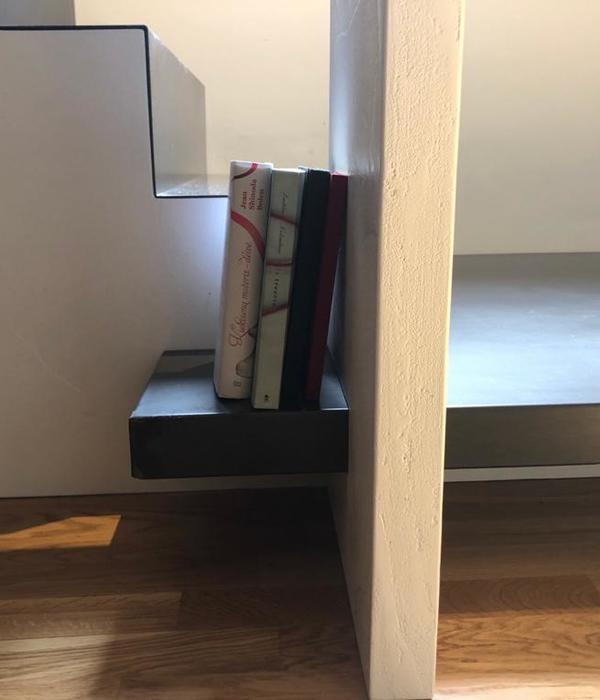
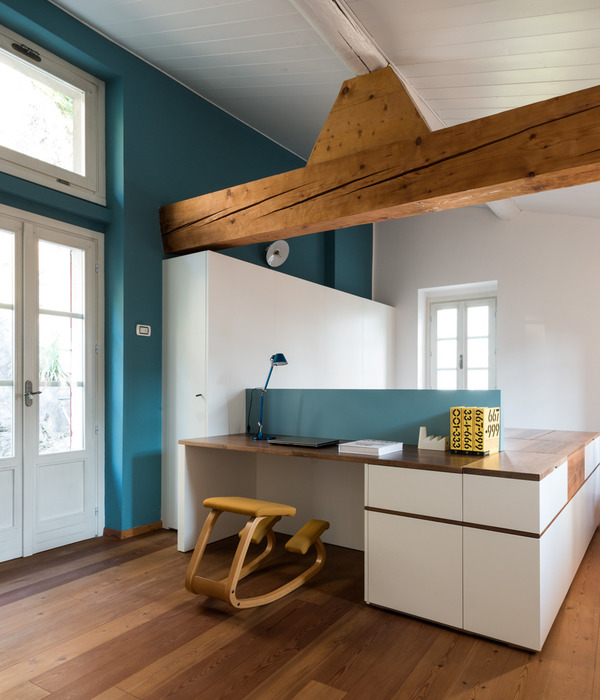
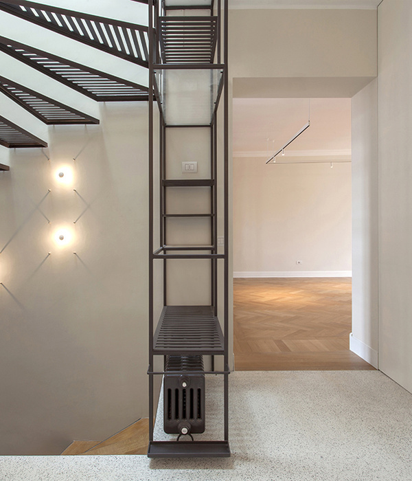
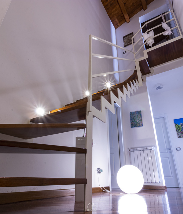
The design’s response to the programs and compact footprint was to create economically maximize functionality by employing open, shared and interconnected spaces and to create illusion of spaciousness by playing of volume and light. The master bedroom is placed facing the street, made as compact as possible to allow a generous living room facing the garden. The supporting spaces- en-suite, mini-library and staircases were designed for high dimensional efficiency, all these spaces are arrayed within a narrow width of 4.5m in the middle zone, this was made possible by integrating the bookshelves with the 2-storey staircases, turning both the circulation and the staircases into 3-storey mini-library and also turning standing space of the bathroom as circulation.
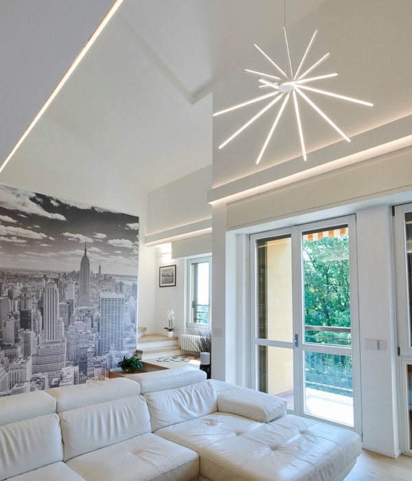
To further accentuate multi-functionality and spaciousness, spaces are demarcated only by trackless full height sliding doors, this enable the play of space changes- completely open floor or defined closed rooms.The North-west garden facing living space is designed with double volume and generously sized glass windows. The sky scenes, changing with the time of the day, and season, wash right through the ceiling height opening of the middle zone to the master bedroom on the opposite end. The 4th floor was designed as an office space, enjoying air and light from the double volume living space and the terrace facing the street.
There were challenges to build within standard construction cost, extra effort were put in talking to manufacturers to accommodate modification to their pre-fabricated standard product in order to achieve slimline details and high dimension efficiency. The solid Oak staircases are one of the results, they are standard factory cut that were modified slightly to integrate 3-storeys bookshelves. On the other hand, on site construction dimension and details were also designed to fit into standard off-the-shelf building products, as though the building products were custom-designed to fit perfectly to the project
There are total 4 units of this starter typology in the row and this project is the last extension to take place. Considering sandwiched in between earlier extended neighbors, a subtle yet outspoken approach was taken to blend the extension into the existing terrace houses architecture. On the street fronting, the façade is the duplicate of the neighbors’ to keep the consistent urban language. Whereas on the garden fronting, while applying the same materials and details to keep the coherency let the façade speaks for the space behind it, the space in which is atypical and bold to typical terrace houses.
▼项目更多图片
{{item.text_origin}}

