Architect:iarchitects
Location:Trezzo D’adda, Italy
Project Year:2015
Category:Restaurants
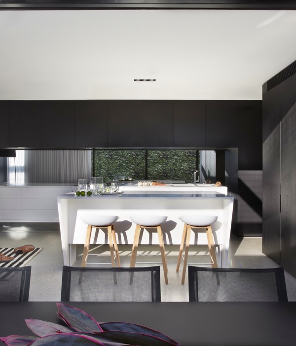
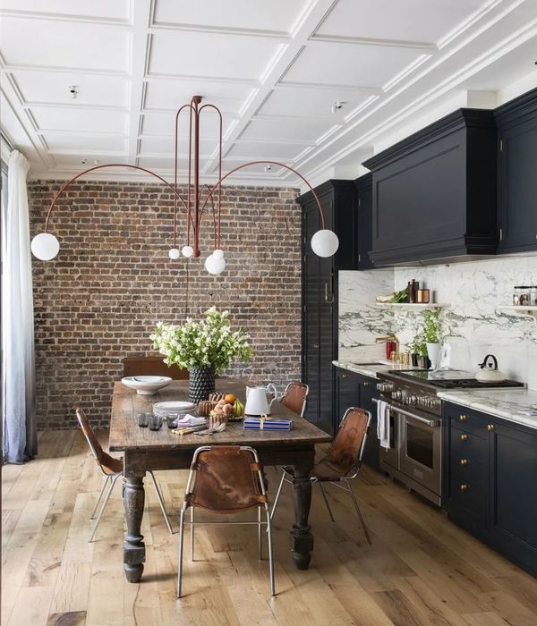
iarchitects designed the new restaurant PCube Trezzo D’adda. The project is a conversion of an old building at the terminus of the line ATM Milan Trezzo that housed the restaurant and guest house for the employees of the railway end of ‘800 in a cozy and informal, that maintained the convivial vocation of the old building. The space was transformed by combining the premises of the old working men’s club, and preserving the subdivision in three different environments, which can be declined in different uses room, take away, aperitif and dinner. The entrance is defined by great bar counter with high chairs and stools and a long table; The next two rooms are home to smaller tables and a seating area with sofas and armchairs vintage. The environment is characterized by the use of traditional materials such as wood, used for vertical cladding (the bar and the wall opposite the kitchen) and furniture, and iron. During the restoration works have been recognized and highlighted the original wooden ceilings, hidden by false ceilings in plaster and wattle. The tables were handcrafted by the two brothers Nicholas and Jacopo PEPE members of local GEORGE PEREGO chef, who reused old boards of the existing building.
The elements iron furniture, in particular stools and hanging lamps, take up the elements of the front door in Ferrofinestra evoking the industrial past of the building.
The material used to cover the floor and the horizontal plane of the bar counter calls the breccia which is typical of buildings in Lombardy The wall of colored cement tiles as a backdrop to the small sitting emphasizes the vocation of the local vintage. The outdoor area with a large terrace, is fitted with padded seats and soft lighting.
iarchitects also dealt with the brand’s design and coordinated image, choosing a minimal graphic line for the sign and the series of accessories (mats, doggy bag, take away containers, bottles)
“There we found, as often happens, a charming historic building, hidden behind rearrangements that over time, they had the appearance change,” said architect David Cumini. “The idea was to restore the spirit of the place, working on some important characters that tell the identity. For example, we removed the plaster ceilings, covering the original wooden framework, to find the ancient beauty: now follow one another three spaces marked by the history of the ceilings, that create a path to do with the nose.
We wanted to make explicit references to the past also used materials, such as the floor covering and the floor of the bar, which recalls the breccia typical of buildings in Lombardy. Or the great wall of colored cement tiles that leads to the kitchen: The entire The venue was transformed following an interpretation almost melancholy of old haunts after work. “
▼项目更多图片
{{item.text_origin}}

