Architects:Dominique Coulon & associés
Area:5458 m²
Year:2022
Photographs:Eugeni Pons
Structural Engineering:Batiserf Ingénierie
Acoustics:Euro Sound Project
Assistant Architects: Lukas Unbekandt, Thibaut Muller, Diego Bastos-Romero, Olivier Poulat
Project & Site Supervision: Hugo Maurice
Electricity: BET G. Jost
Fluids Engineer: BET Louis Choulet
Economist: E3 Économie
Scenography: Atelier Sophie Thomas
Landscape Architect: BRUNO KUBLER
City: Rennes
Country: France
The cultural hub Antipode is constructed in the new concerted development zone of the eco-district of La Courrouze, two kilometers away from the historic center of Rennes with very good tramways and soft mobility connections. Urban planners Secchi and Vigano organized various programs like large islets flooded by vegetation. The site is a vast territory on which were historically armament factories. To make its memory last, some walls have been preserved as well as large trees that punctuate the horizon.
The project is part of a very open urban landscape. The building is flooded with greenery in this wooded universe, a phenomenon that will increase with time. The structure will reveal itself through the large oak trees, a filtered vision through the canopy. Like a castle in its park, the building, as if concealed, will emerge through this vegetal universe.
For this wealthy program, the objective was to weave relationships between very different architectural elements.
The agora connects blocks as different as a current music scene, a media library, music rehearsal spaces, a Youth cultural center, music and recording studios, dance rooms, and a creation and rehearsal space. The challenge was to bring them all together while taking advantage of the unusual proximity of such cultural services.
Around a central agora with an added patio, the spaces are intermingled, and fused to connect the plan's elements intended for public use such as the bar, the exhibition space, or the conference room. The building covers the site generously and occupies the entire plot. The spaces seem to be positioned side by side with no apparent hierarchy.
The project is drawn like an extended and compact mass from which the empty spaces have been removed. The natural light irrigates the spaces thanks to the four patios and some terraces. The visitor is constantly drawn to these interior exteriors which stand as landmarks. The empty zones visible in the sectional arrangement and the numerous sectional drawings create micro-spaces.
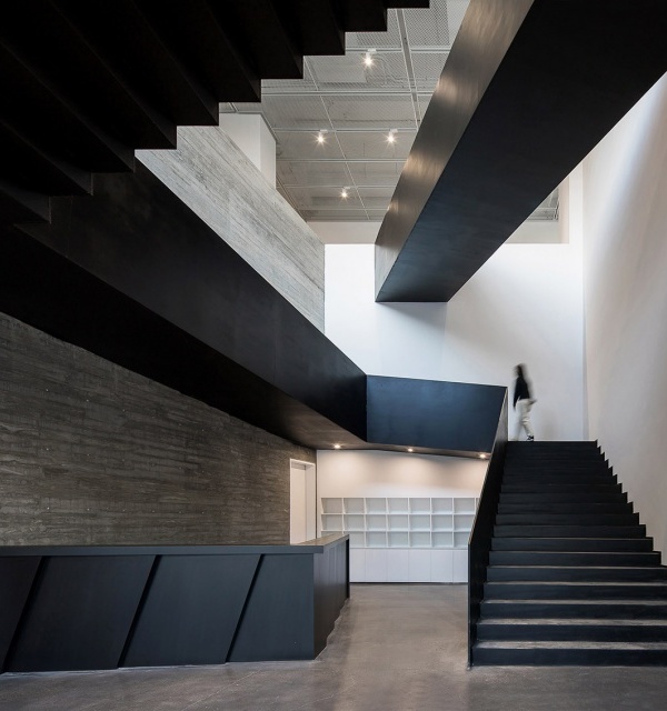
The almost maze-like layouts reveal the complexity of the interweaving programs and their layers. Like a Raum, the unusually scaled plan emphasizes an apparent absence of hierarchy. The crossings and intertwining paths are aimed at better highlighting the programs.
Here is an architecture of the interstice, an architecture of the crevice. On the outside, the black mass of the building contrasts with the luminosity of the interior spaces. The media library catches the light on all four sides as if it were evading from this thick, compact mass.
{{item.text_origin}}


