PaperGames HQ Office | 灵活办公空间设计
Architect:UStudies Architects
Location:Shanghai, China
Project Year:2021
Category:Offices
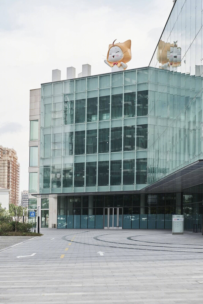
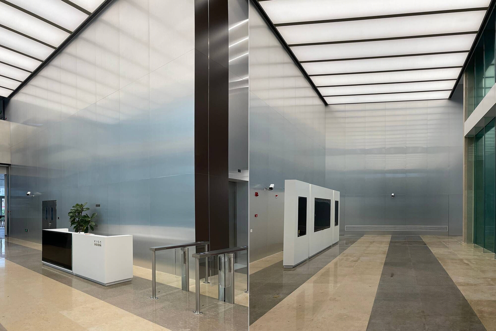
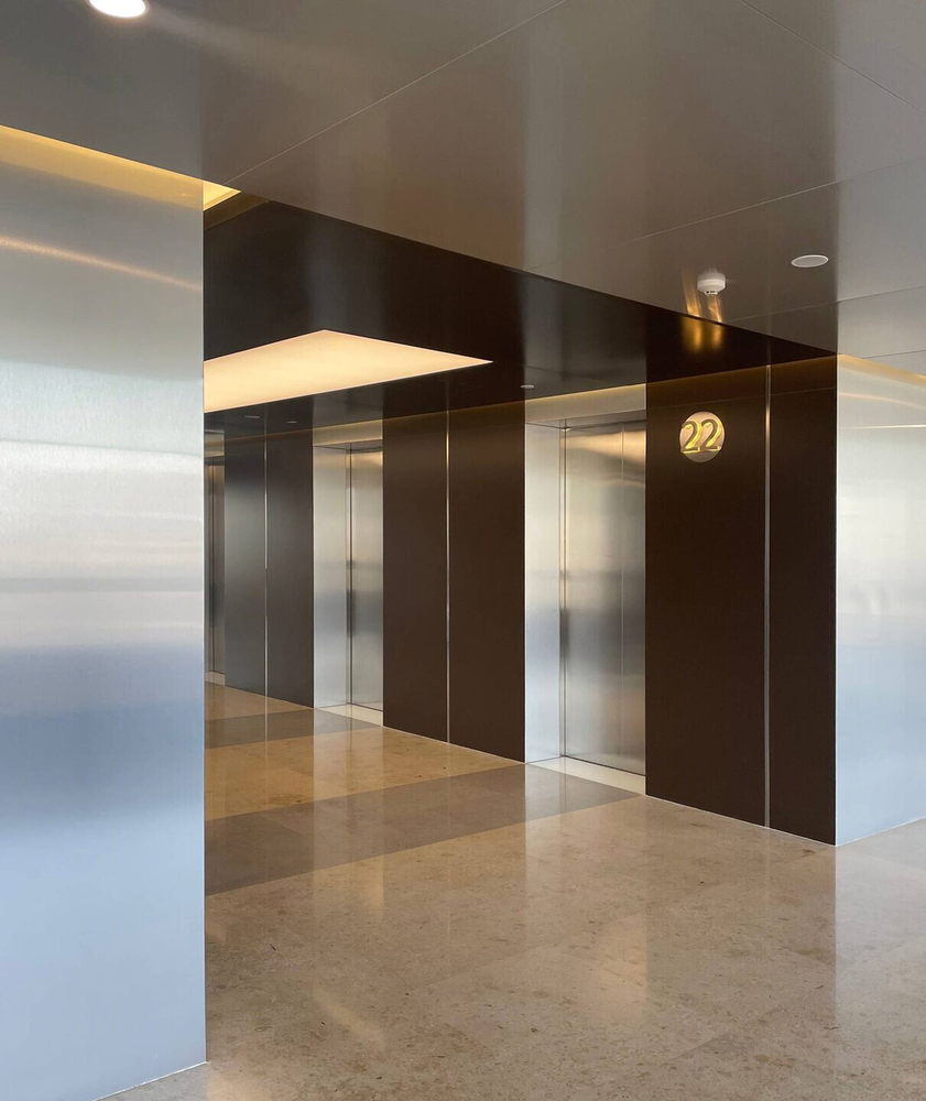
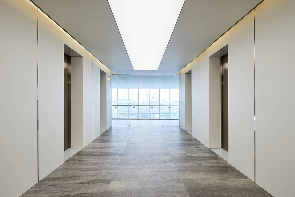
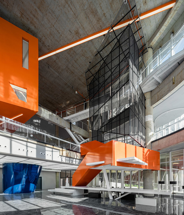
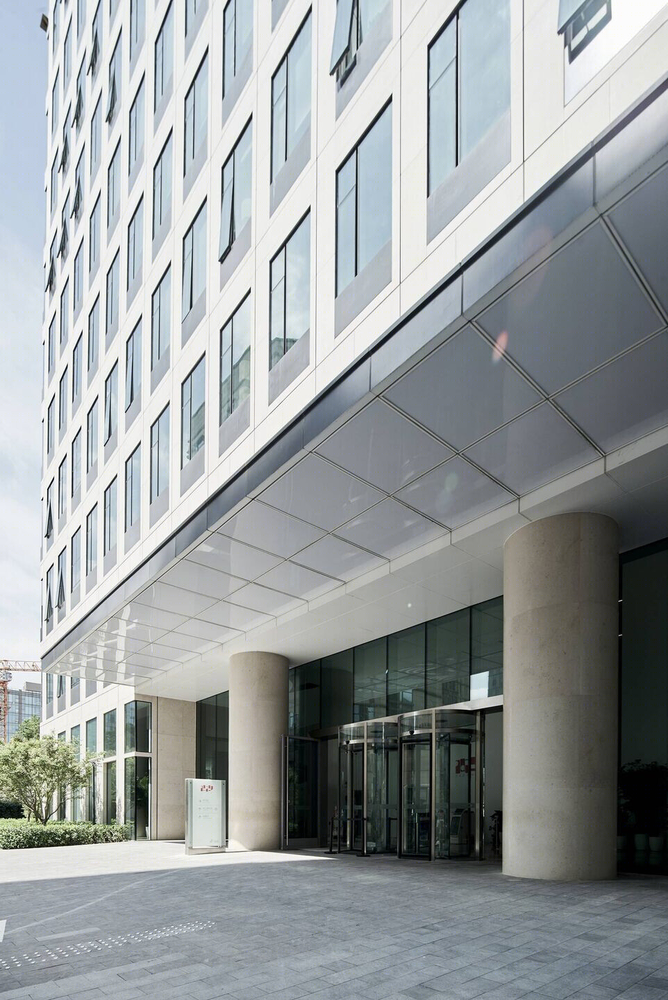
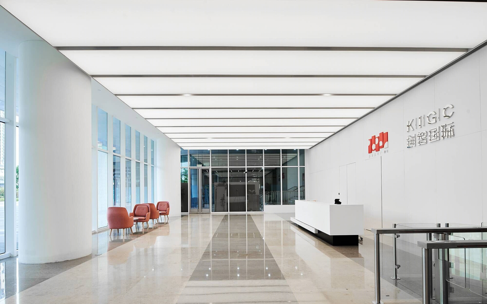
In the overall planning of the building, there are two main entrances from the north and the south, and the floors are divided into high and low elevator areas, with the 15th floor as the dividing point according to the pedestrian flow measurement. The following six bases are set as public cores in-floor function planning, including external reception and interview areas and internal training, dining areas, post offices, and leisure and sitting areas. In the pre-design stage, the design team spent more time communicating with 22 departments and the project team, hoping to ensure that each floor could meet their individual needs in terms of function.
Erik Ho
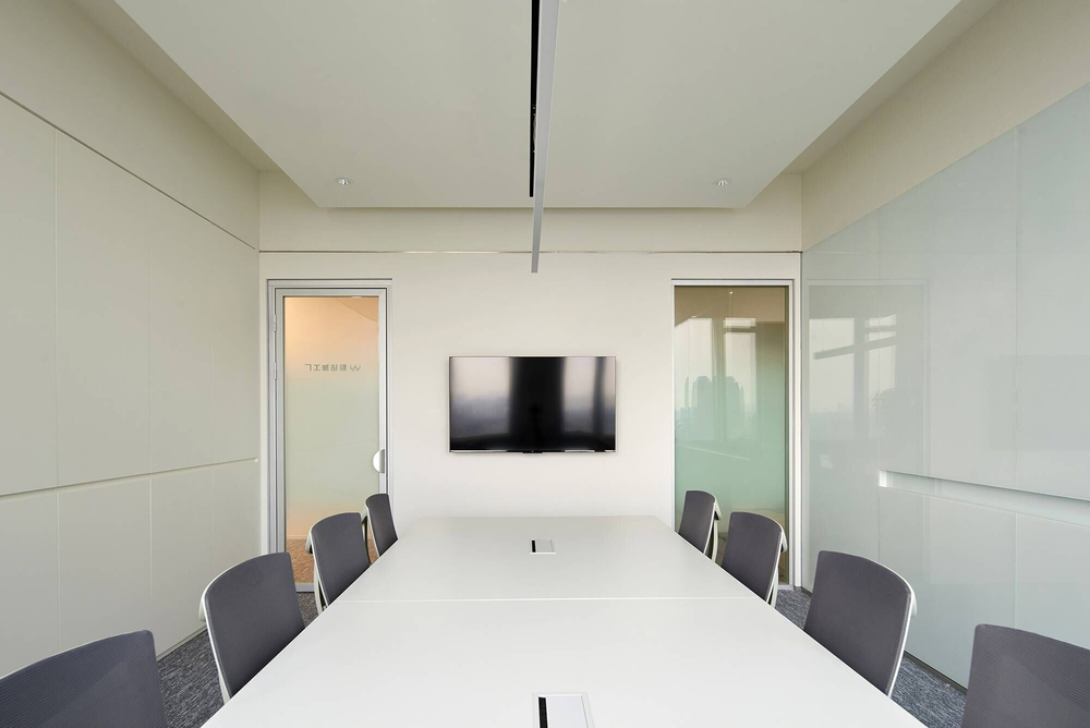
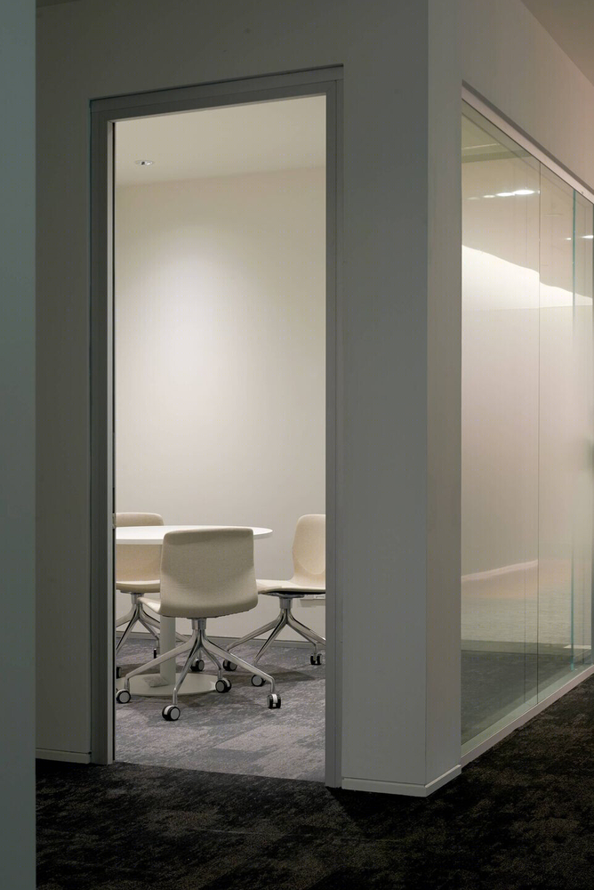
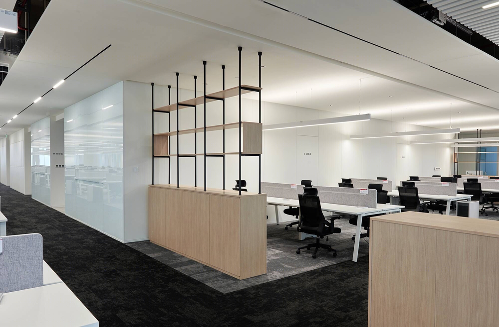
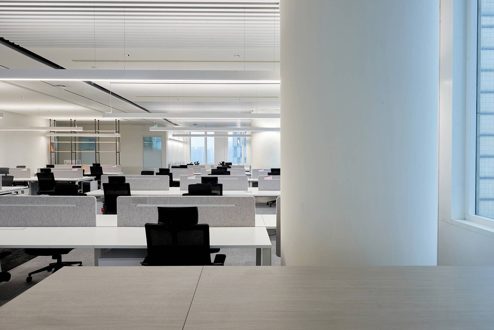
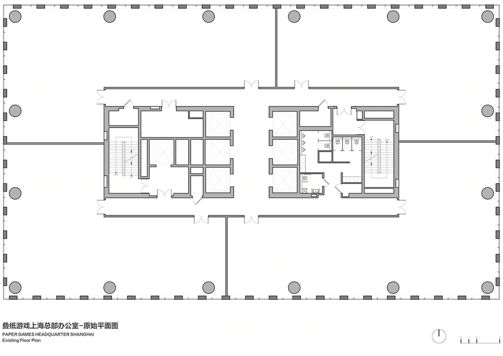
The original floor plan of the building is a typical back layout. In the design strategy, the office floors are based on the standard feet, and the plan variants are made according to their individual functional needs; in addition to the need to ensure that each floor has nearly 200 workplaces, a large number of meeting functions must also be met, the meeting rooms are arranged on the south side, to preserve the area with less sunlight on the north side for the office to see less energy consumption.
Erik Ho
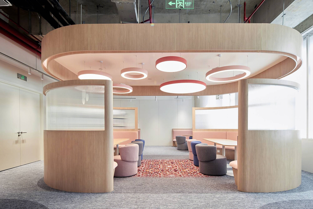
At the same time, the external meeting area and the internal meeting area are also set in the dynamic hierarchy to improve space efficiency and management. The building was initially designed by SBA, a German architectural design firm. The building structure and pipeline layout are neat and orderly. For the sake of environmental protection and respect for the principle of the building itself, the open office area adopts a semi-open ceiling. Above the workstations, a floating roof design is used, with a side guide angle design.

Erik Ho
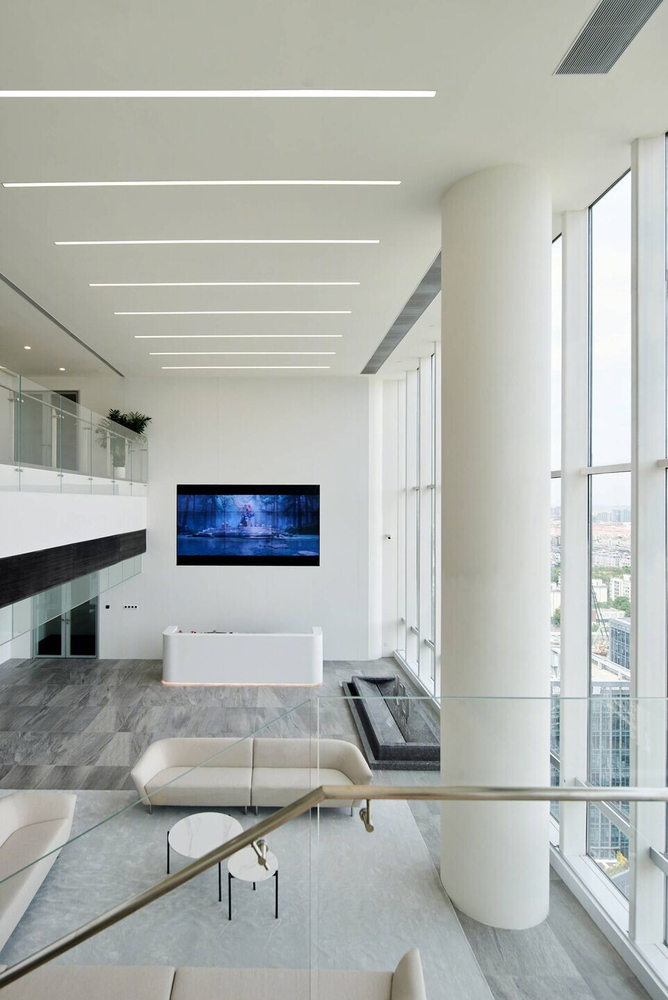
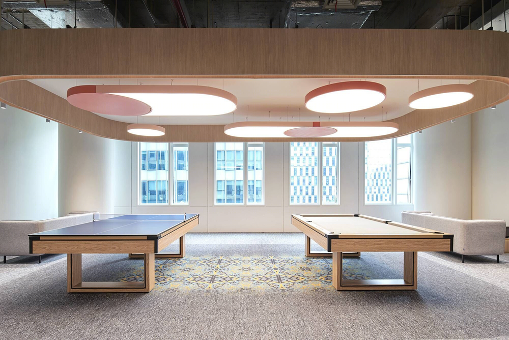
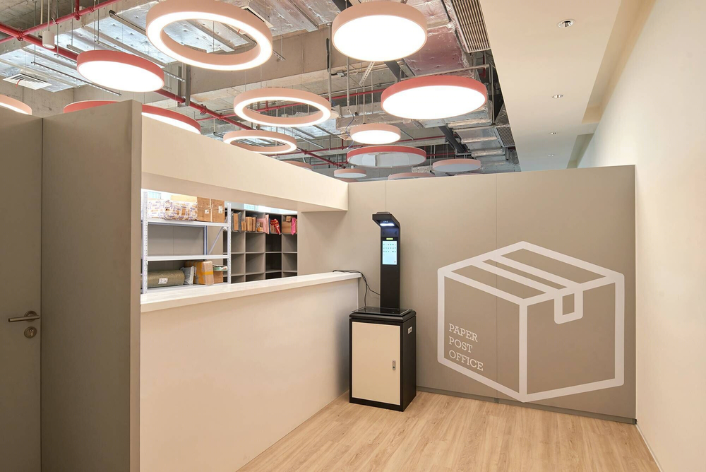
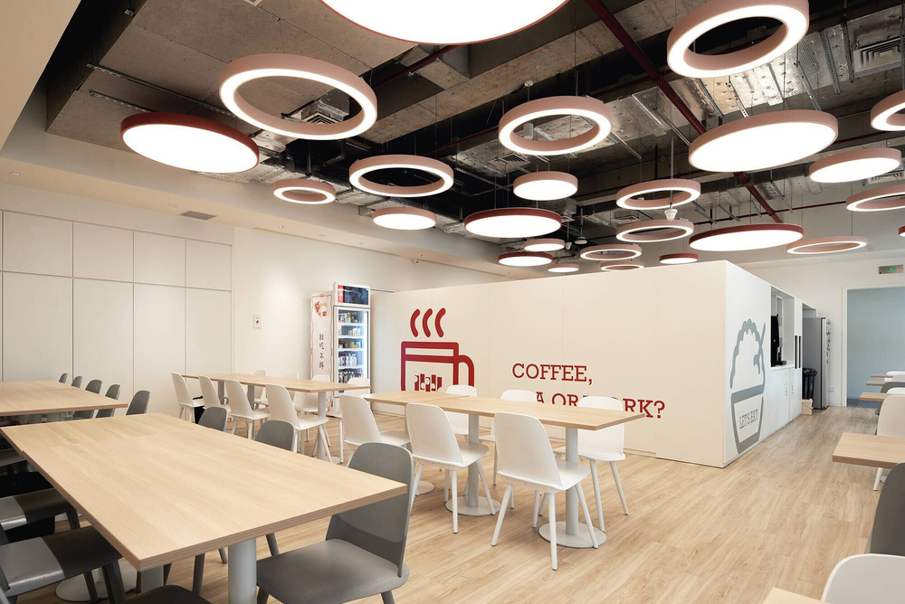
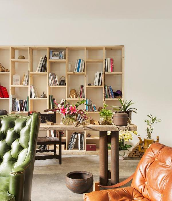
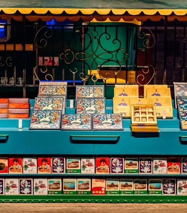
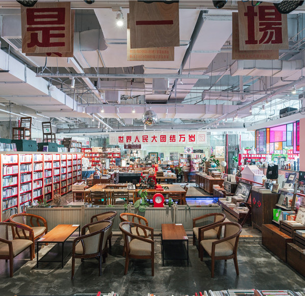
The top has a sense of lightness but can produce a certain sense of security in space while also ensuring the basic functional requirements. In addition to the relaxation functions, the shared floor also includes a staff service center and a post office. This floor is connected to the food and beverage complex, so a dining area is also provided to serve all employees.

Erik Ho
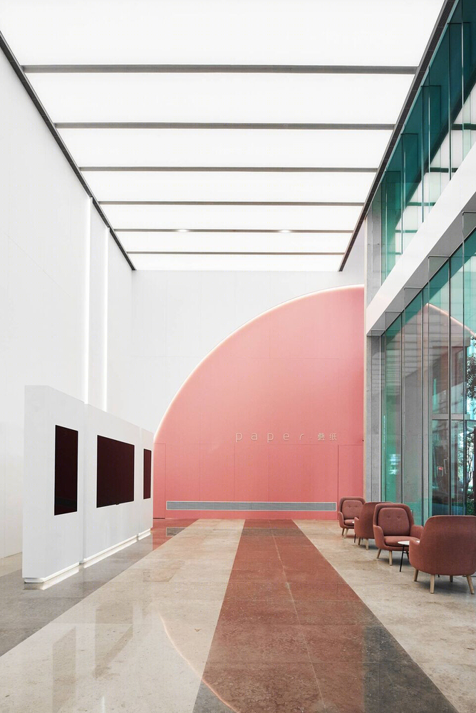
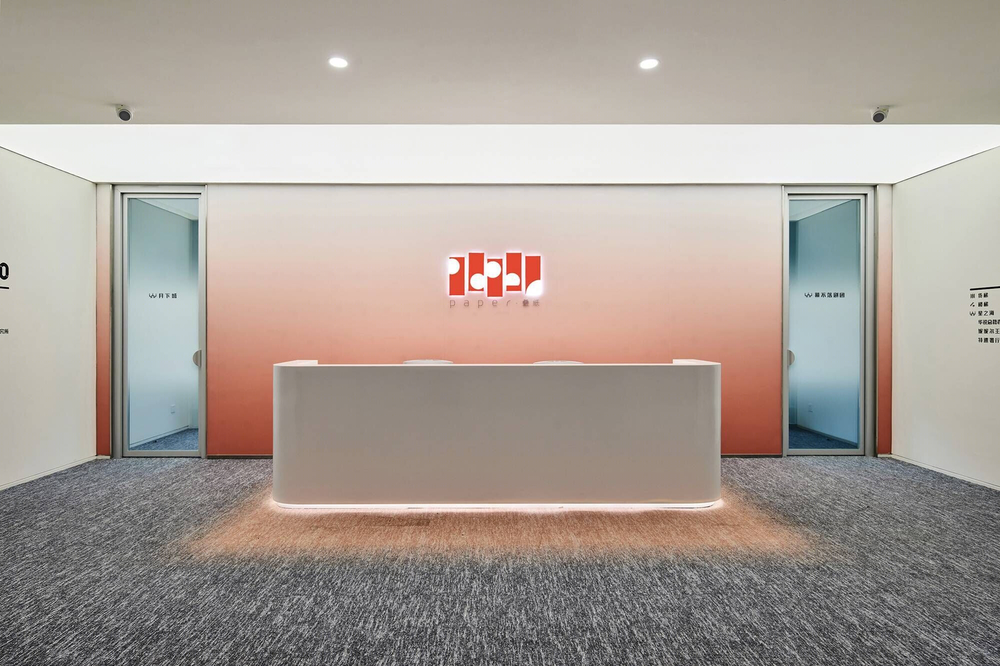
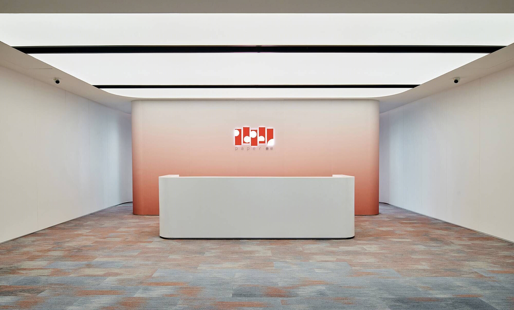
In the long term, the post office and dining area can switch to multifunctional rooms for training and performance in the future. The signage system design originates from the word “paper” in the name of the client’s “paper stacking game.” The overall visual is based on 90 degrees, 60 degrees, and 45 degrees rounded graphics. The visual effect of paper stacking and flipping is produced by processing corner details to build an optical base with small and big.
Caption
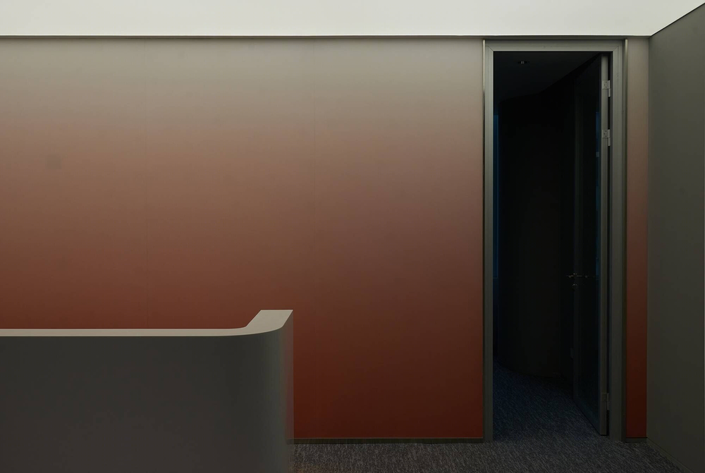
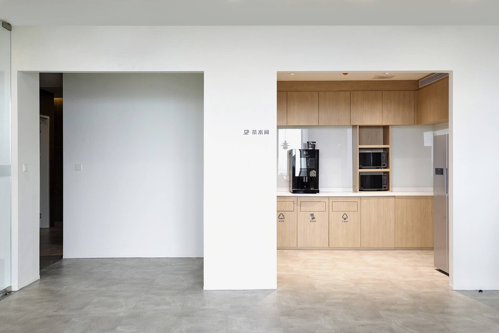
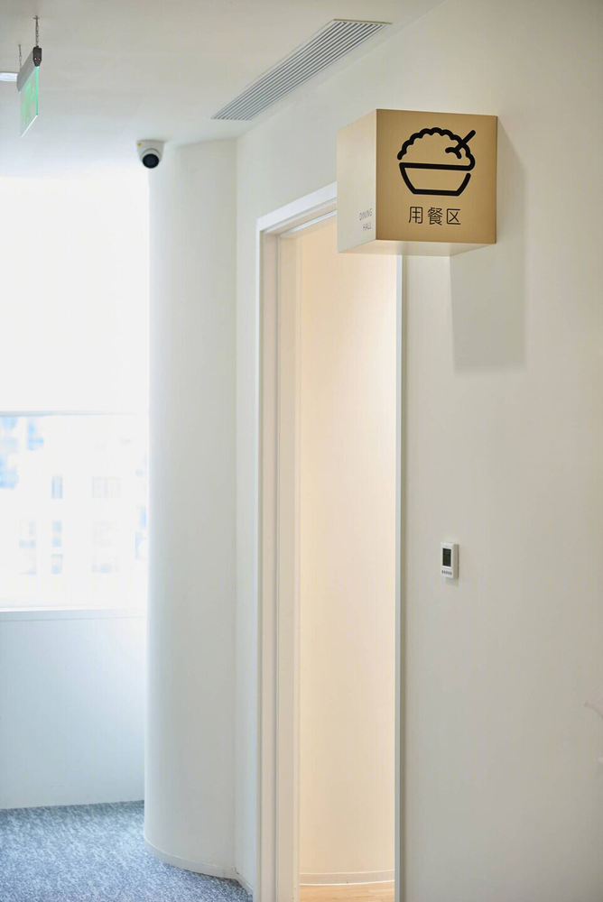
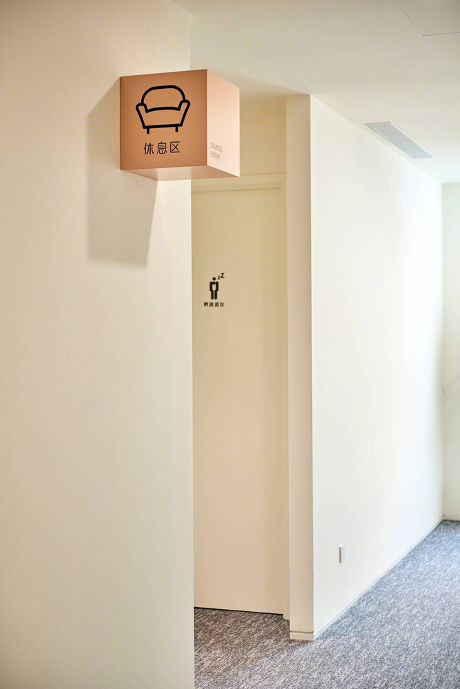
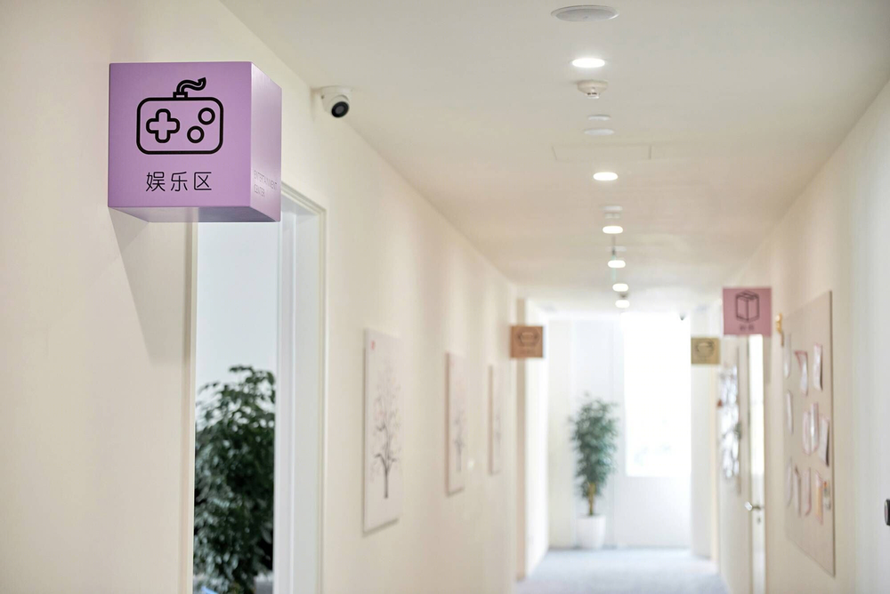
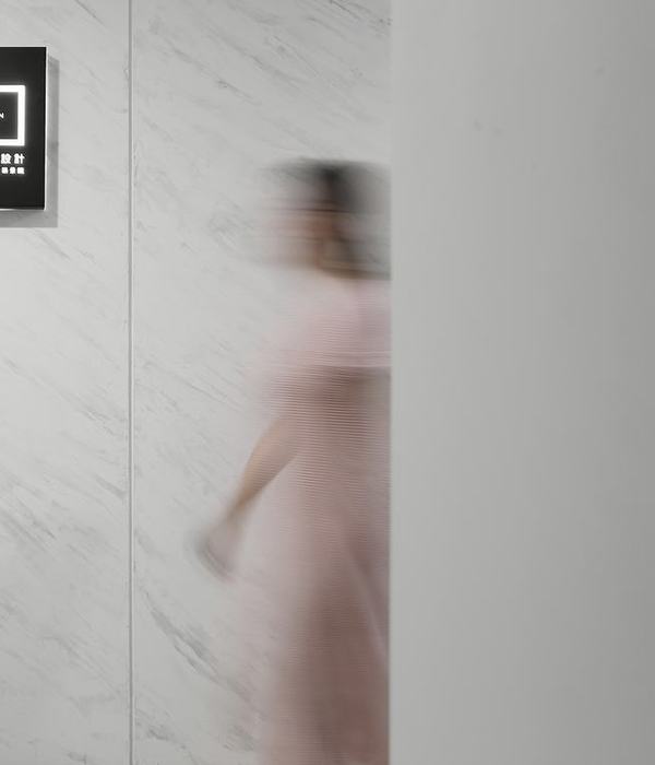
As the whole interior space wall is composed of various materials, it presents different challenges to the completion. Three forms of silkscreen, paste, and stand-up advertising board are established to unify all the product realization. The shared floor made a differentiated design in the signage design of the aisle from other beds, using six different color square-shaped signs to embellish the white space, making the area more lively and exciting.
Caption
Material Used:
1. Flooring- Carpet, Milliken
2. Interior lighting- CDN Lighting
3. Interior furniture- Yavon
Caption
▼项目更多图片
