Come into an old building to get a drinking experience!
酒
——
以水的状态流淌,以火的性格燃烧。(莎士比亚)
在色彩心理学中,
红色,代表了积极、主动、不羁、热情,
以及乐于与人交往的性格。
在上一个世纪中,
灰色,代表了风华绝代洋派建筑的砖墙,
以及象征经典沉静的证明。
Wine
——
with the state of the water flowing to the character of the fire burning. (Shakespeare)
In China, Red represents positivity,initiative, uninhibitedness, enthusiasm and a willingness to interact with people.
During the last century,
Grey, representing the brick walls of the peerless Western-style buildings, and a testament to classic stillness.
Design Inspiration /
红色
“Forte
劲
”
小酒馆位于一幢
1920
年代的上海老建筑之内,整座建筑由深具历史象征的深灰砖墙和西洋纹饰建造而成,而
Forte
如同其法文本义,像是一道充满奔放力量的光束,成为建筑体上最强劲的焦点。
"Forte" Bistro is located in an old Shanghai building in the 1920s. The whole building is built with old grey brick walls and Western ornaments, which are deeply symbolic of history. Forte, like its French meaning, is full of unrestrained spirit. The beam of power becomes the strongest focal point on the building.
红色是
Forte
的品牌识别色,我们围绕着主题色作为出发点,将红色于色彩心理学上所表现的意义,结合空间设计的表现,打开品牌想赋予的充沛能量,呈现出对生活的热情与自由。并且,我们也希望能够将室外建筑的灰砖墙面,连带能够往室内延伸,因此在室内的材料运用上,也都相对应的选择了灰色系的各式素材。除了运用品牌主题色,同时也延伸了
Forte
的
logo
,我们透过拆分
logo
的形式,运用了彷若控线木偶的暗线概念,转化到空间的各个维度之中
。
We focus on the theme color as the starting point. Red is the brand identity color of 'Forte'. In addition, we want to bring the grey brick used on the wall of outdoor buildings into the interior to make the people feel the connection between them. We also choose various grey materials accordingly. In addition to using the brand theme color, we also extended Forte's logo by splitting the logo and transforming it into all space dimensions.
弯曲的楼梯呼应了
logo
左边的曲线,透过金属面递渐式缩小与砖墙的搭配,带出了向上旋转的视觉。顶面弧形不锈钢镜面,象征了
logo
中间的杯沿,而两者相互产生出一种天花板交错盘旋而上的视幻感。我们透过将
logo
悬挂于空间的想象,融合于
Forte
之中。空间伴随着音乐与酒精交互的动感,是我们希望在创造空间高度张力的当下,也能够让客人感受到轻松欢愉的自在氛围。
The curved staircase echoes the curve on the left side of the logo, and the metal surface gradually shrinks to match the brick wall, bringing out the vision of upward rotation. The curved stainless-steel mirror on the top surface symbolizes the cup’s rim in the middle of the logo. The two create a visual illusion that the ceiling is staggered and hovering upwards. The space is accompanied by the dynamic interaction of music and alcohol.
Material & Installation /
是动?是静?动静之间
设计师在空间材料的选择上,主要以金属、玻璃和灰砖为主,从材质的本身开始,就强调了
“
动
”
与
“
静
”
之间的关系,透过设计的条件,让静态的材质与装置,也能够传递出动态的表现。
Static Materials and installations can also convey dynamic performance, like moveable feeling by their properties. For that they mainly focus on using metal, glass and grey bricks.
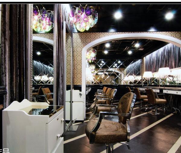
为了能提升空间在视觉上的幻觉艺术,设计师将材质(静态)与人群过往(动态)巧妙搭配,运用深灰色镜面不锈钢于天花之上,并且再以凹面深灰色镜面不锈钢作为吊顶装置。圆弧形的造型,让人有一种彷佛会旋转移动的错觉感,而镜面的材质更是扩大了对空间维度,随着人们不停流动与灯光调动的变化下而不断的变化,从而自不同的角度下,相互反射出不同的画面。
To enhance the visual illusion art of the space, we skillfully matched the material (static) with the crowd (dynamic), using dark grey mirror stainless steel on the ceiling, and using concave grey mirror stainless steel as the ceiling device. The arc-shaped shape makes people feel like they will rotate and move, and the material of the mirror surface expands the dimension of space. At different angles, different images are reflected from each other.
我们希望在空间中除了金属之外,还有其他材质能够自然地表现出波纹感的效果。咖啡色的瓦楞玻璃运用于外立面以及室内酒架的设计,而呼应品牌主题色的红色渐变瓦楞玻璃,则是大量的运用于走道边上的酒柜表面,成为了空间里相当醒目的另一视觉。同时,也在吧台后的放酒平台,设置了红色透光玻璃砖,让吧台在红色的视觉体系中,散发着迷离的光芒。
The designer hope that other materials can naturally express the effect of ripples in the space except for metal, for example, the dark orange corrugated glass on the façade and the indoor wine rack or the red gradient corrugated glass used on the surface of the wine cabinet on the side of the aisle. It has become a very eye-catching other in the space. At the same time,red light-transmitting glass bricks are installed on the wine platform behind the bar so that the bar emits a blurred light in the red visual system.
Forte
依旧是这上世纪建筑的一部分,所以我们更希望保留了老建筑的代表性元素,延续了从室外到室内的设计语言。而灰砖是该年代时兴材料重要的象征,将其重新排列砌于室内的吧台、地面、墙面及楼梯,淡化了历史的痕迹,也保留了这百年的老建筑风华。
Forte is still in the last century building, so we prefer to retain the presentative elements of the old building and continue the design language from outdoor to indoor. The grey brick is an important symbol of fashionable materials in this era. We rearranging it on the bar, floor, wall, and stairs indoors has diluted the traces of history and retained the elegance of the century-old building.
在灯光设计上,我们在吧台、桌面、酒柜等位置,设置了许多间接的变色LED灯带,希望利用光线在空间中创造出一种层次感和链接延伸的感觉。而在楼梯的灯条上,则是刻意的以“一半”为设计,增强了楼梯层递而上的设计效果,也降低了灯光的强度,避免了刺眼的问题。
In terms of lighting design, they set up many indirect color-changing LED light strips on the bar counter, tabletop, wine cabinet, etc. The design team uses the light to create a sense of hierarchy and to feel the space connected. The led strip on the step is deliberately designed by “half”, which enhances the design effect of the staircase going up and reduces the intensity of the light, avoiding the problem of glare.
在一个充满迷人诱惑力的空间里,我们希望金属的浑沌与波纹玻璃的流动感,能展现出所有材质在运用上的多元混合魅力,透过独特的装置结构,汲取旧时代的元素,塑造出一个醉人美酒与迷人音乐相融的独有之境。
In a space full of charm and temptation, we hope that the chaos of metal and the fluidity of corrugated glass can show the diverse and mixed pleasure of all materials used. Create a unique environment where intoxicating wine and captivating music blend.
User Experience /
在现实中,所见之处皆为可用
由于可使用空间较为受限,所以对于任何的空间运用,都成为了实际上需要相当重视的规划。靠近楼梯的酒柜展示柜中,隐藏了几张小型桌,提供了暂时置放酒杯的需求。而在吧台墙边上则是设计了靠垫,提供饮酒的客人更能随意的倚靠于上。
Since the usable space is relatively limited, space utilization has become a key that requires considerable attention. Several small tables are hidden in the wine cabinet near the stairs, providing the need to place wine glasses temporarily. Cushions are designed to let guests who drink lean on them more freely on the edge of the bar wall.
为了同时能将展示和储存空间并存,我们几乎在每面墙上都设置了酒架,随处可见的展示架,透过这样的设计,不仅是达到了功能上的需求,同时也展现了在设计对于狭小空间的使用与建构,提供了最直接的品牌体验空间。
The use and construction of small spaces provide the most direct brand experience space. To coexist display and storage space simultaneoulsy, we have set wine racks on almost every wall, and display racks can be seen everywhere. Through this design, the functional requirements are met and displayed.
About This Project /
项目信息
项目地址:上海南京西路
931
凯式精品酒店
1
层
项目面积:
45
平米
楼层:
1
层以及夹层空间
商业形态:酒吧
lounge
客户
:
凯式酒店集团
材料:灰砖、咖啡色钢板、自然色胡桃木饰面、金属网、弧形定制镜面不锈钢、红色玻璃砖、瓦楞玻璃
设计公司:
RooMoo
摄影师:
Xiao Yunnnn Studio
Location: First floor, Cachet Boutique Hotel, 931 Nanjing West Road, Shanghai
Project Area: 45 Square Meters
Number of Floors: 1 floor and mezzanline space
Business Attribute: Pub lounge
Client: Cachet Hotel Group
Materials: Gray brick, brown steel plate, natural walnut finish, metal mesh, arc custom mirror stainless steel, red glass brick, corrugated glass
Design Company: RooMoo
Photographer: Xiao Yunnnn Studio
Project Supplementary Drawings/
项目补充图纸
▼
平面图,
floor plan
©RooMoo
▼
立面图
,
elevations
©RooMoo
---------------------------------------------------------
更多请关注
官方网站
{{item.text_origin}}


