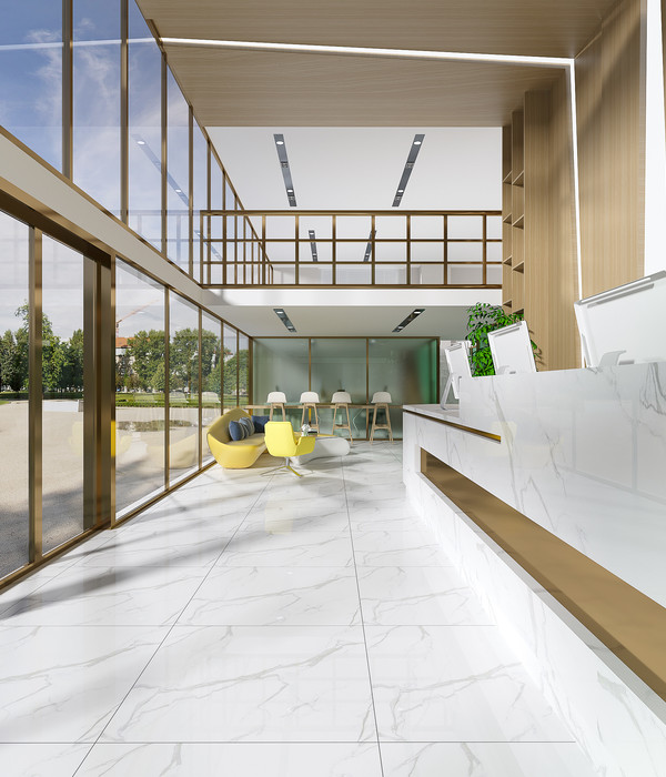
印度 Pune 现代办公室设计 | 融入本土元素的开放式空间
Architect:KSD Studio
Location:Pune, Maharashtra, India
Project Year:2020
Category:Offices
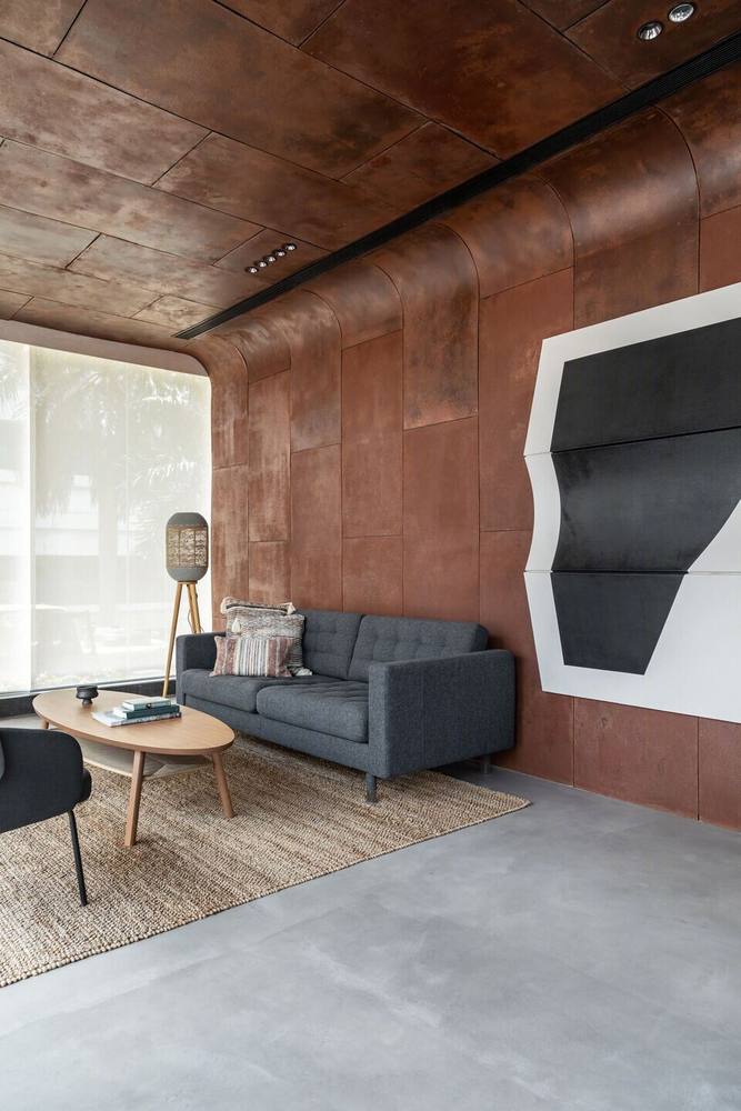
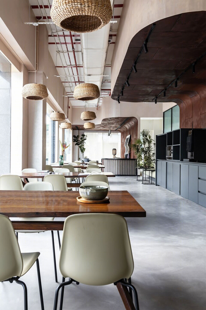
The workspace designed in Pune is a reflection of the modern sensibilities of the workforce that will inhabit the space, a language, the Studio consciously tries to bring in. A layered aesthetic, that is cultivated through the Studio’s philosophy that dwells on the nuances of local identity and tradition, transforming it into a contemporary setting. The idea was to have a raw and industrial styled aesthetic where a palette was created with materials that were picked for their inherent properties such as colour and texture. From corten steel panels, concrete flooring, fabric as acoustic panels to the hand painted artwork on canvas and the custom-made banana fiber lamps.
Varad Anvekar
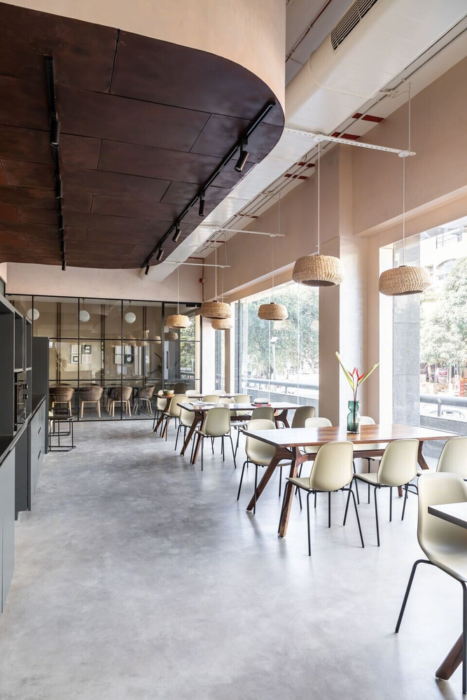
Located on the ground floor of the building, the office enjoys visibility from the street. The Studio has used this to bring in transparency, make it more welcoming and engaging by treating it as a storefront. This play in the treatment of the façade, steps away from the monotony of the closed, boxed-in interiors and embraces a modern day sensibility of an open office.
Varad Anvekar
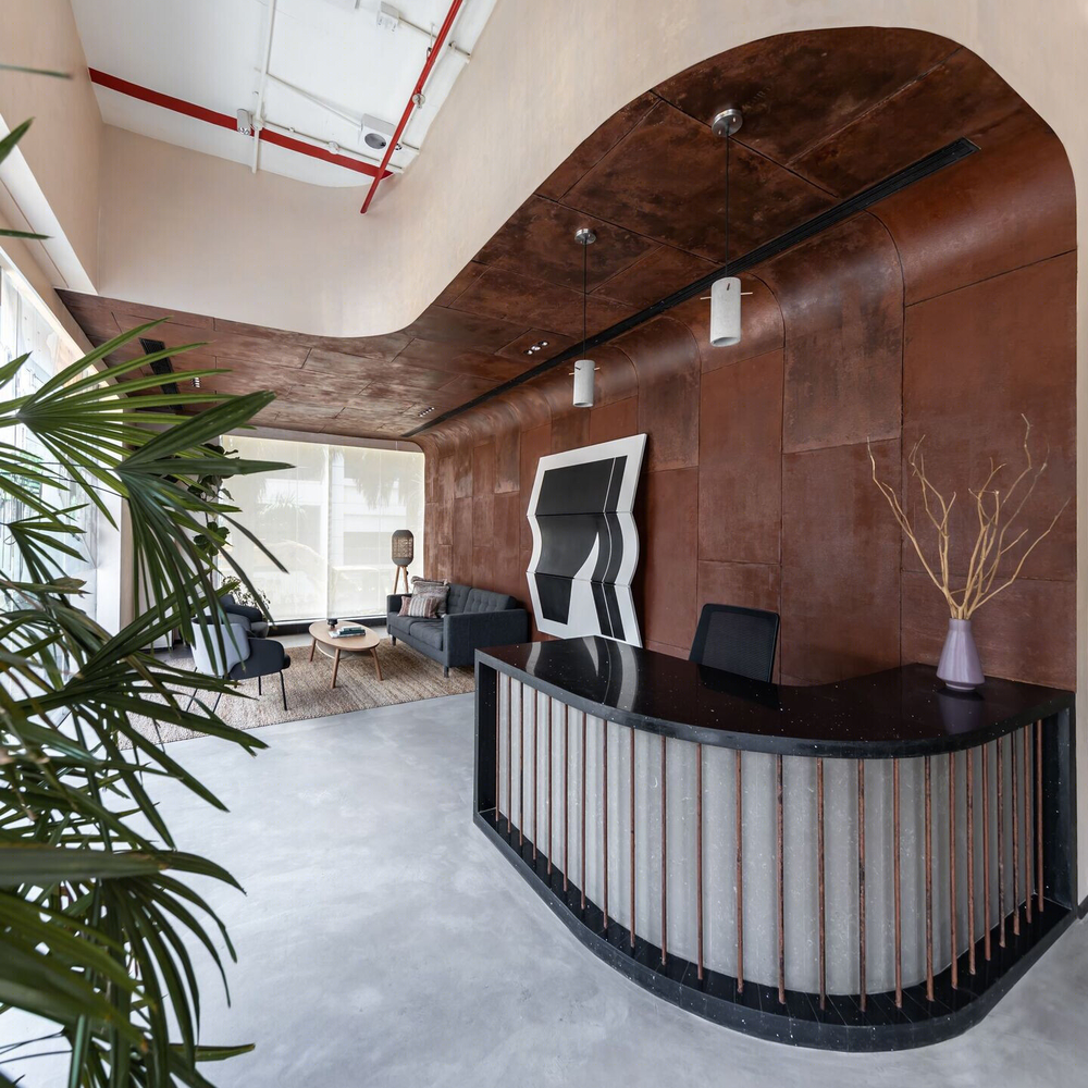
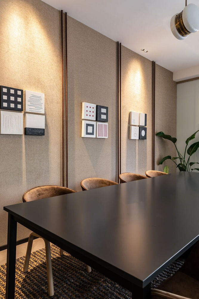
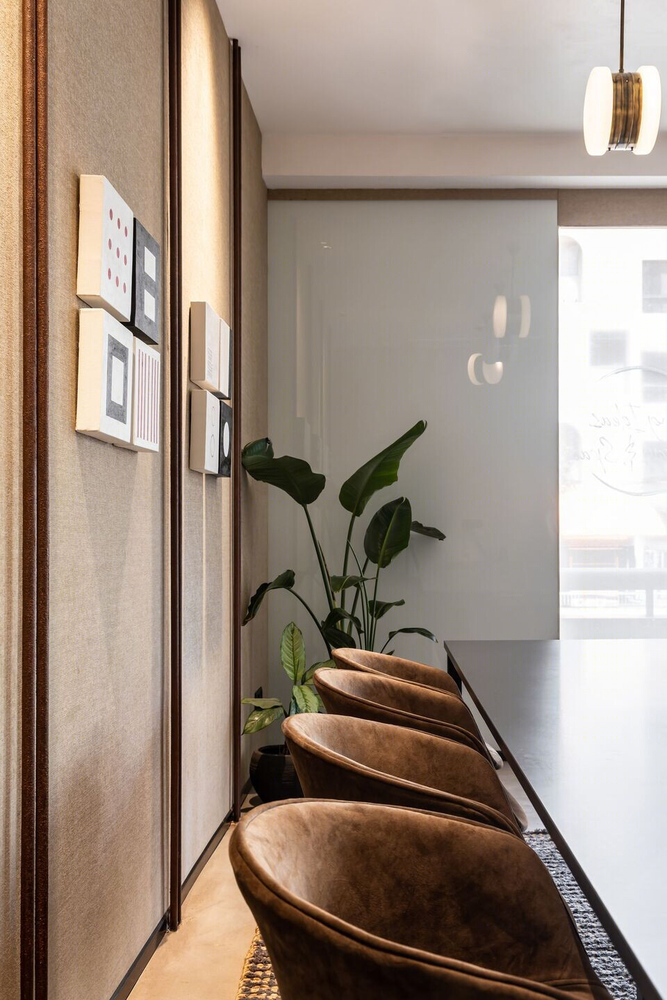
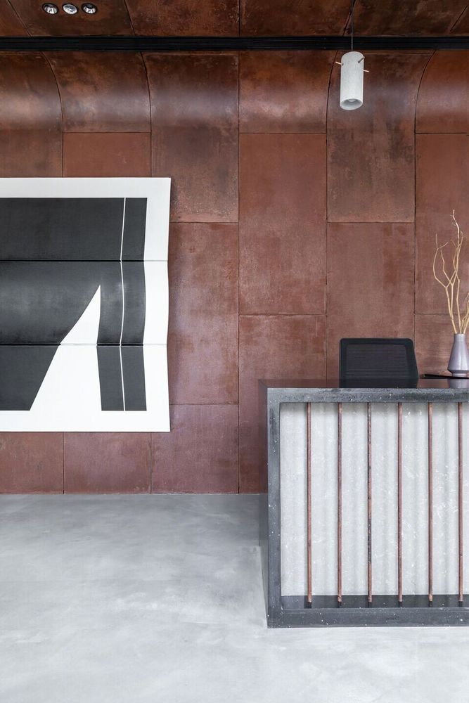
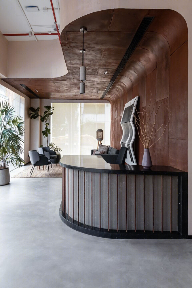
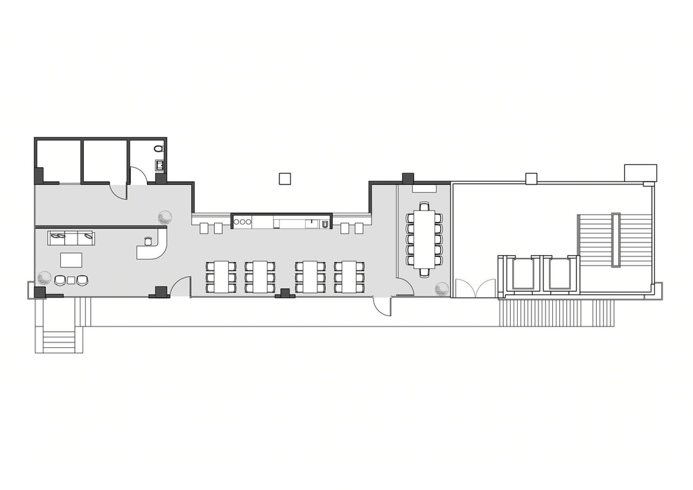
As one steps inside, the reception lounge is to the left and a vibrant pantry space on the right. The large volume of this storefront strip, is broken down in two distinct volumes by the use of corten steel paneling as a backdrop that wraps itself to the ceiling defining these two spaces. The residual volume accentuates the height of the space and tucks within the services that are left exposed intentionally. The large volume of the linear front space, divided by its two dominant functions and coupled with the transparent glass facing the street, bringing in natural light creates a feeling of spaciousness. To the far right, is a 12-seater meeting room with fabric panels on the walls and corten steel tubes paired closely to break monotony.
Varad Anvekar
Polished concrete acts as a grey floor plane that is in effect, a link that connects all the spaces. It becomes a canvas that carries all the elements, from the quartz stone reception desk, the built-in dark grey pantry cabinets to the mint green pantry seating. A handful of materials are used in creative ways across the entire space.
Varad Anvekar
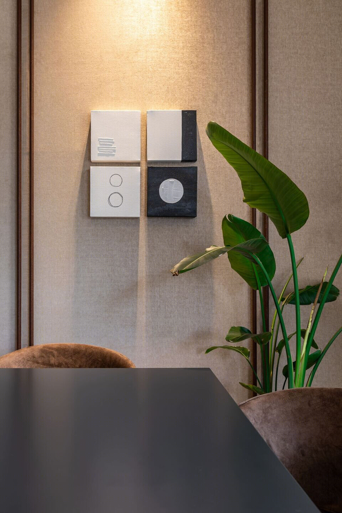
The repetition of these in different forms creates homogeneity, a subconscious frame of reference for the eye that is not distracting. For instance, the coarse texture of the rug is replicated in the hanging lamps made of banana fiber; the concrete-copper pendent lamps seem to branch out of the floor; or the abstract art work in the reception, deliberately broken in parts and mounted finds reference in the four mini square canvases grouped together in the meeting room.
Varad Anvekar
A minimalist design, with a nifty choice of materials has been used to curate a space that is stimulating. It is interesting to see how the vision is realized through the sum of its parts.
Caption
▼项目更多图片
