Architects:Helen & Hard
Year :2020
Photographs :Sindre Ellingsen
Manufacturers : Blumer LehmannBlumer Lehmann
Project Team : Reinhard Kropf, Mariana Calvete, Håvard Auklend, Dag Strass, Simon Baumann
Country : Norway
Concept and Organization. It is a contextual and yet spectacular signature building that together with the proposed square creates a new identity and an initiation for further development in Nord-Odal. It is the new living-room for Sand´s inhabitants, the main gathering space with a low threshold for participation. It brings together literature, knowledge, economy, people, tradition, and history under one single roof. A holistic space with several functions that enhances a feeling of ownership for its users. Samling also connects the main street with the park and church on the other side at the same time that it connects to the courtyard of the municipality on the back. This layout, together with the inviting and transparent main entrance, makes it an obvious urban passage. An indoor street through the library’s main room that increases life in the building, an invitation to unintentional visits, meet people, bring a newspaper or book, or have a short coffee break.
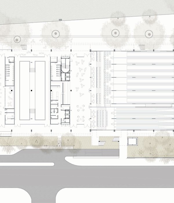
The building is relatively compact with an open atrium in the centre. A quiet space that gathers the different functions and allows people to see each other. The characteristic, radial geometry define the layout of the building from this center. The 10 apartments are situated above the bank offices and are oriented to the south and west, thus making room for the generous ceiling height in the library.
Exterior Expression. The intrinsic radial organizational principle of the building enhance the dynamism of the façades, the exterior walls get a soft feeling by the weaving balconies. These are designed so that no vertical division between the apartments is required, they become deep in front of the living room and kitchen, and become narrow french balconies to the bedrooms. The façades are composed of a timber batten cladding of vertical wooden slats. The slats play around the entire building in horizontal bands, this wooden skin gives the building a depth effect and creates a holistic but simultaneously varied architectural expression. The large glass surfaces of the public spaces provide a transparent skin between the interior and exterior, enriching their visual connection.
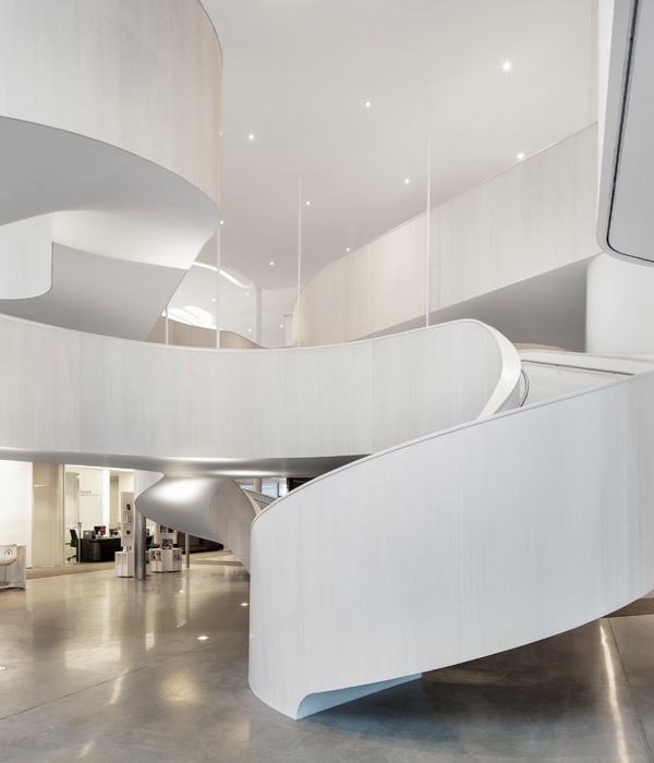
Interior Materials and Atmosphere. Nearly all building elements are made of wood, an environmentally friendly material but also a material that has unique aesthetic and sensory qualities together with a pleasant scent. By having a substantial use of wood, the building inspires a more sustainable and responsible society, reflecting the cultural heritage of wooden buildings and the local wood industry. The characteristic wooden lamella ceiling conceals the integrated technical fixtures while growing to become bookshelves and sunshades. The soft curves of both the ceilings and structure are important elements for room experience and quality in the bank, library, and common areas.
▼项目更多图片
{{item.text_origin}}

