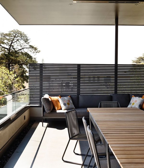
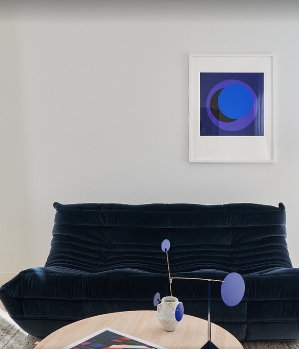
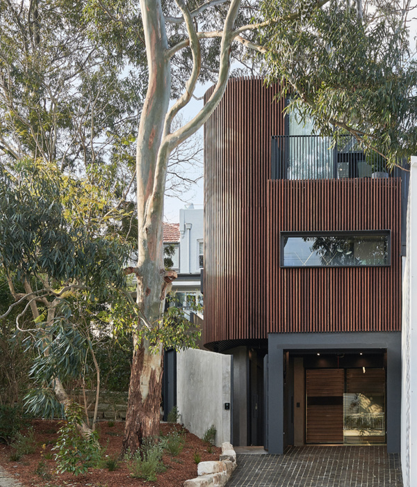
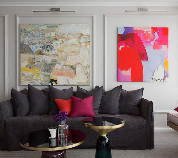
It is an apartment for young newlyweds who are interested in arts. Before the refurbishment, they have lived in the 40-year house for 2 years. Since many basic types of equipment and functions were damaged that in need of a proper fix, they decided to let the house shine again and being more suitable for their way of living by the assistance of NestSpace Design.
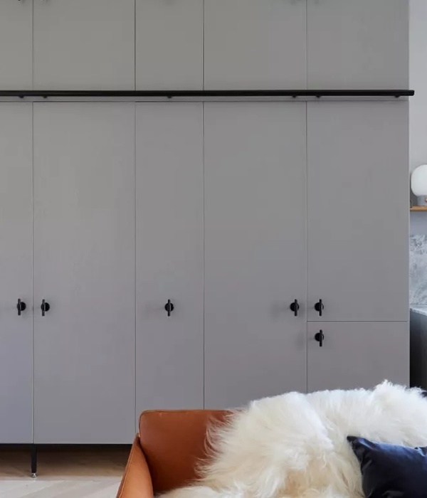
The apartment size is around 105 sqm, integrated with expectations of an open bright kitchen, separate workplace for both people as well as an ideal space arrangement which takes care of storage requirements. After a series of consultation, the main design concept was to focus on how they make the most usage within a scale and also to present the multiple living spirit raised from the hosts. In order to achieve a practical purpose, most walls and rooms were reorganized to make sure every settlement are connected with their future life, creating a house which includes a living room, kitchen, dining area, storage room, 2 bedrooms along with 2 workrooms and 3 balconies.
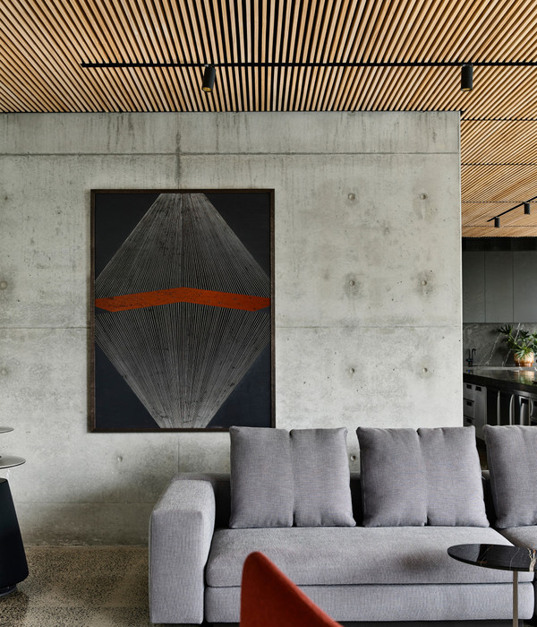
Colour took a pretty important role in the entire design, spreading lively and coherent vibes in-and-out. A diagonal geometry graphic is painted on the back wall of the sofa. Once people get in, they will immediately see the vivid wall which stands for a lifestyle with various hobbies. The palette was mixed with low-saturation tones of blue, pink, grey and light green. By such hues, we would feel active mood yet not get disturbed while working. This graphic wall also makes a beginning, bring colours based on it to other interiors.
It was an interesting plan to have a kitchen located between the lady’s sewing room and drum room. Because the couple wishes to own individual space to be completely indulged in their things, but still, they’d like to feel the existence of each other. There is a matte-white-painted wooden pegboard in the sewing room, and a ceiling-height open shelf to keep the hostess’ stuff. Showing out those things enriches the house decor, it also expresses the unique characteristics of the residents as well.
A window in front of the stove appears uncommon in Taiwan. However, it provides a pleasant view when we are busying with cooking. That issue was repeatedly discussed whether to keep or not during the design process. In the end, the owner chose to keep half of the original size, and the design team put additional glass along the window side to solve maintenance concerns. Now that proves an enjoyable cooking experience -- unexpected sunlight would flow in to picture an intriguing kitchen scenery.
Project | My 2/3 Artist Life
Area | 105 Sqm
Design Office | NestSpace Design
Designer | Jun-Cheng Yeh, Chun-Ting Yeh
Location | Taipei, Taiwan
Photography | Jackalliu Photography
{{item.text_origin}}

