- 项目名称:福建中海石化接待中心
- 主案设计:张鹏峰
- 设计团队:直合设计
- 项目摄影:陈荣坤
一棵树或一块石头可以是一个无穷的宇宙,像天空一样广阔无垠,超越任何固定的定义。把树或石头仅看作树或石头的观者所看见的不过是他自身具体化了的观念,他们把“树”或“石头”的意象物化了。用超越这种物化的心象来看世界,通过物与物、物与环境的特殊配置来消除缠绕于物本身的、人为赋予的意义联想,把物放在一个更大的时间、空间背景中“任其自寻机遇”。——李禹焕
A tree or stone could represent an infinite universe. Like boundless sky, It is beyond any certain definition. Seeing tree as tree or stone as stone, People see these materials as objects. They materialize the presence of tree or stone. If we view the world beyond the objects, eliminate the so called imagination associated with the objects themselves. We would allow the objects to connect and reflect with the surrounding space or between themselves. They would show you what they really are. -Lee Ufan
本案将石头、砾石、旧木等自然物与现场环境结合。物质或物体被安排在一个场所,这个场所就生动地产生了“与存在相遇”或“与存在对峙”的关系。重要的不是自然物本身,而是它们自身传达出的存在感。它们存在于场所和空间中,进而在空间中消解,与空间和环境融为一体,达到“物我两忘”的同一状态,主体和客体不再是主动与被动的关系,都实现了充分的自由。
In this project, we present nature materials like stone, rock and wood etc in surrounding space. There activity and the relationship they establish between themselves or with the space, connects with the outside world. Make us feel again the wonderful aspect of the surrouding space or the world that we did not know.
"静寂"与日本传统文化中的"空寂"有异曲同工之趣。"就是‘主客合一’、‘物我相忘’的境界;就是‘还没有主客分离,还没有物我差别’的状态;就是‘没有精神和物质的区别,只有物即心,心即物’的状态;就是‘心物合一’的境界。"
"Silence" is very much alike the "empty" in Japanese culture. It is a realm like combination of subject and object and forget everything; There is no difference in sprit and material and you could feel the unity of mind and material.
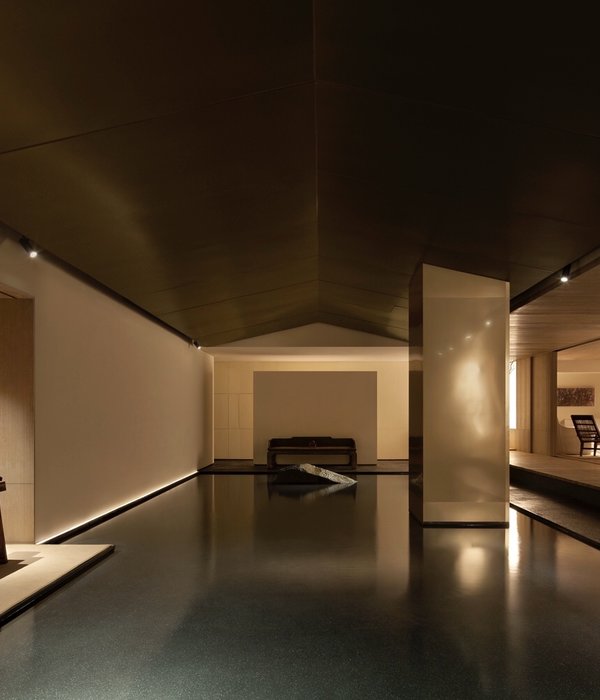
顺着狭长的通道一路指向前方的茶室,延伸至长廊尽头。墙上的油画,通过灯光漫射,突出整体的静谧与神圣感。
Along with the long and narrow aisle, there is a tea room, extend till the end of the corridor. The light diffuses into the oil paint on the wall, resulting in a ambience of peace and holly.
赭色包裹的空间下,极简的手法与侘寂的元素自然地结合。质感、简洁度、体块感的强调,使极简渗透到侘寂寂静、质朴、淡泊的氛围之中。
Covered by mahogany color art paint, combined by simplification line and elements, strengthen of quality,simplity and block, this space makes us feel empty, simple and stoic.
同一种色彩及肌理,形成地、墙、顶的无缝连接,极致统一。
Same color and pattern applied in floor,wall and roof, make these three space seemless connection and unity.
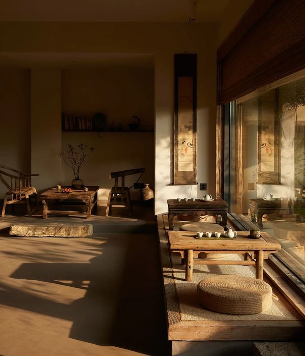
每一件家具和装饰器物都是非常素朴,用其粗糙、暗哑的姿态来隐约传递和表达自然美,与侘寂随性、静怡的气氛相融相合。
Every single piece of furniture and deco are rudimentary. Their rough and matt presence shows the nature beauty, into the quiet and pleasant atmosphere.
墙体细长的缝隙,与画的中心相对称,创造出一种窃视的神秘视角。
The long and narrow gap in the wall, is symmetrical to the middle of the paint, creates a mysterious perspective like peep.
窗外的川流不息、灯火霓虹与室内侘寂黯然、枯寂的美学意识形成强烈反差。而日照光线带来与人的亲近感,让身体在空间中得以放空、沉浸。
Outside the window, the endless flow of cars and the colorful lights, are big contrast to the dull and monotony of aesthetic consciousness.
面对一幅幅艺术作品,如同置身寂然、平和的艺术氛围,拥有一颗安静的心去思考、探究事物的本质。
When you look at these works of art, you would feel surrounded by quiet and calm art atmosphere. Gives you calm and clear mind to think and explore the nature of everything.
在返“朴”归真的路上,遇见自己。
Meet yourself on the way to nature.
项目信息
Information
项目地址 | 福建泉州
Project Location | Quanzhou,Fujian
项目名称 | 福建中海石化接待中心
Project Name | Fujian Zhonghai Petrochemical Reception Center
主案设计 | 张鹏峰
Chief Design | Zhang Pengfeng
设计团队 | 直合設計
Design Team | HE-DESIGN
施工管理 | 刘光旺
Construction | Liu Guanwang
项目摄影 | 陈荣坤
Photography | Chen Rongkun
项目面积 | 170m
Project Area |170m
设计时间 | 2019.04
Design Date | 2019.04
主材品牌 | 威罗进口艺术涂料、泉州西顿、iHome 艾上家
Materials | Willowimported art paint, Spring Seton, iHome On home
特别鸣谢 | 鼎立雕刻集团
Acknowledgement | DingLi Carving Group
油画创作 | 著名艺术家 李歆
Oil Painting | Li Xin
直合设计创始人张鹏峰
专访:侘寂风目前在国内接受度还没那么高,是怎么的机缘才有了这个作品呈现?
专访:Wabi-sabi is not so widely accepted in China at present. How did this work come about?
Zhang:因为有多次合作的客户,之间是可以互相信任的关系。刚好我们都不喜欢过度的形式化以及商业味的设计风格,更想呈现的是一个质朴、可以令人放松身心的空间。可以说是地利人和。
Zhang: Because we have cooperated with clients for many times, we can trust each other. Just we do not like the excessive formalization and commercial taste of the design style, more want to present is a plain, can make people relax space. You could say it’s the right place.
专访:你是怎么理解侘寂美学?对于材料与灯光的运用有什么考究?
专访:How do you understand the aesthetics of wabi sabi? What are the requirements for materials and lighting?
Zhang:侘寂是在不加修饰的裸露下,或粗糙暗哑、或残缺和不完美,用肉眼可见的原始状态来传达空间的自然美。这种自在感是能够让你脱下城市的束缚,放下压力,拥抱自由。我所运用的材料更偏向于朴拙、安静、纯粹的感觉,而灯光也是柔和的,通过漫射的方式来营造氛围,制造代入感。
Zhang: Wabi-sabi is to convey the natural beauty of space in its original state visible to the naked eye, under unmodified nudity, or rough and dark, or incomplete and imperfect. This sense of freedom allows you to take off the shackles of the city, put down the pressure, and embrace freedom. The materials I use tend to be simple, quiet and pure, while the lighting is soft, creating atmosphere and sense of substitution by diffusing.
专访:你喜欢的设计师/建筑师/艺术家有哪些?他们对你的设计有怎样的影响?
专访:What are your favorite designers/buildings? How did they influence your design?
Zhang:太多了,斯卡帕、路易斯康、John Pawson、杉本博司、布朗库西、葛姆雷等等。比如石上纯也的《水庭》,从哲学的角度理解是自然中的不自然,不自然中的自然。他设计的表现形式让整个项目看起来近乎接近自然,越棒的设计越简单也越有力量,直逼内心。我觉得很多人会对室内设计容易产生误解,以为只在室内看,其实应该跳脱出来,从室外、建筑、城市、景观、艺术、装置、雕塑等各方面多角度理解室内,思考生活。
Zhang: There are so many. Scarpa, Louis Kahn, John Pawson, Sugimoto bossi, Brancusi, Gormley, and so on.
For example, Water Garden designed by Junya Ishigami, from a philosophical point of view, is not natural in nature, not natural in nature. The expression of his design makes the whole project look almost natural. The better the design, the more simple and powerful it is, the more powerful it is.
In my opinion, many people tend to misunderstand interior design, thinking that they only look at interior design, but in fact, they should jump out of it and understand interior design and think about life from outdoor, architectural, urban, landscape, art, installation, sculpture and other aspects.
直合设计 HE-DESIGN(原峰尚设计)成立於 2006 年,由独立设计师张鹏峰先生创办主持。合是对设计、空间、为人的一种理解,合是前提,和是提升,为空间平衡的传达。直合设计代表了无限团结与合谐,同心同德、向上进取的目标与方向。关注设计本质,坚持直接纯粹的设计理念,结合自然的生活美学。不推崇刻意营造的形式美,以多元融合创新,及对项目的执着与突破,力求作品圆满合谐。
Established in 2006, HE-DESIGN (formerly PHONSOM DESIGN) is managed by its founder, independent designer Mr. Zhang Pengfeng. HE implies an understanding of design, space and humanity, which is the precondition of everything and elevated by harmony, an expression of spatial equilibrium. HE-DESIGN represents an infinite unity and harmony, as well as the goal and direction of being positive and motivational with one heart and one mind. Focusing on the nature of design, HE-DESIGN upholds a people-oriented, direct and pure design philosophy to portray natural aesthetics of life. It does not trumpet beauty in forms deliberately created but completeness and harmony of works through the combination of diversification and innovation as well as persistence and breakthroughs in projects.
{{item.text_origin}}

