墨西哥风味餐厅 | 融合本土元素与自然材料
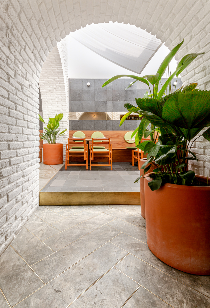
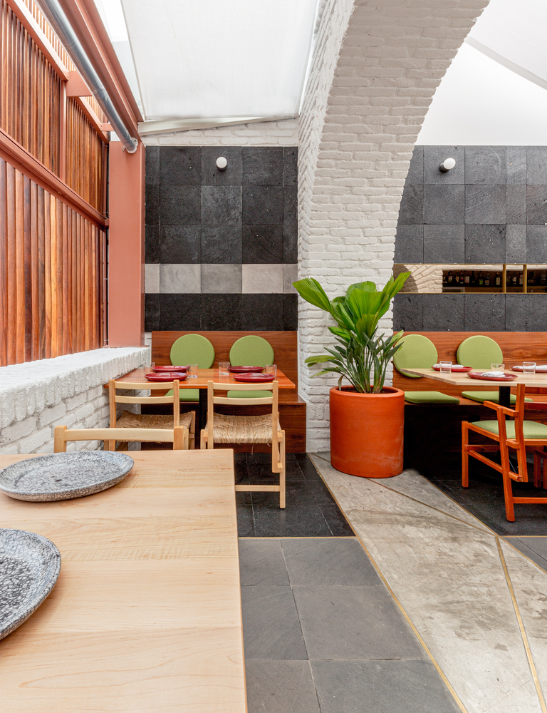
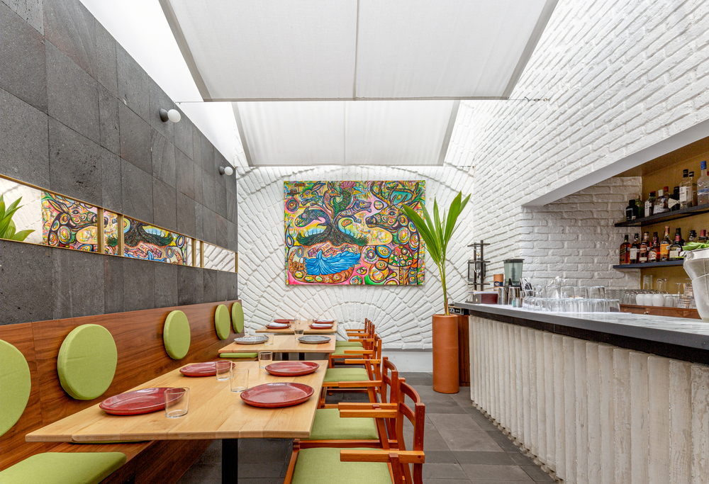
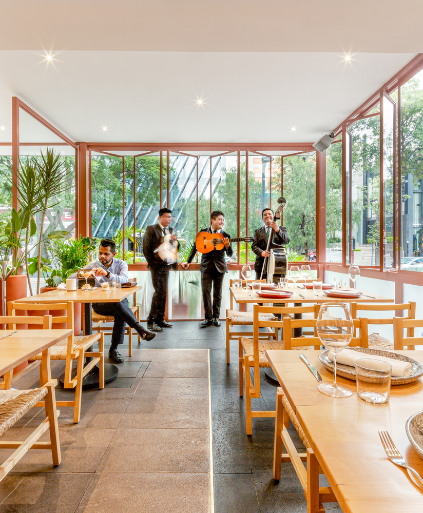
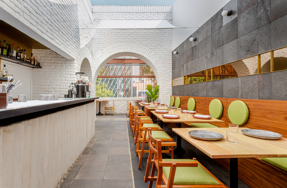
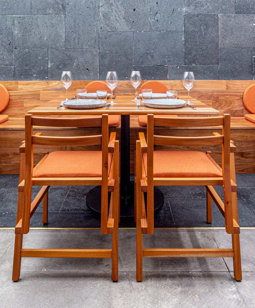
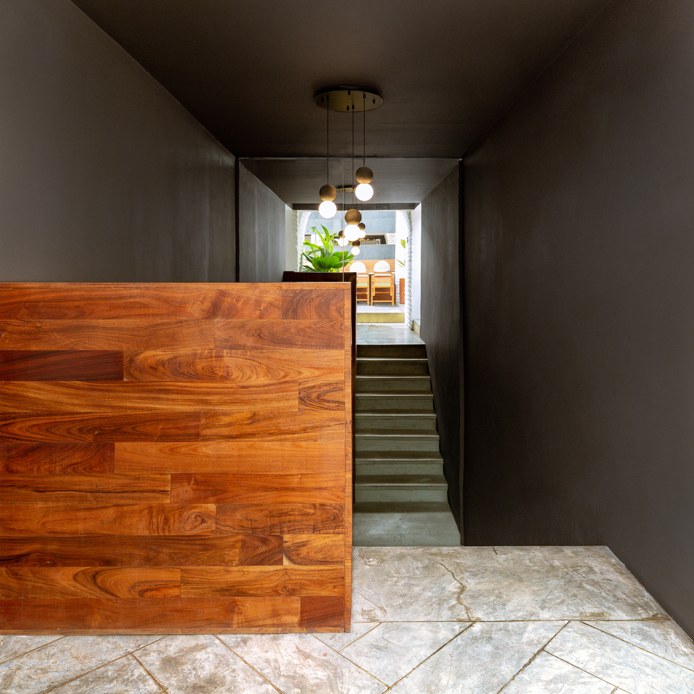
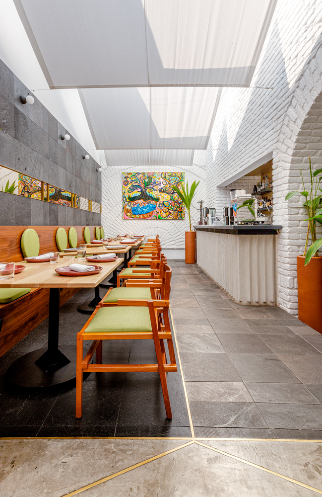
IDENTITY AND MATERIALITY: Mexicano Masaryk aims to bring back the authentic flavors of Mexican culinary tradition, recovering the memory of certain regions in Mexico trough the participation of local cooks named Mayoras. This is why we decided to confront the materiality of an existing building with new natural materials in the most honest way. By using volcanic rock flooring with different varnish treatments, and the use of brass, we tried to homogenize an already eclectic construction.
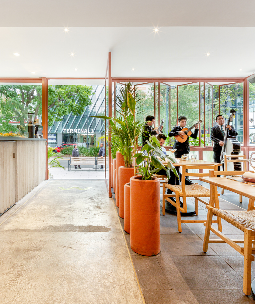
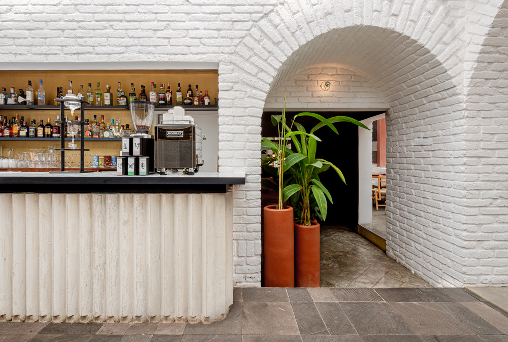
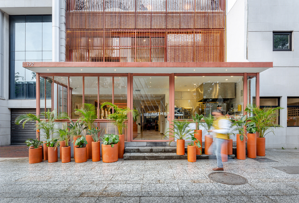
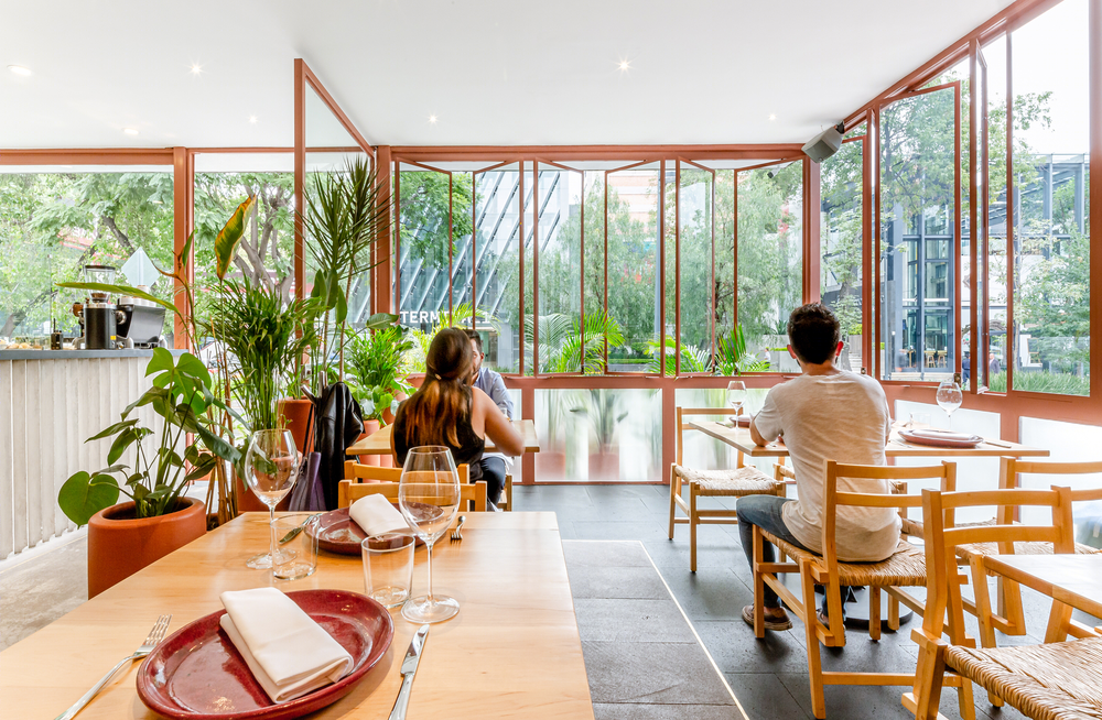
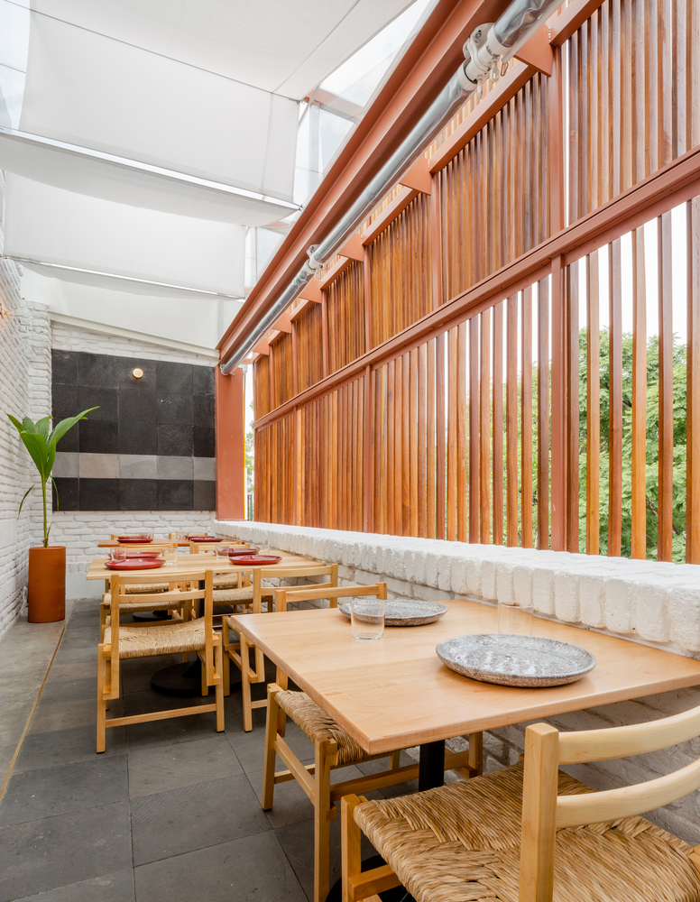
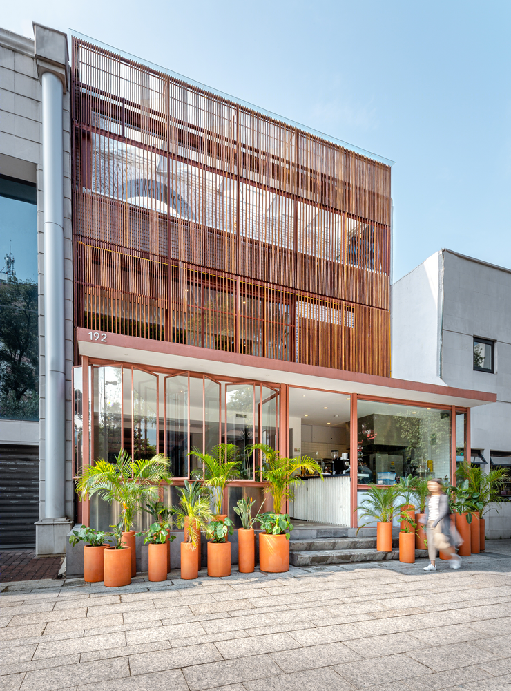
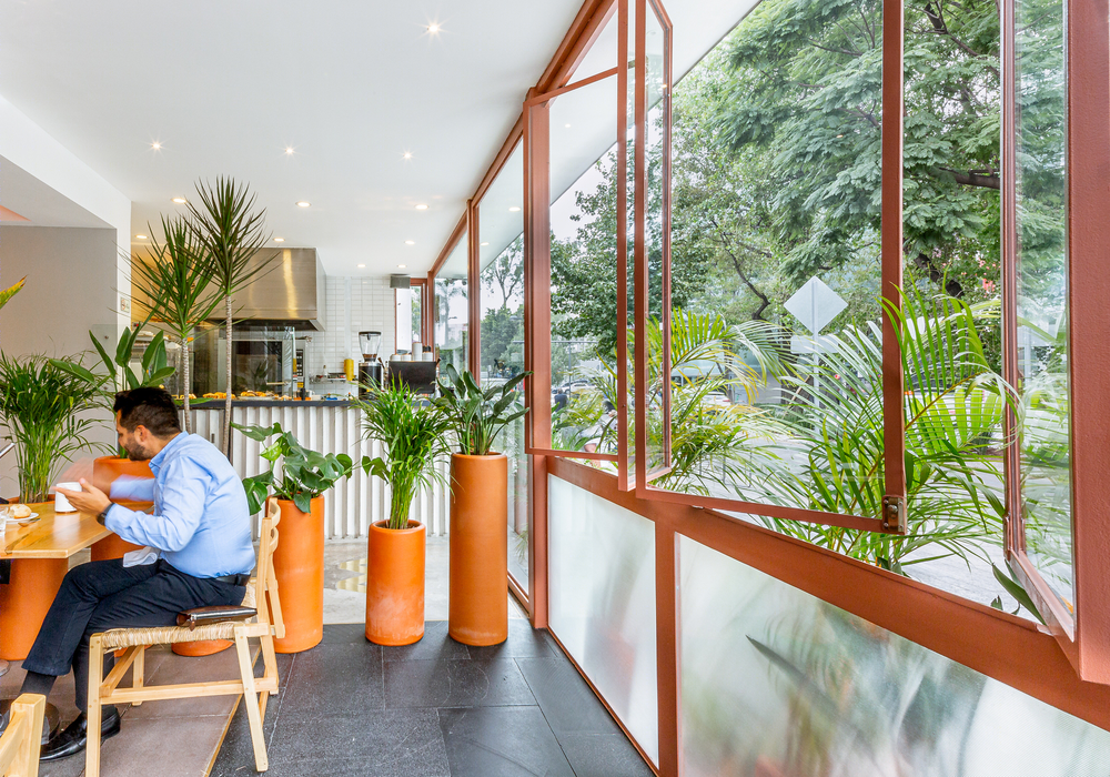
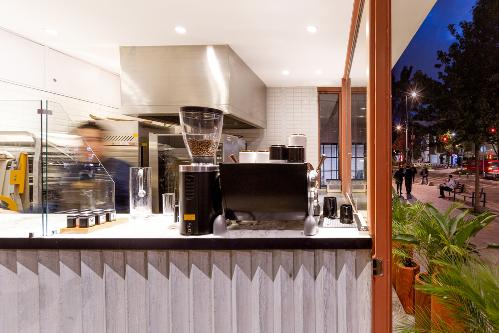
The furniture, handrails, and façade were proposed in different regional woods, such as cumarú, tzalam, white oak and walnut; Trying to complement the culinary experience with a sense of touch. Window frames were inspired in the typologies of modern Mexico from the fifties, and these where painted in red tones similar to the color fo the wooden façade.
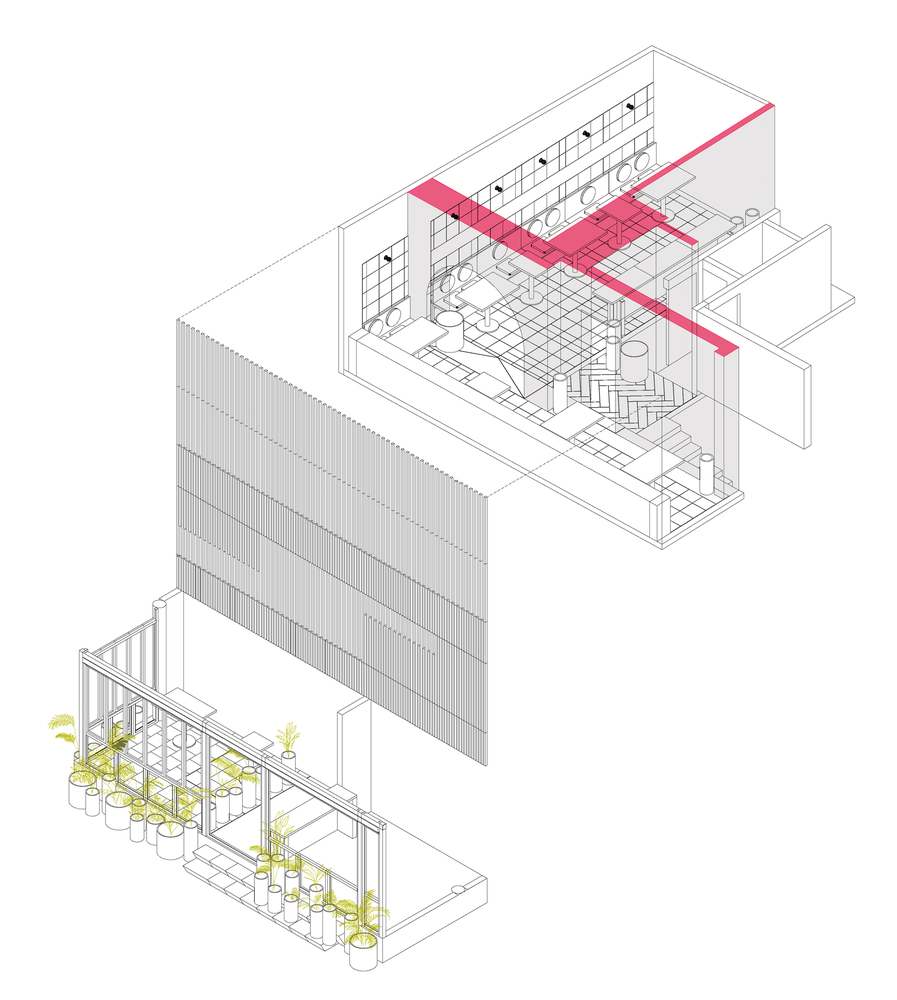
WEAVING WITH EXISTENCE: The design came also from the understanding the existence of a generic commercial building, that by rule of the landlord, could not be affected drastically. Therefore, we decided to develop a language that revealed and clarified the existent by using white paint. Afterwards, we tried to harmonize by using elements such as floors, wall skirting boards, booths, bar counters, window framing, sunscreens, etc.
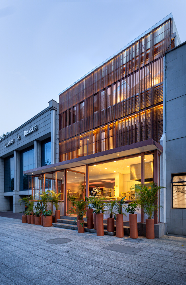
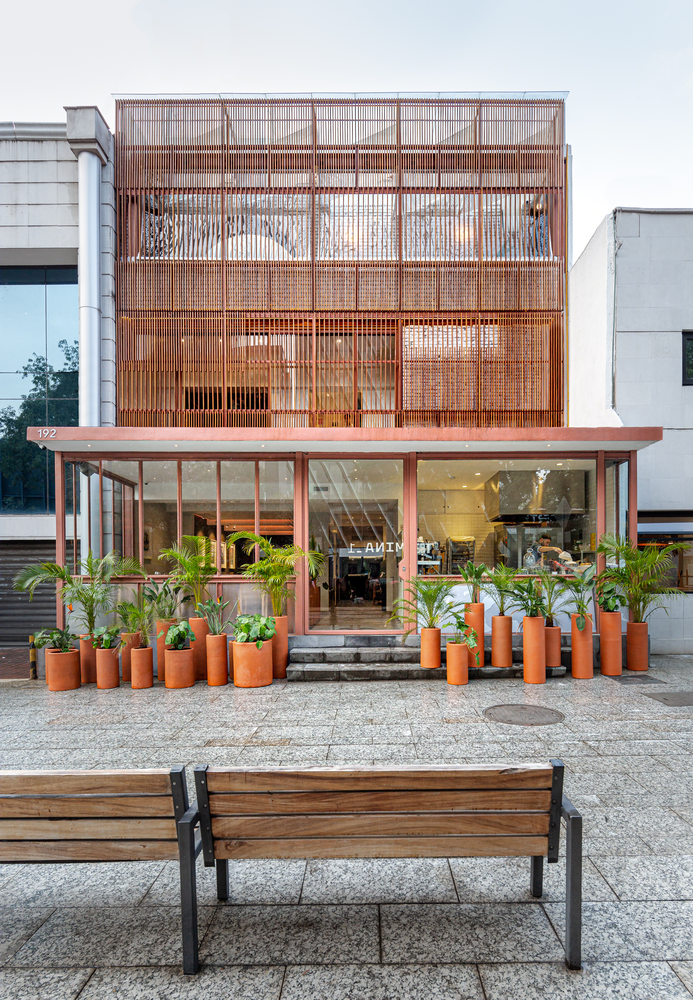
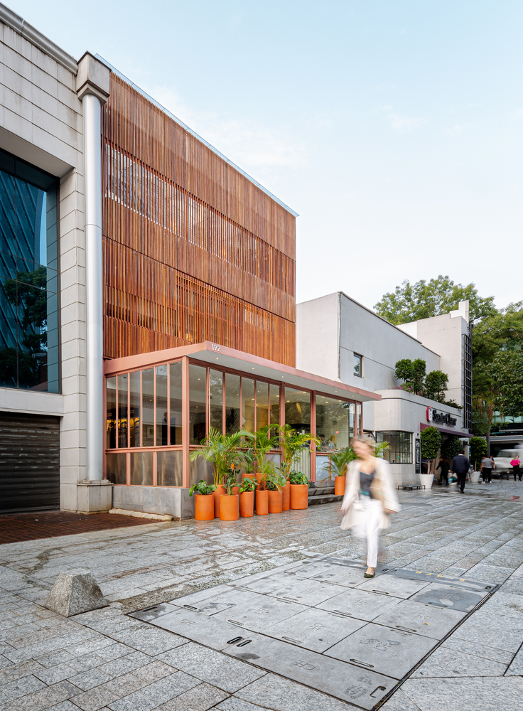
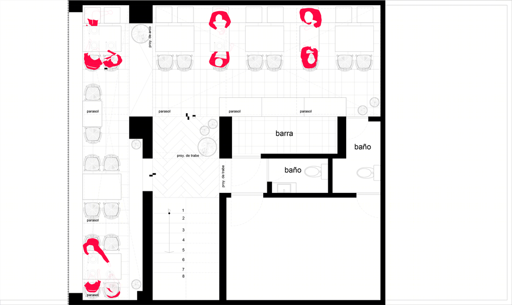
THE FACADE IN MASARYK: Considering that the restaurant is located in one of the most expensive avenues in Mexico City, we proposed a façade that had a contemporary look with great presence, and the same time we wanted some of the life of the interior to be revealed to the people across the street, looking at the facade in a perpendicular way you get a permeable screen, and from an angular point of view one finds a more homogeneous and elegant wooden façade. The lower floor was solved with very flexible window framing, diaphanous, inviting the pedestrian to take a look.
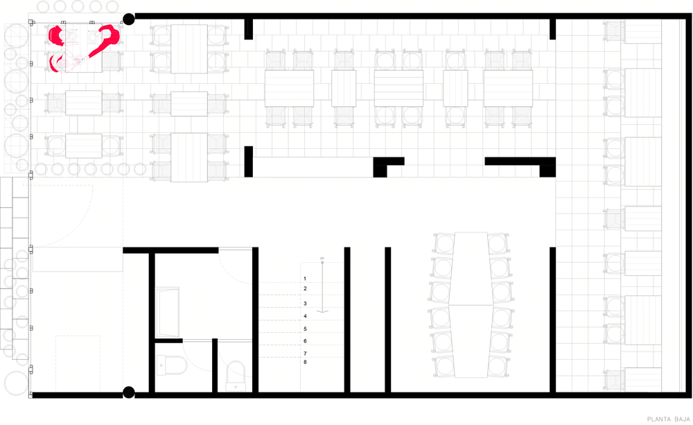
COLOR AND VEGETATION: The color palette emerged in a natural way, first assimilating the dark color of the volcanic rock floors, and then the red tones of the cumarú and tzalam woodworks. Yet we wanted a compliment, an accent that would be brought by the green of the vegetation, first the existing one from the avenue, then trough the proposed layers of tropical plants in the exterior and interior of the ground floor, and at last in the upholstery of the seats and backrests. Also, the clay pots were painted in different earthly colors, trying to get to an honest image of the colors of Mexico.
