Architect:SYNECDOCHE
Location:Ann Arbor, MI, USA
Project Year:2020
Category:Offices
Design Decision Guide
Approachable - where bots sound inhuman and awkward, their ai is meant to be conversational and easy.
Artificial/Industrial - Embracing all that is manufactured, man made, and engineered reflects in the tone of the space (materials, lights).
Fresh - younger, start-up company means open spaces for collaboration, learning, and celebrating.
John D’Angelo
John D’Angelo
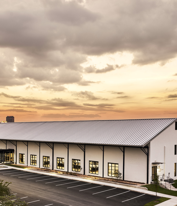
Transforming the former Kiwanis Thrift Store in Downtown Ann Arbor into a technology office headquarters required creative design solutions for a robust adaptive reuse strategy. Actually a group of three different buildings patched together over the years since its construction in 1925, the goal was to make the spaces feel connected and cohesive.
John D’Angelo
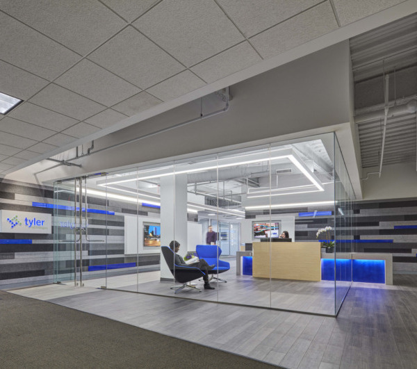
The industrial nature of the ai technology the company works on is reflected in the tone of the office. Throughout the building, we exposed the various ceiling structures to not only make the rooms larger, but also to expose to the different systems used. Utilizing simple, black light fixtures, we contrast with the historic textures above. To separate the more public spaces from the more private spaces, polycarbonate walls were used for their semi-transparent quality. Illuminating every other panel adds another level of light and creates a unique backdrop for the reception, office space, and cafe. The blackened metal reception desk is simple and modern. The geometry directs visitors to the adjacent meeting rooms or office space beyond.
John D’Angelo
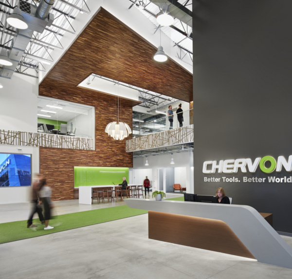
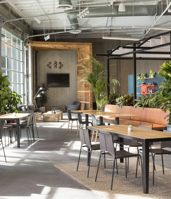
As an innovative company, it was important to have large collaboration spaces. What was once a barn, now vertically connects the work zones with areas for collaboration, learning, and celebrating. At the ground level, a large cafe encourages team members to enjoy lunch and coffee together. Directly above the cafe, the space can operate for training sessions, workshops, or all hands meetings. This flexible room opens onto the new roof deck, a great outdoor space for a midday break or a company wide party.
John D’Angelo
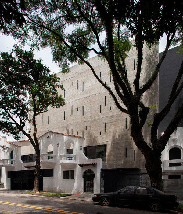
At the exterior, simple dark paint ties the three buildings together with new standing seam metal at the barn. At the entry, a local artist painted a colorful mural. This particular mural looks at the relationship between humanity and technology, fitting for the company headquarters.
Caption
Caption
Material Used:
1. Facade Mural: Taylor White, North Carolina Artist
2. Flooring: Carpet: J+J Flooring, Kinetex Strata, Silt
Carpet: Patcraft, Backlit, Lumen
Solid: Forbo, Marmouleum Walton, Black
3. Interior Finishes: Twinwall Polycarbonate Panel
Zintra Acoustic Panels, ½” Fossil
LG Hi-Macs, Glacial
Mosa Murals Tile 6” x 6”
4. Interior Lighting: Alcon, Continuum & Lombardy
Eureka, Scout
Muuto, Unfold Pendant
Muuto, Ambit Rail Lamp
Eureka, Plate Out Double wall sconce
5. Interior Furniture: Varies from BluDot & Steelcase
▼项目更多图片
{{item.text_origin}}

