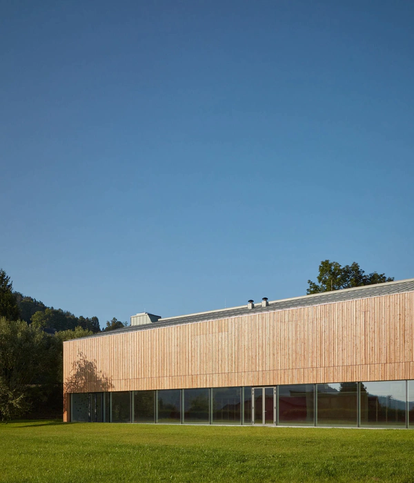
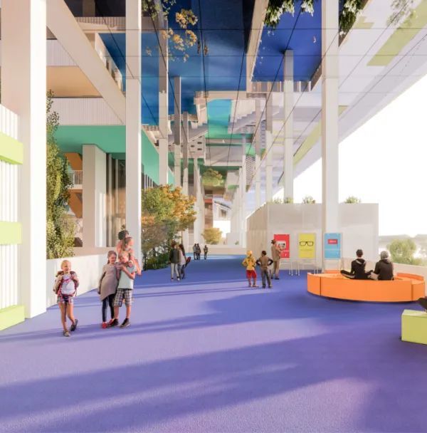
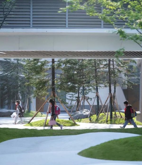
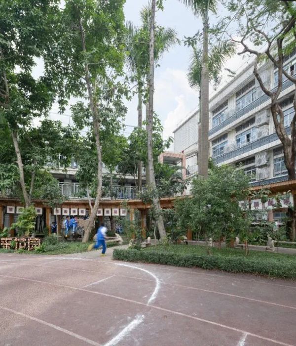
圣保罗城媒体中心的规划项目,旨在建造全新的城市中心。基于现状条件,该中心建筑的公共设施均适应其场地和周围街道及景观而设。该中心建筑的成功建立将构成该城市的核心景观及标志性建筑物。此外,该项目还是这座边缘化城市步入城市革新进程的重要一步。
The urban planning in which the Saint-Paul’s media center is included strongly answers to the desire of expressing a new centrality for the city. In this context, the public facility that we designed marks territory by its shape, its readability, from the Tamarins road to the great landscape. The completion of a media center downtown allows the structuration of the “gateway” area. It expresses an urban renewal expected for this district which until now was considered on the fringe of the city.
▼远眺建筑,view from distance
该项目中所包含的公共设施建设,很好的回应了该市人民对于公共生活的需要。依赖该建筑的自身功能,建筑外貌,及其所营造的公共环境,该项目已然成为当地的标志性建筑。如今在圣保罗,尽管该城市的山脉及海岸线是其最耀眼的城市景观,它的其他部分仍然需要更多的关注。圣保罗的媒体中心共6层,有利于观望该市的自然景观。它用优雅独特的姿态塑造了全新的城市风景线。
The urban settlement of this public facility answers to the need of a strong identity for this public facility in the island. This media center has to become a cultural landmark, through information and training, as well as a visual one through its architecture. Building a public construction, over its function, is to settle a construction in a context. Here in Saint-Paul, even if its richness is at the extension from the mountain climax to the seaside, the district also has to be enhanced. The Saint-Paul’s media center unfolds on six levels to take advantage of this quality, enjoying the scenery. It expresses the entrance of the city by a strong urban an architectural act.
▼6层高的建筑于周围环境中突显,the six-floor building out-standing from the surroundings
该建筑展现为边长为34米的立方体,契合紧凑的设计内容。立面受内部环境的影响,展现为古典和现代相结合的网状结构:如侧面展现的书本页面,或是层层堆叠的纸张推片,又或自然沉积或风化的岩石。不管什么,这层层堆叠的形态都预示着岁月的积累,引诱你去发现和探索隐藏其中的故事。这种独特的设计理念和审美表达,加强了其视觉效果,也更加强化的“书本”这个设计理念的阐述:立面是不规则堆叠效果的展现。然而这个立面设计却是建筑的立面百叶窗,有效的隔离了日间的直射阳光。
We designed a 34m side cube that includes a dense project. Its facades are inspired by the pledge of contents, represented in classic and modern medias: books with those trimmed or in folio pages, magazines or disks stack, sedimentation of maps, pile of pictures, stratification of an hard drive layers. All these accumulations that keeps the datas, are holding mysteries expected to be discovered. This vocabulary of a strong and surprising aesthetic enhance the notion of a visual cue, and reveals the singularity of the “book” object: the facade effect is a stack of irregular sheets. These are actually slight wavy louvres window blades vibrating depending on times of the day, soaking sun shades of colors.
▼立面百叶有效隔离日间阳光,the slight wavy louvres window blades vibrating depending on times of the day, soaking sun shades of colors
立面百叶中某些部位微微扭曲形成如眼睛般的洞口,主导了该建筑的立面结构:媒体中心的休息室,花园,以及露台遍布建筑屋顶,在这里远眺印度洋风景,感受绝佳的观景体验。如同书中插画一般,该建筑中的各层天花板也装饰了Michal Batory的画作,描绘了该建筑与Reunion的历史故事。立面的表达,布景的设置以及室内的装饰设计共同打造了该建筑的文化氛围。
In this book some pages are opening like “eyes” to create chapters that structures the building: the lobby of the media center, the garden, and several terraces spread over the top levels molds some lookouts on the Indian Ocean landscape. As book illustrations, the ceilings of the levels gives to read pictures by Michal Batory about medias and Reunion’s heritage. Texts, pictures and sketches combine to generate a cultural atmosphere.
▼立面百叶形成如眼睛般的洞口,some layers are opening like “eyes”
▼从立面洞口可以眺望远处风景,the holes are allowed visitors to view the beautiful landscape
▼天花板图案配合纯白色墙壁营造温馨氛围,te colorful ceiling with white walls creates a warm atmosphere
▼天花板图案,the picture on the ceiling
▼地面层公共花园景观,the public garden on the ground floor
室内色彩斑斓的屋顶配合纯白的墙壁展示,展现了一种温暖的环境氛围。建筑平面享受270度观景体验,沐浴在阳光下,感受穿透立面百叶而来的徐徐微风,让人倍感舒适。大自然的融入模糊了室内外环境的界限,该建筑是植物与矿物的有机结合体。环绕建筑的公共花园成就了建筑的有机结构形式,树荫提供了有利的遮挡:松树等多种植物的繁茂生长将创造季节性的绿荫环绕。地面层遍布各种长椅,吸引人停留观赏,享受城市生活的美好。
Interior spaces are warm, in a uniform white values the colorful pictures of the ceiling. The free levels opens over 270° to the landscape, bathing in light and crossed by a slight natural breeze coming from the louvres adjustable blades which optimize the thermal comfort of the users. The nature penetrates into the bulding, erasing the limits between inside and outside, to connect the build and the landscape. It generates amazing atmospheres between vegetal and mineral. The garden takes part of this organic ornament, surrounding the building and slipping into the interior spaces. The tall trees offers a smooth and protective shade : Pine trees, flamboyants, tamarins, will soon provide a qualitative canopy. On the ground, some planted islets are limited by benches. This public space invites to take a break and place the media center into a pleasant journey in the district.
▼夜色中的建筑,architecture in the night
▼轴测图,axon
▼底层平面图,the ground floor plan
▼二层平面图 /夹层平面图,the first floor plan/the mezzanine floor plan
▼三层平面图/四层平面图,the second floor plan/the third floor plan
▼五层平面图/六层平面图,the forth floor plan/the fifth floor plan
▼立面图,section
▼立面图,elevation
▼立面结构分析,facade structure
Project manager : Juliette Bonnamy
With : Charlotte Lefebvre, Alfredo Luvison, Claire Oiry, Emily Murphy, Timothée Kazmierczak, Pierre Tignon, Karine Bergevin, Camille Isaac-Dognin, Charline Lalanne, Guillaume Guilbert
Adress:Chaussée Royale – Rue du Générale de Gaulle
City:St Paul – la Réunion
French department:974
Program:Achievement of a media library with café, restaurant, reception area and gardens, conference and entertainment spaces, self-learning and citizenship spaces, reading and media areas, sound and image center, and an administration.
Site area:5 002 m²
Bldg area:4 567 m² shon (net floor area)
Total floor area:6 802 m²
Landscape area: 4 250 m²
Stories:6 stories
Structure:Reinforced concrete
Finish: Anodised aluminium sunshades with a natural finish mounted on a steel structure
Design Participation:PEUTZ & Associés (acoustic research department)
Client:SEDRE for Saint-Paul city
Model:PERIPHERIQUES Architects
Rendering:L’autre image
Photographer:Luc Boegly
Landscape designer:Zone Up
Structural engineer:EGIS Océan Indien
Constructional engineer:EGIS Océan Indien
Cost:13,17 M € H.T.
Schedule:competition May 2011 – completed in April 2015
{{item.text_origin}}

