Architects:Snow AIDe
Area :696 m²
Year :2020
Photographs :Jaeyoun Kim
Manufacturers : AutoDesk, Enscape, DADA brick, Noroo paint, Pos-Zinc, Rhino, VitnaAutoDesk
Architect In Charge : Hohyun Park, Hyunjoo Kim, Sunggon Cho
Design Team : Hyunwoo Park, Sungwoong Yoon
Consultants : ileap Constructure
Country : South Korea
Background - The site is an old town in the northeast of Seoul. This town faces The Jungnang river on the west side and the Yongma mountain on the east side. Although the beautiful natural environment, the area was outdated in the last 30 years. The client, who spent his youth in this town, wanted to build a new building for his old parents. When I visited the site for the first time, the existing small building looked like a withdrawn child surrounded by tall buildings. The client told me his idea about retail space, rental houses, and a small house for his parents on the top floor.
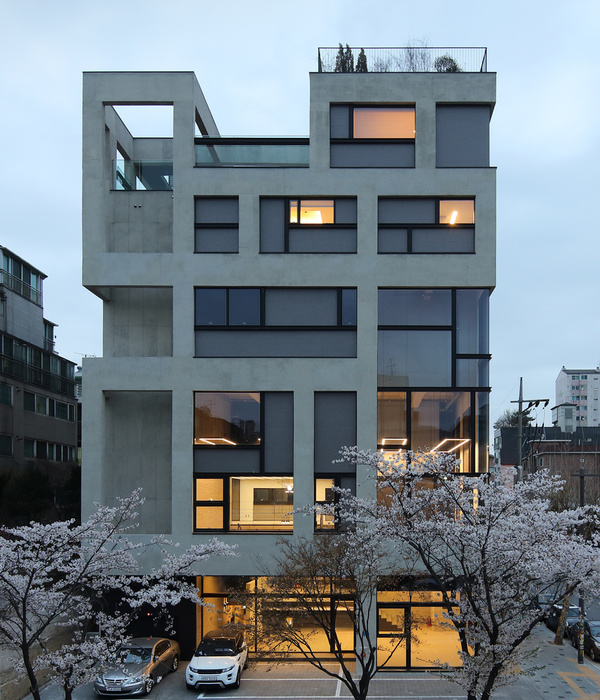
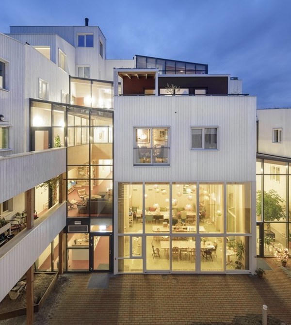
Site & Mass - The rectangular shape site is only open to the Neungdong road on the west side. All the other side are adjoining with other buildings. Viewing and natural lighting are limited solely to the west. Therefore, every residential unit needs to see the west side. If all the residential units line up on the site’s longitudinal axis, they have to see the church’s wall, which is right next. The residential units need to be shifted as a step shape to share the natural light and view of the Neungdong road.
The next question is how to solve the parking space. Because of the narrow width of the site, underground parking is not efficient. So, the parking space is planed on the ground level. The building’s primary form is derived from placing residential units and parking spaces on the ground level.
Program & Plan - The client wanted to have a small café space on the ground level, commercial space on the underground and 2nd level, residential units for rent on the 3rd and 4th level, and the house for his parents on the 5th level. However, the limitation of parking space decides the size of the whole building. We determined the final program by reducing the number of residential units and removing the underground based on the maximum parking number.
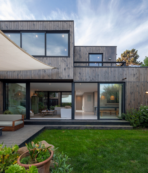
After setting the program, the size, and the basic shape, we started to design the house on the 5th floor. Since the client wanted to make a house with a garden, We placed the garden on the southeast corner, where we can see the scenery of the Mountain. The wooden decks connect the garden to the living room on two sides by folding doors. There are the kitchen and dining on the back of the living area. Behind the dining area, the stair connects to the attic. The attic space is for the family who visits to see their parents. Since the attic’s height is low, we put the glass wall on the living room’s side to avoid stuffy space and get the sunlight. The master zone is on the west side end to see the city view.
Design & Material - The steps shape has five corners, and the corner windows show a different life. The inverted triangle windows, which connect to the corner windows, are the result of balancing between viewing and hiding. The west elevation, which is seen from the road, could be massively looking. So, adding diagonal patterns of brick tiles and metal c channels creates tension on the façade. The diagonal pattern and the roofline make the dynamic window shape in the master room.
▼项目更多图片
{{item.text_origin}}

