Some homes have that something special. The sort of interiors that feel like they belong to both the here and now, but also somewhere in the past. Ludivine Billaud created just that sort of feel in this Paris apartment, which captures her personal style rooted in utilitarianism and functionality – a manifestation of what she refers to “public style.” I call it a gentle not to Le Corbusier, but I think ultimately her and I mean the same thing.
Billaud is originally a textile and graphic designer who trained at the Cambre School in Brussels and then Decorative Arts in Paris. Inherently attracted to arts and crafts and materials, she broadened her practice to the domain of furniture design, decorative elements and furnishings. She previously owned restaurants in Paris, now returning to her deep interest in decoration and demand from an existing client base for custom interior solutions.
This apartment is divided into private and public areas while maintaining a sense of fluidity between the two. “Guests can be comfortably welcomed at the front of the apartment, while the lounge and sleeping areas remain present, but concealed – the suggestion of much more, without an absolute exposure,” says Billaud.
A new bathroom sits nestled between the public and private realms of the home, it’s curved form manifesting both inside the bathroom interior – bending the available natural light into the shower – while delivering similar value on the structure’s exterior. Covered in clay brick, the form becomes a feature of the apartment providing strong sculptural relief in both private and public areas of the home.
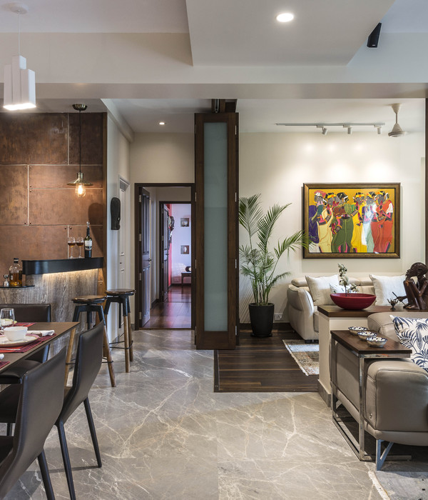
“In the lounge and bedrooms, plush woollen carpets and curtains accentuate the ambient comfort of the private spaces. Conversely, the public areas are served by a hardscape of patterned ceramic flooring, that is both practical and visually stimulating,” says Billaud.
The designer delivers a scheme with a strong design language and materials associated with both the public and private domains. Tiled horizontal surfaces extend between rooms providing small storage units, shelving and practical places for simply displaying.
“I was inspired by the architecture of ‘Residences’ of the 1960s and 70s; those big entry halls welcome residents into large apartment buildings, where the furniture is fixed and space is considered and designed. I wanted this space to feel like that kind of public space,” she adds.
With no wall surface painted, Ludivine relied on various textures rendered by different concrete-based wall finishes playing with the grain, stain, and – in the case of the kitchen – even creating strong and abrupt lines between tints, and integrating the mirror which creates a strong modernist fresco. Colour highlights provided by the lighting fixtures, soft furnishings, curtains and ceramic surfaces have the effect of bringing extra depth and extending the available space.
The attention to detail, the noble but honest quality of the materials used, and the care given to the decor elements and the bespoke design of all the carpentry and furniture reinforce the sentiment of living in an environment that is unique. The custom-designed furniture, which is mainly fixed and integrated into the partitioning (cupboards, bench, sofa, sills, niches) amplifies the serenity that emerges from the ensemble. Furniture becomes secondary in the space by celebrating the interiors volume and allowing uninterrupted circulation.
[Images courtesy of Ludivine Billaud. Photography by Cécile Bortoletti.]
{{item.text_origin}}

