Courtesy of Neri&Hu Design and Research Office
奈里
架构师提供的文本描述。罗宾·埃文斯(RobinEvans)1978年的“人物”、“门”和“段落”分析了一个计划的普通元素及其安排是如何相互作用和一个简单的角落或窗口打开实际上是由一个复杂的空间关系矩阵决定一个空间是如何使用的。奈里
Text description provided by the architects. Robin Evans’ 1978 essay Figures, Doors and Passages analyzes how ordinary elements of a plan and their arrangements interact and shape occupancy. A simple corner or window opening is in fact inscribed with a complex matrix of spatial relationships that determine how a space is used. Neri&Hu’s design for Bloomberg Hong Kong’s internal office stair is in part inspired by the mundane elements of space-making - windows, passages, staircases and thresholds. The client’s brief was to design a staircase to connect the 3 different floors of their office with the explicit rule that this stair should to be used daily as the only vertical connection within the office to encourage employee interaction. Part of the brief was to also create a design that would respond to the locale of Hong Kong to create a link to the larger context of the city. The site is situated in the client’s existing office, within a typical office tower and surrounded by existing conference rooms, break-out areas, a recording studio and an auditorium. The existing spiral staircase was sculpturally iconic but the geometry was not conducive for the daily high traffic volume. Our challenge was re-design a staircase that would work within the structural limitations of the knock-out panels in the floor slab, while still creating a more spacious journey.
Courtesy of Neri&Hu Design and Research Office
奈里
Courtesy of Neri&Hu Design and Research Office
奈里
新楼梯包括平台、落地、内建座位及策略性窗框等元素,与香港的自然景观及城市地形的极端情况相呼应。楼梯的形式是插入木箱,它主动否认了维多利亚港的景观(香港公司办公室通常是一种被追捧和框架化的观点),而是专注于办公室内部的框架活动,同时仍提供精心策划的视野。这座楼梯被一片轻灰烬木包裹着,带有裸露的细骨料混凝土踏板和青铜金属栏杆的口音,可以看到意想不到的景致-透过窗户、双倍高的切口、向下的大空隙和周围的程序。隐藏式巴里斯托尔照明的目的是模仿天窗在天花板上的自然切割。
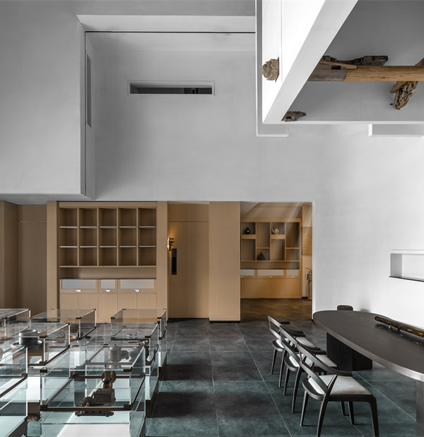
The new staircase integrates elements of platforms, landings, built-in seating and strategic window framing that echo what one may find in the extremes of Hong Kong’s natural landscape and urban terrain. Expressed as a wooden box insertion, the staircase massing actively denies the view to Victoria Harbor (a typically sought after and framed view in Hong Kong corporate offices) and instead focuses on framing activity within the office while still offering curated views out. Enclosed in a light ash wood massing, with exposed fine aggregate concrete treads and bronze metal railing accents, the staircase winds and turns to offer unexpected views – through windows, up double height cuts, down large voids and across to surrounding programs. Recessed barrisol lighting was designed to mimic natural skylight cuts in the ceiling.
Courtesy of Neri&Hu Design and Research Office
奈里
Courtesy of Neri&Hu Design and Research Office
奈里
这三个层次中的每一个都具有不同的功能,以适应一组不同的垂直程序。旅程开始在25楼的接待,表现为一个雕刻的利基与窗口框架的海港视野之外。这一级别是设计为最外向的性质,一个大的活动空间舞台的聚会,建立在长凳上的周边,以及专用的区域,为小的脱离小组的座位。小众座位的部分灵感也来自于扩大的楼梯计划中被取代的会议舱;我们没有将它们恢复为单独的会议空间,而是将功能座位和会议区域整合到楼梯的建筑语言中。在与磨坊进行更密切的互动后,用户会在这些座位壁龛内向用户展示隐藏的定制细节-小木料和青铜面板折叠起来,露出充电口、镜子和可以放置一杯咖啡或手机的功能台架-意想不到的细节支持日常办公生活的普通仪式。
Each of the three levels is designed with different functions to accommodate a diverse set of vertical programs. The journey begins on the 25th floor reception, expressed as a carved niche with a window framing the harbor view beyond. This level is designed to be the most extroverted in nature with a large event space stage for gatherings, built in benches on the perimeter as well as dedicated areas for small break-out group seating. The niche seating was also inspired in part by the break-out meeting pods that were displaced in the enlarged staircase scheme; rather than reinstating these as separate meeting spaces, we integrated functional seating and meeting areas into the architectural language of the staircase. Upon closer interaction with the millwork, hidden bespoke details are revealed to the user within these seating niches - small wood and bronze panels fold out to reveal charging ports, mirrors, and functional ledges where a cup of coffee or cell phone may be placed – unexpected details in support of the ordinary rituals of daily office life.
Courtesy of Neri&Hu Design and Research Office
奈里
一直持续到26楼,在流通的道路上形成了不同的观点。考虑到彭博录音室就在这个层次上,以及会议室,这个想法是为了创造一个更内向的空间,以解决声音遏制和视觉隐私的问题。该质量被分成两个盒子,使登陆成为门槛区,视觉打开沿幕墙在一边的港口景观,并连接到另一个会议室的通道。该视觉框架还满足客户的要求,提供一个受控的一瞥或“借来的场景”的激活楼梯从录音室作为拍摄背景。考虑到这层楼更安静的性质,内置的座位面向港口景观侧提供单独的休息。
Continuing up to the 26th floor, different views are framed along the circulation path. Given that the Bloomberg recording studio is located on this level along with conference rooms, the idea was to create a more introverted space to address issues of acoustic containment and visual privacy. The mass is split into two boxes, allowing the landing to become the threshold zone that visually opens up to the harbor view along the curtain wall on one side and linked to a passage to the conference rooms on the other. The visual framing also satisfied the client’s request to provide a controlled glimpse or “borrowed scene” of the activated staircase from the recording studio as a filming background. In consideration of the more quiet nature of this floor, built-in seating facing the harbor view side is provided for solitary respite.
Courtesy of Neri&Hu Design and Research Office
奈里
在27楼的最后一层,楼梯又打开了,变得更加外向,可以看到周围的景色。体积进一步缩小,以更大的开口和透明的玻璃来提供广阔的视野。一个悬臂式观景台是设计作为大礼堂突破空间的一部分,以提供戏剧性的多层视野和旅程的高潮在一个休息室面对港口的景观。
On the final level of the 27th floor, the staircase opens up again to be more extroverted to bring in views of the surroundings. The massing is reduced further in scale, punctuated with larger openings and clear glass to provide expansive views. A cantilevered viewing podium is designed as part of the auditorium break-out space to provide dramatic views down the multiple levels and the journey culminates in a lounge facing the harbor view.
Courtesy of Neri&Hu Design and Research Office
奈里
通过仔细的构图和并列,我们日常认为理所当然的普通的小插曲,特别是在办公室类型学中,被编排成了一个丰富的旅程,允许偶遇、停顿和非正式交谈的时刻。
Through careful composition and juxtaposition, the ordinary vignettes we take for granted on a daily basis, especially in an office typology, are choreographed into a rich journey that allows for moments of chance encounters, of pause and informal conversations.
Courtesy of Neri&Hu Design and Research Office
奈里
Architects Neri&Hu Design and Research Office
Location Cheung Kong Centre, 2 Queen's Road Central, Central, Hong Kong
Category Offices Interiors
Architect in Charge Lyndon Neri & Rossana Hu
Area 268.0 sqm
Project Year 2015
Manufacturers Loading...
{{item.text_origin}}

