WAY INTERIOR DESIGN
Le design pour le plaisir
我们仅仅构建可以被理解和可用的功能性产品是远远不够的,我们还应该构建能够给人们的生活带来乐趣,兴奋,愉悦和美的产品。--唐.诺曼
It’s not enough for us to build functional products that can be understood and usable. We should also build products that can bring fun, excitement, joy and beauty to people’s lives.--Don Norman
About
项目地址 / 七日食LIGHFOOD轻食(正大CPL店)建筑面积 / 260m²
设计团队 / 未止设计
设计时间 / 2020.07
竣工时间 / 2020.10
关于格局
这个项目坐落在正大CPL底商,共有四个出入口。东南两侧是落地窗,采光非常好。但也因为有四个出入口的原因,所以造成了一定会存在四个通道。所以我们在店铺中心位置设置了中心服务区,可以照顾到各个角落的客人。环绕吧台一周设置了各种属性的坐客区。
△原始平面图
△平面布局图
About Color
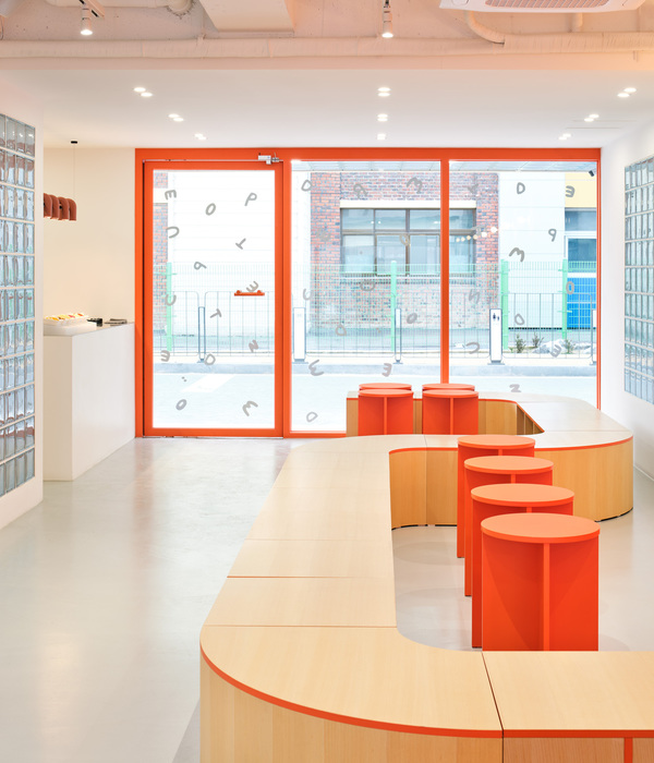
色彩上和上个店不同,这次运用了更热烈的橘红和米黄做搭配,局部运用了蓝色加以点缀,希望能营造一种时尚,温暖,轻松的氛围感。
The color is different from the last store. This time, we used more warm orange and beige to match, and partially used blue for embellishment. I hope Wang can create a stylish, warm and relaxed atmosphere.
Door& Gateway
我们最终将南面及北面作为主入口,东西两侧入口也保留,让客户从任何方位都能方便进入店内。
We eventually used the south and north sides as the main entrance, and the east and west entrances were also reserved, so that customers can easily enter the store from any direction.
北入口在写字楼内,方便楼内客人进出
The north entrance is in the office building, which is convenient for guests in and out of the building
南入口挨着路边,方便室外客人进出,也是外卖出入口
The south entrance is next to the road, which is convenient for outdoor guests to enter and exit. It is also the entrance and exit for takeout.
BarCounter
我们将最重要的功能性吧台设置在了店铺C位,利用空间动线,将下午茶区、办公岛台区、散座区、卡座区以及操作区域划分开来,环形吧台也被分为了酒吧吧台区、咖啡操作区、收银区以及方便外卖人员取餐的取餐区。
We set up the most important functional bar counter in the C position of the store, and use the space to divide the afternoon tea area, office island area, scattered area, deck area and operation area. The circular bar is also divided into Bar counter area, coffee operation area, cashier area, and meal collection area for takeaway staff.
集多功能于一身的吧台
Multi-functional bar counter
Office island area
设置了高吧台,适合团队聚会
Set up a high bar, suitable for team gatherings
Afernoon Tea Area
紧挨着落地窗我们设置了下午茶区,与周边自然空间有互动性。
Next to the floor-to-ceiling windows, we set up an afternoon tea area, which is interactive with the surrounding natural space.
Scatterea Area
Deck Area
顶面与墙面相结合,从墙体以弧形分叉、延伸,像是一页被翻开的书
The top surface is combined with the wall, bifurcating and extending from the wall in an arc, like a book that has been turned over.
卡座区设置了隔断,更加私密
The deck area is partitioned for more privacy
©如初建筑空间摄影
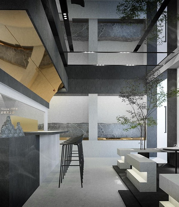
顶面设置的镜面投影出了有趣的空间
The mirror set on the top surface projects an interesting space.
延续了一店的菜单墙,有趣的点餐方式
Continuing the menu wall of a store, an interesting way of ordering
©馥岛摄影工作室找一个靠窗的角落,清晨,点上一杯咖啡充实味蕾,准备迎接新的一天;午后,两三好友相聚,点一杯果汁和美味的甜品;夜晚华灯初上,轻食与酒的搭配也是那么和谐统一。放慢节奏,品味生活,享受当下现代都市人难得的奢华时光吧。
Find a corner by the window, in the early morning, order a cup of coffee to enrich your taste buds, and prepare for the new day; in the afternoon, two or three friends are meeting, order a cup of juice and delicious desserts; at the beginning of the night, the combination of light food and good wine is also the same Harmony. Slow down, enjoy life, and enjoy the rare luxury time of modern urbanites.
丨空间设计丨
WAY DESIGN STUDIO
丨空间摄影丨如初空间摄影
丨场景摄影丨馥岛摄影工作室
丨撰文丨
SHUUG_Wil
丨编辑丨
Ace/ Alex
WAY未止空间设计有更多设计需求请联系
T:15136369042 / 15136368045
A:洛阳市涧西区世纪华阳9-2-2001室
{{item.text_origin}}

