With a goal of increasing and revitalizing internal communication, JTOWER's new Tokyo office gives employees of the infrastructure sharing business a vibrant space to carry out their work.
inter.office utilized a minimalist design to create a sleek and welcoming environment for the JTOWER offices in Tokyo, Japan.
It was required to introduce ABW for the first time and create a place with various seating and induce face to face communication, with the aim of adjusting to expansion of personnel and revitalize internal communication. Considering that requirement, we set the concept as “JTOWER LINK STATION” and created the office as a center of exchange where links between inside and outside the company can spread.
The workplace consists of five areas: “FOCUS” specializing in solo work, “CO-WORK” specializing in exchange, “LABO” for verification of equipment, “MEETING” for internal and external meetings and “CIRCUIT”, a distinctive circular passageway that connects these areas. We incorporated features of the site into design that you can feel the sense of urban speed outside while inside since this site is located on the 3rd floor of a glass-walled building facing the main street. The space near the window, which is not suitable for work due to the constantly moving outside view, was saved as a wide passage for movement and placement iconic furniture here will encourage quick meetings and cross-departmental interaction. In addition, the plan is to always pass through the “CIRCUIT” when moving between areas, with the aim of promoting a mindset each time they move.
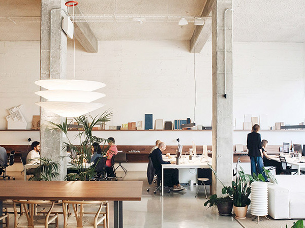
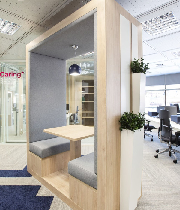
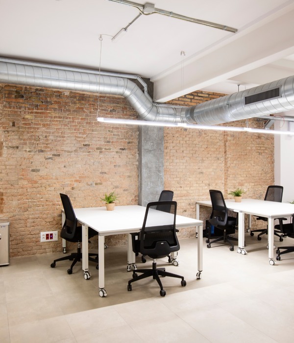
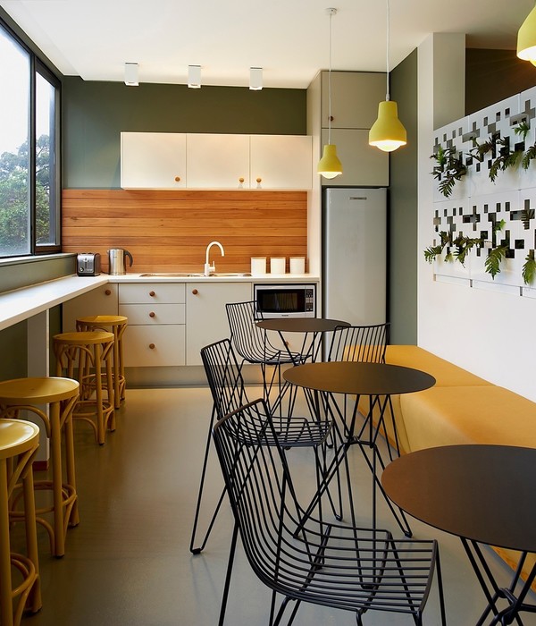
“CO-WORK” located in the center of the site has a pantry and booths to encourage casual interaction among employees, and natural materials were used to create a high-quality café-like atmosphere. “FOCUS” located in the corner is designed to encourage concentration, with wide office seats and individual booths in slightly calm tone color scheme. In order to maintain a high degree of purity in the role and mood of each area, even the same office space, the meaning of those space are clearly distinguished.
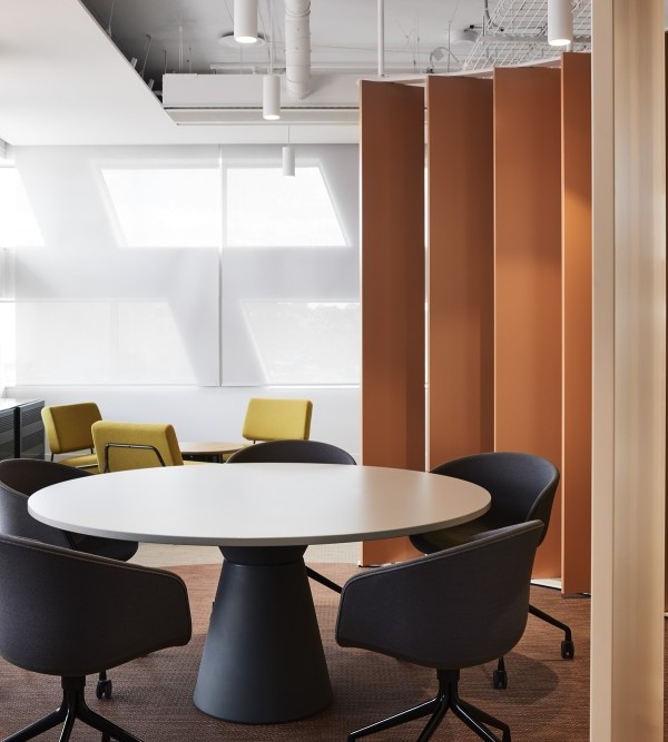
“MEETING”, the face of the company, was designed to express the corporate identity, combining walls and ceiling painted in corporate color navy, champagne gold curved lighting and a biotope to give a sense of the advance and speed of the business.
On the other hand, we actively utilized environmentally friendly materials such as wood-hair cement plates made from thinned wood and wall panels made from recycled volcanic ash, making it a space where you can feel the japaneseness and the warmth of the materials.
Recently, it has become common to choose working from home. That is why we believe that an office can establish its value as a place for employees to gather by characterizing its design and improving the purity of the spatial experience that occurs there, rather than by making it a universally comfortable environment for everyone.
Design: inter.office
Photography: Tomooki Kengaku
14 Images | expand for additional detail
{{item.text_origin}}

