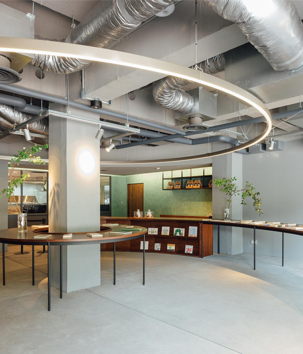
在以 “图书馆与艺术 “为设计理念的指导下,Yuko Nagayama and Associates为这座拥有50年历史的商业建筑进行了空间改造。改造后的新空间为大众提供了一处休息与放松的场所。设计将宽敞的中庭改造成了一处温馨的聚集场所,同时结合公园功能与私人图书馆性质,为游客阅读书籍与赏鉴艺术创造机会。
Guided by a design concept of “Library & Art,” this renovation of a commercial building with a fifty-year history provides a place for community members to rest and relax. Our design transforms the spacious atrium into an intimate enclave that resembles a park in some places and a private library in others, offering opportunities for visitors to encounter books and art.
▼服务台,Service center
空间内部主要由三个元素构成:灯光、书架以及如公园般的丰富绿植。其中由669个灯泡和1338根电线组成的照明系统成为该项目最独特的亮点。通过改变悬挂灯泡的高度,设计团队在支撑结构之间打造了四处天花板。灯泡如同项链吊坠一般悬挂在两根细绳的交点处。白色的线条被悬挂的灯泡照亮,在头顶形成一个个叠影光环。在此之前,团队已完成了重量计算并进行模拟测试,确定所需的重量,以防止绳子最远端(长度5米)松动下坠。灯泡是由亚克力雕刻而成,以替代玻璃制品,即使遇到意外敲击也能确保安全。此外,设计中还将不锈钢线插入没有电线的其中一根绳索中,作为防止灯泡掉落的多重保护措施。为了防止亚克力灯泡内部反射的光线过于耀眼,设计团队尝试了不同的形式,以避免反射出不必要的扭曲光线。
Three primary elements compose the space: an assemblage of lights, shelves for encountering stories, and parklike greenery. Comprised of 669 bulbs and 1338 cords, the assemblage of lights is the most distinctive feature of the project. By varying the height of the suspended bulbs, we constructed four ceiling vaults between the columns. Bulbs are suspended like necklace pendants from two thin cords hung at convergent 40-degree angles. The white lines overlap to form a nimbus overhead that is illuminated by the suspended bulbs. We performed weight calculations and made mockups to determine the weight necessary to prevent the longest cords, measuring 5 meters, from slackening. The bulbs are made of carved acrylic rather than glass, ensuring safety if they are ever knocked. Of the two cords used to hang each bulb, stainless steel wire was inserted in the one without electrical wiring as an additional safety measure to prevent bulbs from falling. To prevent the carved acrylic cavities from shining too brightly from the light reflected inside of them, we experimented with different forms to avoid additional distorted reflected light.
▼由灯光、书架以及丰富绿植构成的空间,
The space is composed of lights, bookshelves and parklike greenery
▼遍布绿植与吊灯的室内空间,
The interior space is filled with greenery and light
团队营造温馨氛围的第二个策略是鼓励到访者与新书建立联系,通过有效地排列展示,使书籍的封面可清晰被游客看见。图书部门主管特意从书中摘选有意义的引语,展示在每本书的下方。空间内另有一处专门摆放艺术类书籍和工具的书架,可以帮助参观者了解创作过程的幕后花絮。中庭的两根支撑柱装饰着有助于唤起大众阅读兴趣的艺术壁画。二楼咖啡厅的书架上则收藏着 100 本书关于面包与咖啡的书籍。
Our second strategy for creating an intimate atmosphere was to connect visitors with new books by arranging them so their covers are visible. The book director also selected meaningful quotes to display under each book. One shelf is devoted to art, with books and tools that were important to artists giving visitors a behind-the-scenes look at the creative process. Two of the columns in the atrium are decorated with artists’ murals evocative of the experience of reading. Additional bookshelves in the second-floor café hold 100 books about bread and coffee.
▼摆放各类书籍的书架,Shelves to display all kinds of books
▼装饰着艺术壁画的支撑柱,The support columns decorated with art murals
第三个元素则是公园般的丰富绿植,通过在空间内设置多处种植池,展现了该地区作为东京度假胜地的历史背景。其中,对于日本本土植物的选择灵感来自著名的避暑度假胜地,如轻井泽与等等力溪谷公园。部分种植池内种植了各式季节性植物,将四季之美带入室内。
The third element, parklike greenery, is achieved through planters that reference the district’s history as a resort area for Tokyoites. The selection of native Japanese plants was inspired by famous wooded resorts such as Karuizawa and Todoroki Ravine, where city dwellers went to escape the summer heat. Some planters include space for seasonal plantings, bringing the four seasons inside.
▼从二层空间望向中庭区域,View from first floor to the atrium
商业设施也在极力追求与联合国可持续发展目标一致的设计策略。考虑到这一点,项目中广泛使用了可持续材料,如用于室内装饰与家具的废弃木材。自开业以来,这处新空间吸引了众多到此处休憩放松并享受艺术与书籍的游客。
Commercial facilities are increasingly seeking out designs that reflect the UN Sustainable Development Goals. With that in mind, we made extensive use of sustainable materials such as scrap wood for the interior finishes and furnishing. Since opening, the space has drawn many visitors who spend time relaxing and enjoying the art and books.
▼二层空间,first floor
▼悬挂吊灯近景,Detailed view of the hanging light
Interior design: Yuko Nagayama and Associates
Photography: Daici Ano
Location: 3-17 Tamagawa, Setagaya-ku, Tokyo
Completion: April, 2020
Design period: May, 2019 – October, 2019
Principal use: Commercial facility
Total floor area : 55416.33 m2 (designed area : 2058.2 m2)
Client: Toshin Development Co.,Ltd (Takahiro Minamikawa)
Architect: Yuko Nagayama and Associates (Yuko Nagayama, Shoichi Hirota, Hideo Yokota)
Design development: Nihon Sekkei, Inc. (Takao Yuki, Masayuki Hamachi, Yoshifumi Karasawa)
Greening designer: Daishizen Inc. (Taichi Saito, Akira Masuda, Miyu Yoshizawa)
Lighting designer: Izumi Okayasu Lighting Design (Izumi Okayasu)
Art curation: Sakie Takasu
Contractor: Tokyu renewal Co.,Ltd (Kosuke hirokoshi, Yoshiyuki Yasuhara, Yuji Otsuka, Yasuhiko Eto)
{{item.text_origin}}

