在这栋为四口之家设计的住宅中,业主希望不管处在房屋的哪个位置,家庭成员都能够感觉到彼此的存在。以山顶场地的现有地形为基础,建筑师希望设计建造的住宅不会对周围安静的居住区造成过多的影响。场地中原有一栋老旧的住宅和一栋出租建筑。建筑师决定使用同样的方式重建两栋建筑。为了保留花园中的柿子树并尽可能的维持小镇原有肌理,山墙屋顶体量参照原有住宅的布局和形式。
At this house – a residence designed for a family of four – it was requested that everyone in the family should be able to feel the presence of each other regardless of where they are in the house. The design is based on the fixed topography of the site at the top of a hill, and the expectation that there will not be any big changes to the quiet residential area of the surrounding in the future. On the site there was an aging main house and a rental building; we decided to rebuild both houses using the same composition. The volumes of the gable roofs were placed with reference to the original layout and form, in order to keep the persimmon tree in the garden and to preserve the memories of the town as much as possible.
▼住宅及出租建筑外观,house and rental building exterior
▼为了保留花园中的柿子树并尽可能的维持小镇原有肌理,山墙屋顶体量参照原有住宅的布局和形式,the volumes of the gable roofs were placed with reference to the original layout and form, in order to keep the persimmon tree in the garden and to preserve the memories of the town as much as possible
▼住宅南侧花园,garden on the south of the house
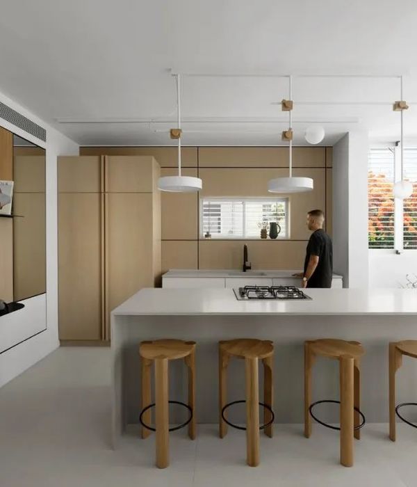
▼出租建筑内起居室、厨房及餐厅,living room, kitchen and dinning room in the rental building
在内部,考虑家庭成员位置之间的视线关系以及塑造同时满足不同生活方式需求及交通流线的空间,是设计的重点。建筑师通过柱列创造优良的视角,在需要的情况下,可以在朝向天空开敞的东南方向增加更多分层空间。
▼住宅空间图解,house space diagram
With the interior, it was essential to consider the ways to convey the signs of the family’s presence, and to design rooms that can accommodate changes in their lifestyles and in the circulation at the same time. We were able to create a good viewpoint by lining up columns, and if it is needed, adding more split-levels, towards the southeast where it opens to the direction of the sky.
▼通过柱列创造优良的视角,designers were able to create a good viewpoint by lining up columns
▼洗手间地面比厨房地面低400mm,the bathroom floor is 400mm lower than the kitchen floor.
▼厨房,kitchen
二层设有一扇大窗户,为小起居室带来良好的视野。这里也是一个半室外空间,形成了一个与周围环境相连的休闲放松区。
We also placed a large window on the second floor creating a good view for the small living room, which is also a semi-outdoor area, resulting in a casual and relaxed place that connects with the surroundings.
▼楼梯空间,stairs
▼二层空间看学习区、厨房、餐厅,view on the second floor to the study1, kitchen and dinning room
▼二层学习区,study room at second floor
▼从小起居空间看学习区,左侧前面可以作为学习区的黑板,view to the study from the small living room, the left wall can be used as a whiteboard
遵循小镇景观的外部形态与内部遵循场地地形的梁柱体系形成对抗,塑造了空间的起伏和深度。这两种元素与住宅其他元素一同塑造复杂而多样的内部空间。在住宅中,人们的生活方式像是在树屋中一样,围绕着住宅来回移动;室内的柱子与地面分散在空间之中。
The competition between the exterior that follows the townscape, and the columns and beams in the interior following the topography, produce a fluctuation and depth in the space. The resonation of the two and various other elements, result in a polyphony. It is a house where a lifestyle is led by moving round and round in the rooms like a tree house; the interior bristles with columns and floors are scattered in between the spaces.
▼三层空间,third floor
▼卧室,bedroom
▼洗手间,bathroom
▼平面图,plan
Design Design : Tato Architects/Yo Shimada Team: Yo Shimada, Yasue Imai Structure : Takashi Manda Structural Design Team: Takashi Manda, Taijiro Kato Plants : Coca-z/Tatsuya Kokaji
Construction: Ao Co.,Ltd. Main Structure: Timber Scale: Two-story house Site Area: 243.09 Building Area: 66.16㎡+25.74㎡(Rental House) Total Floor Area: 128.39㎡+48.44㎡(Rental House) Completion: 2017
{{item.text_origin}}


