Architect:Slash Architects
Location:İstanbul, Turkey; | ;View Map
Project Year:2022
Category:Hospitals
“Hair of Istanbul” Hair Transplant Clinic is an 450 sqm interior design project located in YalıAtaköy Complex in Istanbul, Turkey. Two flats in the third floor of a residence building are merged for the clinic.
To create a technological healing place, concept of the clinic design is wrapped around an idea of “digital forest”. These two seemingly conflicting themes are brought together to support each other in the design. As a result of being a health center the feeling of a sterile environment is established with a minimalistic approach shaped around the concept of “flat design”, easy-to-clean surfaces, and the use of white color in different materials. The use of technology with elements such as sensor doors, mirror screens, video walls have also been integrated into the project to support the operation of a modern health facility.
The theme of “forest” is handled in this project with references to the recovery and growth of a self-renewing ecosystem. This theme is included in the project in a way that allows visitors and staff to relax mentally in a hair transplant clinic which could be perceived as a space of self-healing. By considering the biophilic design principles, it is aimed to include nature in the space visually, audibly and tactilely while creating spaces with fluid geometric forms inspired by nature. The sterile feeling of the clinics, which is both reassures but also creates a cold environments is broken with the usage of vibrant green colours, natural materials and living green walls in main circulation areas and in the rooms users spend most of their time.
The third pillar of the concept is the artworks that are considered as part of the design. The videowall at the entrance and the screen at the end of the corridor, which is positioned as an object of curiosity, are planned to display digital artworks. In harmony with the concept of the clinic these artworks supported by soothing sounds will relax the visitors while they wait and wander around the clinic. In addition to this, two sculptures specially made for this project are presented at the beginning and the end of the corridor. All signage and graphic works are also considered together with the general concept.
While making the plan layout of the project, the main spaces are located in front of the façade, and the secondary service spaces are located close to the core. Thus, it is aimed that the areas where employees and visitors spend more time receive daylight and have natural ventilation when needed. Because the clinic is formed by merging of two flats, it has a advantage of having two entrances. While the main entrance opens to a large waiting area, the secondary entrance serves as a service entrance and therefore the technical volumes are located around it. An uninterrupted and clear circulation route is defined between these two entrances.
This route, which emerged with the layout decisions, has been one of the main challenges addressed from the very beginning of the project. To prevent the main circulation area turning into a boring and monotonous corridor, this route envisioned as an experience path with an object of curiosity at the end. Overall design approach infused with the technological feeling is also the main tool which is shaped the corridor form. The floor, wall and ceiling of the corridor are seamlessly connected with curved surfaces and envelops the visitor like a capsule. In order to emphasize the form, corridor lighting is provided with recessed linear lightings placed in the same section. This futuristic-feeling continious form is interrupted and pulled back in the niches where the entrance doors are located. These niches are separated from the rest of the corridor with the barisol ceiling, green coloured floor and walls. Thus the entrances to the rooms become highlighted. Throughout this “journey”, the visitor is also accompanied by the visual and auditory stimuli of the digital artwork at the end of the corridor.
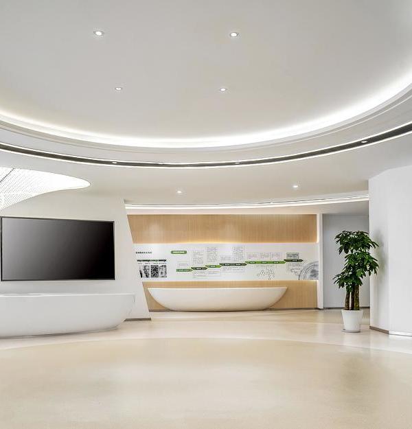
The entrance lobby aims to create an impressive first impression of the space with the digital screen facing the entrance, the fluid-form barisol lightings on the ceiling, the green living wall, the hot desk for working and comfortable resting areas. While planning the layout, customer’s way of working was examined and instead of positioning a classical secretariat at the entrance, the hair drawing area, which is considered as the "kitchen" of the hair transplant operation, is placed just to the right of the entrance. The drawing room, on the contrary of being hidden, has been made transparent and highlighted as a showcase. A semi-opaque film was applied to the glass facade in order to create an impression of the movements taking place inside while providing the necessary privacy. To include the brand identity in the project in a minimal way, the logo is transformed to a new graphic work and applied on the metal panels inside the drawing room.
The living green wall in the entrance lobby creates a relaxing feeling for the visitors. In addition to comfortable armchairs, a hot-desk facing the sea view is placed in front of the facade allowing visitors to use the ipads for their work while they're waiting. After the pandemic era, the need for personal space is grown. Keeping this in mind, the lobby creates a differentiated areas for the visitors to wait alone or with their family and avoids a crowded layout.
The clinic rooms is designed with a minimalistic approach and arranged in accordance with the function. After discussions with the customer on how the hair transplant operation is carried out, work benches with a cooled surface area are designed and manufactured specifically for the project. The cloakrooms reserved for the patients and the storage volumes containing the various products required for the operation are solved with hidden closets.
The cafe is planned as an area where employees and visitors take long breaks between operations or enjoy their time while waiting for their relatives during operations. Since it will be used to rest and relax, it is positioned in front of the main facade to receive natural daylight and to the view of green landscape. In order to create a warmer and calmer environment, light green fabrics, natural wood materials and a living plant wall are used. To strengthen its relationship with the kitchen and to provide ease of service, the wall between the two rooms is designed with a counter and a service window.
As a necessity of being a healthcare centre, long-lasting materials resistant to strong chemicals are selected and all the surfaces designed as easily cleanable.
All these design decisions are came together for the idea to create a new-age modern, digital, comfortable and inviting healthcare centre.
Architect: Slash Architects
Main Contractor: Aks Architecture Construction Company
Photography: Alt Kat Architectural Photography
▼项目更多图片
{{item.text_origin}}

