Sanders 酒店 | 哥本哈根的温馨家园
Sanders酒店的所有者是Alexander Kølpin,他提出的设计任务既简单又富有挑战性,那就是打造全哥本哈根最好的酒店。随着设计师与业主的深入探讨,项目的设计内容逐渐显现出其野心与独特性。项目最关键的目的之一是为城市带来全新的体验,这将着重体现在酒店的服务与设计当中。新的酒店将唤起人们对旧时俱乐部的记忆,并为游客和当地居民带来家一般的舒适体验。
Our client Alexander Kølpin is the owner of the hotel. His initial brief was simple yet challenging… he wanted to create the best hotel in Copenhagen. As we spoke further with him the many layers of ambition unravelled however, and the uniqueness of the project became evident. One of the key intentions was to bring an entirely new experience to the city. This was to be expressed in the service as much as in the design, with Alexander aiming to introduce service style reminiscent of a members club, a home from home for visitors and locals alike.
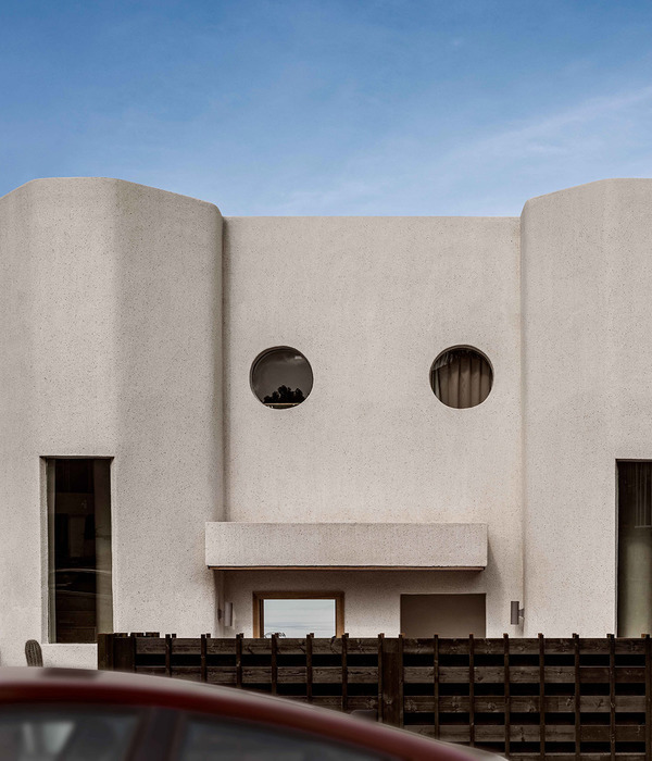
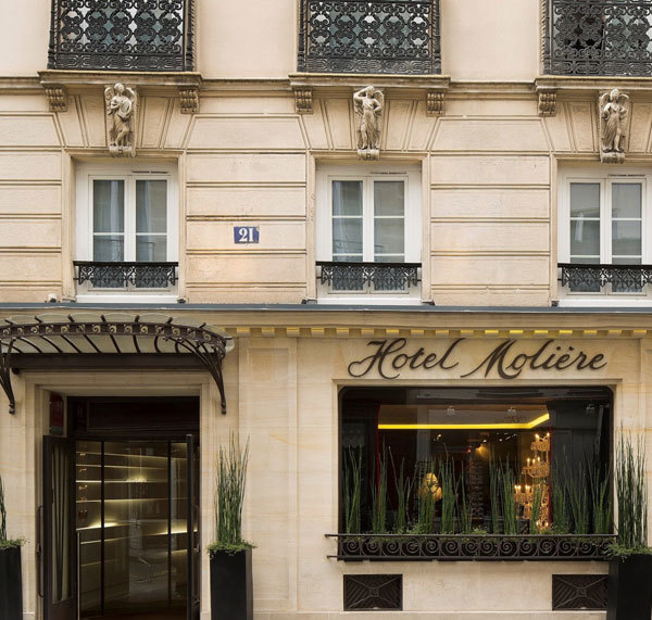
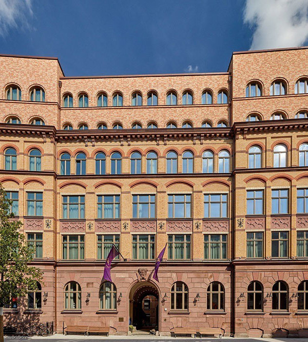
▼酒店外观,exterior view

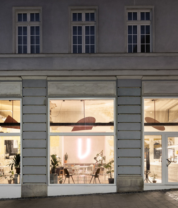
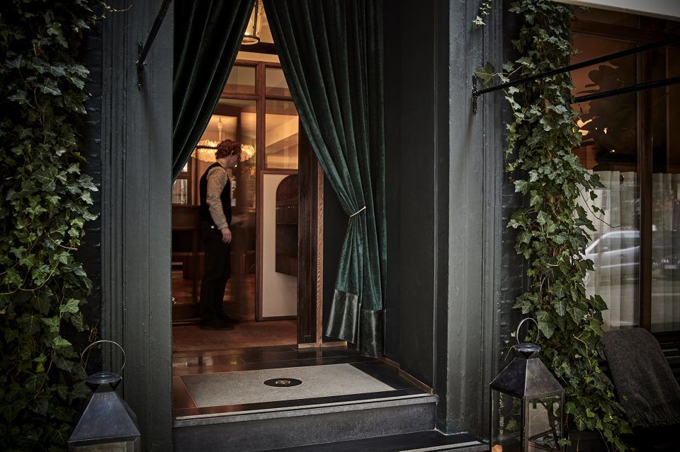
▼立面完全朝街道打开,共有三个主要的入口,an open, inviting face to the street, with three main entrance points

▼大堂入口,central entrance
设计师为客房等较为安静的区域引入了中现代的丹麦设计风格,营造出家一般的氛围。虽然整个酒店中充斥着多种色彩,但依旧保持了细腻而低调的观感。室内空间并未使用当下流行的色彩,而是以大地色系和白垩色系为主,旨在呼应木材和石材的天然质感,传递出一种永恒的气息。公共区域还使用了一些独特的颜色,例如Tata酒吧的红色丝绒窗帘,酒店餐厅Sanders Kitchen的墨绿色皮革座椅,以及前台区域的金色丝绒沙发。
Our approach was to reference Danish mid-modern design in the furnishings of the guest rooms, which are generally calmer and quieter than the public areas. We like to think of the hotel as a Danish home, one belonging to someone who has travelled the world. Although there are many colours and tones through the hotel, the intention was that they should remain subtle and understated. The spaces are generally earthy in their colours, even chalky. We have aimed for something timeless, and so have avoided the use of trend driven colours, option to embrace the natural tones of the timbers and stones as much as possible. In most of the public areas the colour is found in the likes of the rich red velvet curtains (Tata), the dark green leathers (Sanders Kitchen) and the golden velvets of the furnishings (Reception area).
▼前台,reception

▼公共区域,public area
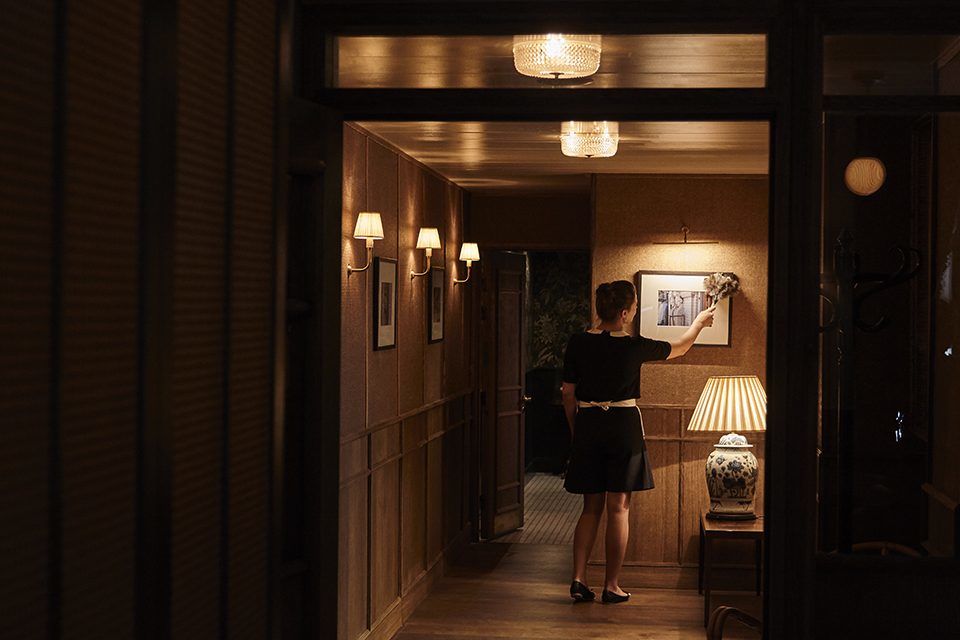
▼客房走廊,guest room corridor

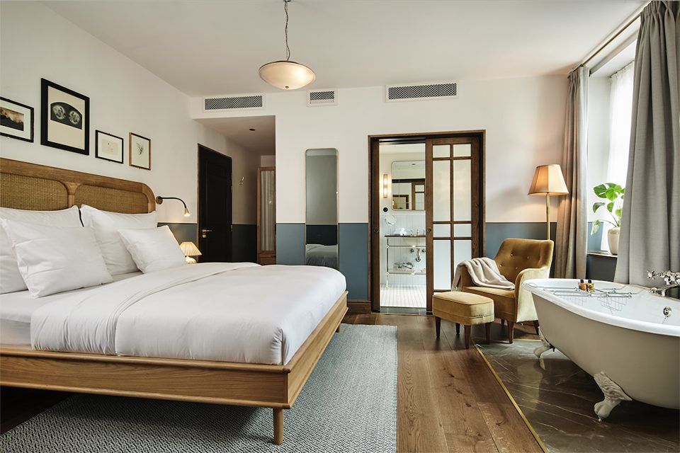
客房墙壁的底部使用了红色、绿色和蓝色三种颜色的护墙板,使多次入住的客人能够获得不同以往的体验。不同的色彩与不同的房型交错搭配,使每个房间都有所不同。
The guest rooms are where we make a little more of a feature of the colour by introducing a painted dado band around the base of the walls. We used three muted tones in the end, a red, a green and a blue. The thinking behind this was to help create a differing experience for guests on each visit. We’ve applied the colours across the room typologies in such a way that no two rooms are exactly the same.
▼客房内部,guest room interior view
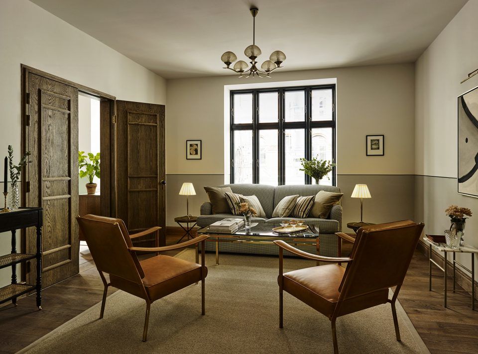

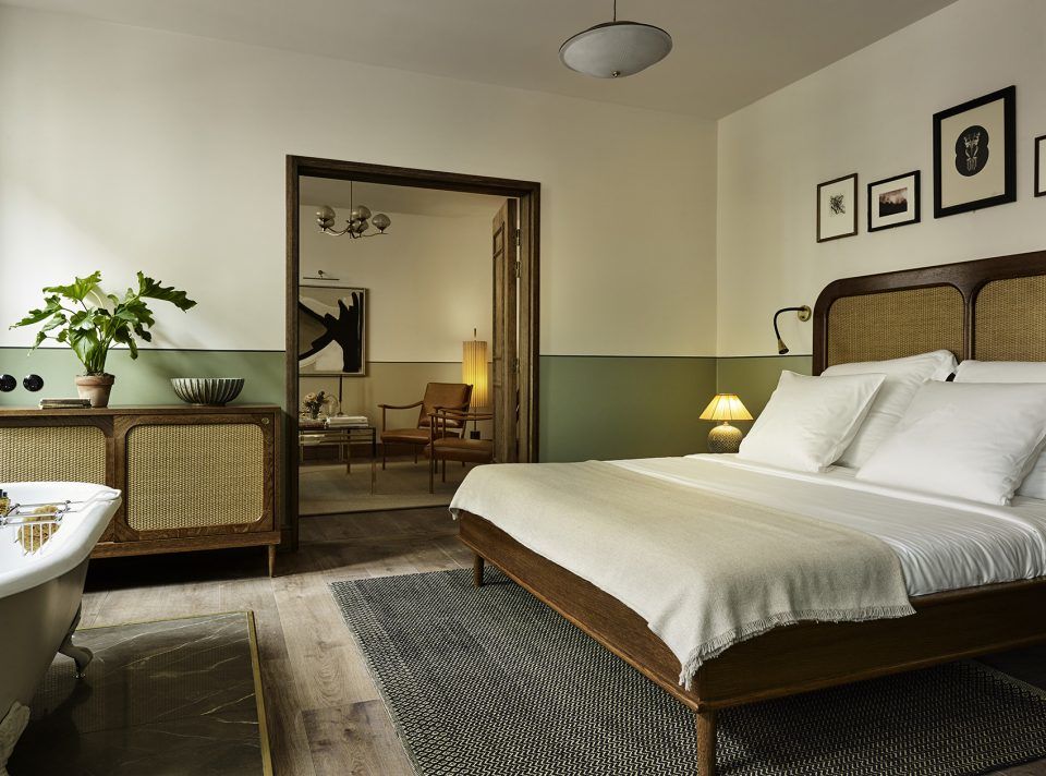

▼不同的色彩与不同的房型交错搭配,使每个房间都有所不同,different colours were applied across the room typologies in such a way that no two rooms are exactly the same



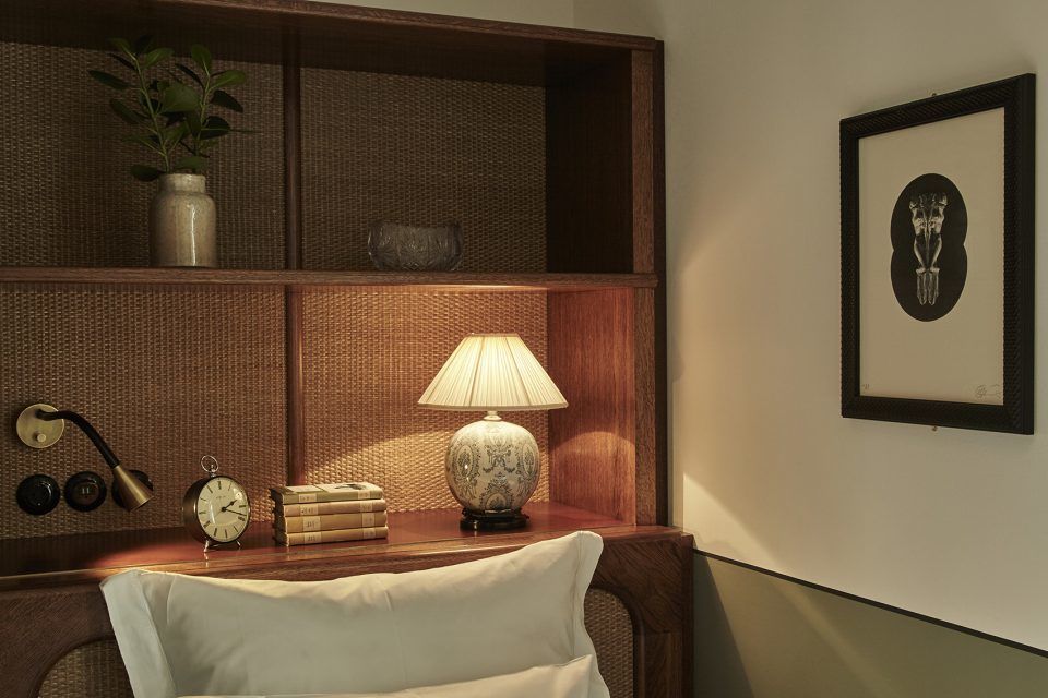
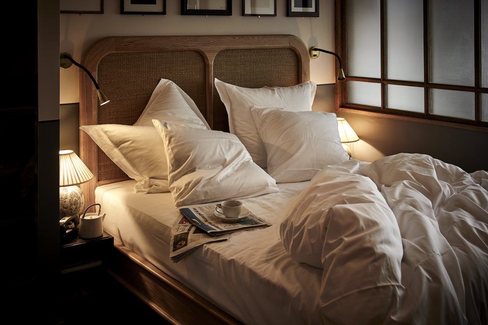
▼室内细部,detailed view




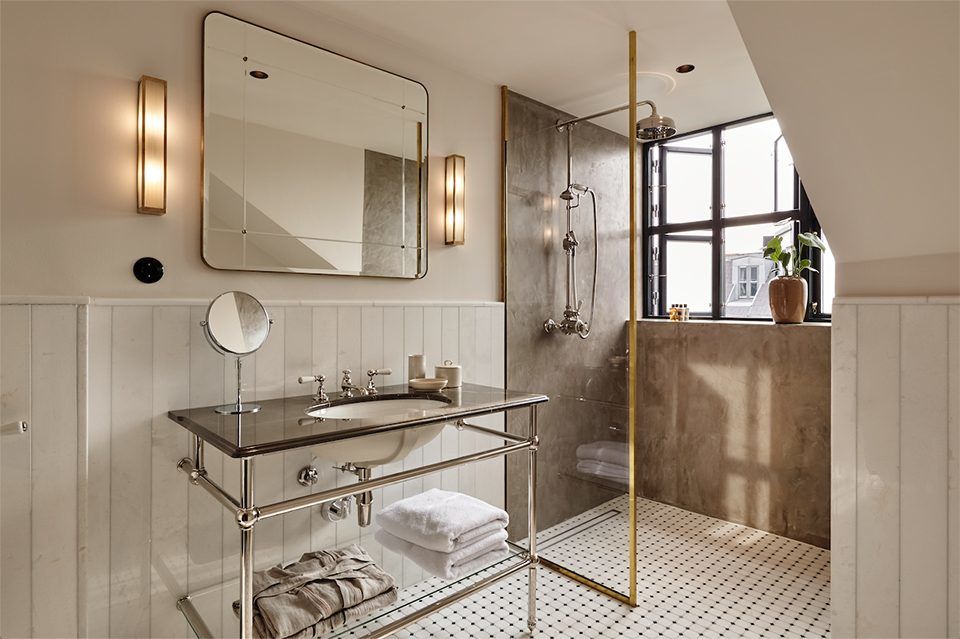
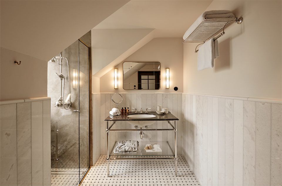
▼浴室,bathroom
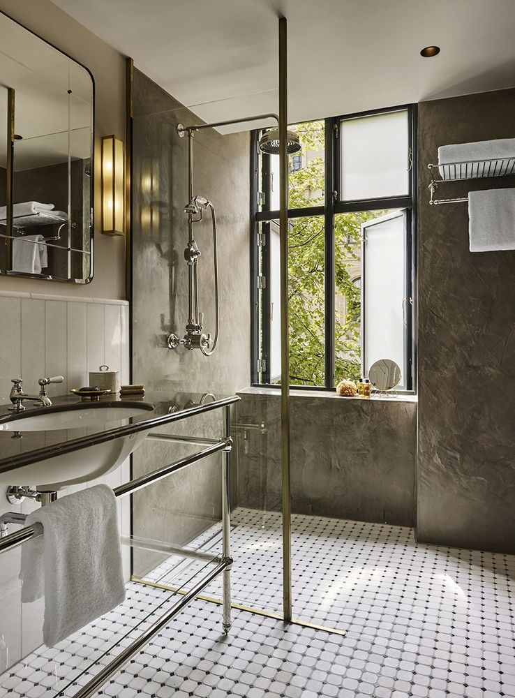
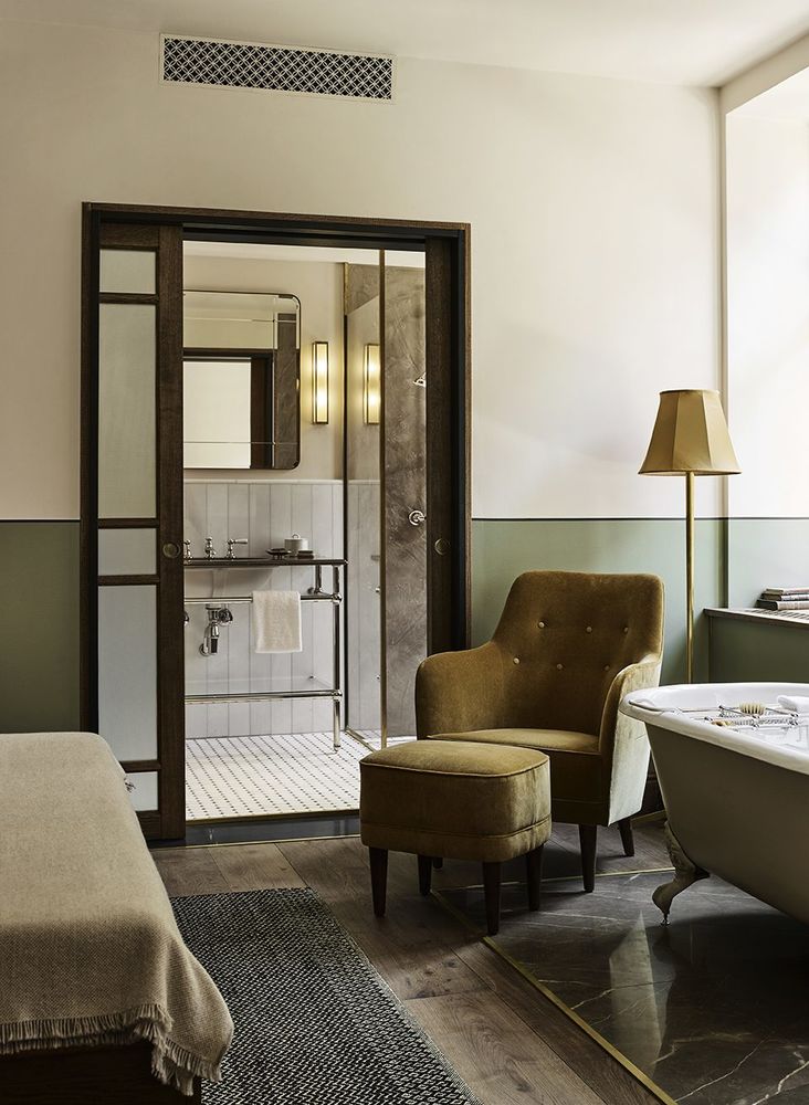
▼浴室细部,detailed view

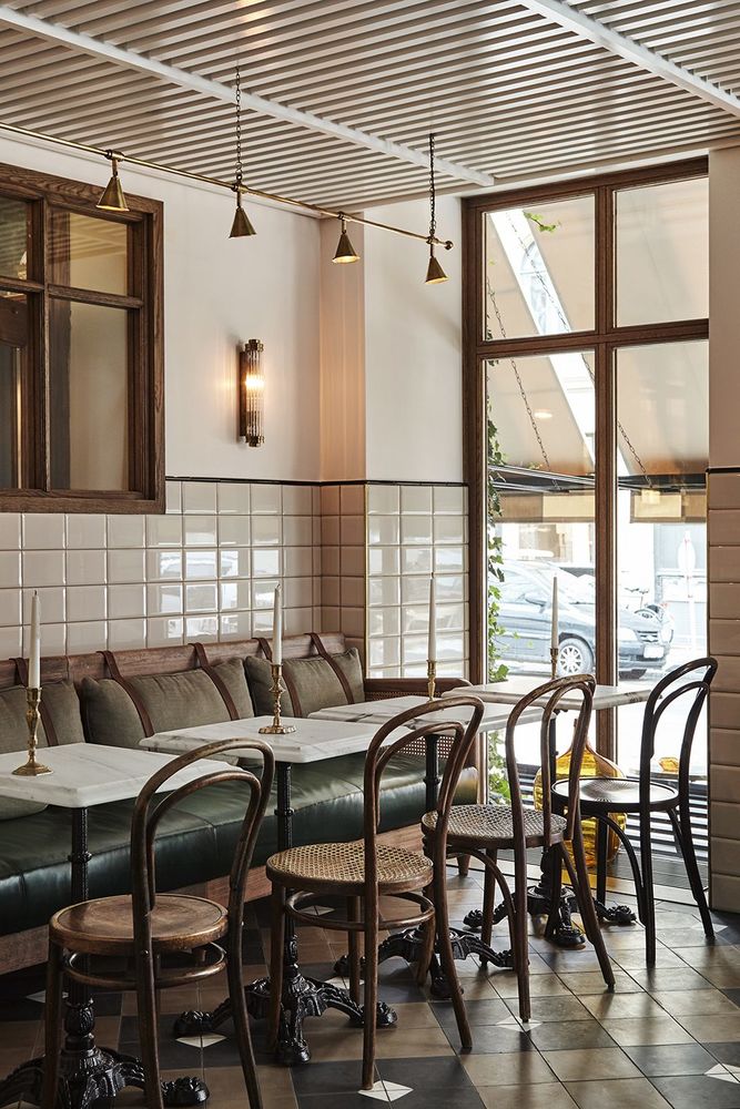
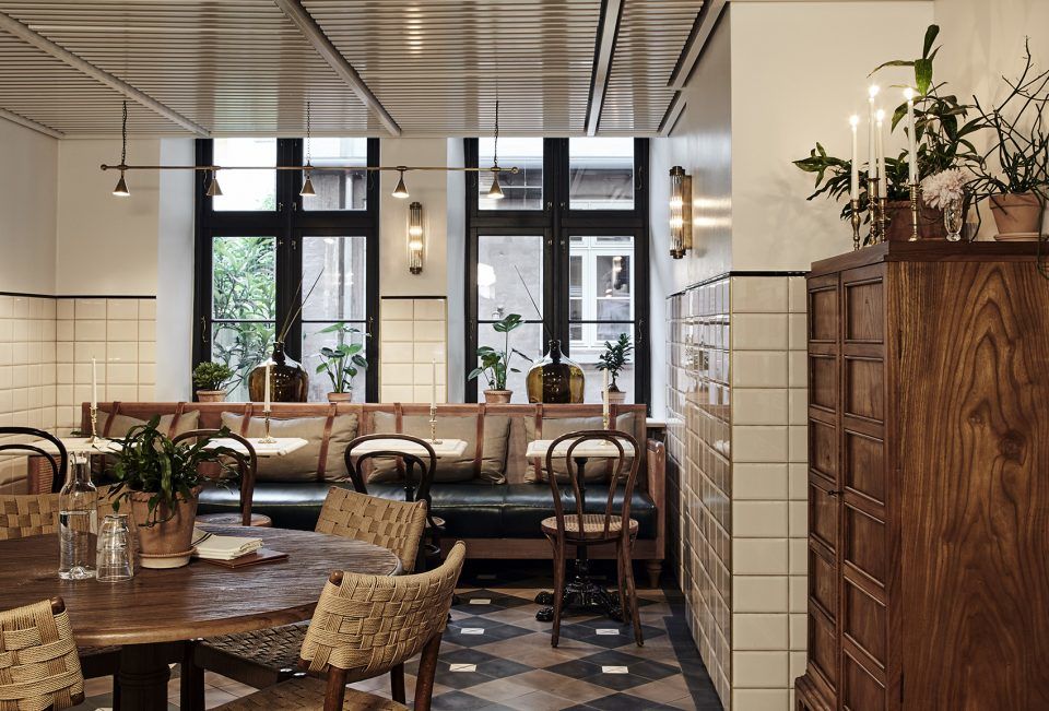
Sanders酒店的布局是其不同于其他酒店的原因所在。它的立面完全朝街道打开,共有三个主要的入口。位于中间的入口将客人引向前台和大堂区域;左边的入口通向酒店的餐厅Sanders Kitchen;右边的入口则通向Tata酒吧。餐厅和酒吧均可以从街道层和酒店大堂进入。酒店的另一个特点在于它并没有正式的用餐空间。酒店主人希望能够营造一种俱乐部般的氛围,为客人们带来舒适轻松的感受。有用餐需求的客人们可以选择酒店内的其它五个公共空间: 1. Sanders Kitchen 餐厅:Sanders Kitchen具有熟食店般的清新氛围,为酒店住客和当地居民提供咖啡和早餐。作为全天营业的高档餐馆,它将成为酒店美食和夜间活动的中心。
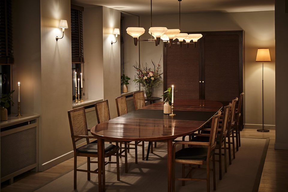
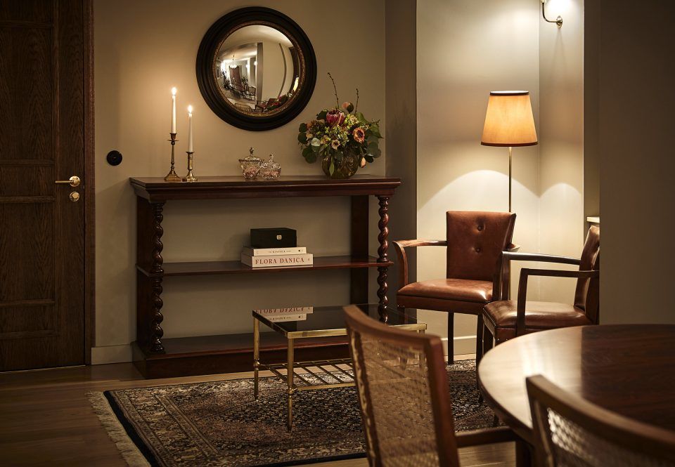
Sanders is rather untypical as a hotel, and this is particularly evident in its layout. It presents an open, inviting face to the street, with three main entrance points. The entrance in the centre of the facade will be that most used by residents, taking them to the reception lounge. To the left is a street entrance to Sanders Kitchen, and to the right is a street entrance to Tata bar. Both are internally accessible from the hotel lounge. The hotel is also unusual in that there is no formal dining space. Alexander was very keen to create a relaxed, members club-like atmosphere where guests felt comfortable eating almost anywhere. Room service will always be available, but otherwise guests may dine in one of the other five public areas of the hotel… 1. Sanders Kitchen — With a fresh, deli-like feel, Sanders Kitchen will serve coffee and breakfast to residents and locals alike. It’s open throughout the day acting as an up-market cafe, and will be the hub for the hotel’s special food evening events.
▼Sanders Kitchen餐厅,Sanders Kitchen


▼私人餐室,private dining room
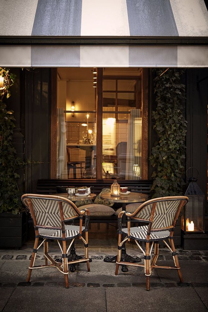
▼室外用餐区,outdoor seats
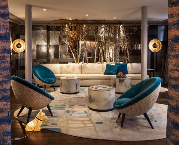
大堂休息室:这里是位于酒店中心的接待区域,搭配以舒适且风格多样的沙发和扶手椅。这是一个能够使客人真正得到放松的温馨场所。
The Lounge — The reception area, in the heart of the hotel, has an eclectic mix of comfortable sofas and armchairs. It’s the space to really relax in a homely, cosy environment.
▼大堂休息室,The Lounge
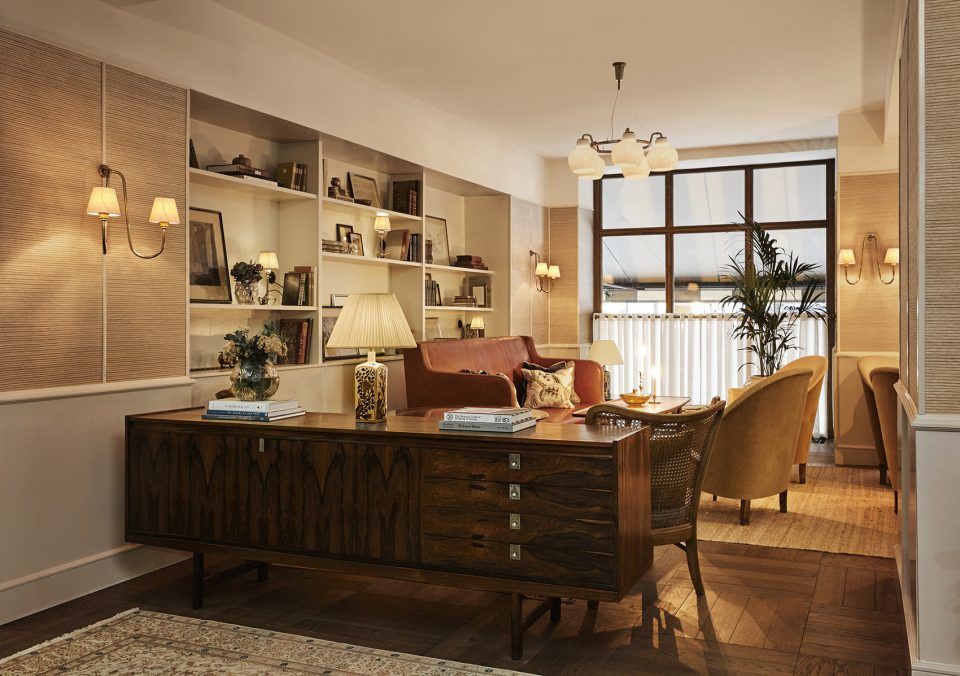
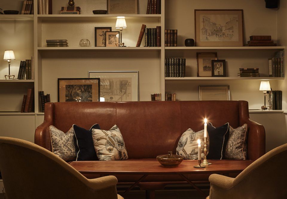
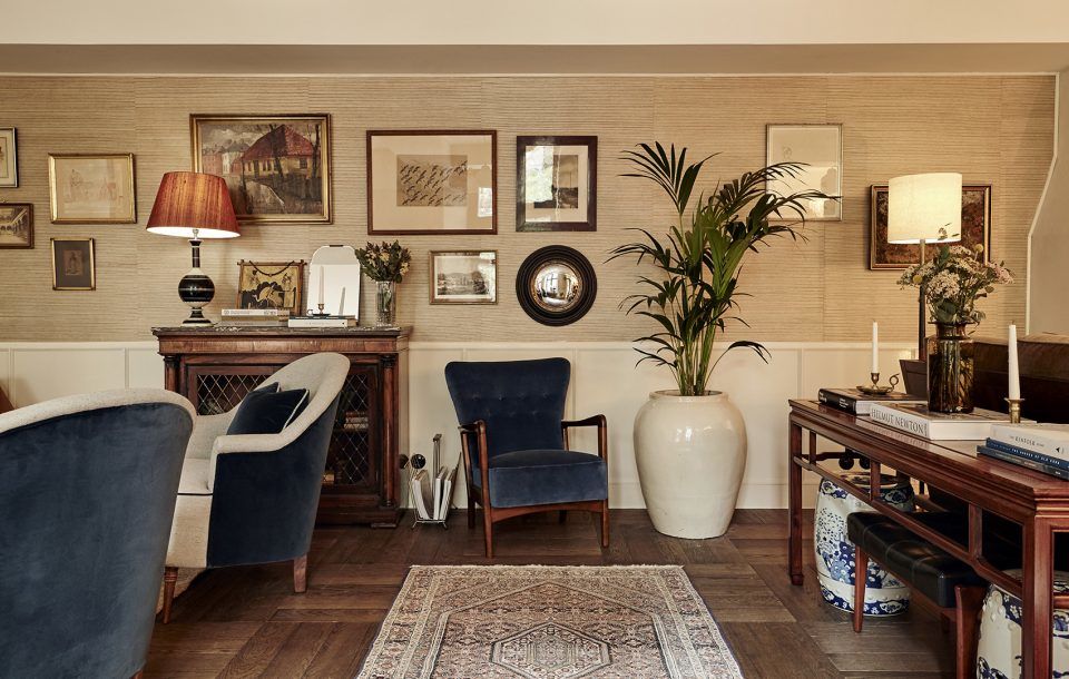
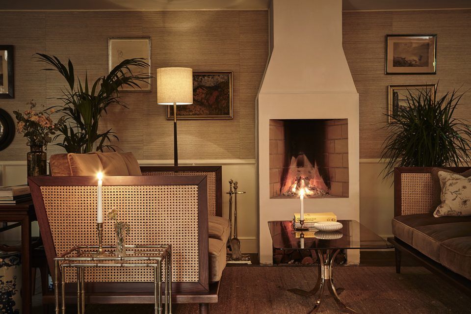
Tata酒吧:这间鸡尾酒吧的设计灵感来源于经典的剧院酒吧,室内装饰以红色的丝绒窗帘、温暖的木材和藤条元素。酒吧虽然全天开放,但在晚上才会真正变得热闹起来,展现出其性感、情绪化、时尚且迷人的本质。
Tata — The cocktail bar is inspired by the quintessential theatre bar, with rich red velvets, warm timber and rattans. It’s open throughout the day but really comes to life on an evening. It’s a sexy, moody, sultry space with a stylish buzz.
▼Tata酒吧,Tata bar
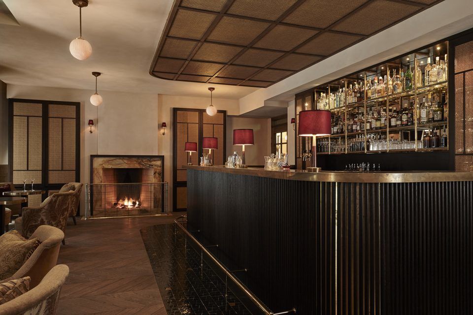
▼座位区域,seating area
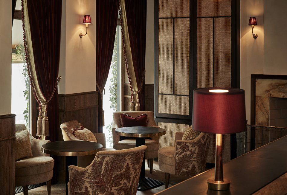
▼吧台区域细部,bar counter detailed view
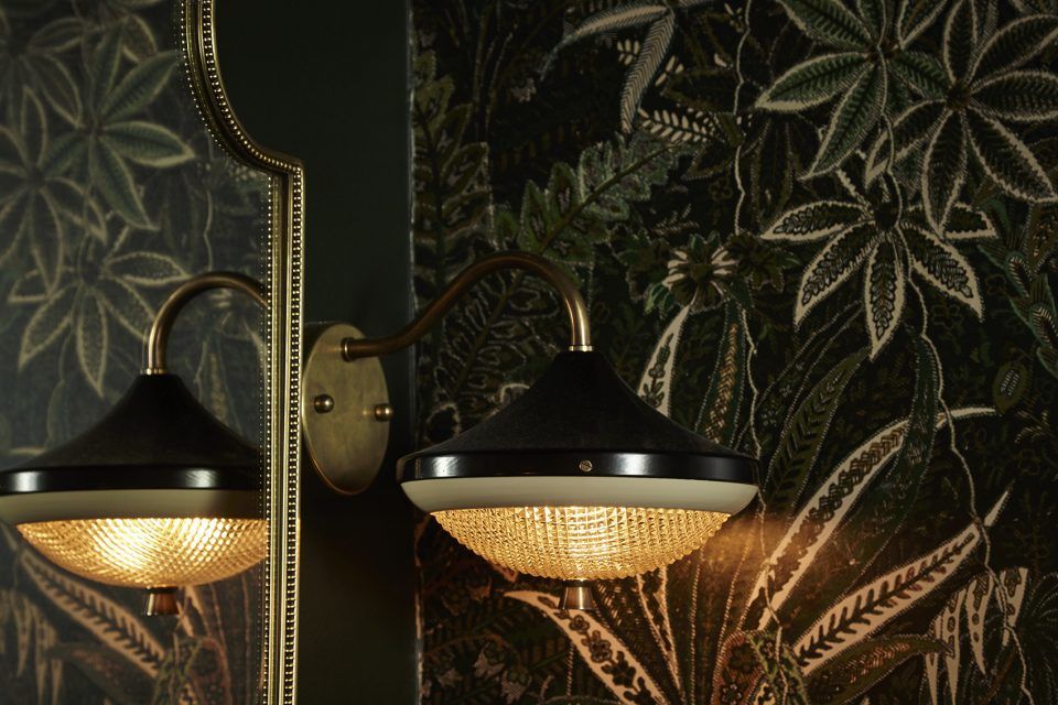

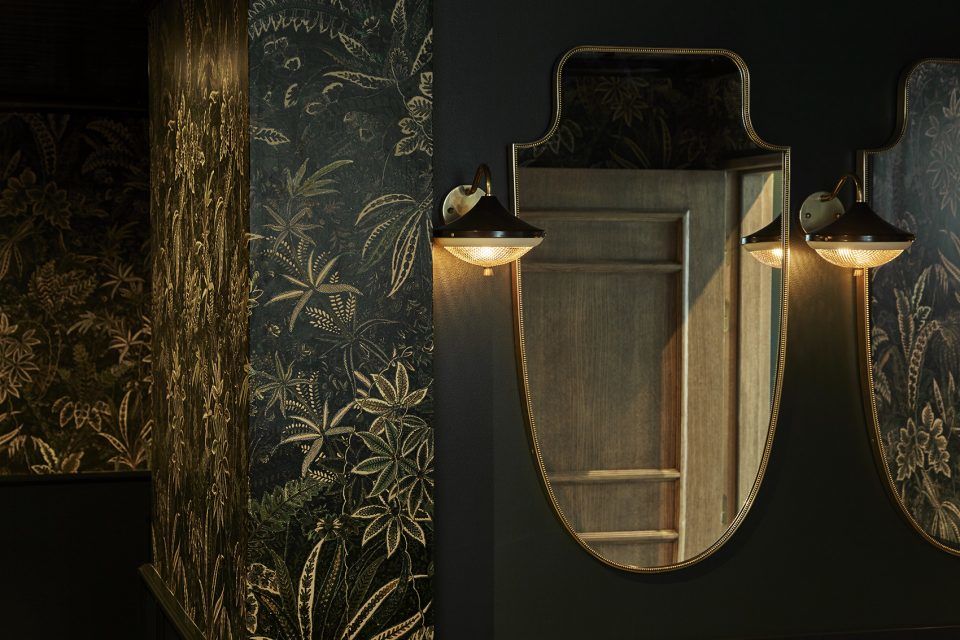
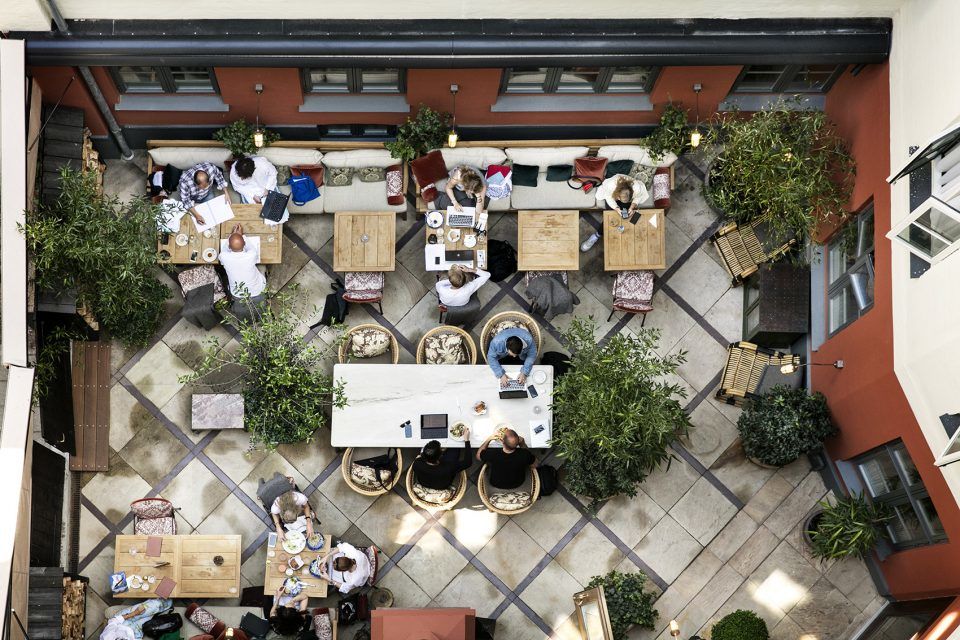
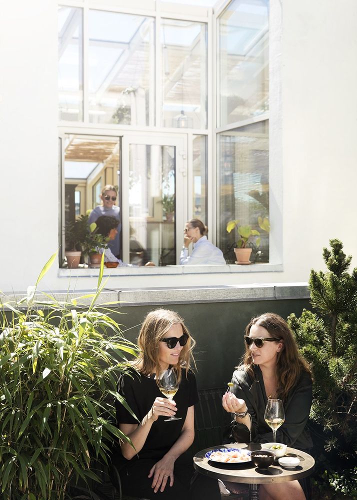
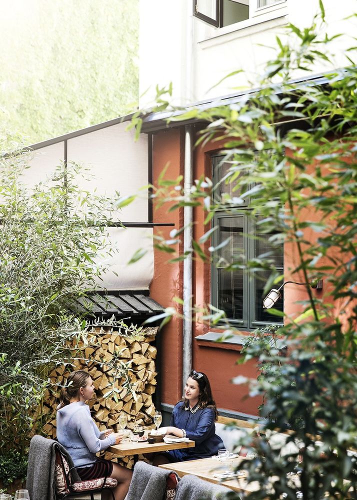
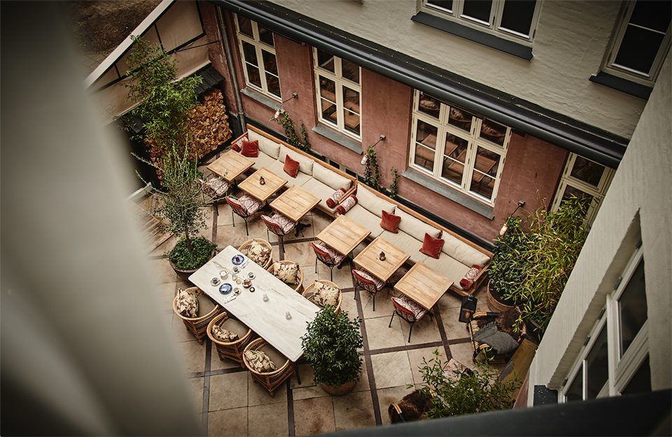
庭院:在天气不太冷的情况下,带有顶篷的庭院无疑是酒店内最浪漫的场所之一。富有巴黎田园气息的常春藤植物、毛毯和火炉共同营造出舒适宜人的用餐环境。
The Courtyard — Open whenever it’s not too cold, the covered courtyard is the hotel’s romantic outdoor area. It’s rustic, Parisian decor offers a place for food and drinks amongst ivy, as well as plenty of blankets and a roaring fire.
▼庭院,The Courtyard
橘园温室:橘园是坐落在酒店屋顶的一处难得的空间,它同时对酒店客人和公众开放。这里种植着许多外来品种的竹子和其他植物,宁静的氛围使人们得以远离都市的繁忙和喧嚣。
The Orangery — The rooftop conservatory is a gem at the very top of the building, a rare space for both residents and the public amongst Copenhagen’s rooftops. This peaceful spot offers calm oasis away from the busy city, and has plenty of colonial-inspired bamboo and exotic plants.
▼楼顶温室,rooftop conservatory
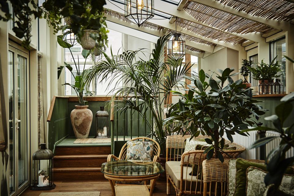


▼座位细部,seating area detail

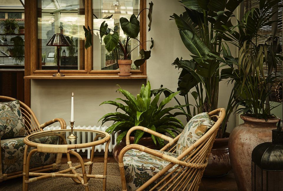
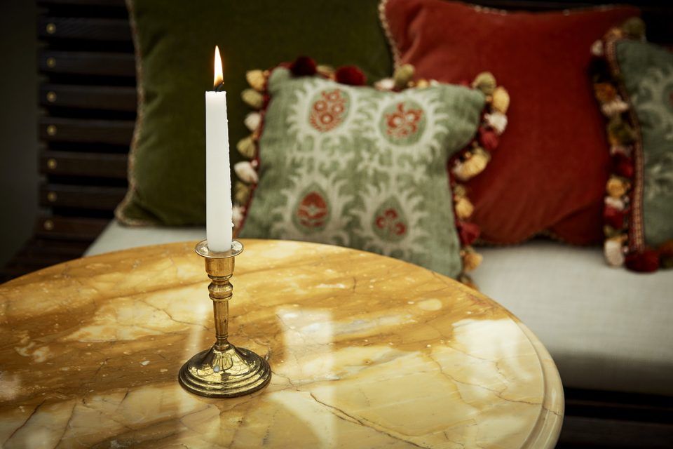
▼植物,plants


酒店内的灯光也经过了精心设计,为哥本哈根漫长而昏暗的冬天带来了光亮。好的照明关键是要防止光线过量,以免破坏空间的气氛,这对于Sanders酒店来说尤其重要。设计师尽可能地不去使用造型过于显眼的灯,使人们的视觉免于受到特定灯具或材料的干扰,从而营造出平衡、柔和且层次分明的灯光效果,同时为空间赋予统一的感觉。
Lighting is very precious to us as designers, and was specially relevant given Copenhagen’s long, dark winters. Denmark generally does lighting very well, even the average pubs give a beautifully warm, inviting glow. The key as always not to over-illuminate, so as not to kill an atmosphere, and atmosphere is so crucial with Sanders. We made a conscious effort not to use recognisable feature lighting. The spaces are very layered and detailed, but we focussed on creating balance so they didn’t feel overwhelming. The aim is that one’s eye is not drawn to a particular fixture or material, but rather takes in the whole the atmosphere of each space.
▼酒店中多使用光线柔和的灯具,beautifully warm, inviting glow throughout the hotel

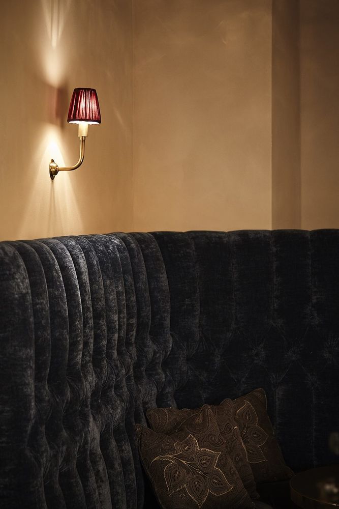


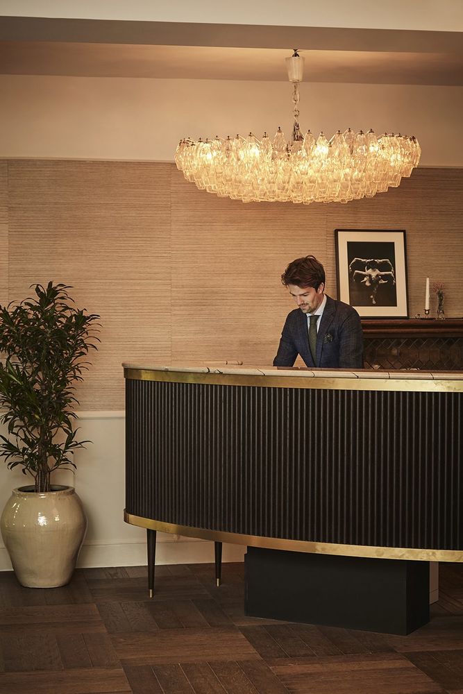
唯一打破了以上规则的是一盏1940年代的复古枝形吊灯。它悬挂在前台上方,由著名建筑师Carlo Scarpa设计。这盏吊灯原本是三个一组,用于装饰苏黎世银行的大厅。由Venini手工制作的300个玻璃棱镜形成十分柔和的光线,优雅地迎接着酒店客人的到来。
The one piece which breaks the rule is the spectacular 1940’s vintage chandelier which hangs above the reception desk. Designed by iconic architect Carlo Scarpa, it was originally one of 3 housed in a Zurich bank. Over 300 beautiful glass prisms, handmade by Venini, create a wonderfully soft glow to greet guests as they arrive.
▼悬挂在前台上方的古典复古吊灯,a vintage chandelier hangs above the reception desk
▼细部,detail

▼楼梯,staircase

Furnishings


