When one of the most exclusive hotels in Southern Africa gave OKHA an open brief to redesign its Cellar bar, lead designer Adam Court combined Japanese reductionist minimalism and post-war Italian Baroque, two seemingly opposing visual styles to execute a complete transformation using what he refers to as “Naked Maximalism”.
Ellerman House is a family run hotel comprising several freestanding villas, a wellness spa, extensive art gallery, wine gallery and terraced gardens which surround the central house, an Edwardian Villa
dating back to 1906. Each of these spaces has been given a unique design treatment which is why, when it came to the new bar it was important for the hotel to partner with a design studio they had not previously worked with; bringing fresh eyes to continue and explore the dialogue between contemporary and classical.
The Edwardian Villa which boasts many of its original features such as rich wooden panelling, intricately sculpted columns and pressed ceilings to newer features such as expanses of carbon fibre and articulated glass walls. The setting too has dramatic contrast; the bar overlooks the deep marine blue and turquoise palette of the Cape Atlantic Ocean and is set against the monumental granite boulders of Lion’s Head mountain.
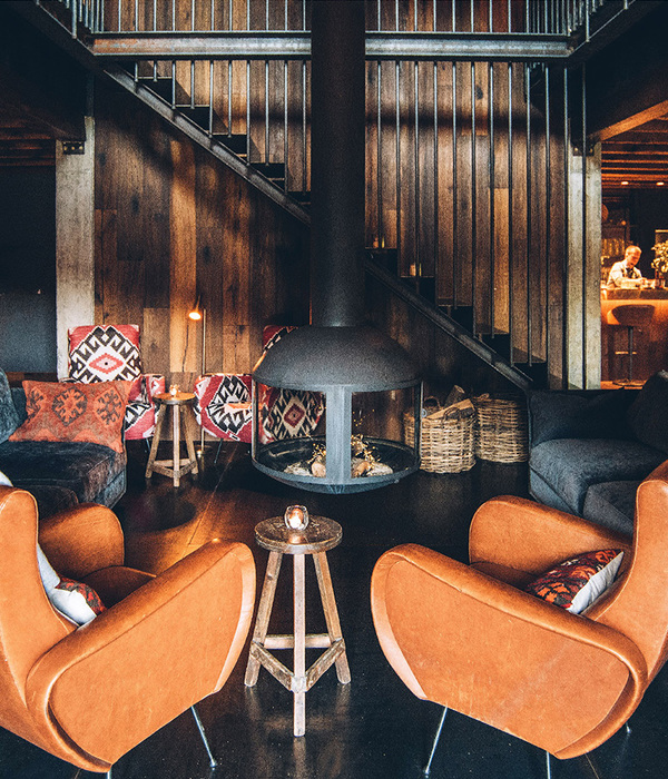
OKHA was chosen for its progressive, innovative and fully inclusive approach to design; being creators of furniture as well as interiors, they custom designed all furniture, fittings and lighting. “The precisely articulated material palette is raw, brutal yet sumptuous” says Court of the long and narrow space which has many intimate nooks and an enormous granite boulder jutting out through its lounge wall. Court completely stripped back the space to its core naked, physical components and reconstructed and sculpted the interior in a ruthless and decisive manner bringing much needed natural light into the previously dark, tavern-like space.
The design is sleek yet emotively resonant and through its effective use of materials is both polished, organic and also delightfully crude. Court has applied his lean material palette in an elegant and precise way. This is evident in the very finest details from the subtle brush-strokes of brass inlaid into chalk white Terrazzo floors to the dramatic swathes of solid brass that frame the terrazzo bar creating an almost psychedelic hall of mirrors effect (Court’s humorous play on the effects of over indulging on the home grown gin varieties).
In the tiny wine cellar, a sculpted brass “bunch of grapes” clings to the ceiling, mirror lined and backlit rectilinear brass boxes house “holographic” shelves of wine glasses and the black and white relief walls collide in a Yin Yang symphony.
In the central lounge space, a bespoke fern-green velvet couch wraps around the length of the granite boulder and bespoke Roc Tub seats in cerulean blue velvet encircle marble-topped tables. The marble and cool sea green-blues are carried through to the bathroom’s wash basins, walls and fittings where even the custom designed bathroom signage has a meaningful decal carved into solid brass. “It’s a transportive place where one loses sense of time, something we all need” says Court.
“The terrazzo floor and bar counter, the exuberant use of solid brass, these things are reminiscent of the halcyon days of the Milanese bar and bistro, I love that theatre and where it takes you”.
Its not surprising then that the name given to BAR ROC has multiple connotations and is Court’s own.
{{item.text_origin}}

