Firm: faci leboreiro arquitectura
Type: Commercial › Exhibition Center Showroom
STATUS: Built
YEAR: 2015
SIZE: 0 sqft - 1000 sqft
The creative process was very important for the design and construction of Asics Mexico Headquarters; we transformed the identity and values of the company into architecture.
Asics is a japanese brand that designs, manufactures and sells running tennis. The company also has the OT (Onitsuka Tiger) brand, which is distinguished by its urban, vintage tennis and sports clothes. These two brands have very different identities, therefore the office space for each is unique, but combined in the same building and office area.
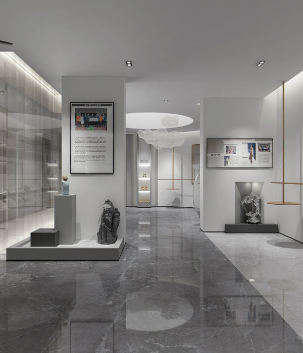
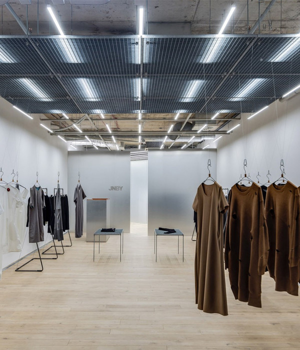
The spaces created for asics represent speed, movement and technology, the main values of the Company. This is translated in spaces that accentuate a long perspective, as well as the light bands in the ceiling, causing a perception of velocity. Colors like white and grey are combined with materials such as stainless steel to represent technology, reinforcing the concept of a sports laboratory. The “Asics Blue” (signature color of the Company) is used repeatedly to emphasize the sports Brand’s concept.
On the other hand, the spaces created for OT, are distinguished by its materials, colors and furniture in brown and black shades, using wood lattices for the shoe exhibition, combined with vintage japanese tatami and antique hanging lamps as it was decided in the main showroom.
All the office area is surrounded by an authentic running track, which combined with the grass-like carpet in the meeting rooms, create a very fresh and sports atmosphere that represent Asics and its product.
{{item.text_origin}}

