北京 dresscode 花店 | 60m²空间里的千面花殿
- 项目名称:dresscode 花店
- 业主:姜思达(内容创作者)
- 设计团队:郑宇,何宇妤,詹迪(F.O.G. 建筑事务所)
- 完成时间:2020年
- 灯光设计:张旭
- 摄影:言隅建筑空间摄影,张之洲
dresscode 店铺面积仅有60 m²,与其说是一家花店,毋宁说是一个人与花卉亲密交流和角色互换的体验空间。我们希望通过设计与大家一同直面花卉的生命轮舞,在这个芬芳馥郁的“小剧场”中,欣赏一场关于时间的表演。
Located in one of Beijing’s most artistic neighborhoods, dresscode is unlike any traditional flower shop, treating flowers not as commercial products but as intimate experiences. Our design therefore emphasizes the presence of the flowers and purposely weakens the boundary between people and objects. We hope that visitors feel subjectively engaged at dresscode – that in their spontaneous exchange with flowers, they find sparks and gratification.
▼店铺概览,overview © 言隅建筑空间摄影;©张之洲
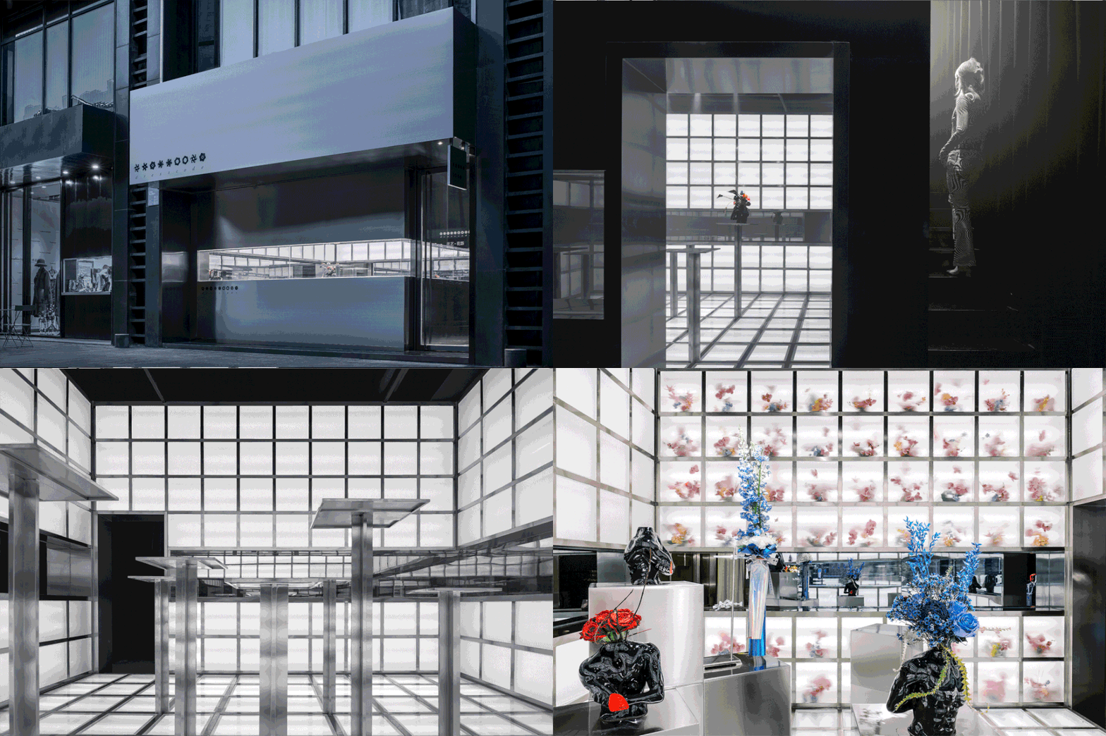
这的确是一个小物业,店型局促,前、后场空间关系混乱,一条楼梯横在场地中间略显尴尬,动线规划也颇为怪异。业主是内容创作者姜思达,他希望在这个小空间中营造一种“由感官叠加而成的性感”、把花的芳华赋予空间。
Disorganized and limited in size, the venue has an area of merely 60 square meters and poses several design challenges at first sight. The owner, Chinese artist and content creator Jiang Sida, wants his shop to define a more carefree and radical type of aesthetic – or as he describes it, “a new sexy that fetches multiple senses.”
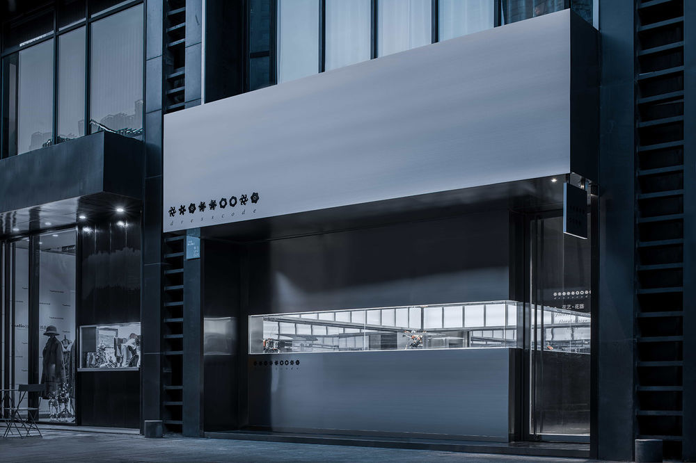
▼外观,exterior view © 言隅建筑空间摄影
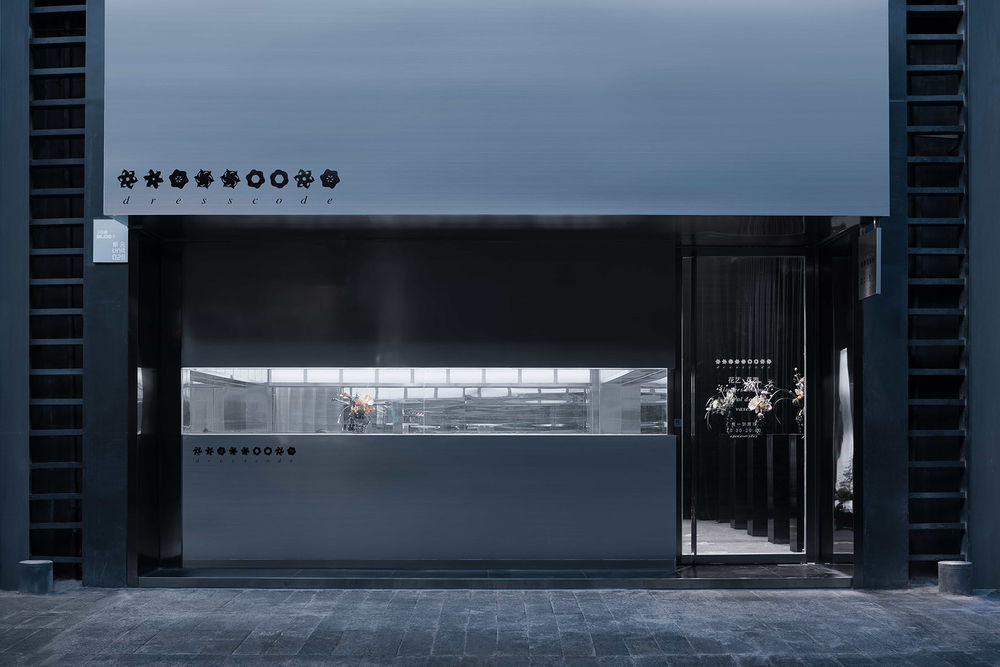
正如花卉作为物理与精神世界的连接物,通过影响视觉、嗅觉、触觉来铺就灵动的想象空间,我们更可以借助花卉摆脱日常时空间的限制,寄托情感于色泽,香味,枯荣。如何以空间类比花,以花抵达自由?我们的设计思路由此生发。
Just like how flowers enliven our spiritual world by massaging our physical senses, this scented art room could lead us into an unknown field of commercial spaces.
▼入口空间,楼梯通向二层,entrance, the stairs leading to the second floor © 言隅建筑空间摄影
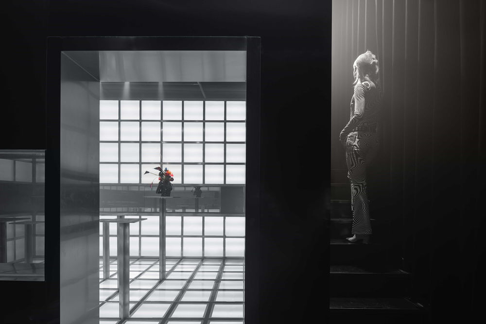
“探“字是整个空间的情绪推动核心。全金属外立面首先呈现冷酷的“拒绝”姿态,与街面熙攘形成动静对比,也从氛围上与周边物业区分开来。然而,我们保留了一个充满诱惑性的入口和一条向未知延伸的门廊,人们需要穿过这条探索路径才能进入明亮的主空间。
dresscode stands out from its surroundings yet doesn’t intimidate. Whereas the cold-tone metallic storefront outwardly rejects any intimacy, the entrance is irresistibly attractive. Visitors pass through a long and dimly lit corridor before they arrive at the dazzling showroom at the center of the store. By ritualizing their entry, we help visitors get in tune with the emotional progression of the space.
▼看向明亮的主空间,view of the bright exhibition space © 言隅建筑空间摄影
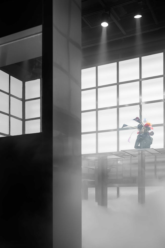
我们试图以这种方式加强入场的仪式感,通过若即若离的店铺外观以及戏剧性的明暗转变,尽可能调动人们的好奇心与想象力,再让这一切成为花卉登场的序曲。
Both the apparently detached look of the store and the dramatic light adjustment inside serve to mobilize the visitors’ interest and creativity as much as possible. These reactions then set the stage for the flowers’ onset.
▼在原本的方形空间内再造一个“盒子”,a box placed inside the space © 言隅建筑空间摄影
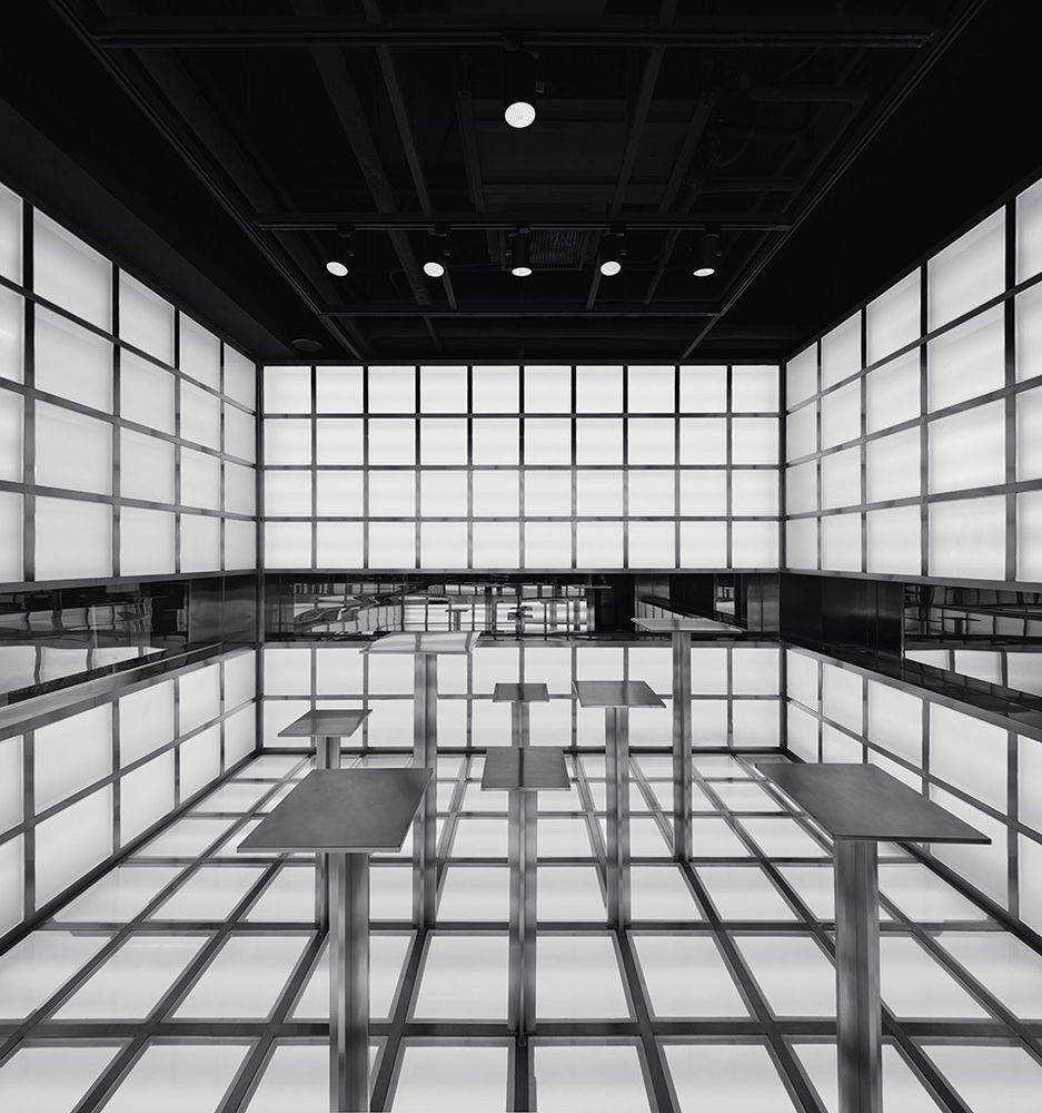
▼戏剧性的明暗转变,the dramatic light adjustment © 言隅建筑空间摄影

此外,空间对色彩和材质的使用也极为克制,大面积的冷色和金属促成一种中性、冷静的视觉效果,编码着“花卉优先”的梦境美学。对于业主姜思达来说,花的“瞬间性”指人与花的“一期一会”,行人、客人、花卉间的对望,正是这间“小剧场”所期望搭建的链接。基于此,我们在做动线分离时为空间打造了两个立面,一个面向街道,一个面向门廊——等同于在原本的方形空间内再造一个“盒子”——而两个立面上都设有与视线等高的单向玻璃观察窗口,如同一条“玻璃缎带”系在“盒子”外围。
To further prioritize the flowers, we worked with a limited palette and a narrow selection of materials, in order to maintain a neutral, calm interior look. Sida believes that the beauty of flowers is transient and ever-fluid. Any encounter with flowers is in itself a fortunate stroke of serendipity. dresscode therefore encourages visitors to cherish every interaction they have with flowers, taking it as a chance of introspection. Hinging on this principle, we constructed a new “façade” parallel to the corridor and perpendicular to the storefront, as if a box has been placed inside the space. On both the frontage and this new façade, we placed one-way mirrors at eye level, as if a glass ribbon is tied around the box.
▼立面上设有与视线等高的单向玻璃观察窗口 one-way mirrors at eye level © 言隅建筑空间摄影
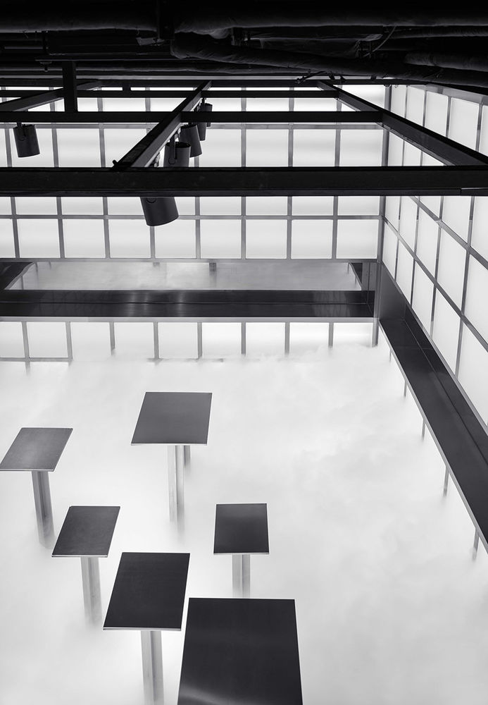
▼“盒子”外围的“玻璃缎带”,a glass ribbon tied around the box © 言隅建筑空间摄影
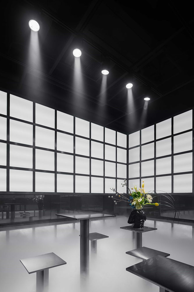
室内,这条“缎带”与其他镜面、金属表面相互反射,提升了空间的重复性、不对等性和趣味性;室外,它允许行人单向观察室内的一切,成了dresscode冷酷外表背后“主动伸出的一只手”。考虑到物业二楼是其他业主的酒吧,这种“方盒套方盒”的设计手法还具有实用性,有效分隔了两层空间的出入路径——如果说,它成功为原本混乱的空间注入秩序,那么鲜花则是这一秩序的“破坏者”,为空间带来表情。
Inside, the mirrors bounce light off other reflective surfaces, thereby magnifying the repeatability, asymmetry and playfulness of the space. Outside, it allows passersby to observe the interior, making the store look more approachable. Given that there is a bar on the second floor of the venue, this “a box inside a box” setup has much practical value, as it effectively separates the entry ways of the two independent spaces and brings order back to the originally chaotic flow.
▼花卉的展示,exhibition of the flowers © 言隅建筑空间摄影

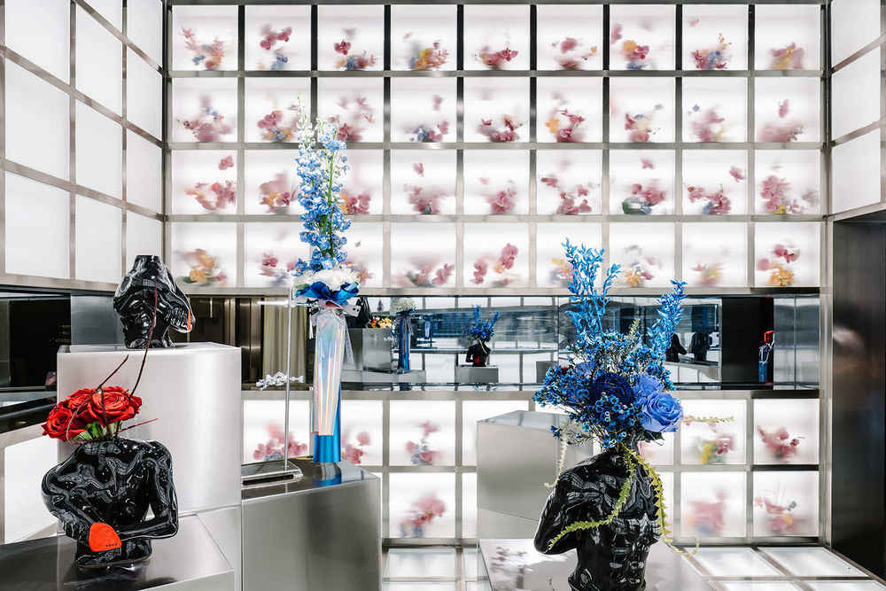
花的凋谢是重要的物哀触发点,不过 dresscode 无意干预其生命进程,希望将花期百态完整呈现。基于这一理念,我们进一步解构了这个“会发光的盒子”,以高度秩序化的网格空间取代常规花器,在“盒子”中为花卉“建档”,并塑造了一个具有宗教感的“剧场体系”——每个格子都是一间“剧场”,花卉在其中上演从初绽到枯荣的不同场幕,一个个独立瞬间组成眼前这座“花之千面殿”。让仓储或是被替换掉的花卉重新变成展陈的一部分,甚至变成空间最重要的构成之一——这是对其生命的尊重,更是对光阴的顺从。
Rather than mourning over the withering flowers or meddling with their growth in artificial ways, dresscode is mindful of every stage of the flower life cycle. To meet this end, we borrowed from scenography techniques and fashioned the glowing showroom into a theatrical space. Having installed a grid system to create spatial order, we placed flowers inside the modular shelving units on the walls, in lieu of using regular vases, and virtually transformed the showroom into a cubic vessel itself. Each unit is playhouse, in which the flower goes through different stages of life while delivering a coded monologue. In essence, we managed to build an archive for the flowers to exhibit their life course. In the meantime, their beauty is deliberately obscured, as we insulated the flowers behind frosted glass to secure a fine distance between the actors and audience.
▼“花之千面殿”,flowers inside the modular shelving units on the walls © 张之洲
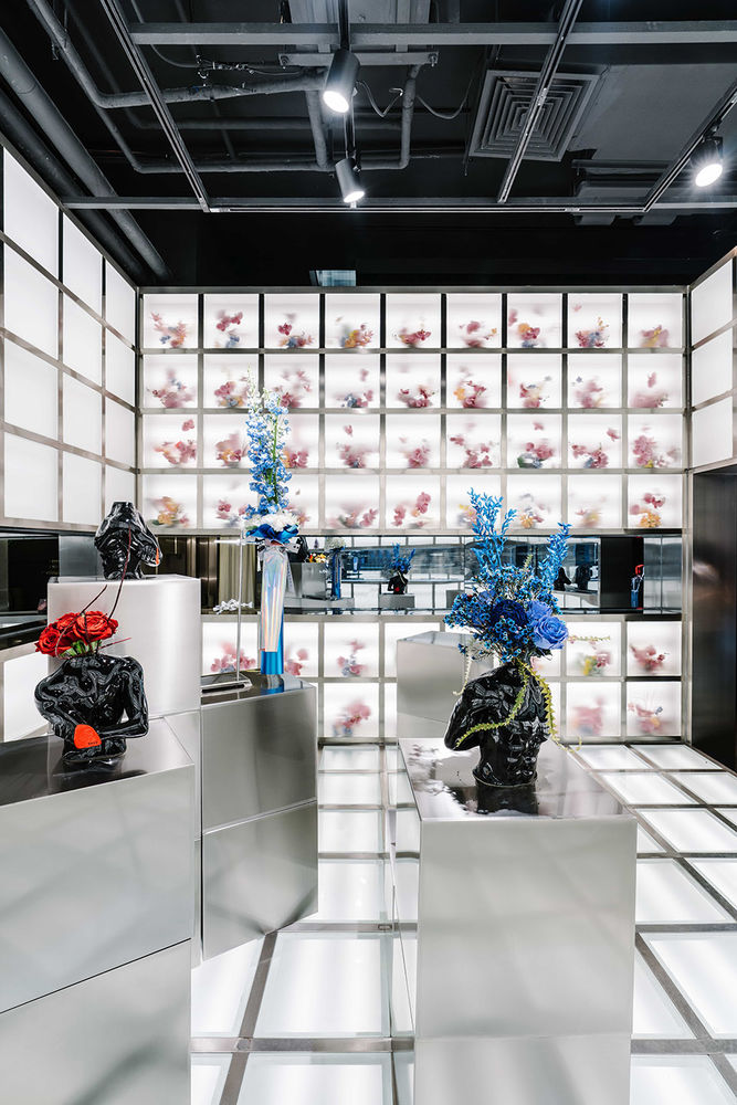
为保证展陈空间采光,同时实现花卉局部补光,我们直接将墙面、地面变成呼吸般均匀明灭的光源,配合多组射灯进而提升空间的戏剧性。如此一来,墙面和地面全部成了展陈的一部分,它们被切分成单元格,可以随机伸出变作“展台”,在空间中按需移动、堆积。
To ensure the lighting of the showroom and the shelving units, we turned the walls and the ground into light sources and added spotlights on the ceiling to increase dramatic effect. We also placed moveable platforms in the showroom, which can be rearranged or stacked together, to fulfill various exhibition uses of the space in the future.
▼墙面和地面被切分成单元格,moveable platforms in the showroom © 张之洲
作为习惯被欣赏的对象,花卉同样是情绪的写照,人在注视花的同时也被花注视着。雾气笼罩下,它们的生命力被空间汇集起来,形成一种肃穆之感,花卉与人、演员与观众之间的边界随之褪去。我们希望这个小店激活的不再是单向的商业行为,而是人与花之间的共情——这种互动是游移而临界的,尤其在这个“网红消费”时代,我们都在购买,也都在被售卖,花在它们的荣枯轮转中,无声注视着我们。
Different phases of the flowers translate into different beauty, and these independent moments consist of the “Hall of Flowers” we see. By reintegrating these flowers that were supposed to be recycled or stored away as a part of the exhibition, even as the most important component of the space, we hope to start a conversation about time, nature and life.
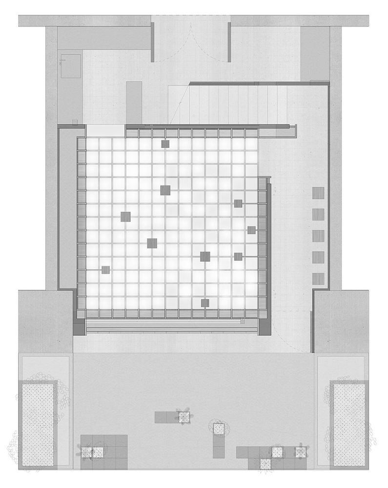
▼一层平面图,the first floor plan © F.O.G. 建筑事务所
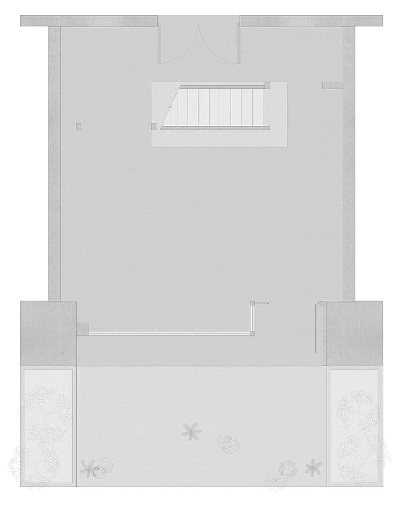
▼二层平面图,the second floor plan © F.O.G. 建筑事务所
▼剖面图,section © F.O.G. 建筑事务所

业主:dresscode 设计团队:郑宇、何宇妤、詹迪 定制家具及装置设计:F.O.G. 灯光设计:张旭 设计&完成时间:2020年 面积:60m² 摄影:言隅建筑空间摄影、张之洲
Client:dresscode Design Team:Zheng Yu, He Yuyu, Zhan Di Furniture & Installation Design:F.O.G. Lighting Design: Zhang Xu Design Time:2020 Area:60m² Photography:InSpace Architecture Photography, Zhang Zhizhou
