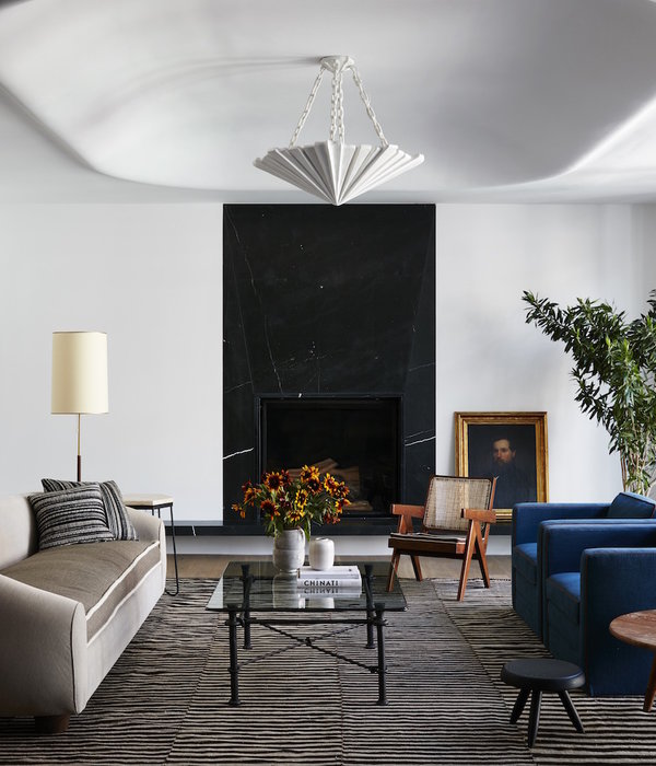
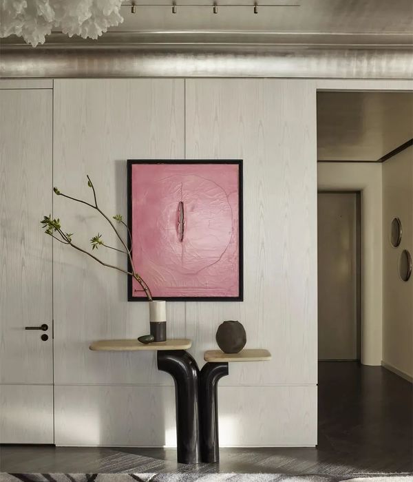
项目名称|Project Name:《瓦伦西亚的午后》项目地址|Location:上海·青浦
面积|area:160㎡
设计机构|Design Agency:简狄设计事务所
亚平宁半岛的阳光 / 撕开厚密的阴影,突然向整个大地展露自己潮湿的光束触击地面 / 敏捷灿烂地疾速离开像鲜花一般 / 轮廓鲜明地绽放……前言
# PREAMBLE #
这次大胆做了一套偏重结构感的极简设计。
淳厚的拿铁色调与局部的红绿色之间碰撞出神秘而复古的异域风情。
加入自然的艺术涂料和微水泥肌理,打造出空间的自由与舒适。
光影与线条分割出开放而利落的空间,延伸出视觉的无隅边界。
结构与空间的平衡构造出极简生活的无限可能。
空间改造。
# SPACE TRANSFORMATION #
---原始户型图---
---平面布局图---本案原始户型为四室两厅格局,我们将与客厅相邻的一间卧室和客厅打通,成为一个大的公共空间,并延伸出休闲地台、办公区等更多的功能层次。另外,在厨房、卧室等空间我们也做了细致的功能优化。
案例讲解
# CASE EXPLANATION #01# Entrance #
随着视线划过半通透的玄关柜,光影挪移间,空间由近及远收于眼底……
With the sight across the semi transparent porch cabinet, the light and shadow move, and the space closes at the bottom of the eye from near to far…
02# Living room #
移动式的柜门,可任意放大或缩小陈列开放区,变换出不同的立面分割效果。
客厅墙顶面的留白处理,让整个空间更加通透轻盈。暖色系的微水泥打造出墙顶面浑然一体的效果,阳光下散发出如拿铁一般温润淳厚的色调,似乎可以安抚内心一切纷杂繁复,回归婴儿般的初始状态。
The blank treatment on the top of the living room wall makes the whole space more transparent and light. The micro cement of warm color system creates an integrated effect on the top of the wall. The warm and pure tone like a latte radiates in the sun, which seems to calm everything in the heart and return to the initial state of a baby.
03# Dining room #
餐厅的设计同样遵循极简手法,弃浮华冗杂,让空间呈现最自然舒适的感觉。餐厨几乎融为一体,无间的互动,可尽享欢乐的烹饪时光。
The design of the restaurant also follows the minimalist approach, abandoning flashy and miscellaneous, so that the space presents the most natural and comfortable feeling. Meals and kitchens are almost integrated, with endless interaction, so you can enjoy a happy cooking time.
04# Kitchen #
橱柜以哑光黑为主基调,营造出高级而富有质感的烹饪空间。
The cupboard is mainly matte black, creating a high-grade and textured cooking space.
05# Bedroom #
主通道内嵌悬挑式玻璃收纳柜,作为卧室收纳补充的同时,也具有展示的功能。
The cantilevered glass storage cabinet embedded in the main channel not only serves as a supplement to the storage of the bedroom, but also has the function of display.
作为一位优质单身女主,卧室的格调带着鲜明的个性化标签,极简的直线条、复古墨绿+脏粉搭配深咖色木饰面,还有精心挑选的小众品牌家具、灯饰……无一不彰显出女主人独特的个人品味。
As a high-quality single hostess, the style of the bedroom has a distinctive personalized label, the minimalist straight line, retro dark green + dirty powder with dark coffee wood finish, as well as carefully selected niche brand furniture and lighting... All show the hostess’s unique personal taste.
06# Bathroom #
次卫为干湿分离的设计,运用了岩板、金属、长虹玻璃等元素,现代感十足。主卫更强调墙地一体化,选用哑光砂岩质感的大板墙地砖,辅以氛围灯光,营造出高级而酷炫的感觉。
The second bathroom is designed for dry and wet separation, using rock plate, metal, Changhong glass and other elements, with a full sense of modernity. The main guard emphasizes the integration of wall and ground, and selects large plate wall and floor tiles with matte sandstone texture, supplemented by ambient lighting, to create a high-grade and cool feeling.
{{item.text_origin}}

